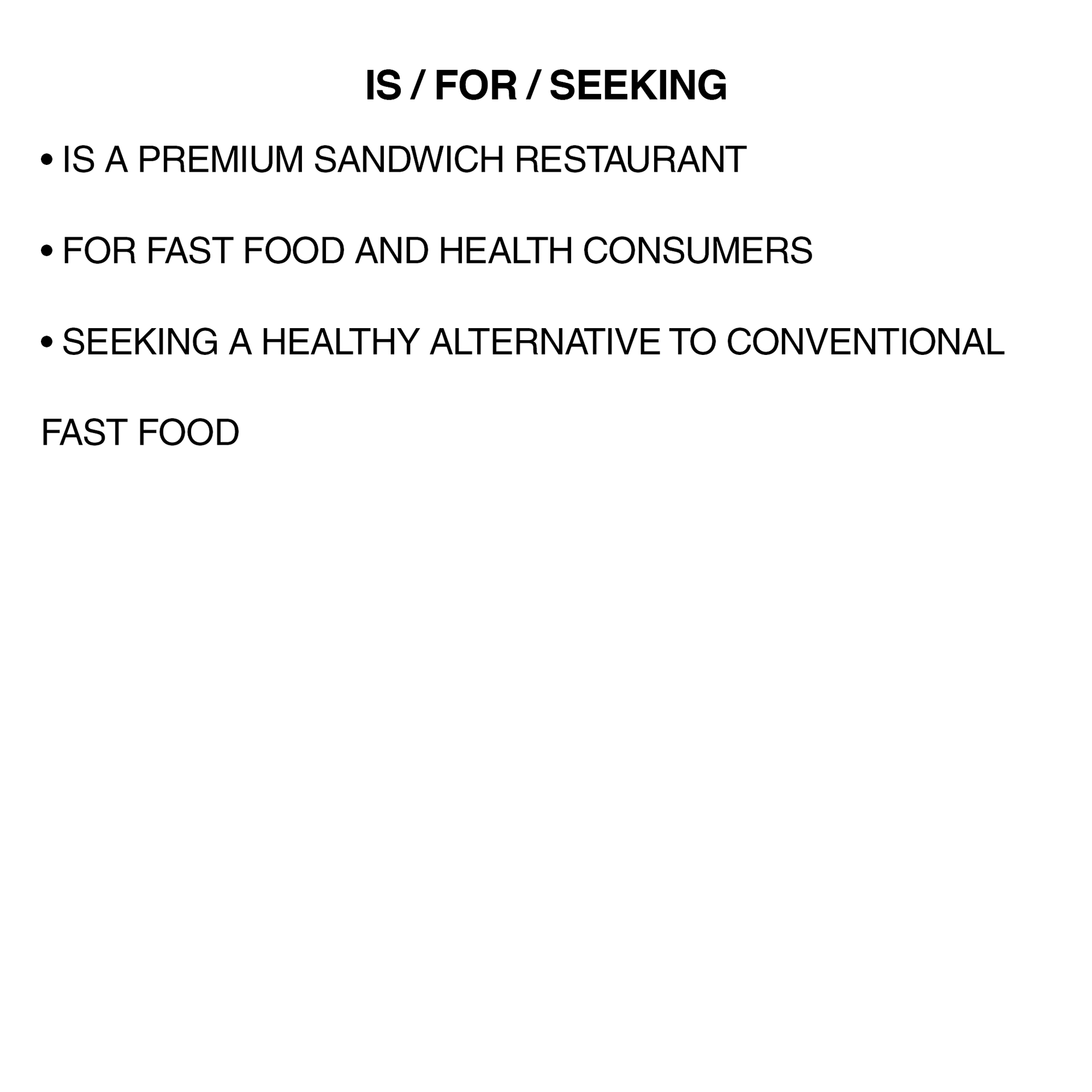
Sub-Traction Branding Design
This is the second design, I created for my university introduction to design course. For this project we were required to take one used or unused word from the previous project and make it into the brand identity of a product, business or organization. We had to justify the use of the chosen term by providing a rationale for the name. In addition, we had to create a creative brief for the business and it's branding with the following requirements: An overview of the project goals / rationale for the name, the main communication objective, the target audience, overall creative approach to tone, image, colour, message, etc.
In order to complete this project, we had to follow the conventional design process: planning, concepts, designing, application. A process, I am very familiar with over the last three or four years of freelance designing.
In this Behance project, I will be displaying my beginning to end logo design process. This logo design and branding kit, is FOR SALE, so please contact me by email or direct message to purchase. Enjoy!
Creative Brief And Outline
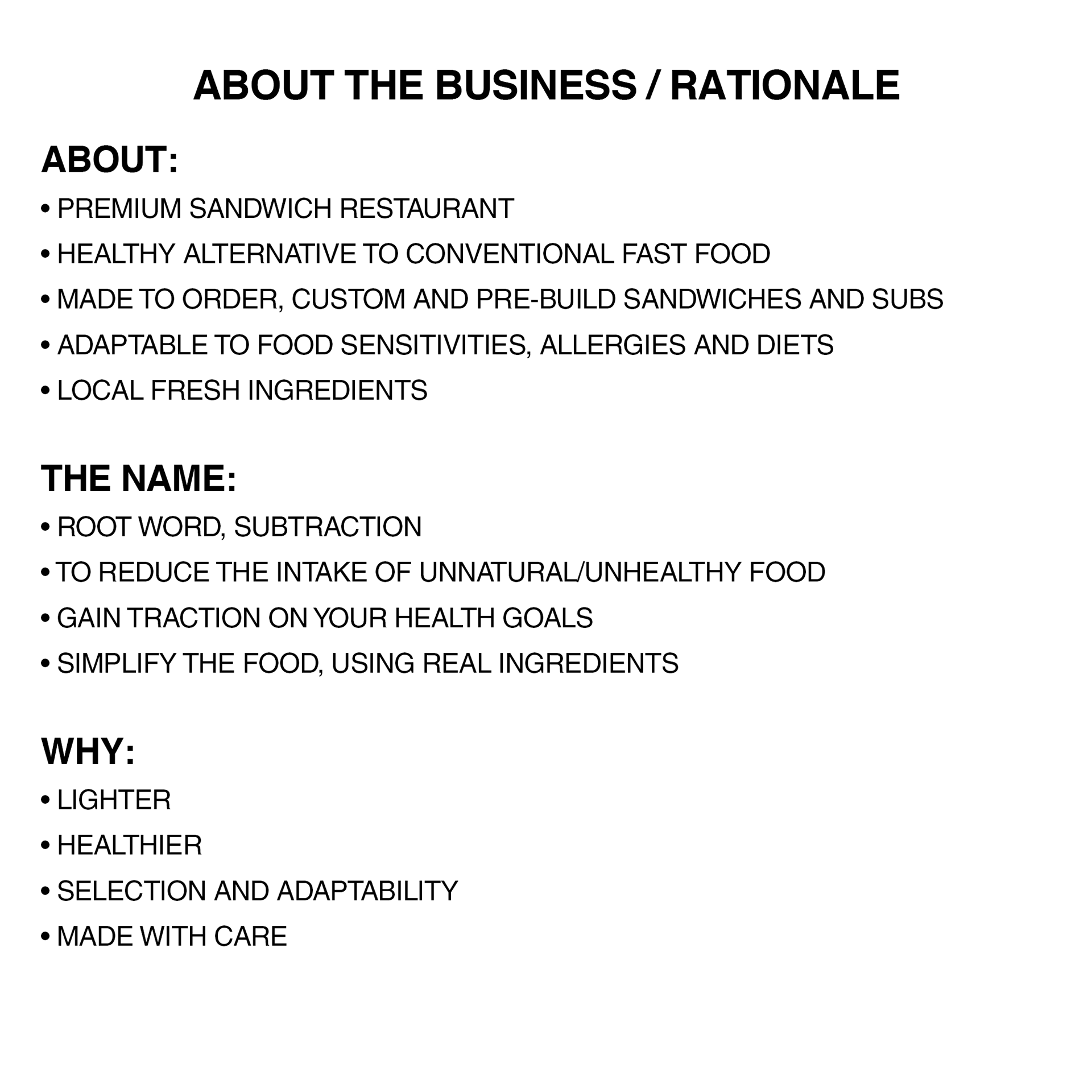
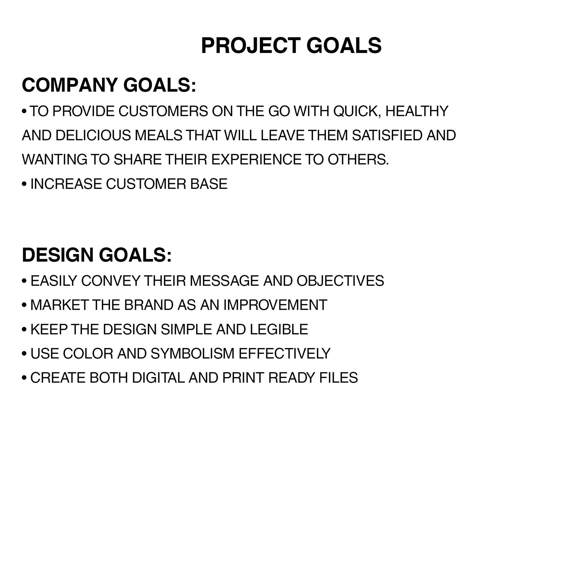
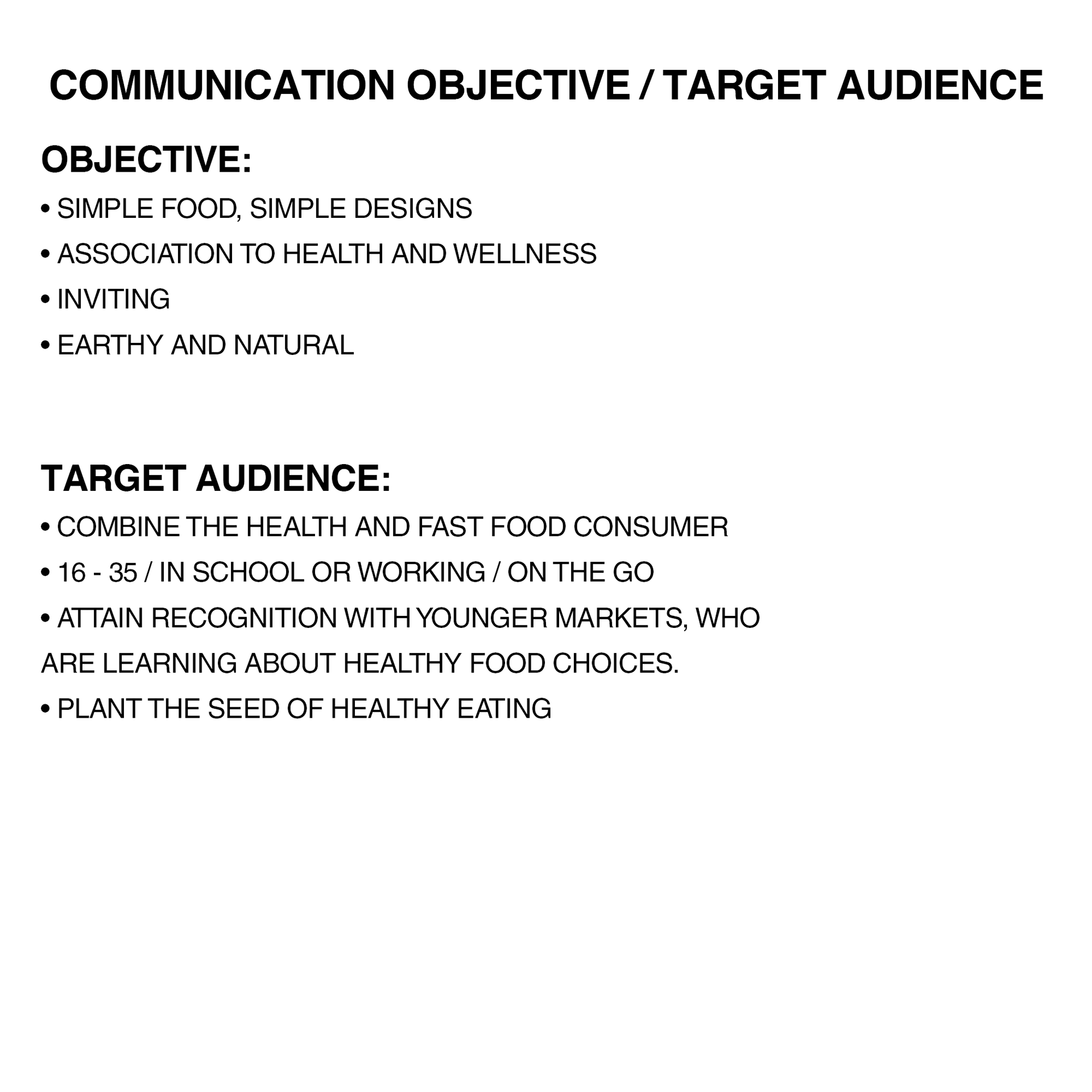
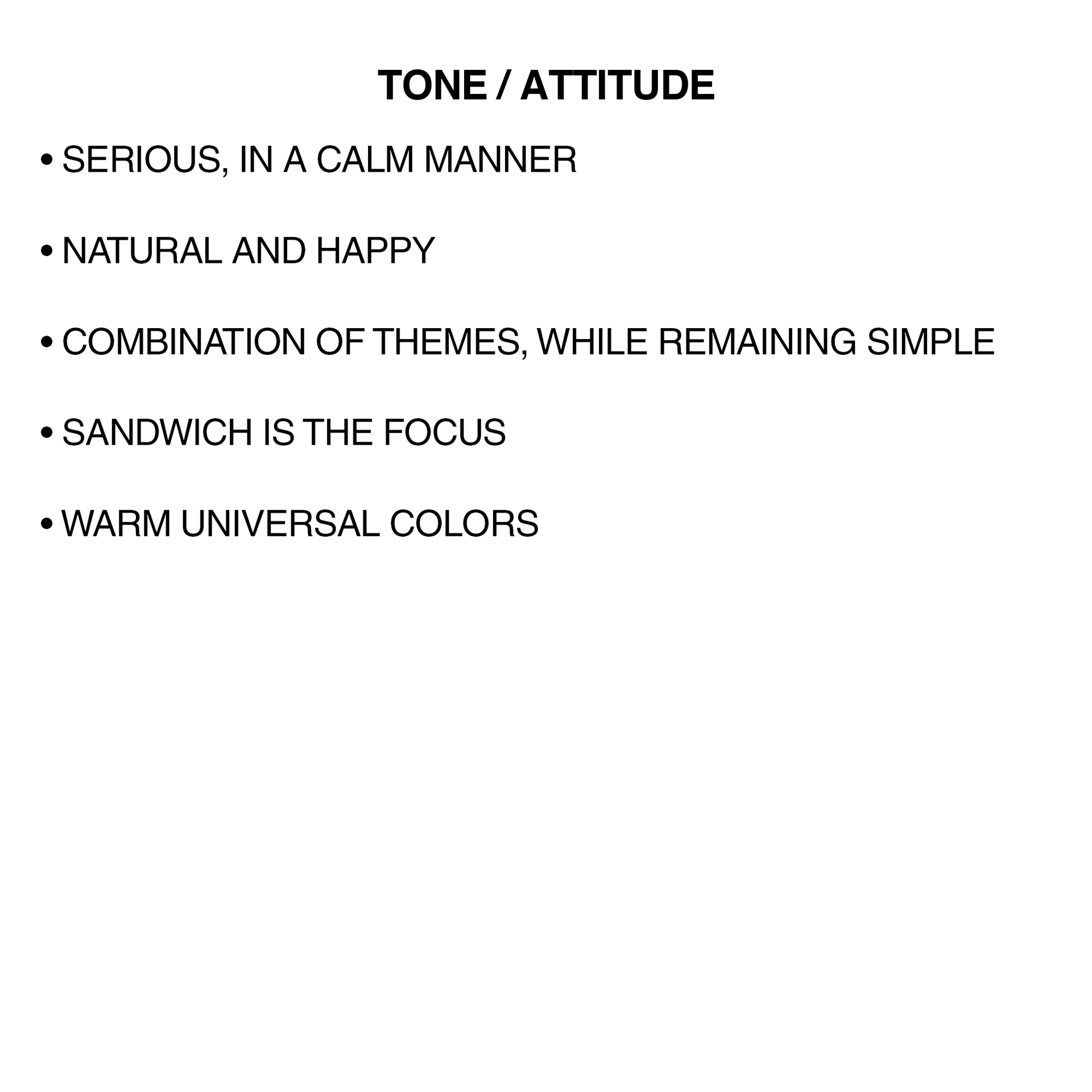
For general information, I created this brief after creating the logo design and completing the design process. The original brief was much more condensed and less detailed. Though, It still worked as an essential guide in the creation of the design. If you have the time to read my brief, you will be able to further understand, my thought process and the ideas behind the work.
Concepts
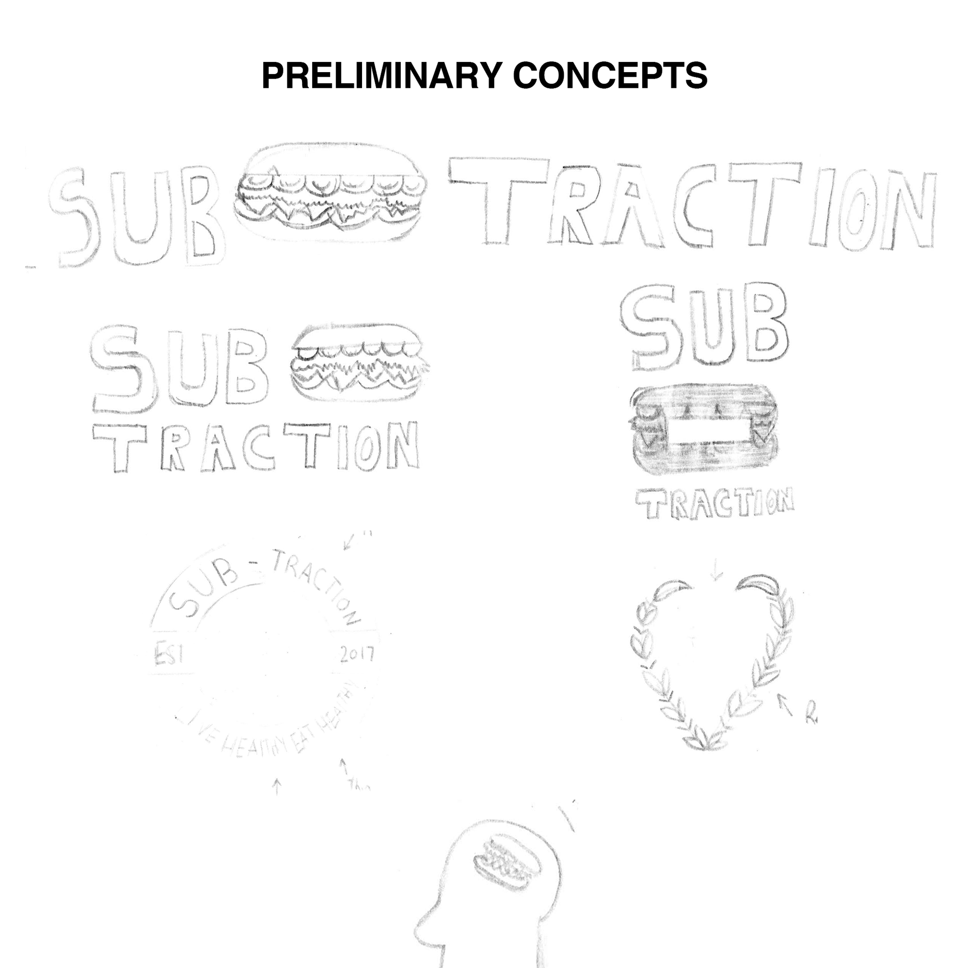
Here, I show the first steps of the design process. Before I draw any concepts, I like to sit and write out all the ideas that come into my head. I took each word and thought about physically breaking the word down and also breaking down the meaning of the word itself. I have a full page of ideas based on the words that we were provided with.
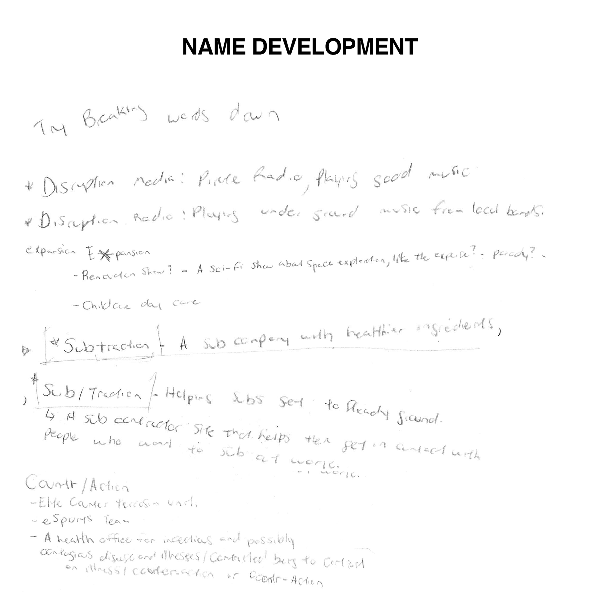
Once I settled on the name of my business, I continued to write down any and all ideas for the creation of the logo. Also, keeping my brief in mind, I tried to identify symbols for general health and healthy eating. Knowing that this is a food-based business, my instructor suggested I contemplate why people would want to eat there, over other restaurants. I took the answer to that question into consideration, for the creation of a mark.
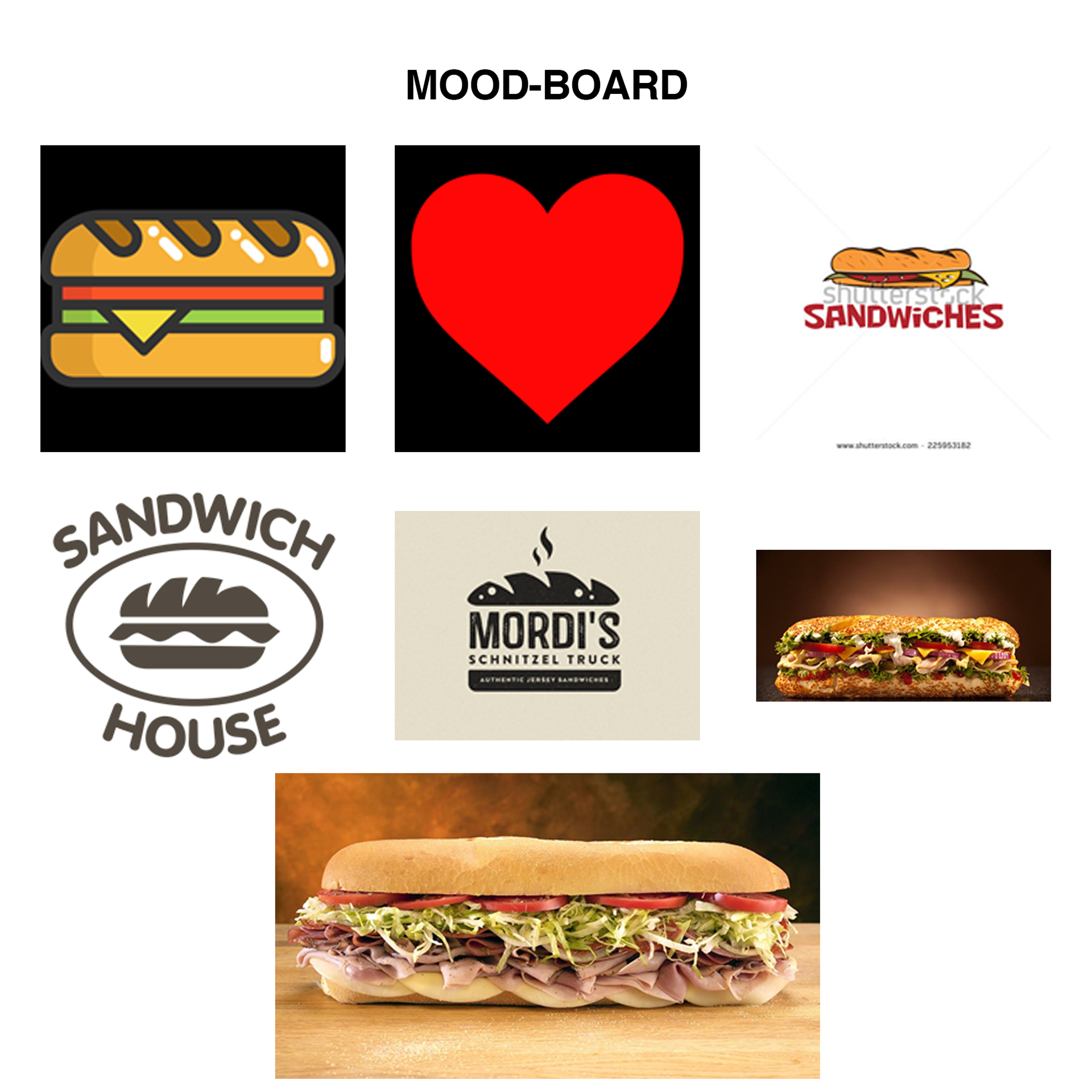
Next, I began to source images for the inspiration of my design. Here are a few!
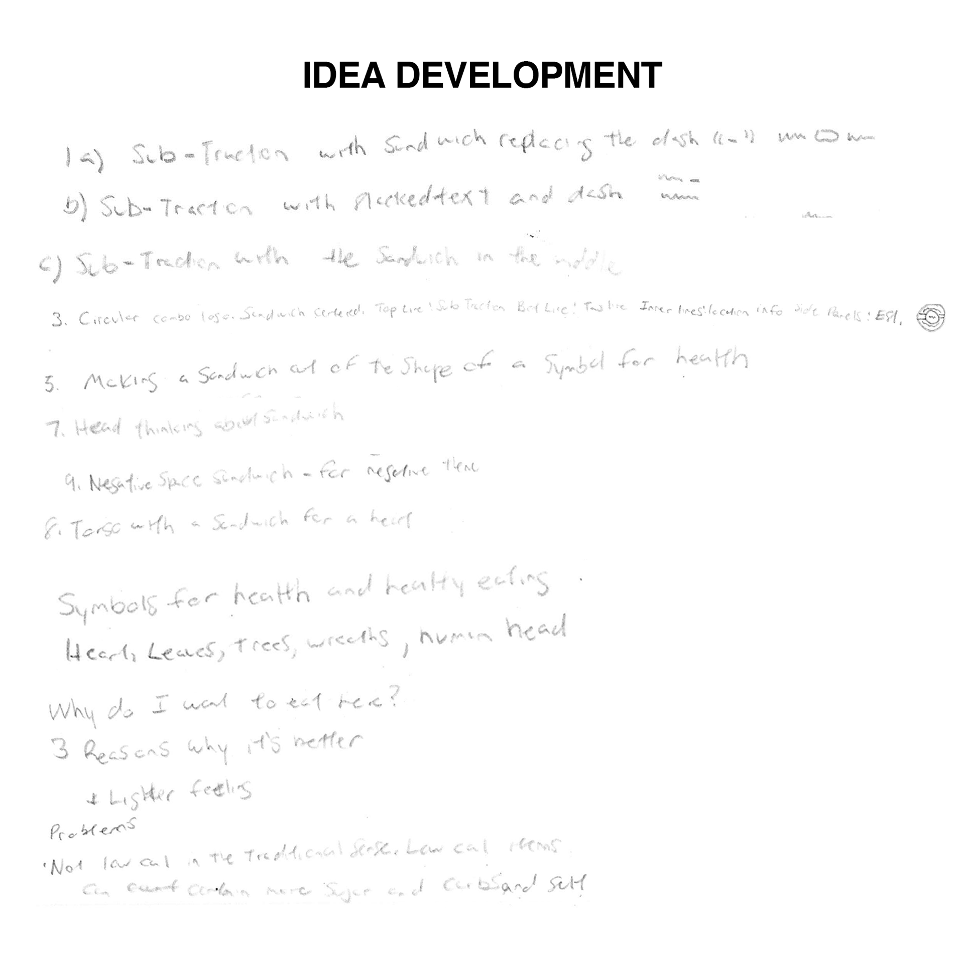
I began to experiment with the shapes of the sandwich and it's interaction with text and other objects.
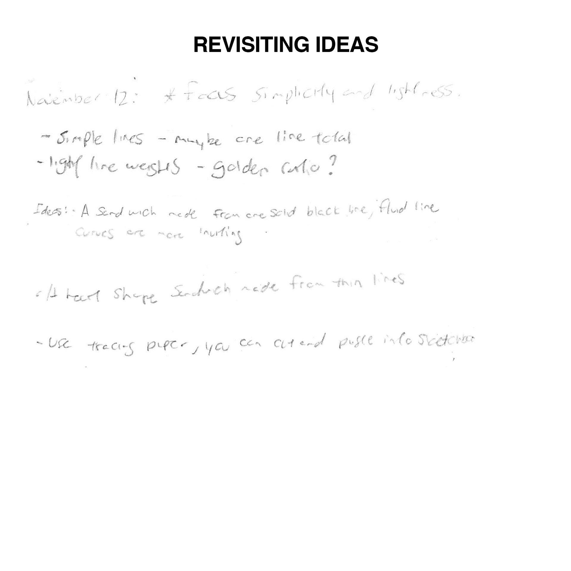
I was stuck for ideas, I let the early concepts sit for a couple of days. Then I revisited the ideas, keeping my brief and theme in mind. I was struck with an idea to take the design and simplify it down to the simplest shapes possible; to represent the lightness of the food and the use of the simplest healthy ingredients.
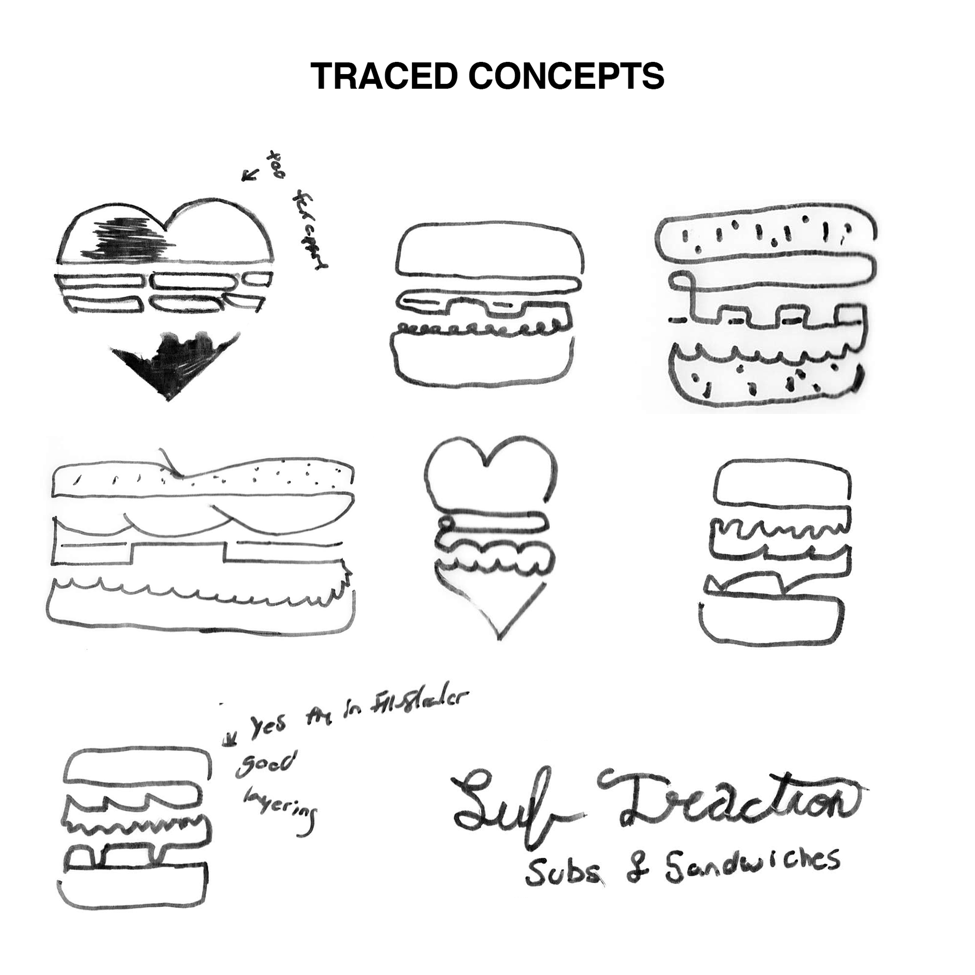
Inspired by my above ideas, I chose to create my design from a single line. To create the shape of the sandwich from one black line. In doing so, would leave me with a simple design, that conveys the lightness of the food and the use of simple ingredients, that Sub-Traction wants to be known for. I took some tracing paper and a black pen and went through sketch after sketch, until I felt that I had reached one, that was satisfactory.
Logo Design
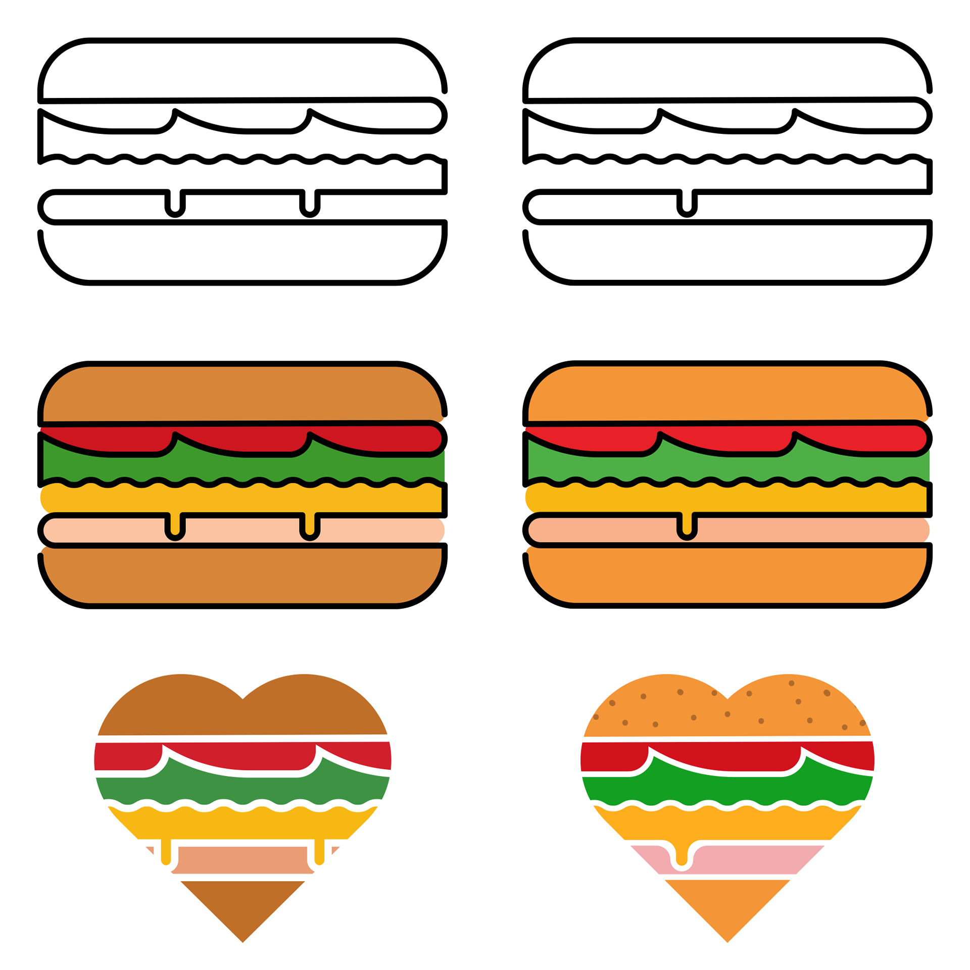
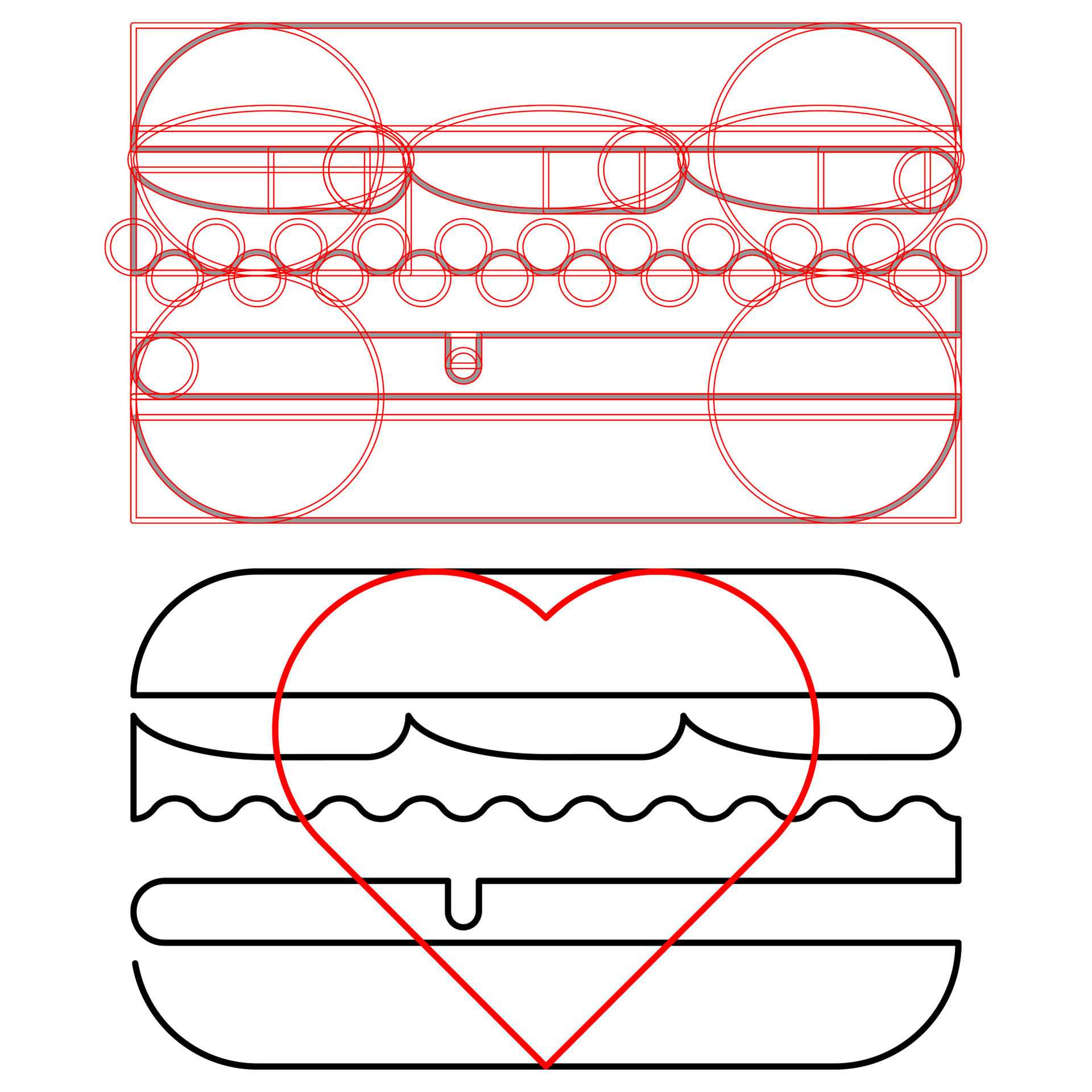
I took the sketch into illustrator, and pen-tooled the design inside of a simple test grid. I rounded the edges of the design, to make it more inviting to the viewer.
Here is a description of the layers: The first layer is the bun / The second is the tomato, I used the rising shape to define each individual tomato / The third is the lettuce, it uses the rising shape of the tomatoes to emulate the idea of, the lettuce being stuffed behind the tomato. / The fourth is the cheese, it takes the wave shape of the lettuce to imply the gooey drippy-ness of melting cheese. The drips roll off the main body of the cheese. / The fifth is the ham, the drips from the cheese are meant to signify the breaks in the slices of ham. / The sixth is the bottom bun.
The left side designs were my first attempt. The right were my second preferred attempt.
Next, I remade the entire design, using more advanced gridding. This way every line and point is there for a reason. The design utilizes stroke, not fill; so the grid items did not look like this when I was making my design. I took the stroke grid items and expanded them, so that those viewing this project could understand the purpose of the grid.
Also, like the above digital concepts, I used a clipping mask to crop the sandwich to the heart shape. The use of the hearth shapes allows me to combine the symbolism of the singular line design and integrate it with, notions of health and wellness.
After testing the clipping mask, I released it and used the shape builder tool to cut the design out from the above heart shape. I then colored the individual shapes, to create the final design.
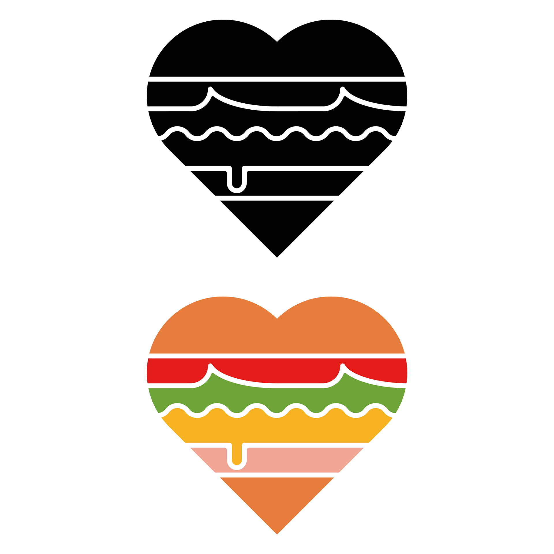
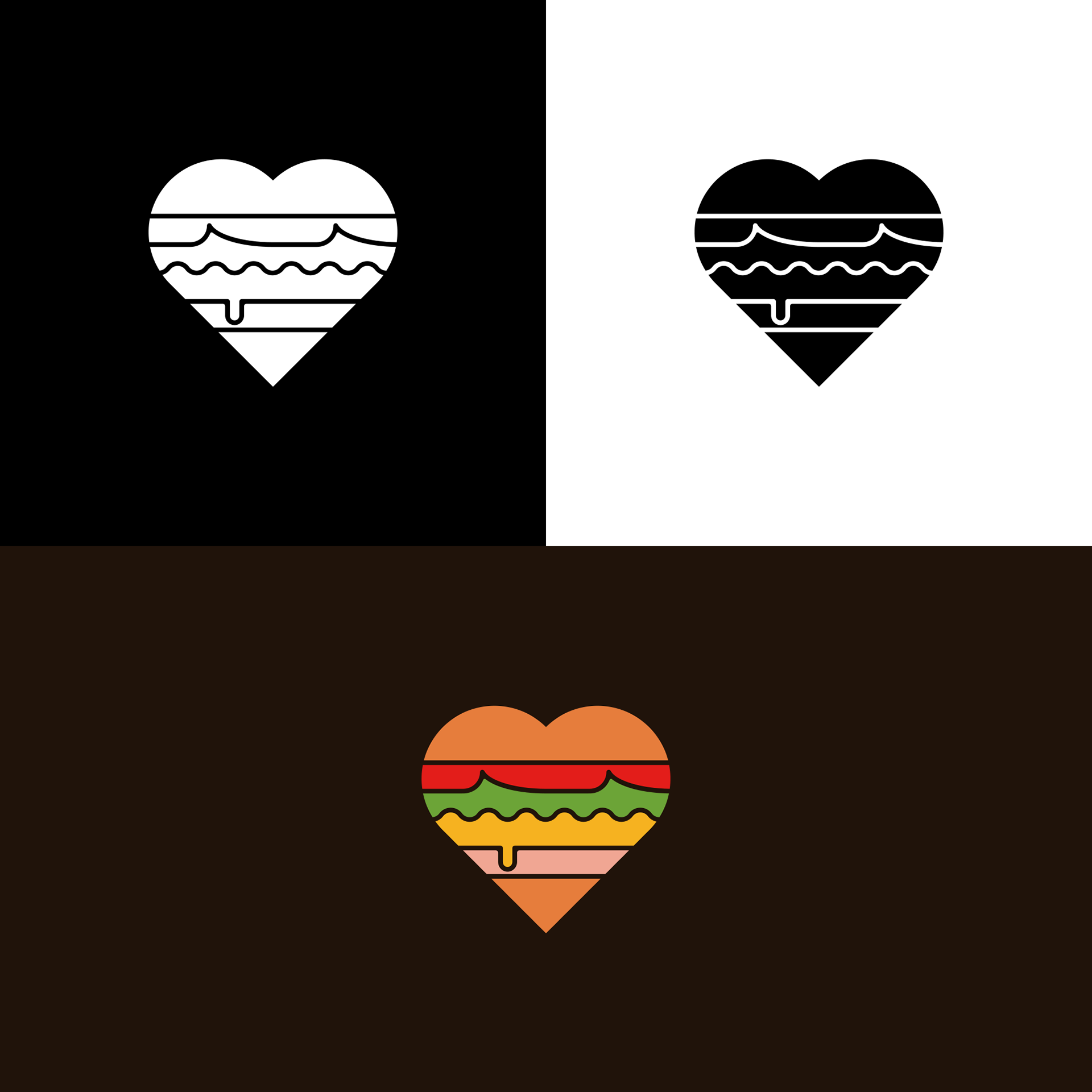
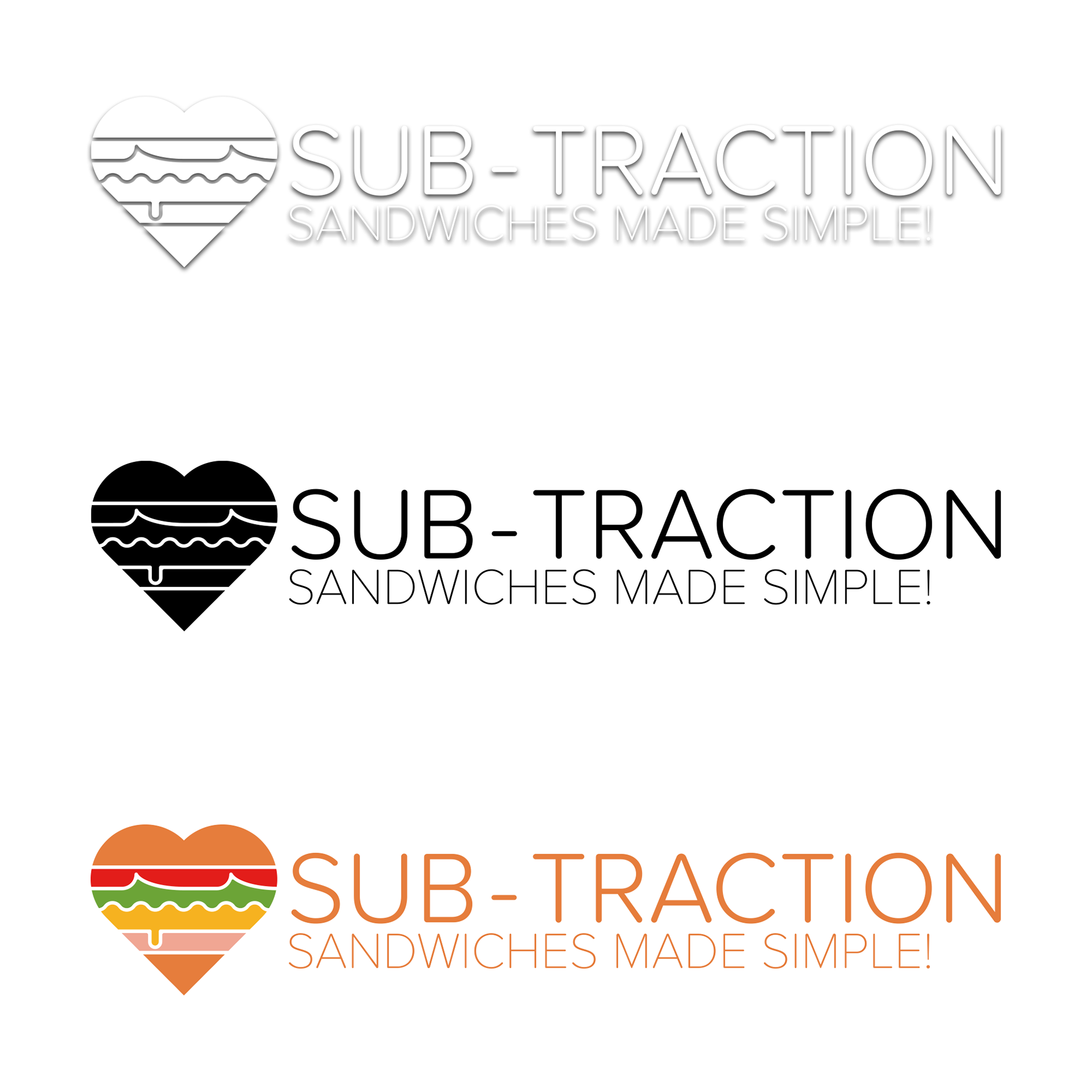
I then took the final designs and placed them on color backgrounds, dependent on the logo color.
Of course, I also created copies using text. I used this font because, the round edges and thickness of the letter-forms, worked well with the above logo.
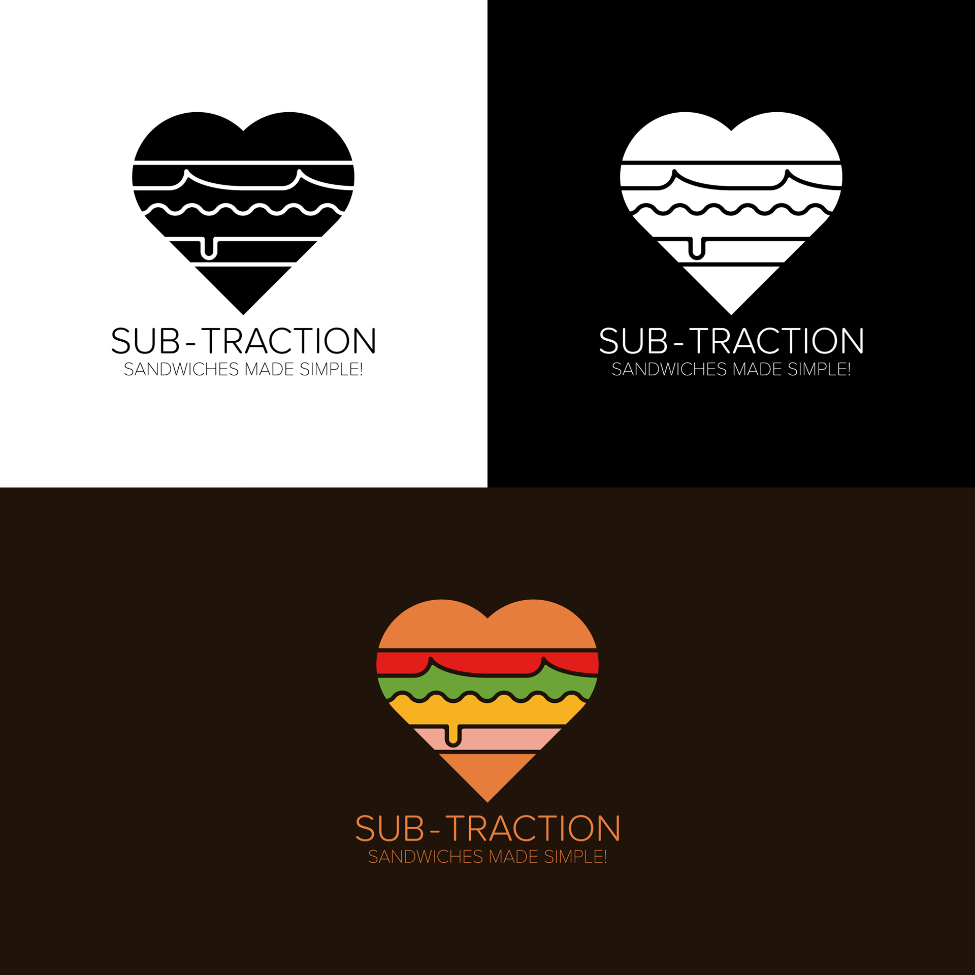
Here are horizontal copies, that are useful for stationery and signage.
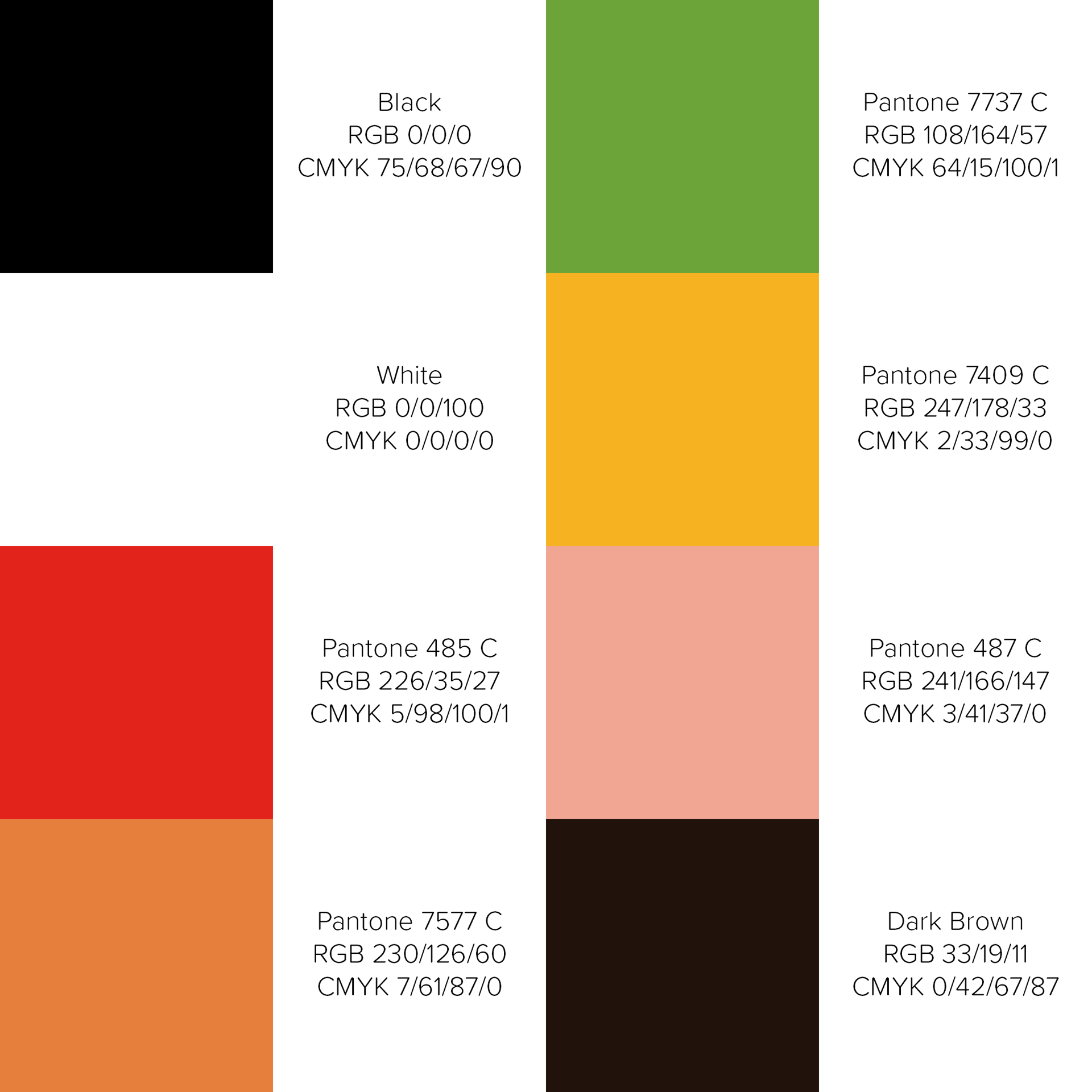
When preparing my designs, I wanted to assure that my colors would match, as closely as possible between digital and print. I used Pantone colors, because they will allow me to get near the same result, when used on most printers or websites. The last brown color I used looks completely different, when comparing RGB and CMYK color modes in software. I used a RGB converter to get an accurate CMYK code. When printed the colors are a near match to the RGB colors.
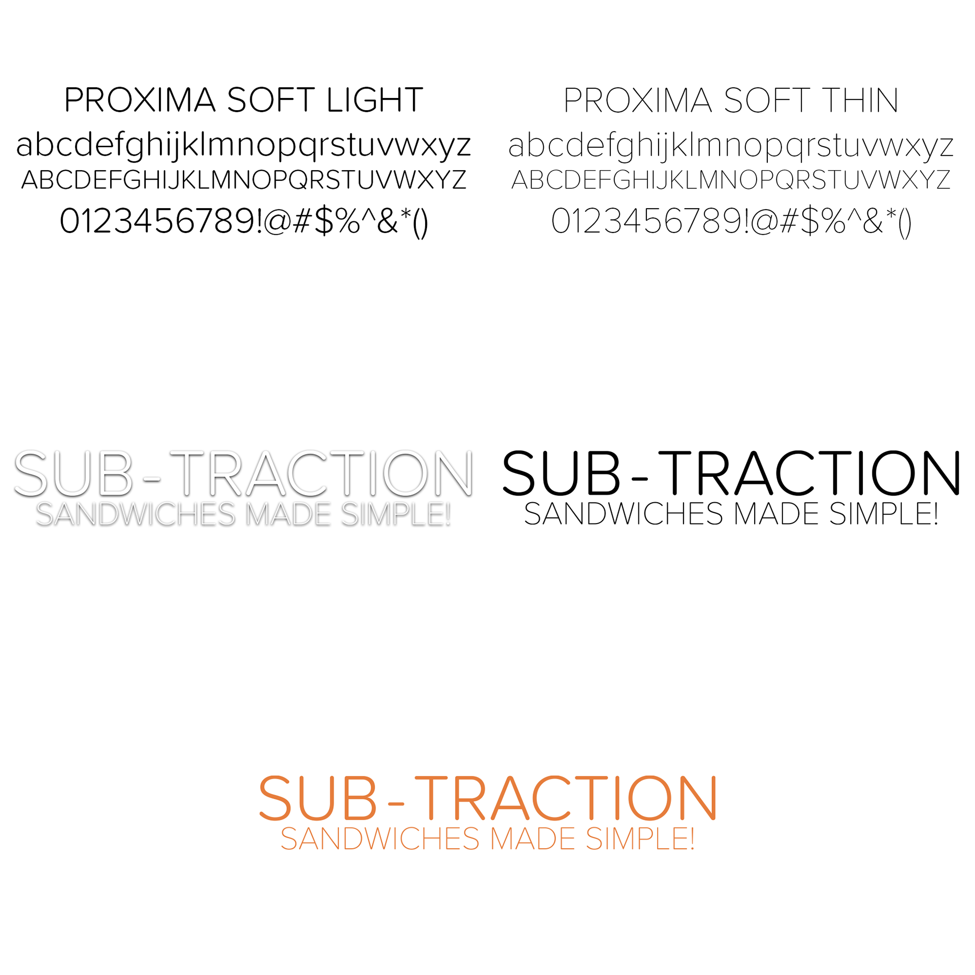
I have used Proxima Nova in the past, which would be considered a sibling font. I was happy to find Proxima Soft, because it is fairly simple and incorporates rounded edges. It fits my theme and brief perfectly. Also, I have included copies of the wordmark below the logo design.
Applications And Stationery Design
After finishing the design, I planned out my applications. I wanted a wide range applications, to show off the many uses of the logo.
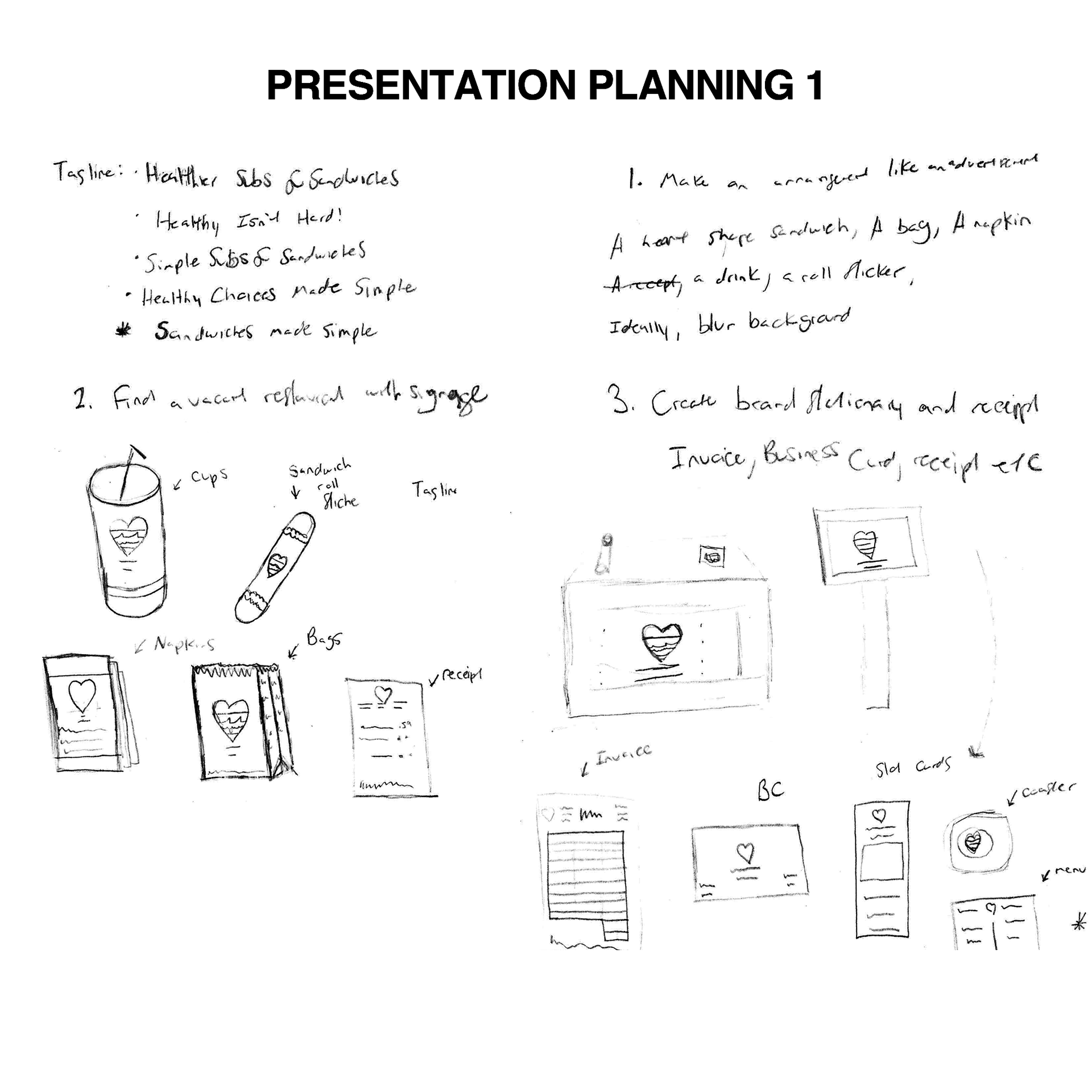
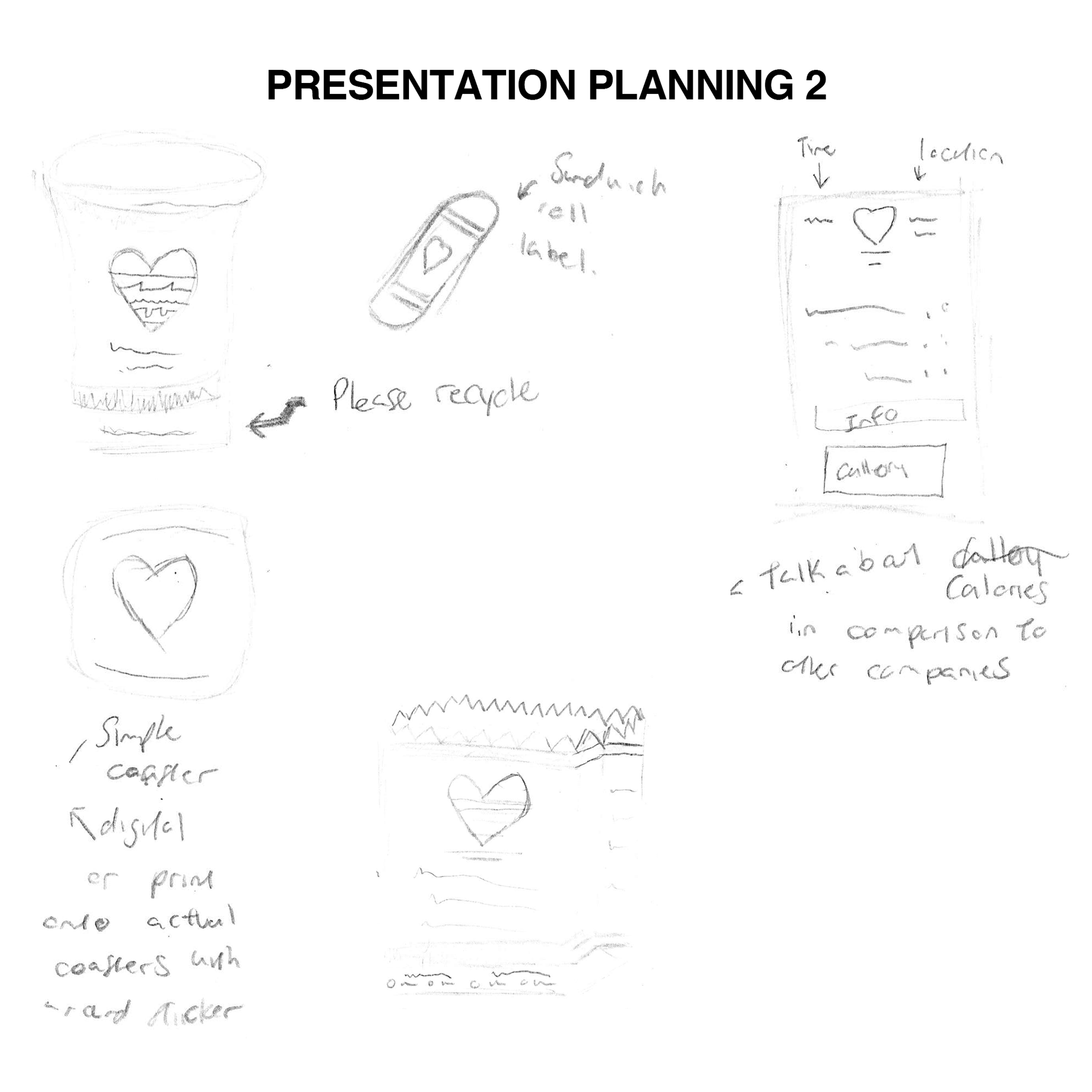
Here are some sketches of the logo placed on different food related items.
Here is the stationery package, I created for the brand. The address and relevant contact information are made up placeholders, that could be changed if purchased.
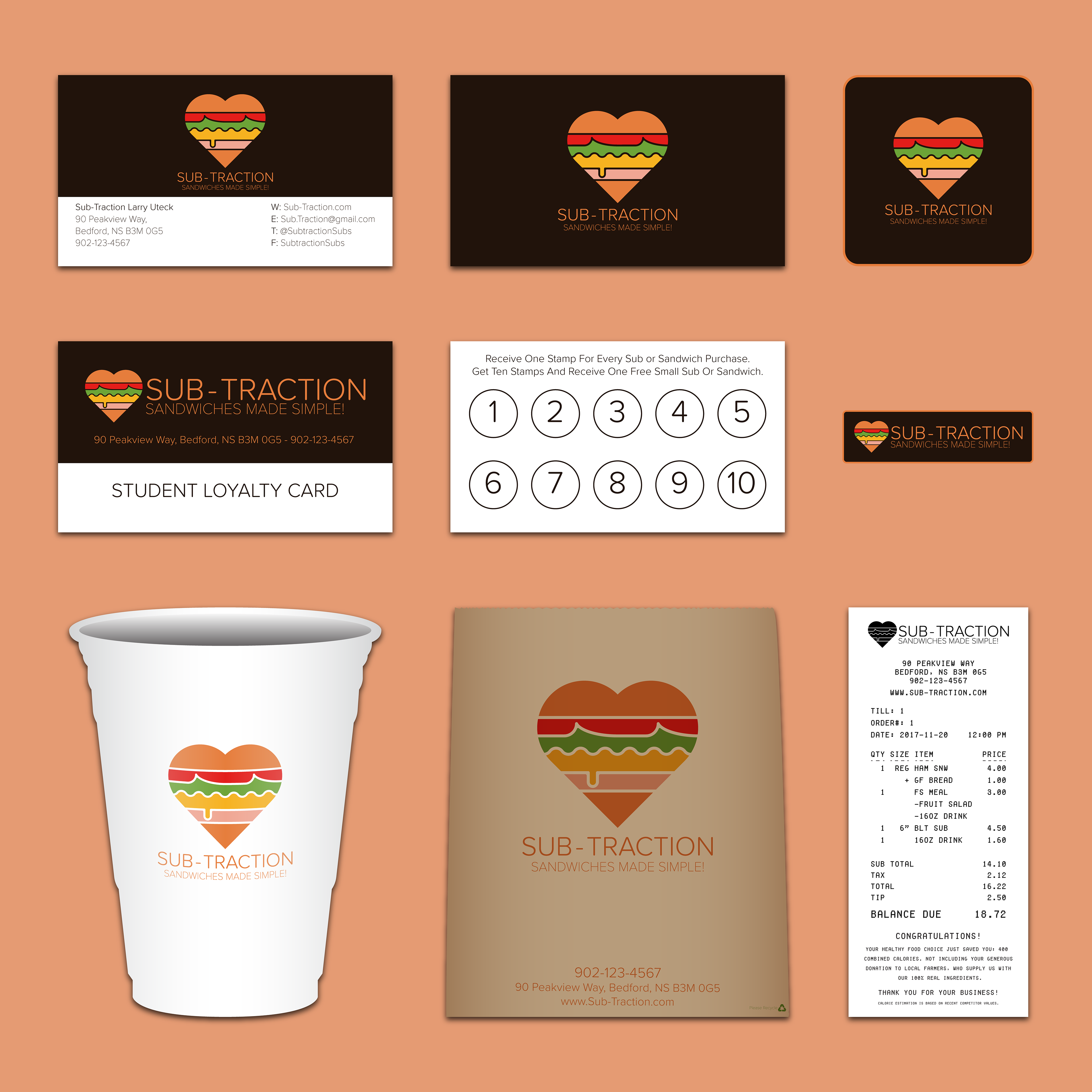
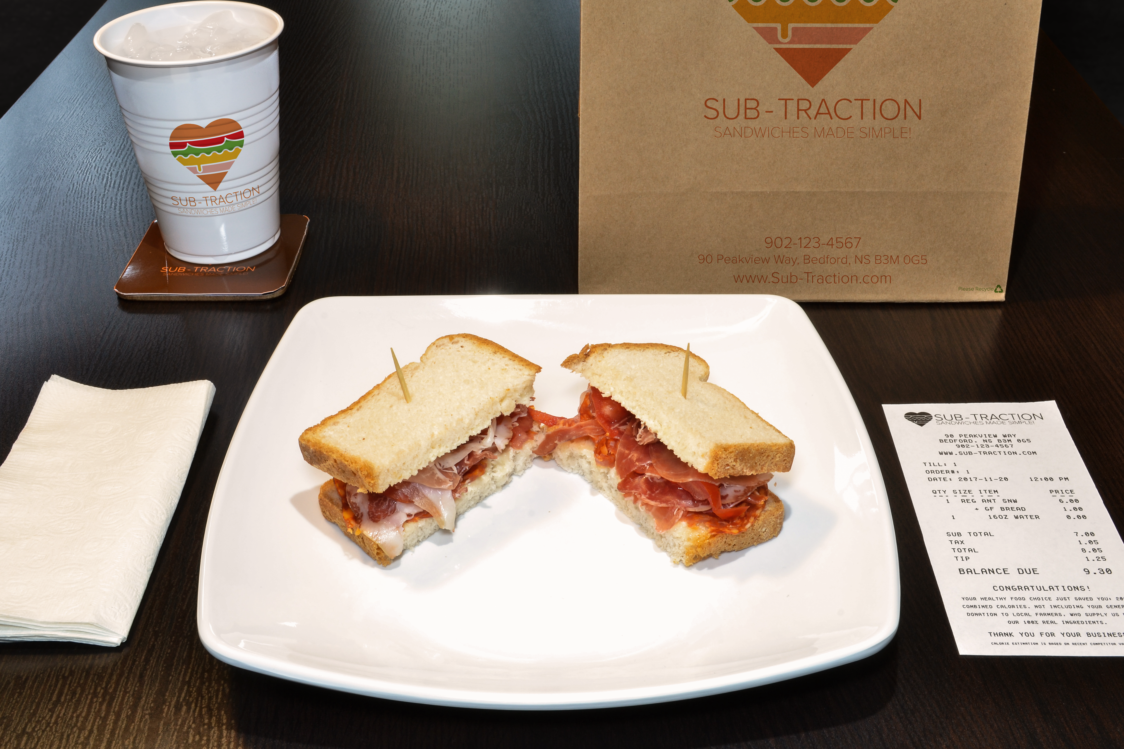
I created this mockup myself, using real and digitally modified elements. I made the sandwich, using real ingredients. I bought a paper gift bag and removed the handle, a plastic cup and a plastic plate. I created a separate receipt then printed it, using my printer. I also printed the coaster design and taped it to an existing coaster of the same size. I arranged all the elements on a wooden table, prepared my lighting and took multiple photographs. I selected the best of the photos and applied the graphics to the cup and bag.
Thanks For Scrolling,
Please Contact To Purchase!
Copyright © 2017 - Bezzina Designs
Project falls under intellectual property law.