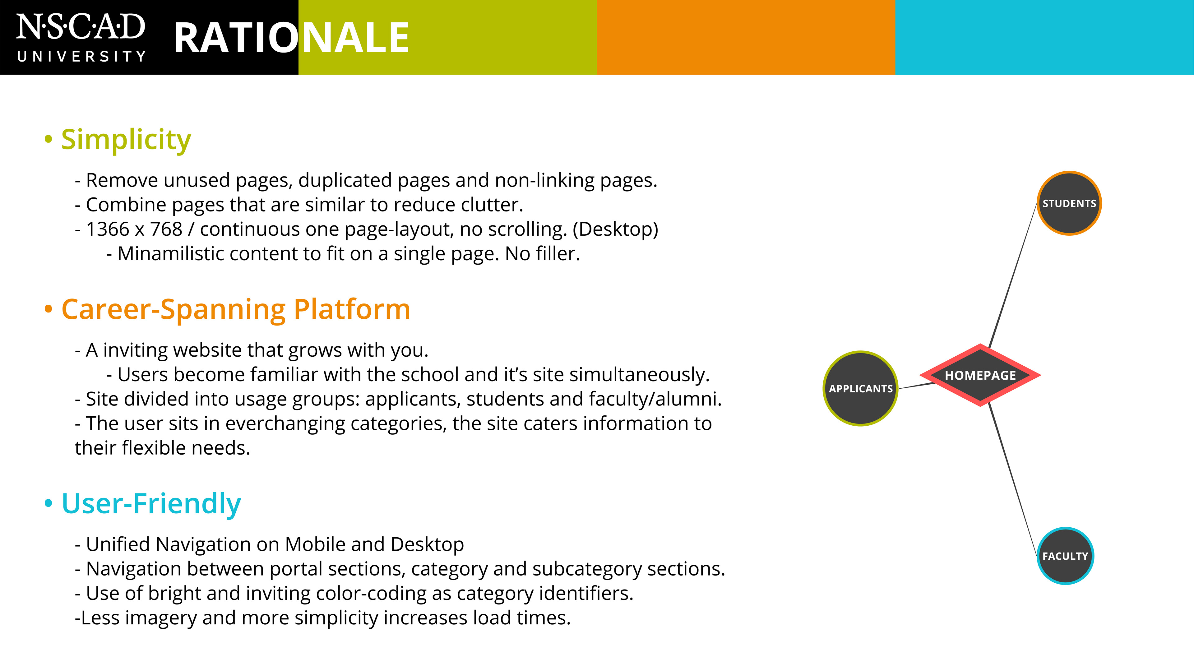
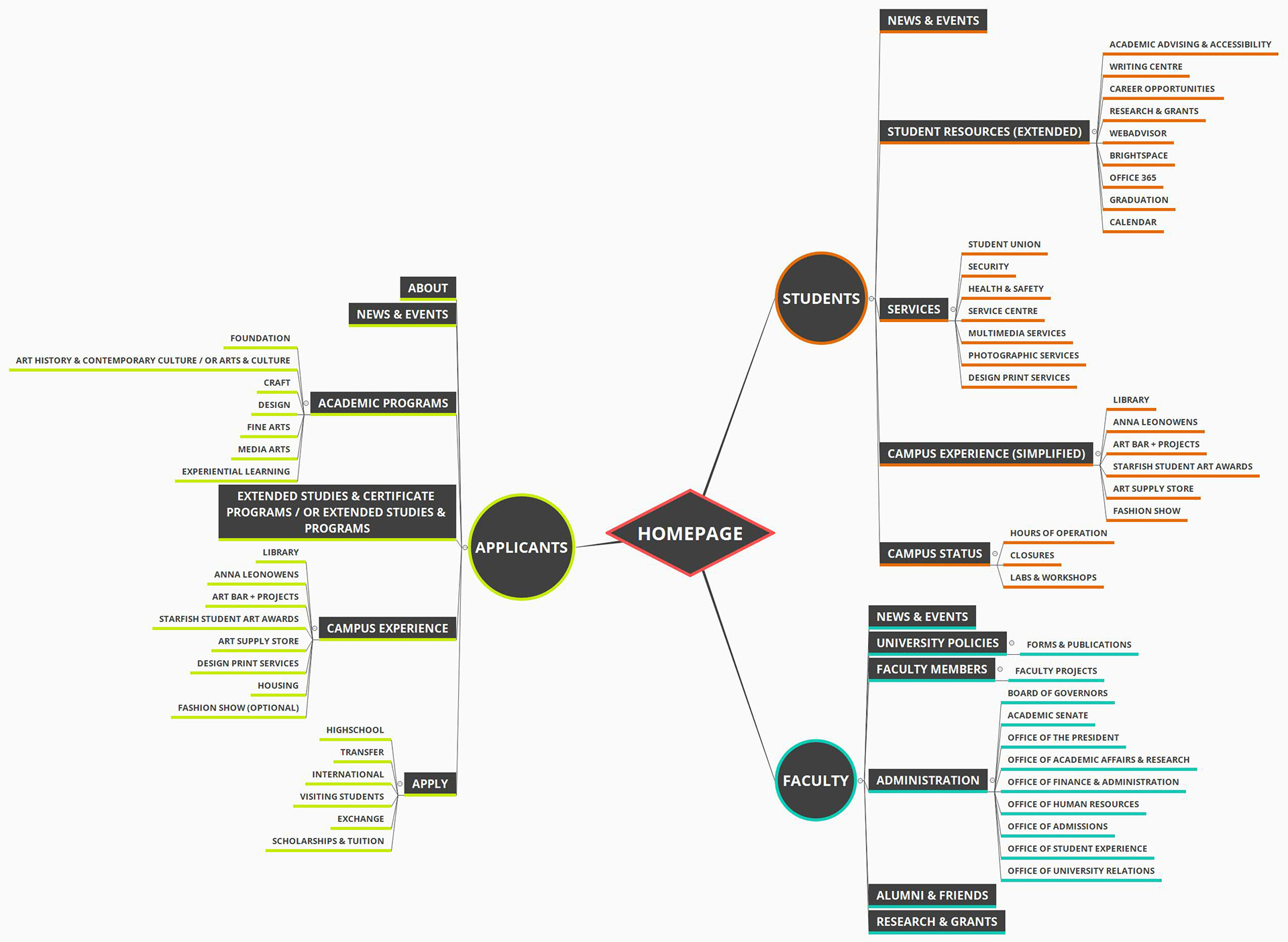
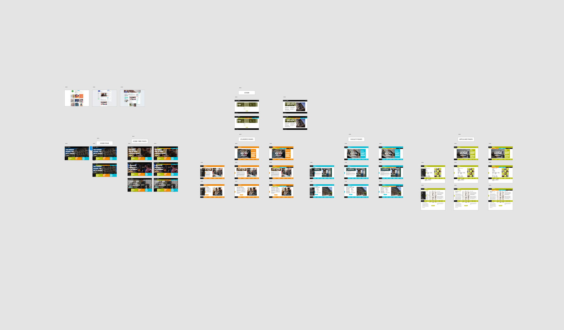
Portal-Site Navigation Architecture:
Wireframe Concepts:
After doing research and reorganizing the existing website content into a portal-style architecture, we each began to develop our own wireframe interpretations of what we wanted our site to look and function like.
A note before beginning - As this was a group project, we all had different roles in the development of the project and each contributed in different ways. While completing this project we also were developing projects in other courses, so we each had to do separate time management for the completion of the work. Everyone's contributions are what led to the result that we achieved.
In addition, I do not have everyone's sketches and early iterations, so what you see is what I personally have on file.
Marco's initial concept was to create a simplified one page high, site where the content scrolls rather than the page. This way we can simplify navigation and limit page content.
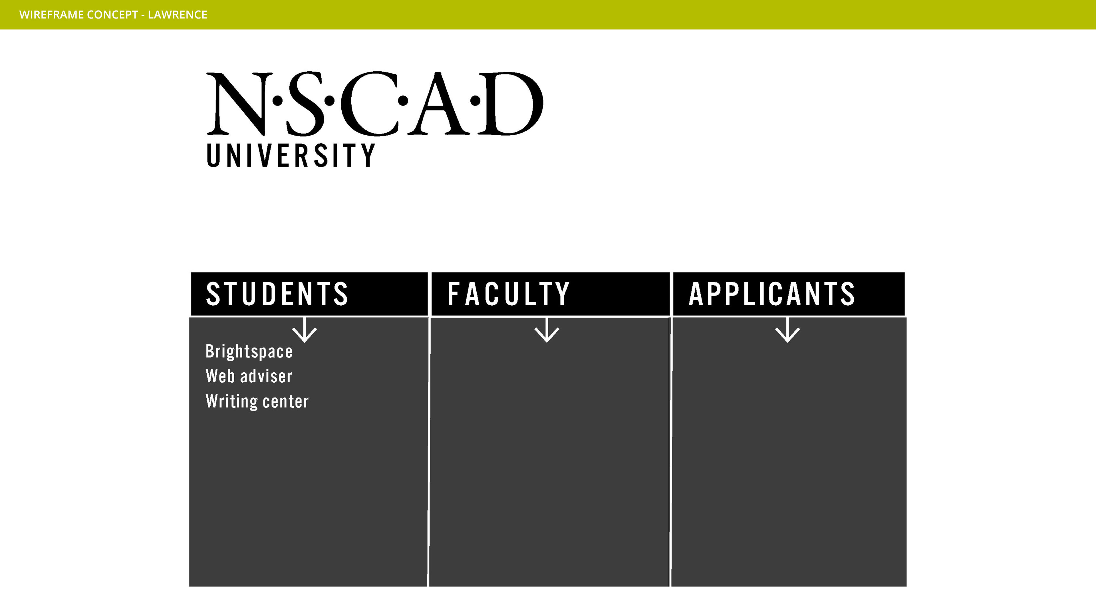
Kiefe began exploring the idea of splitting the main-page content into 3 collumns.
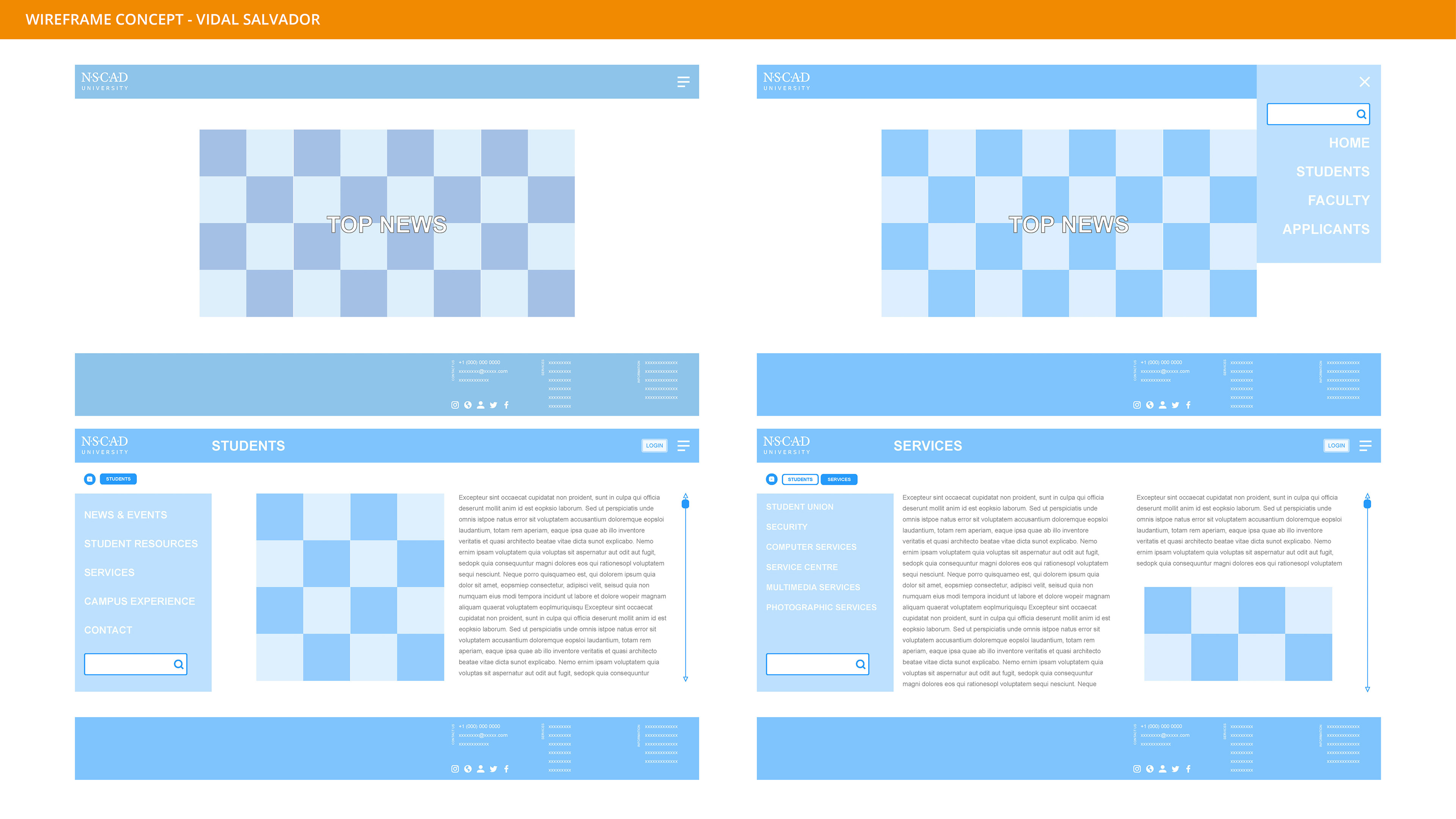
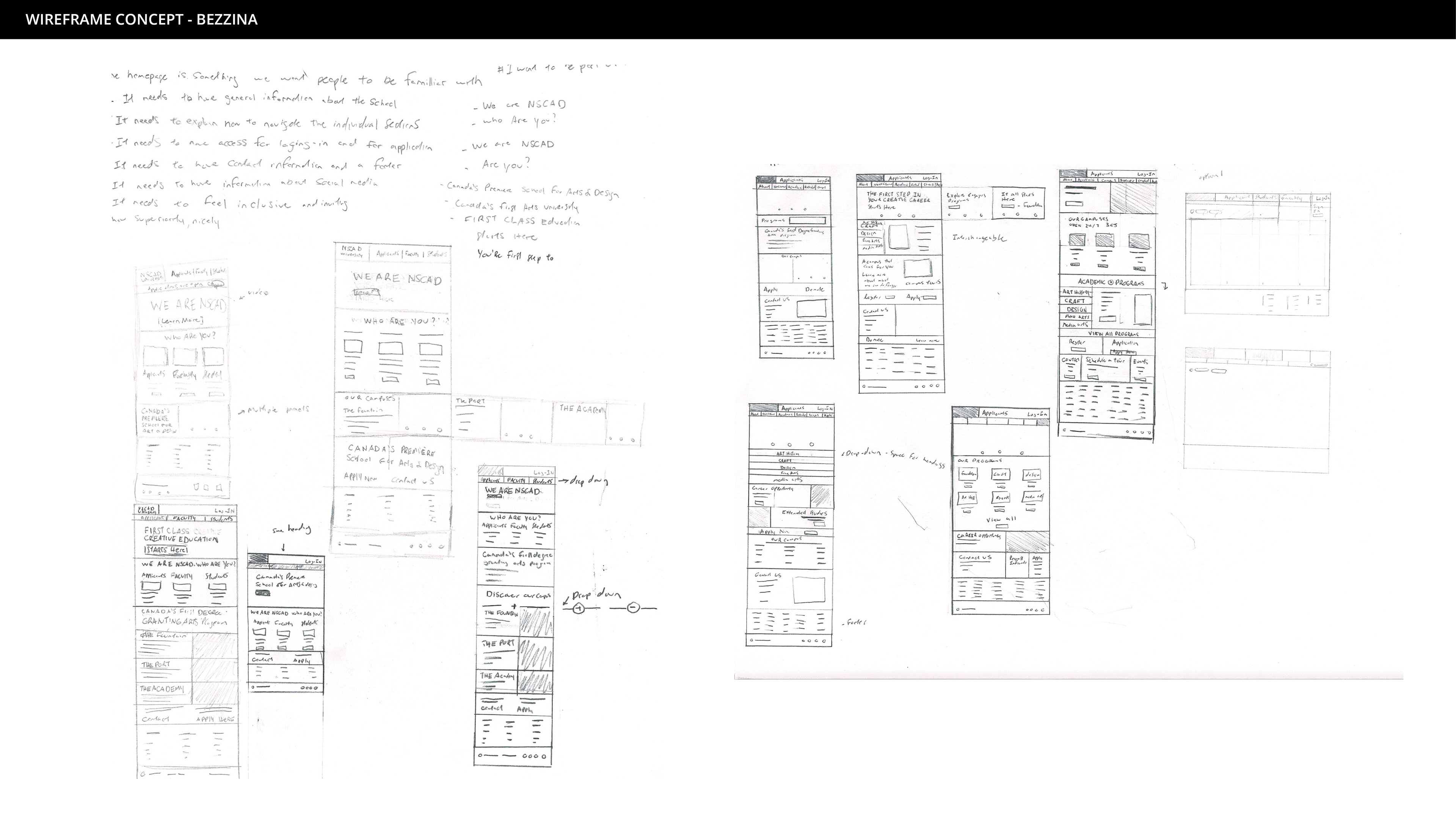
I (Bezzina Designs) created rough sketches to explore the size and functionality of the website.
Individual Mockups:
In this stage, each of us took feedback from our first round of concepts to make improvements to our designs.
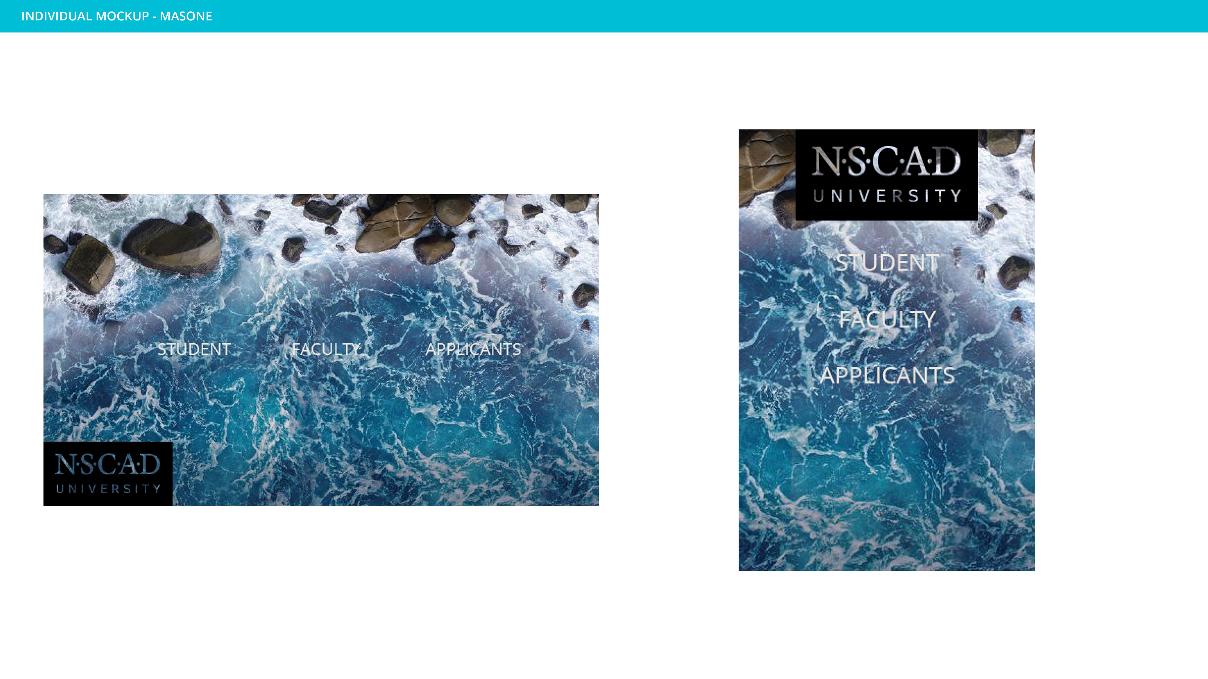
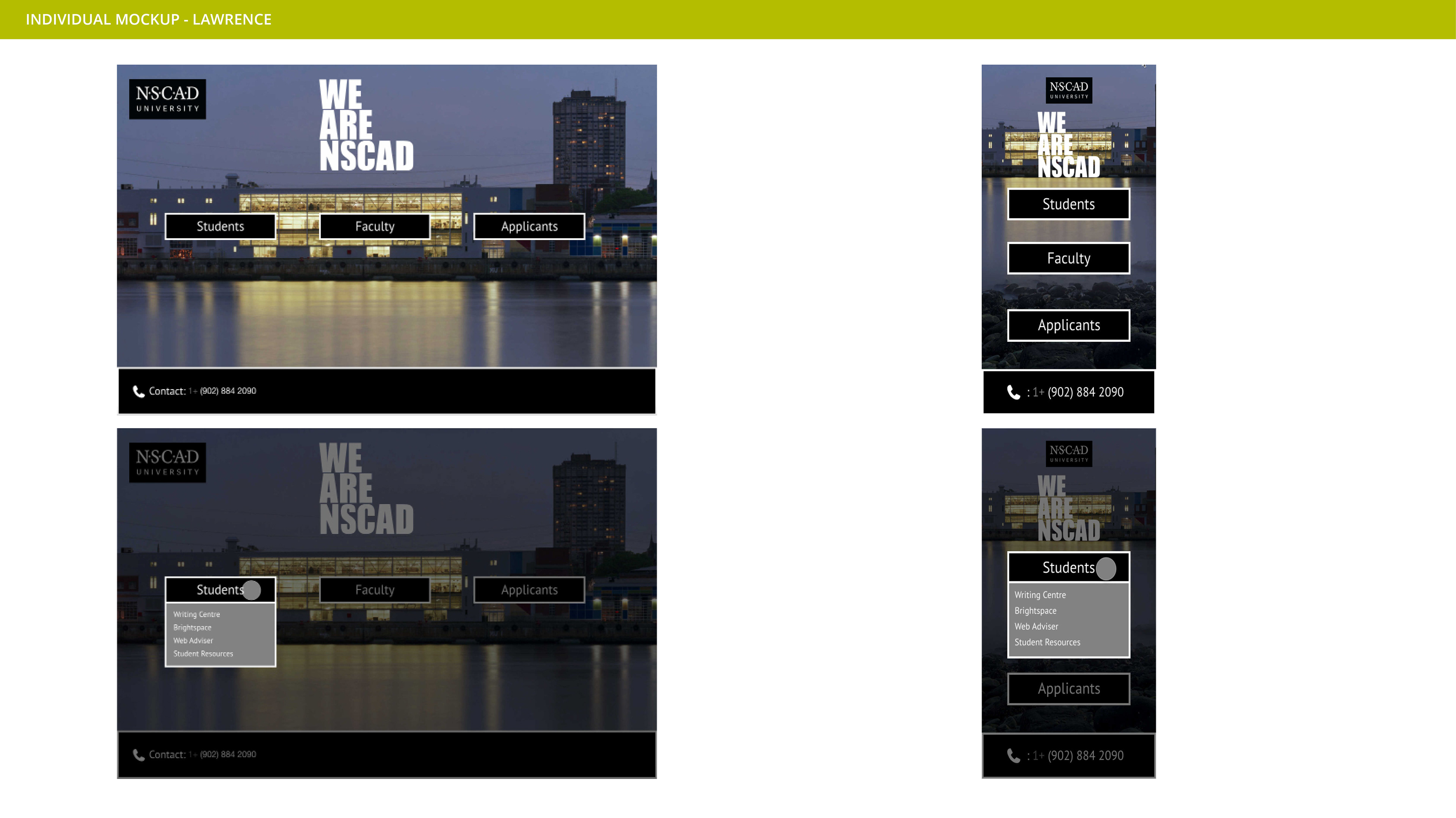
Matthew M. was sick and created his wire-frames at a later date, which I do not have. His individual explored the idea of an "ocean theme" for both desktop and mobile.
Marco expanded upon his initial concept by creating a mobile version of his desktop site, in Adobe XD. In addition, he made slight tweaks and changed the color of his first concept.
Kiefe used Adobe XD to make a new desktop and mobile site that focused on his 3 column layout.
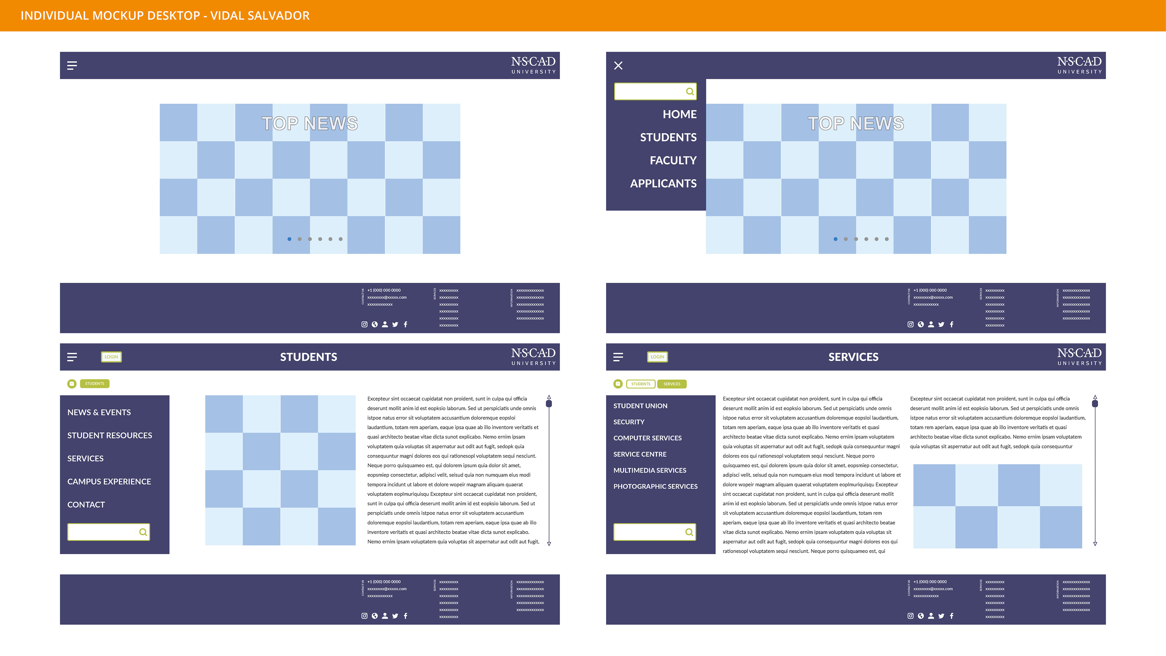
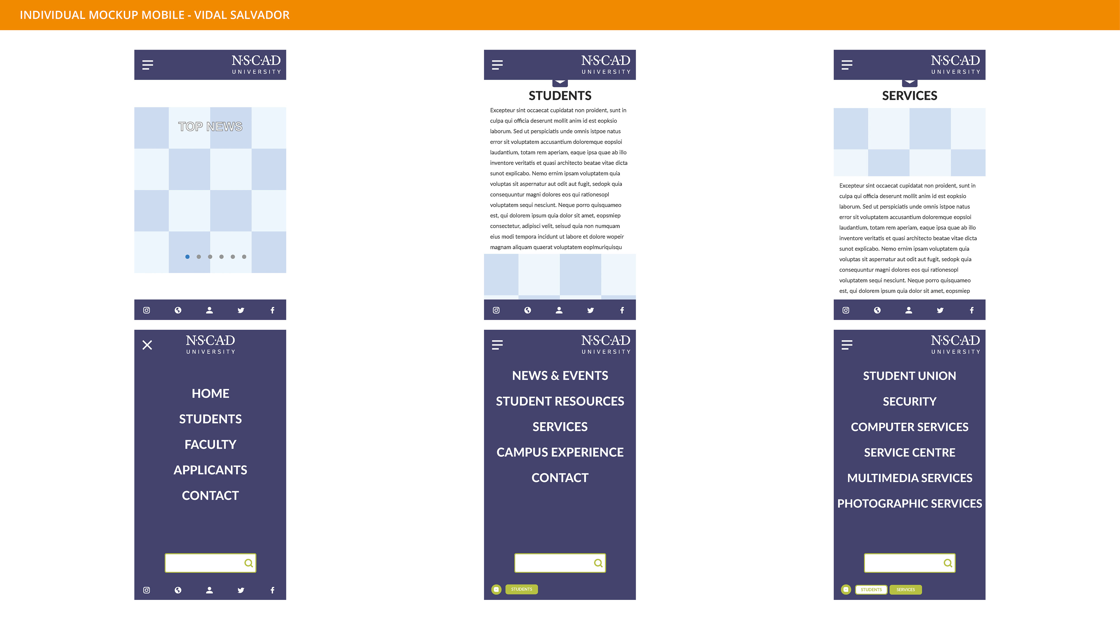
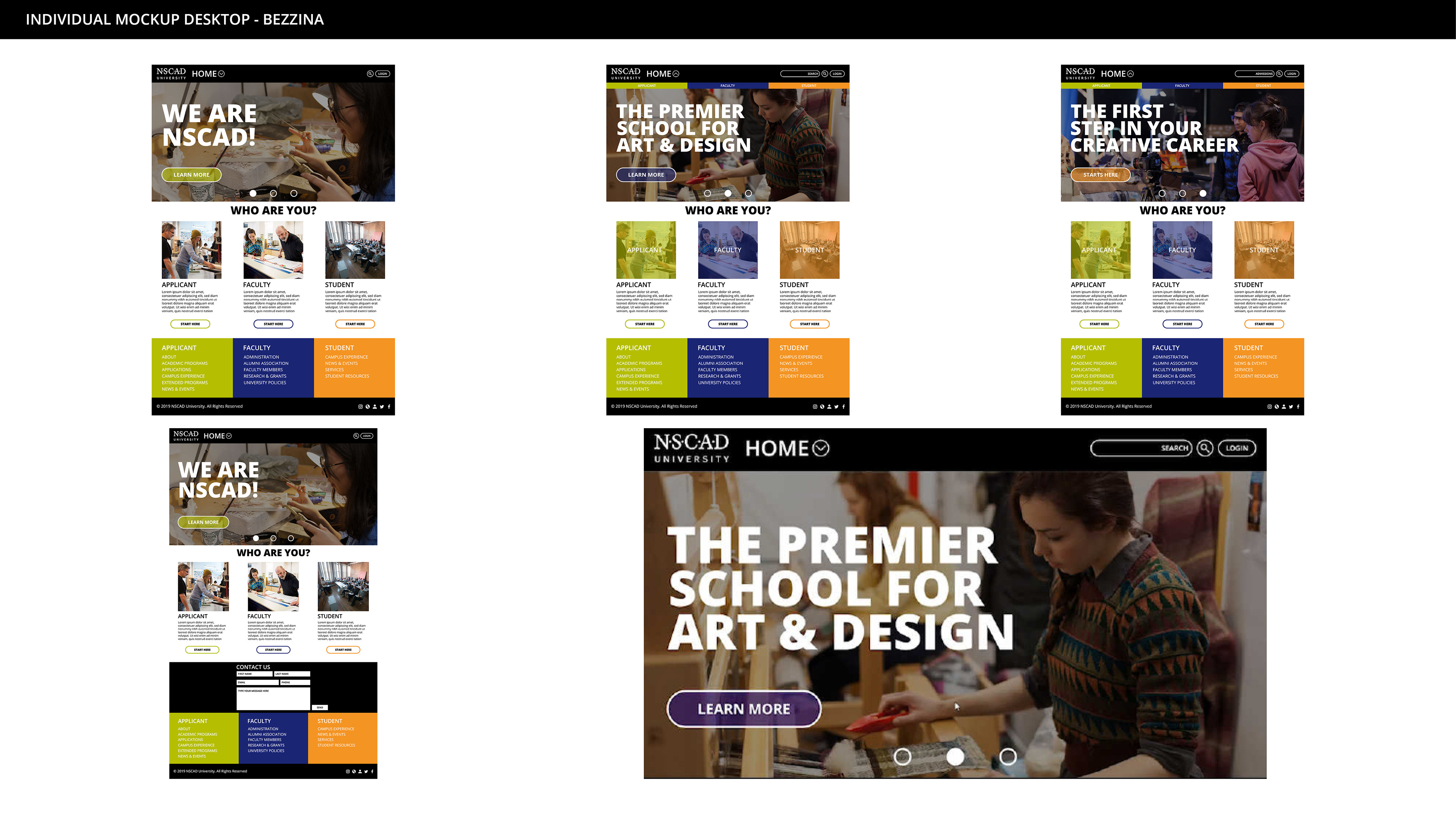
For my mockup, I combined the my own sketches with the previous ideas presented by Marco and Kiefe. I tested out using the primary colors of the school and added the color black, which is currently used on the schools website.
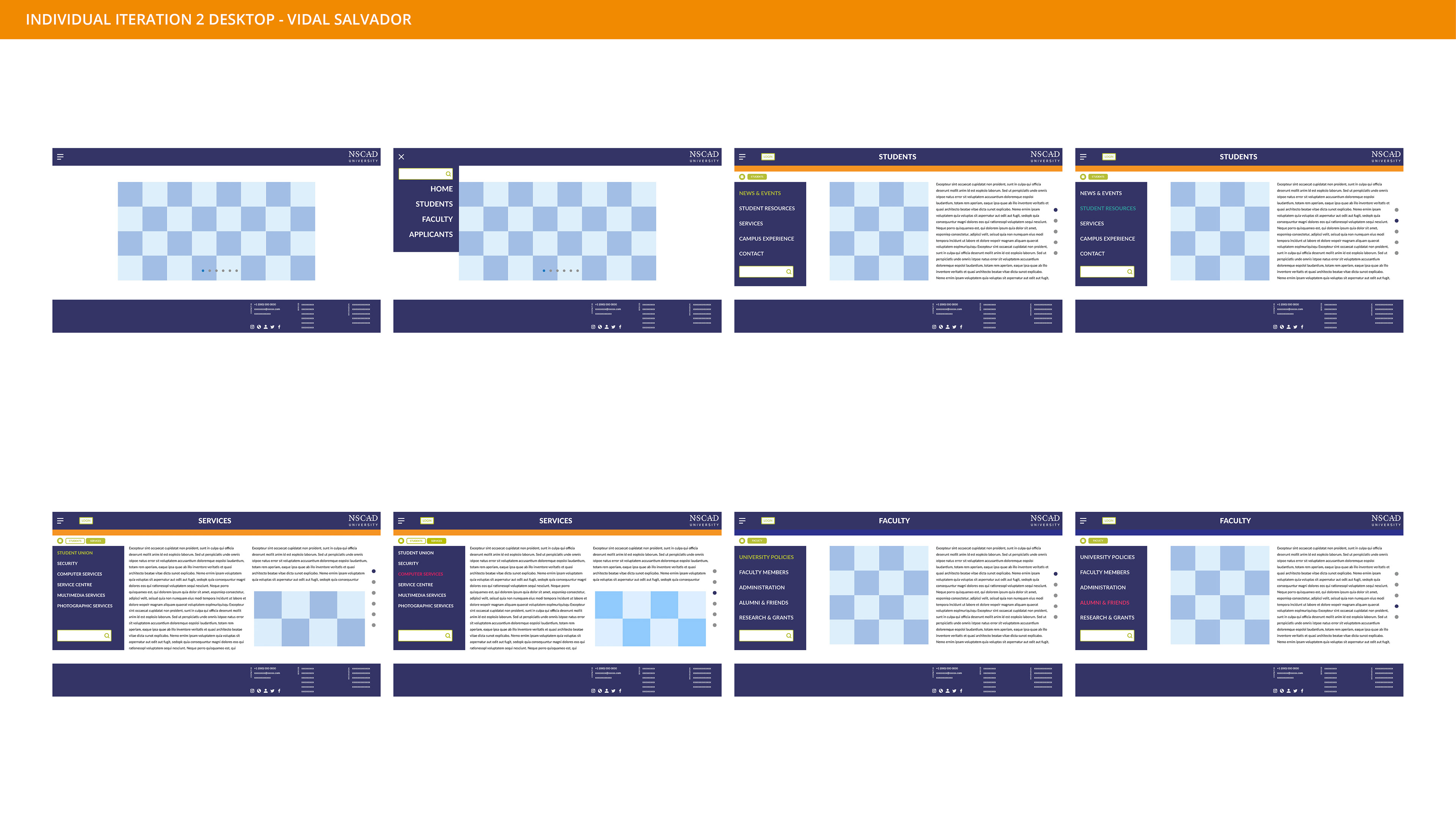
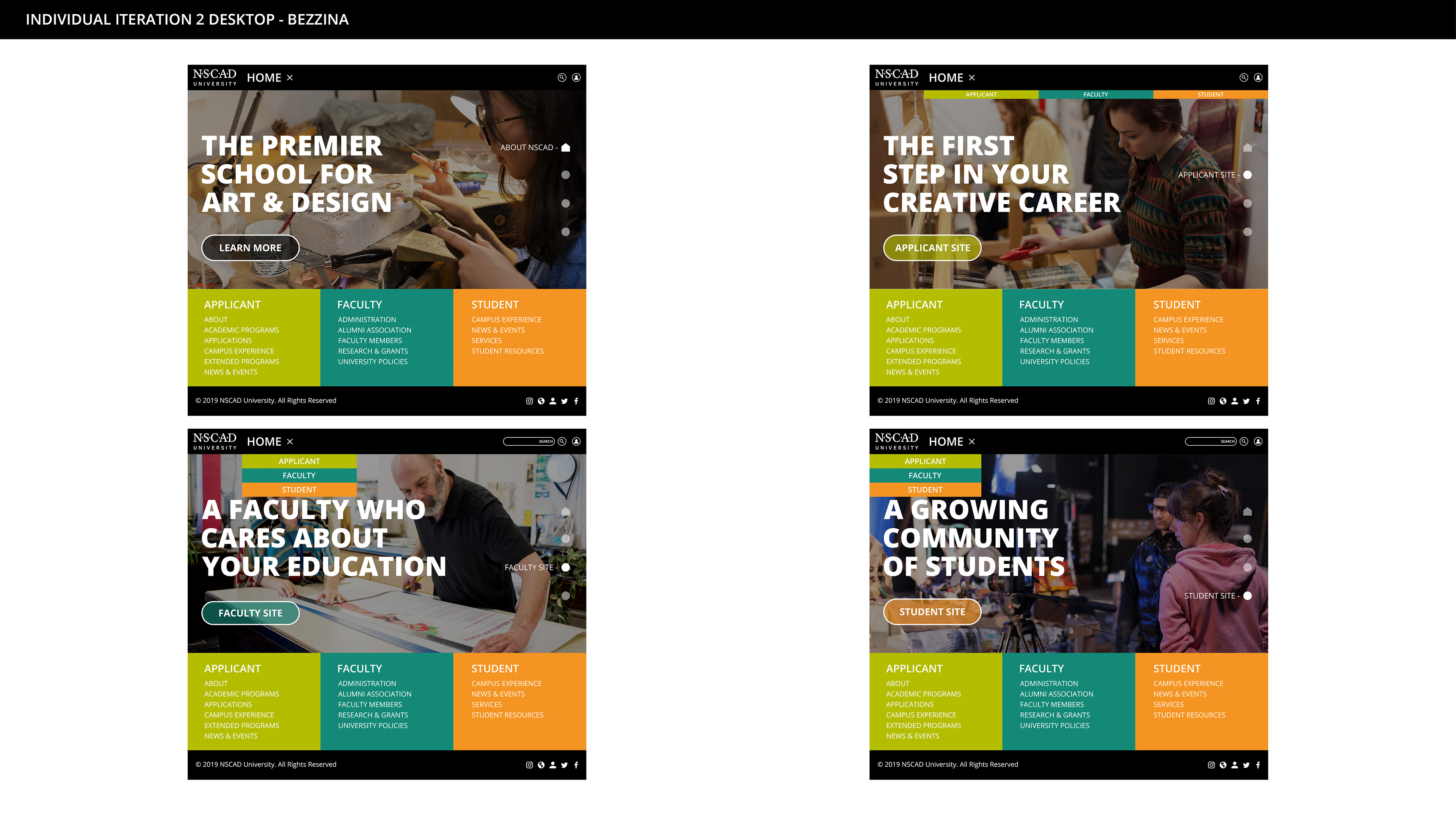
Individual Iterations #2:
The second iteration, once again allowed us to refine our concepts.
Marco began experimenting with color-scheme of the drop down, I presented in the previous round. He also began to work on the navigation functionality of the desktop and mobile sites.
I took my desktop site from the previous round and removed the excess content to fit closer to what Marco had presented. I explored different locations for the main drop-down navigation. I also adjusted the color scheme, to make it more legible on the mobile application.
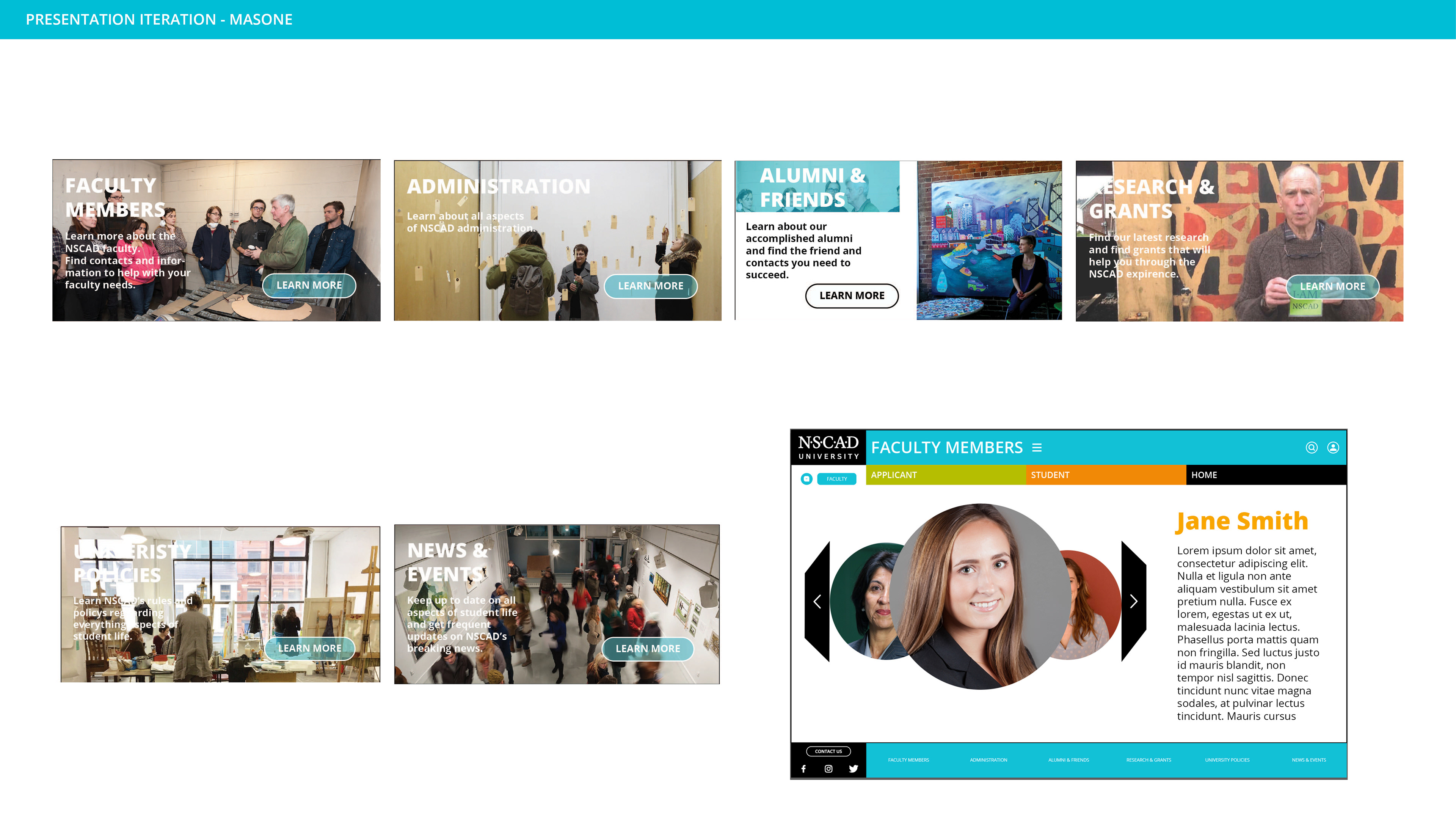
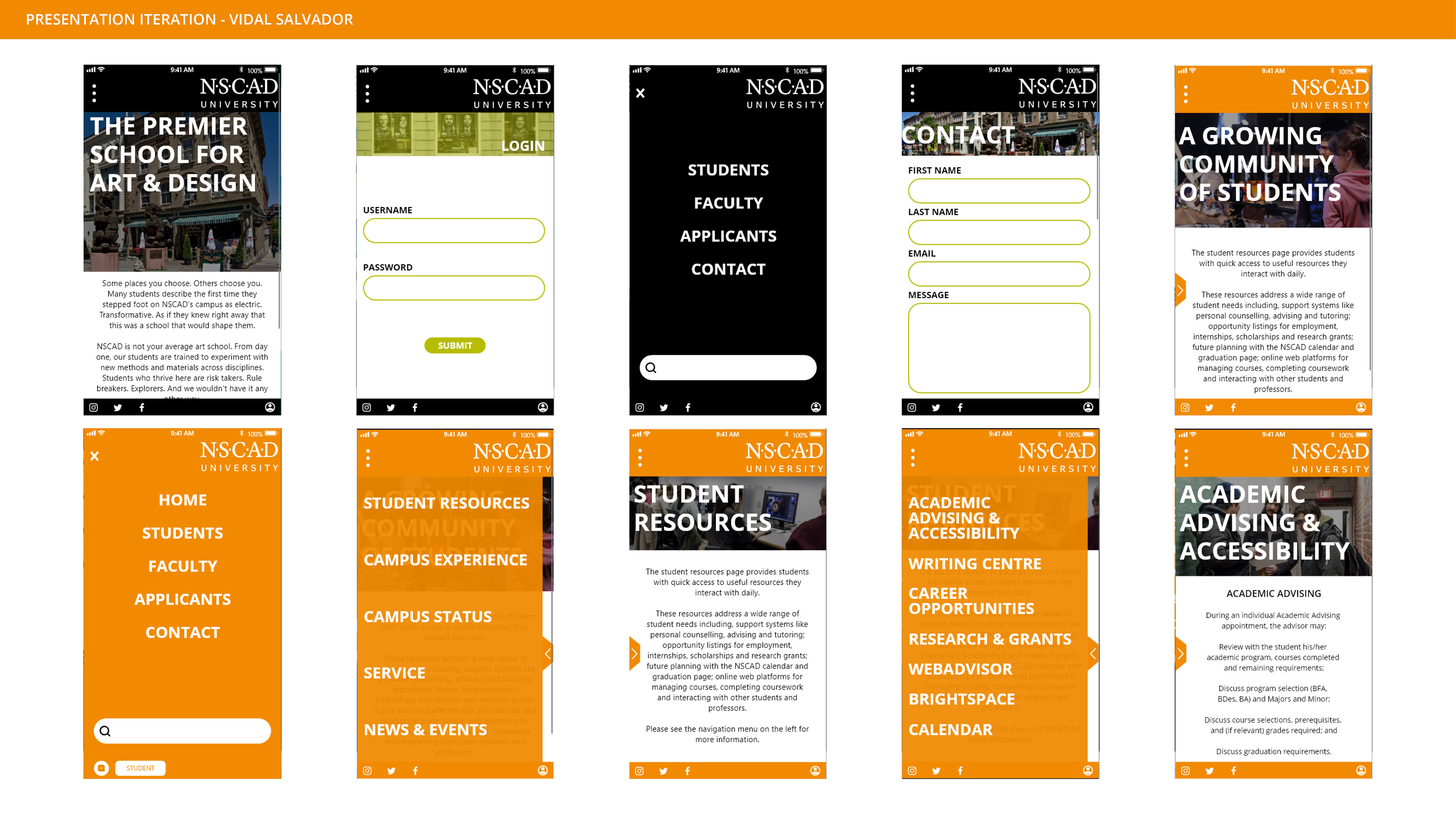
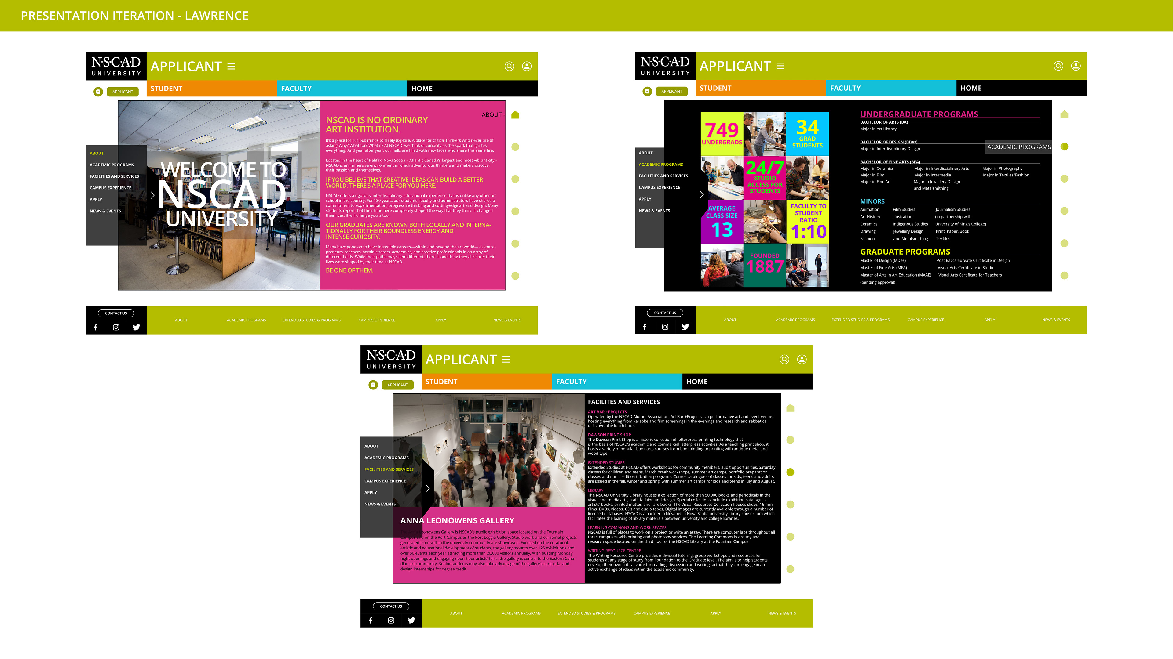
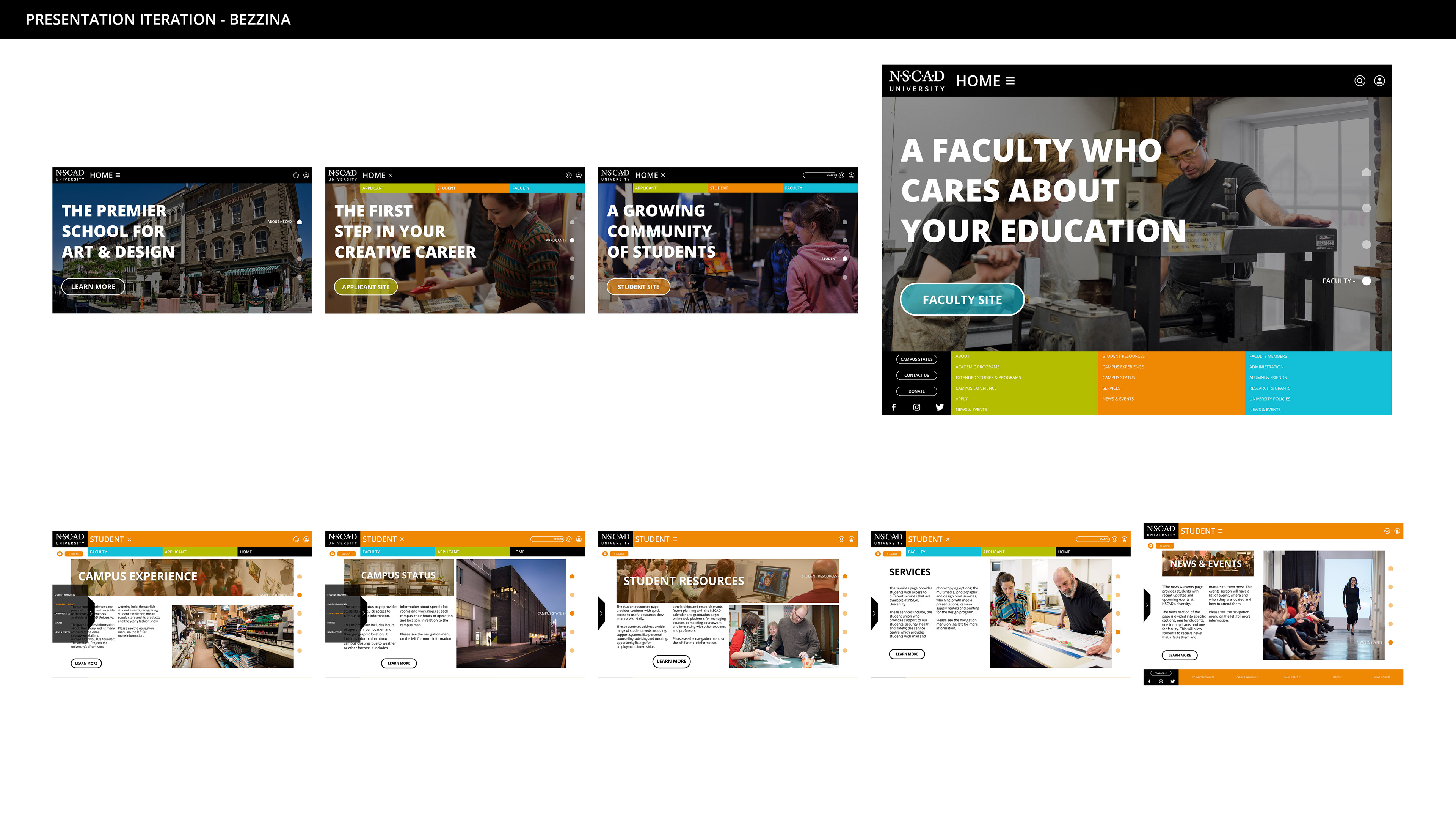
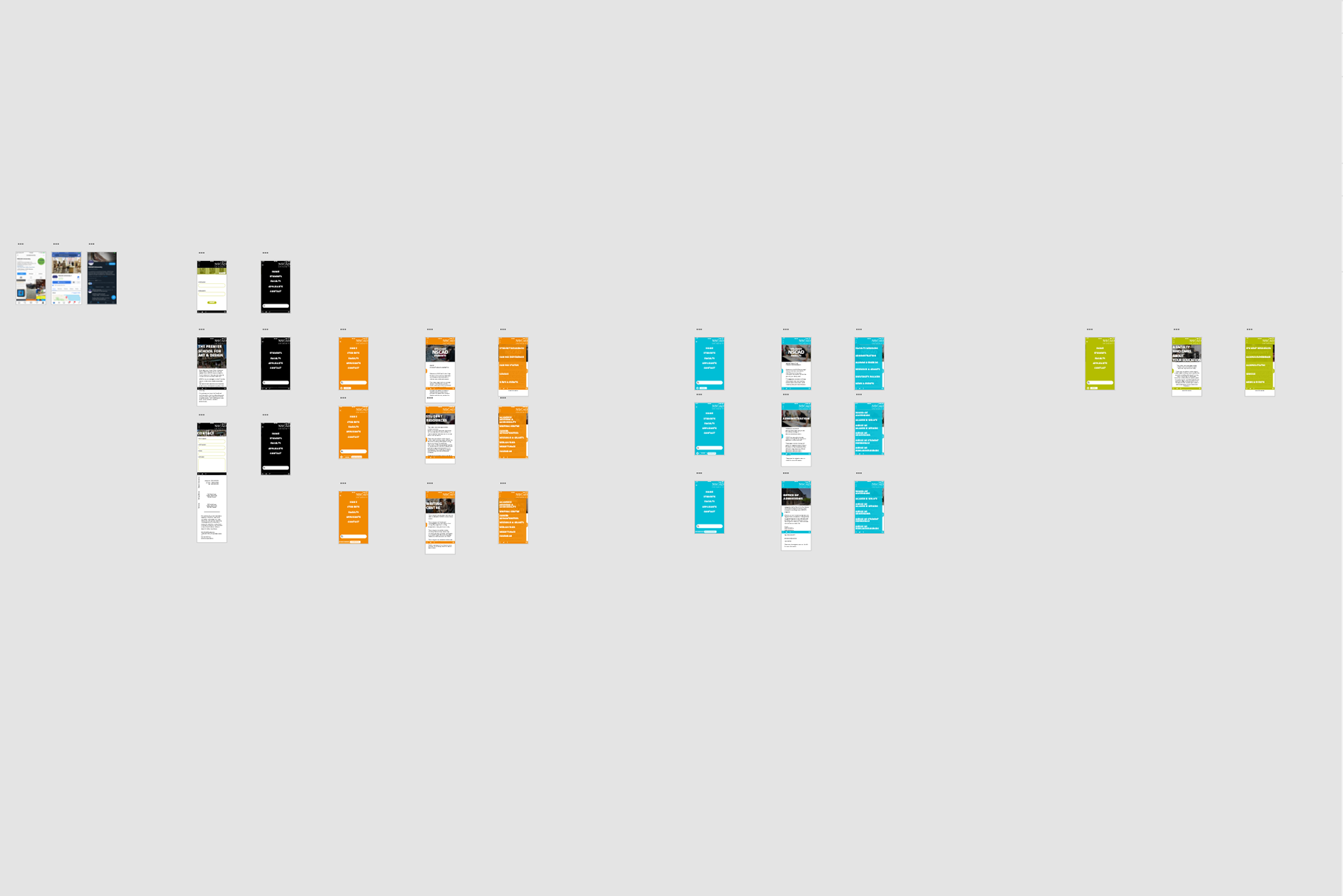
Presentation Iteration:
Throughout the project timeline, we were required to make presentations to the rest of the class. During the time leading up to this specific iteration, as a team we sat down and discussed factors we liked about both websites in order to integrate them into one unified style.
Matthew M. & Kiefe also presented us with new iterations prior to this stage, but I do not currently have those files. Ultimately, we decided to make a combination of my site and Marco's.
I finished the home-page and created a base-plate for all of the other desktop pages. I left the center space open and asked each member to create their own interior style, so that we could compare layouts. I also completed the desktop student section.
Matthew M. created interior panels for all of his pages, using images an text overlay primarily. He also created a faculty member carousel.
Marco from this point worked primarily with XD to assemble working desktop and mobile demo's. He single-handedly converted all of our desktop pages into a functioning mobile demo. For this presentation, he created a functioning demo of the student section.
Kiefe developped three pages that explored multiple levels within the applicant section. His student homepage main panel would influence the design of all other homepage panels in the final version.
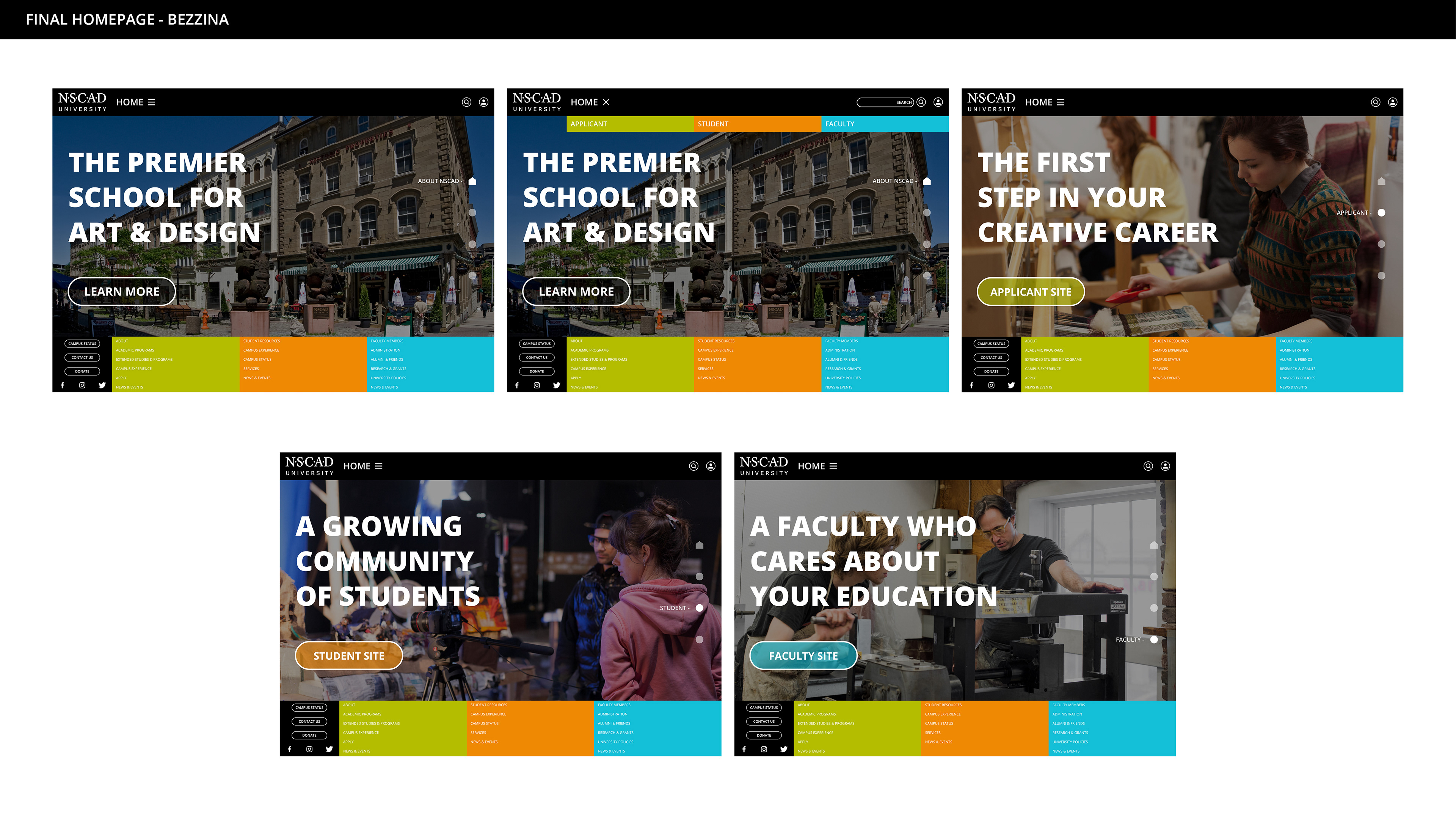
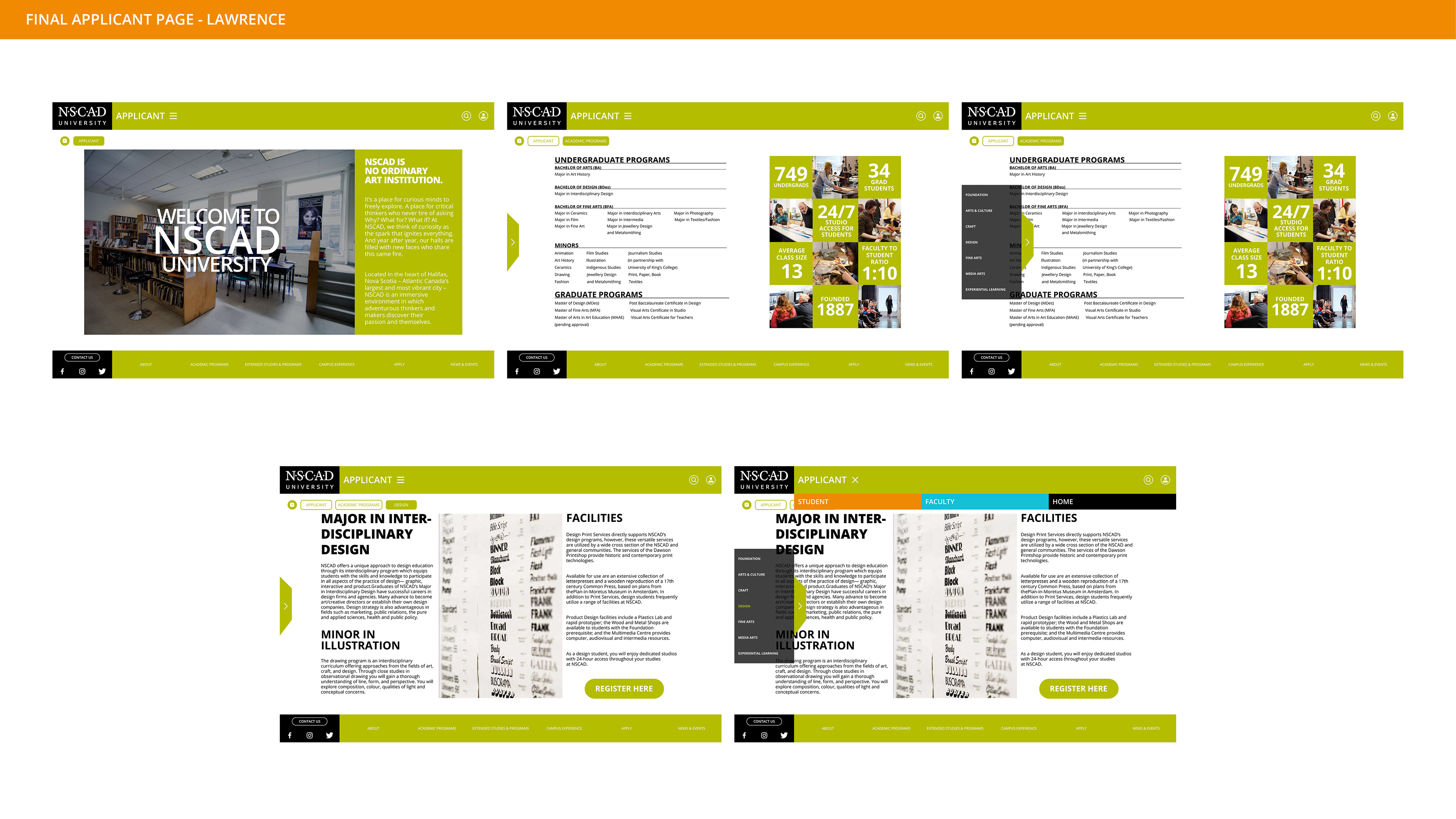
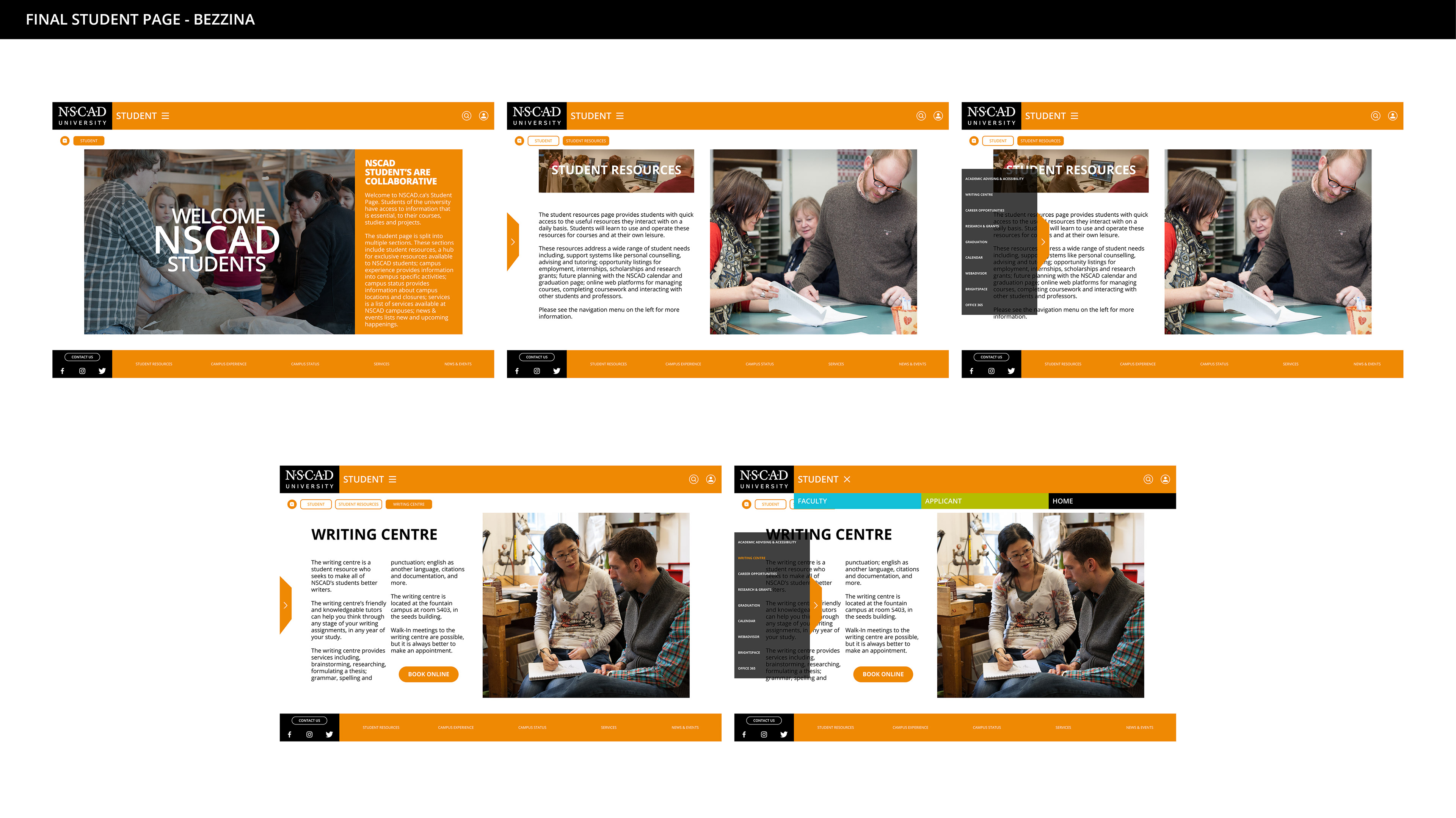
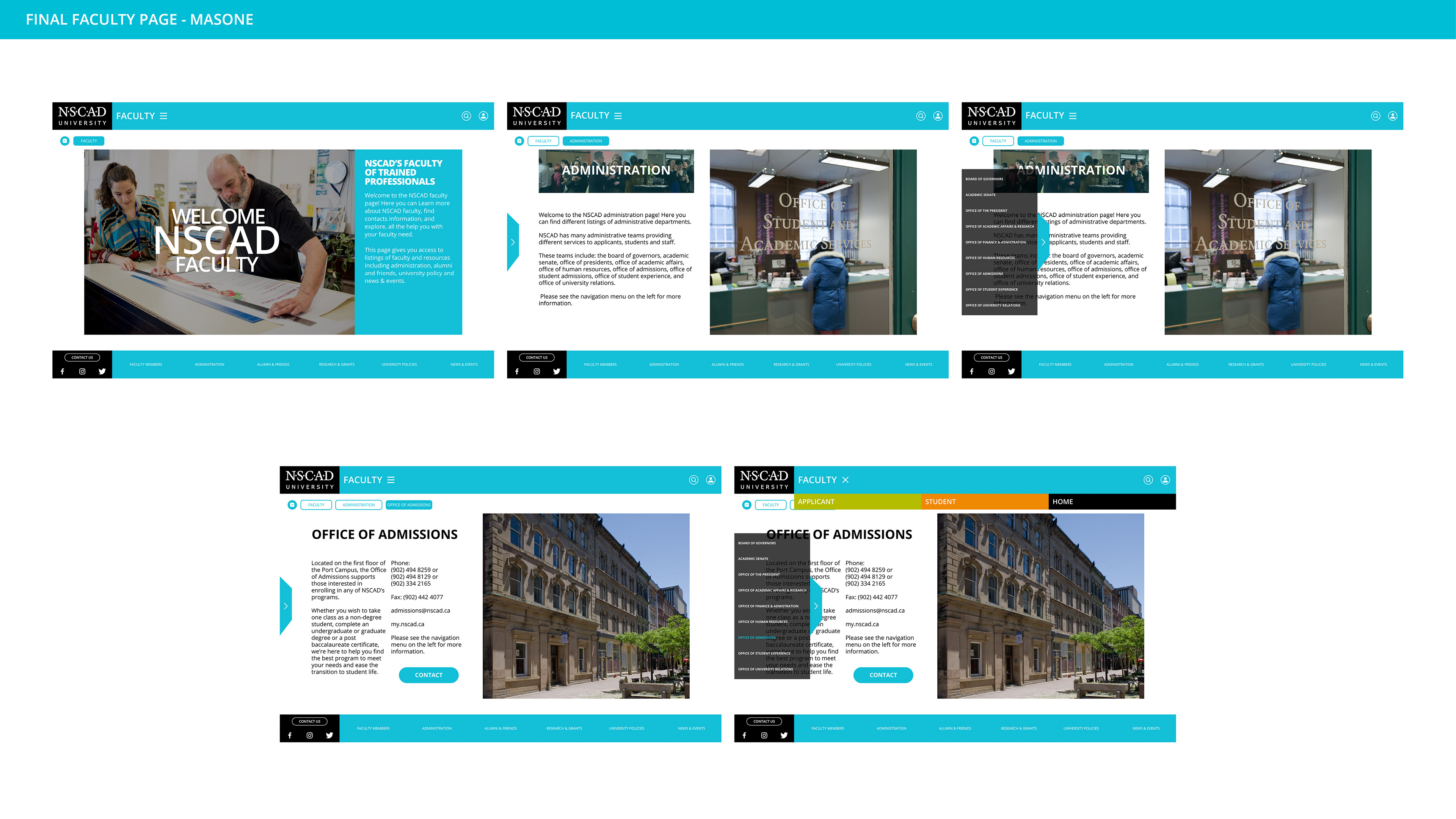
Final Desktop Pages:
Leading up to the final desktop pages, we realized through critique and discussion that our method of navigation, though intended to be simple, became over-complex. In addition, we created too many pages for the requirements of the course's final presentation.
So we went back and made changes to the layout and functionality to allow it to work well for all users. We also removed pages, so that we would only display three pages of functionality per section. Example: Applicant -> Programs -> Design
On my homepage, I made slight aesthetic changes primarily.
For the applicant page, Kiefe made slight visual changes to his initial idea and simplified his content.
For the student page, I took my previous concepts and adapted the aesthetic developed on Kiefe's applicant page.
For the faculty page, Matthew M. took both of our pages and united them to fit his content.
Final Web Demo Desktop / Mobile - Marco Salvador
After completing our pages, we handed everything to Marco, who developed two Adobe XD Demos for our website. Here are two short clips of some of the functionality he prototyped.
Thanks For Scrolling, Please
Feel Free To Leave Feedback!
Copyright © 2019 - Bezzina Designs
Project falls under intellectual property law.