Mobile Food Market Bus Print Design
This is the second in a series of design projects for my design fundamental university course. This project was initially deemed complete for the class, but has since been revisited and updated. For this project, we were asked to create a poster design and editorial layout for a local environmental organization. The Ecology Action Centre has been working at the local, regional, national and more recently, international level to build a healthier and more sustainable world.
I have decided to focus on The Ecology Action Centre’s "Food Action" department, their work helps to educate Nova Scotians about healthy food choices and provides them with better access to fresh foods. Specifically, my project will focus on their Mobile Food Market Project. In this Behance project, you will see my beginning to end process for poster and editorial design.
The Mobile Food Market is a bi-weekly service that provides lower income regions with the ability to purchase fresh produce and other healthy essentials at a more affordable rate. Anyone is welcome, but their primary market is individuals with mobility issues, seniors living alone, low income families, and single parents. The Mobile Food Market is housed within a decommissioned metro bus. The food market is an important communal event for the people of these regions, in which the bus visits. If you or anyone you know could benefit from their services, I highly suggest you check out their website at: http://www.mobilefoodmarket.ca/
References And Concepts
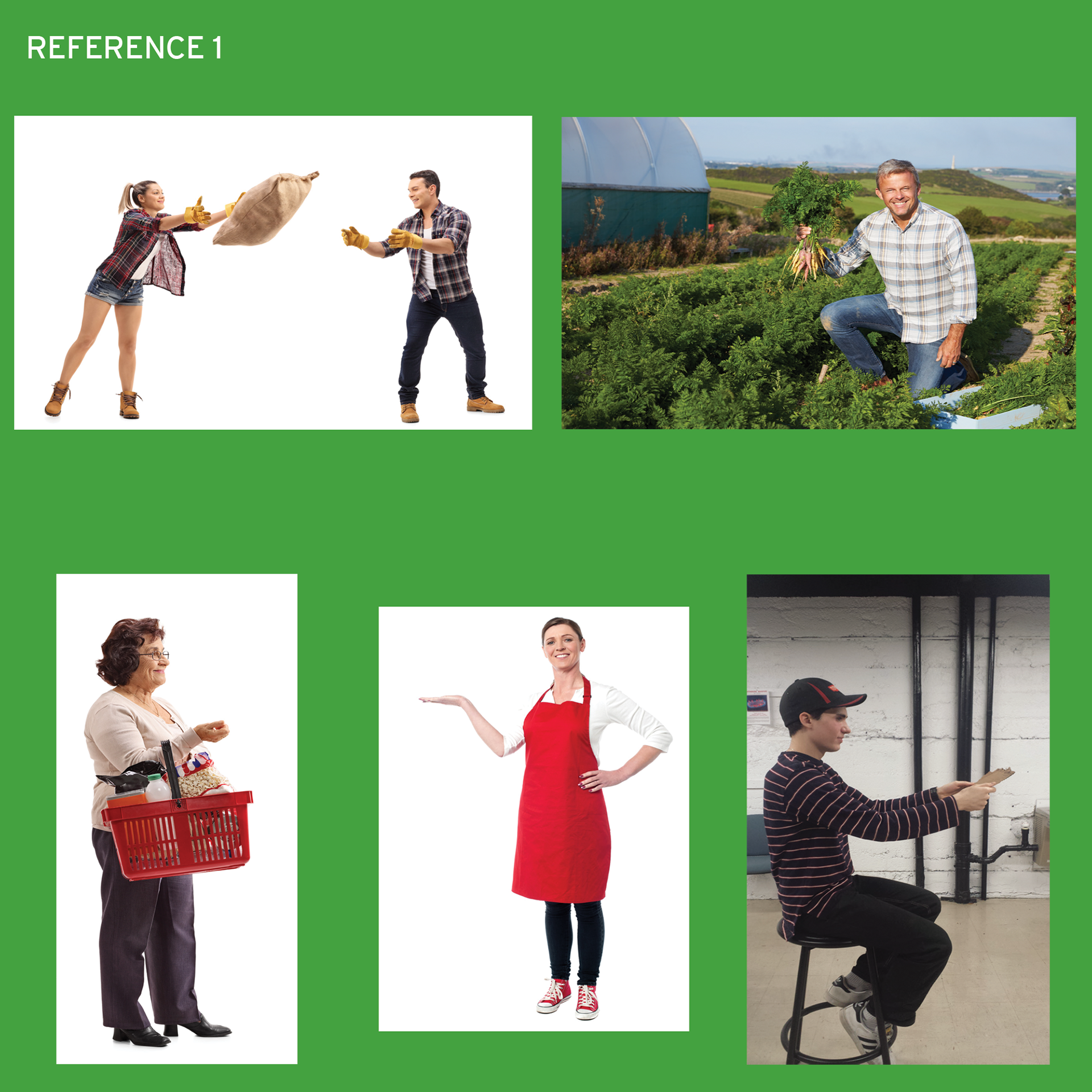
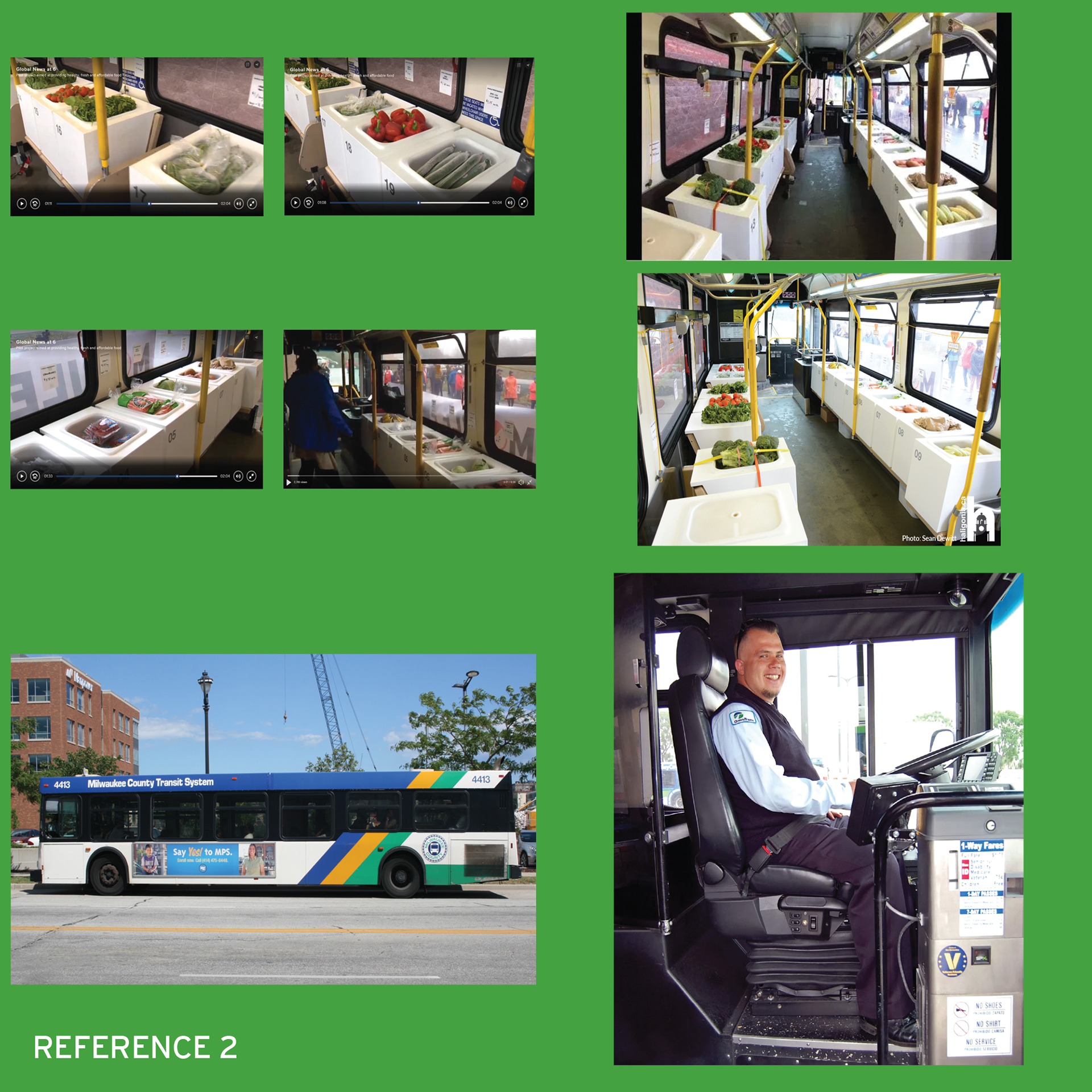
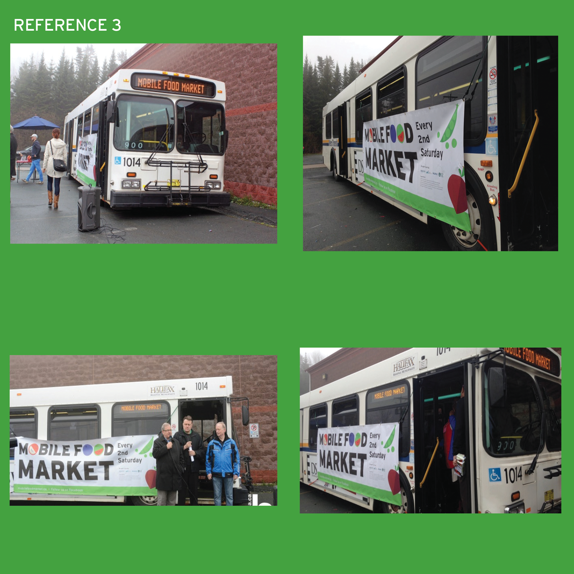
Here are a few items from my mood-board / reference image collection. The bus I created for the final design is a modified New Flyer D40LF. Most of these images have been sourced from the internet, though I have also used some of my own photography. The imagery utilized in the creation of the final design is primarily licensed or free for commercial-usage. The bus itself was created by loosely tracing a commercial-usage image. Any non-commercial images were used primarily for reference and were not entirely traced.

Along with creating the poster and editorial, we collaborated with an illustration course, also taught by my professor. We commissioned students in this program to create a type piece for our poster or editorial design. I worked with two illustrators, below is @VetaTesting’s re-design of the Mobile Food Market Logo. He was very helpful in the initial completion of this project.
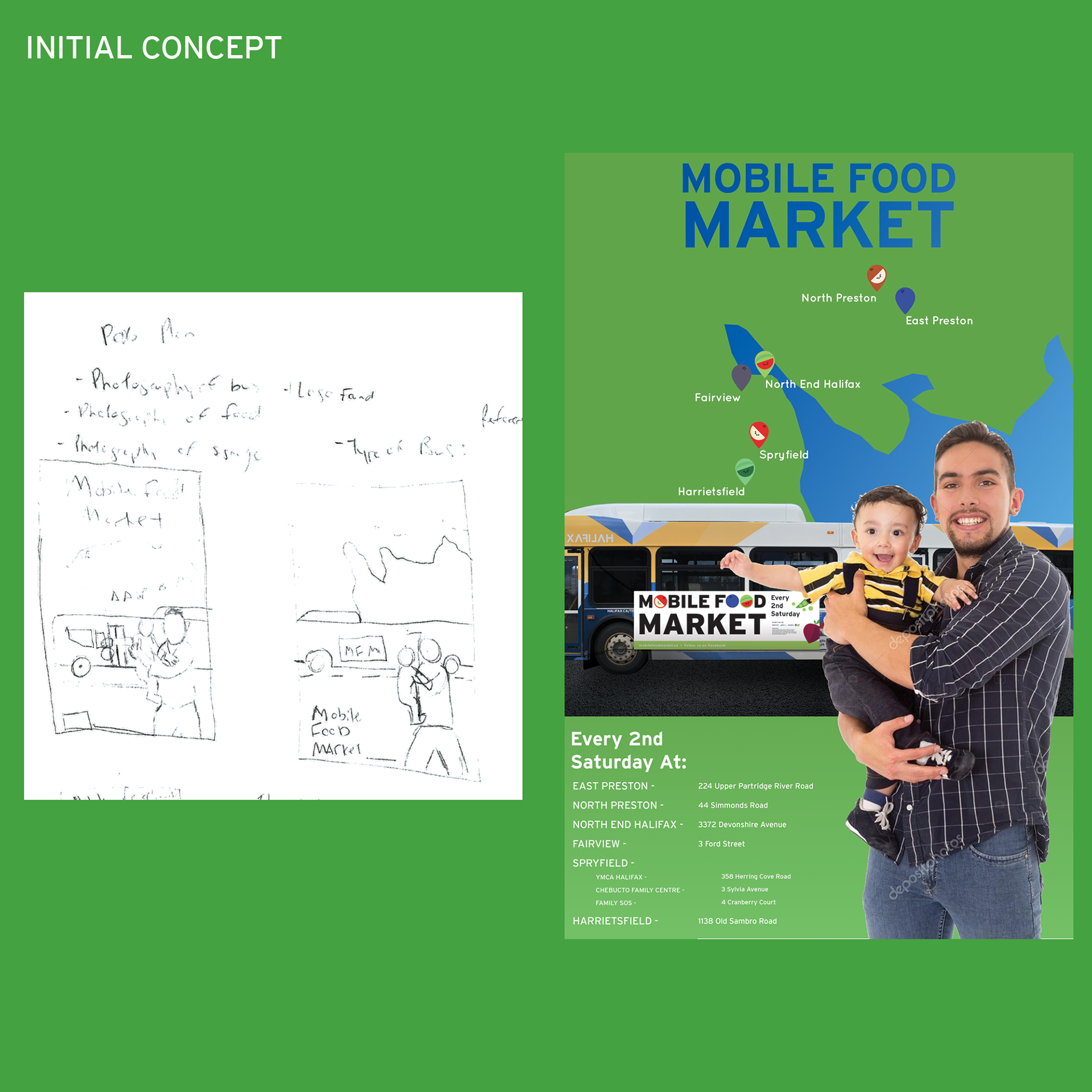
My initial concept was to create an illustrated poster featuring a single-parent and their child posed in front of the food truck. Above the bus is a zoomed-in map of Nova Scotia, displaying the places in which the bus stops. I wanted to find a connection between the business, it’s target market and the city in which it services. After presenting this concept to my professor, he explained that it seemed too much like a conventional municipality poster, there was no hook or wow-factor.
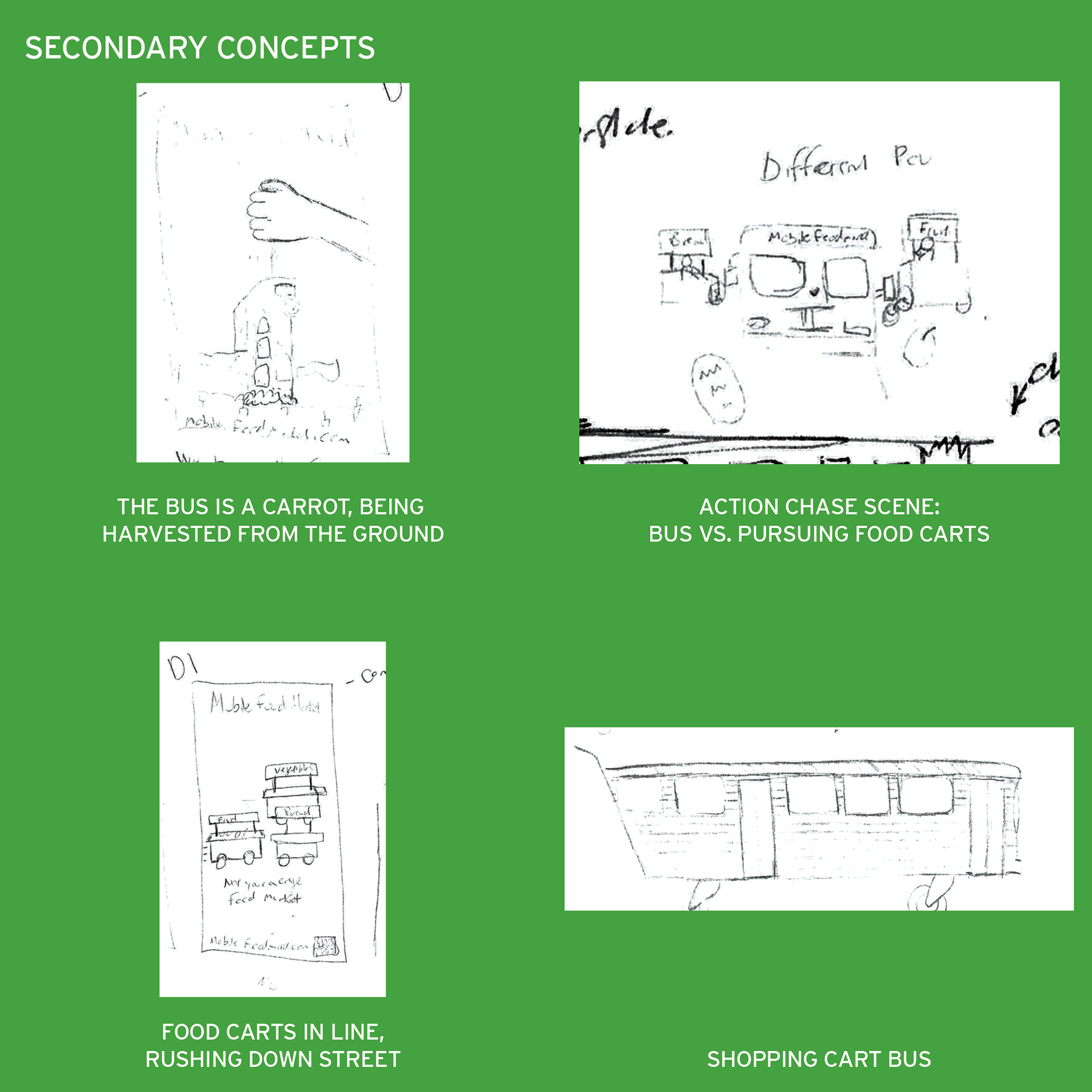
Back to the drawing board, I began writing and sketching down new ideas. I searched for word associations and ways to connect interesting themes to the business. My first idea was to imagine the bus as a large carrot being harvested from the ground, thus connecting the bus to nature and freshly picked produce. My second idea was a wild-card, I created a movie-like car chase scene between the bus and some pursuing food carts. The tagline was “Food Coming at You!” The Third idea was to have a numerous food carts racing on a street, with the tagline “Not your average food market.” The fourth idea was to turn the bus into a large shopping cart.
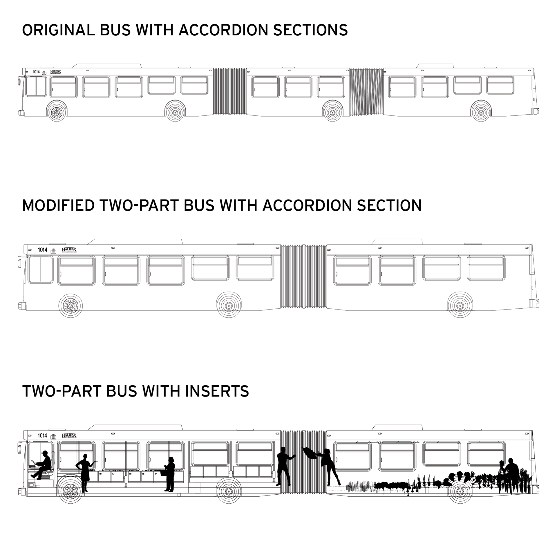
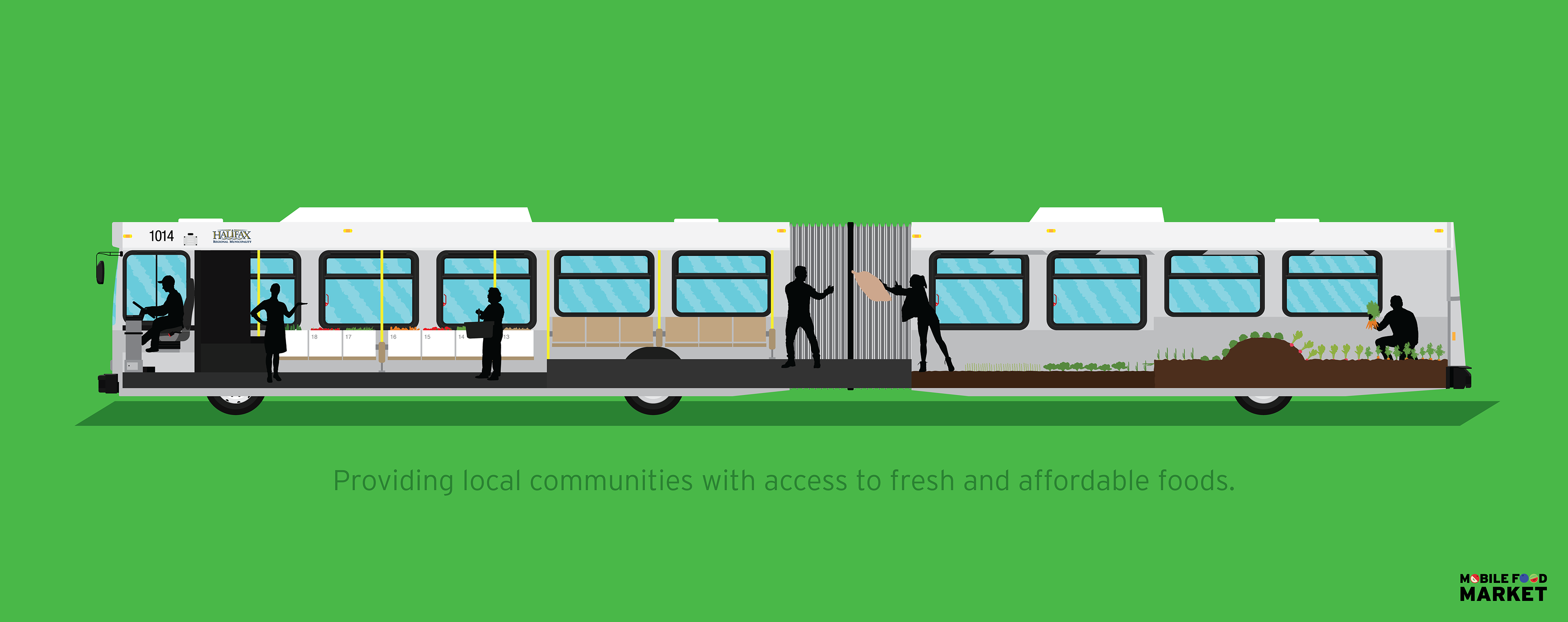
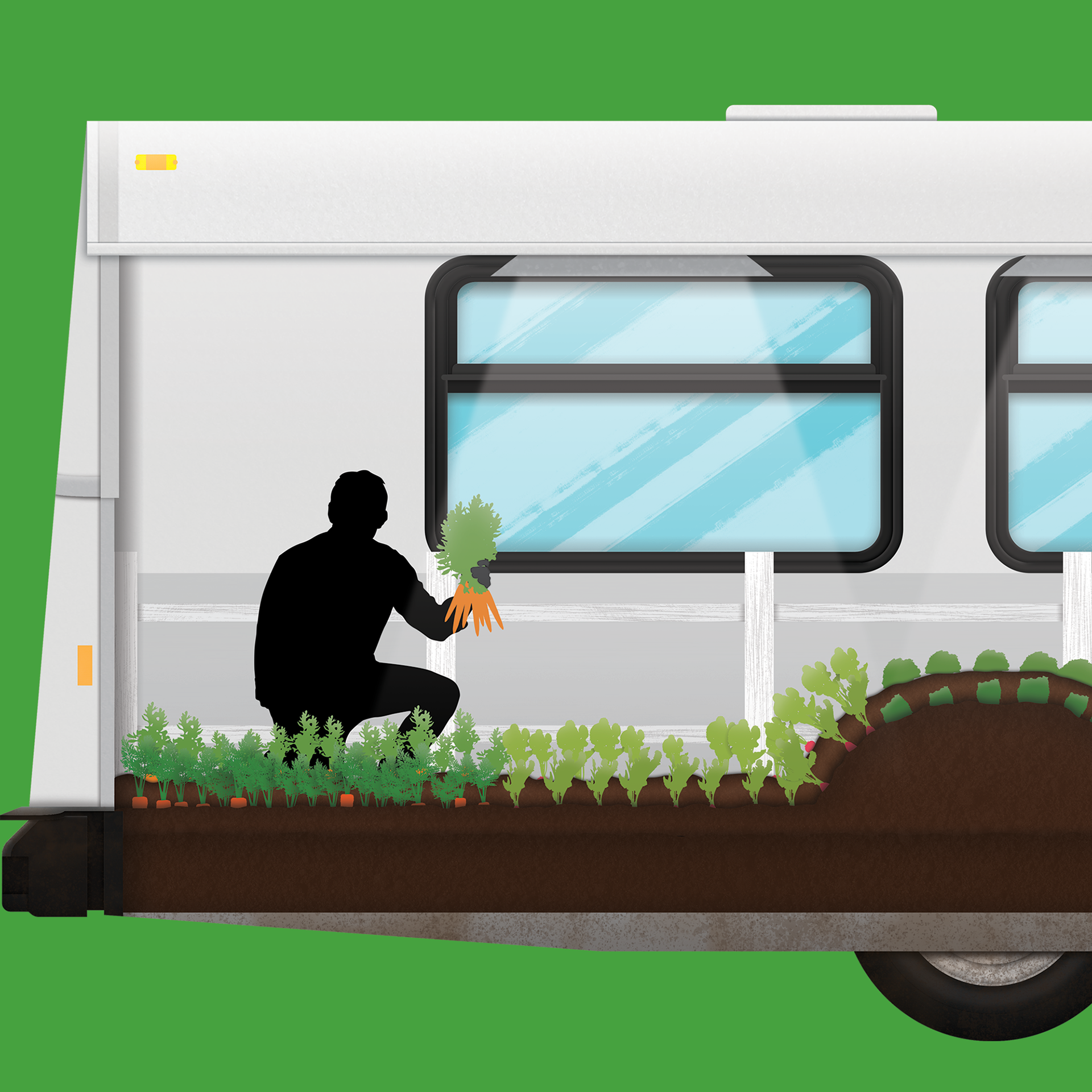
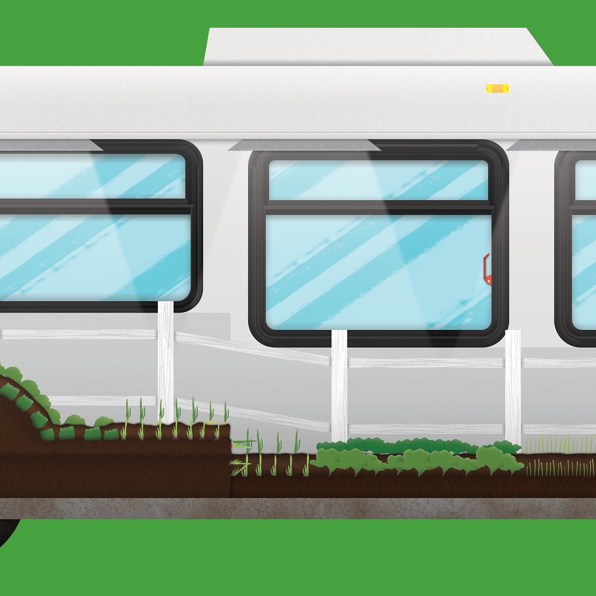
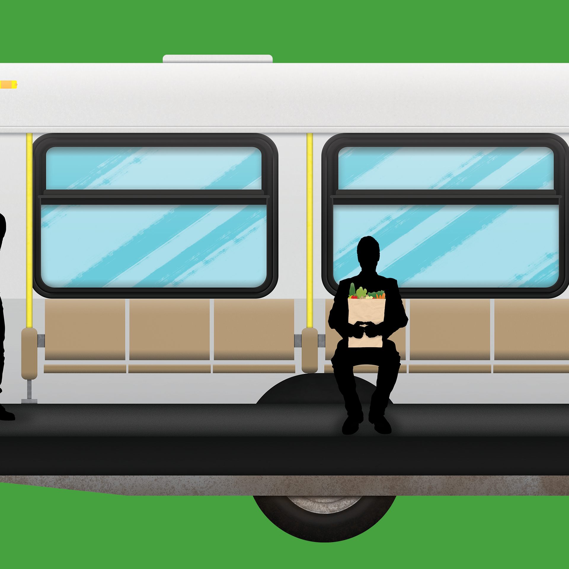
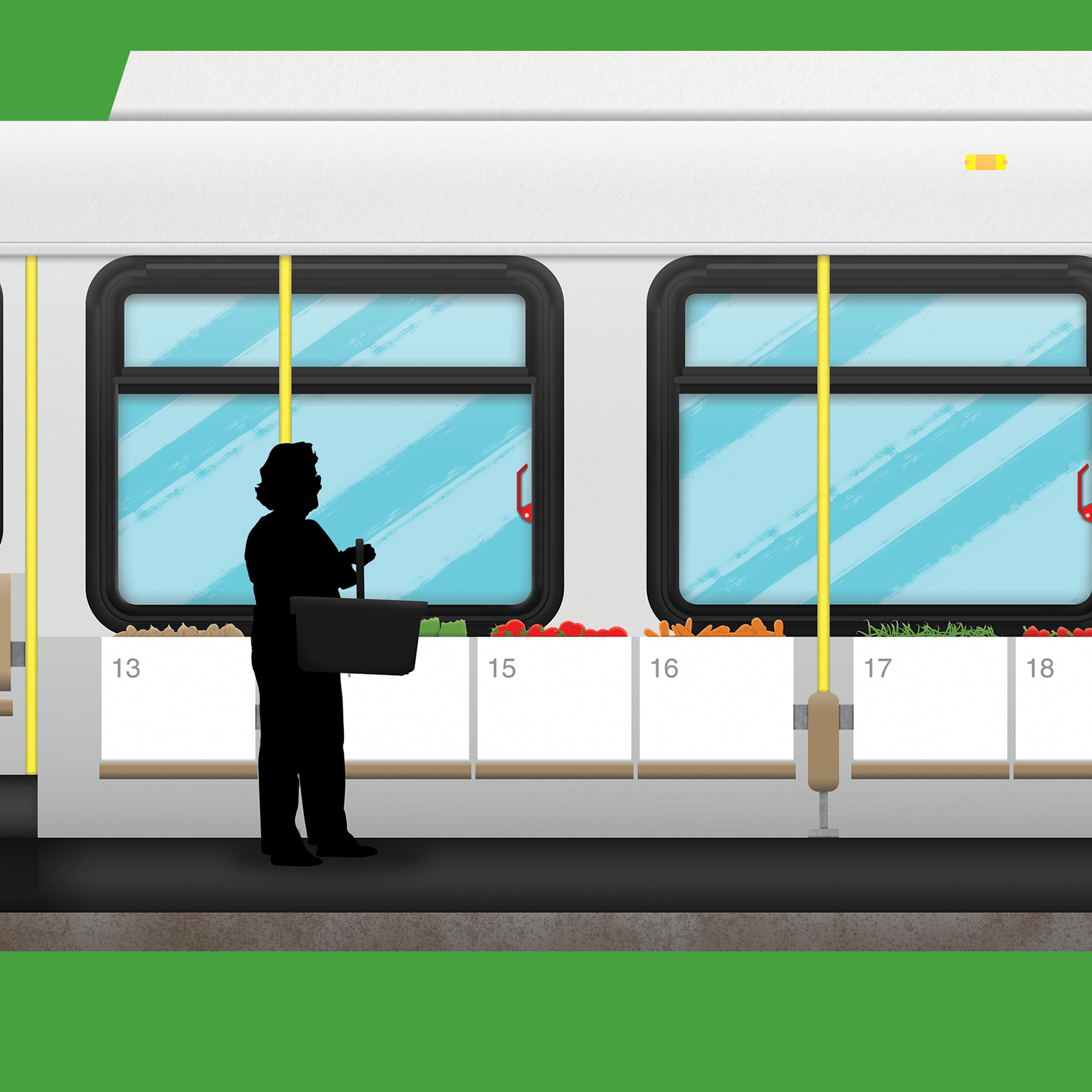
My final idea was to create an articulated bus with three partitions. Each partition would represent a separate element of the bus; aspects that like the accordion sections, are connected to it’s success. These were broken down into a rear farm section, representing the market’s connection to local farmers and locally-sourced produce. The middle section being the staff, that manage and organize operations on the bus. Finally, the front which would represent the consumers, those who benefit from the Mobile Food Market’s services.


Bus Design
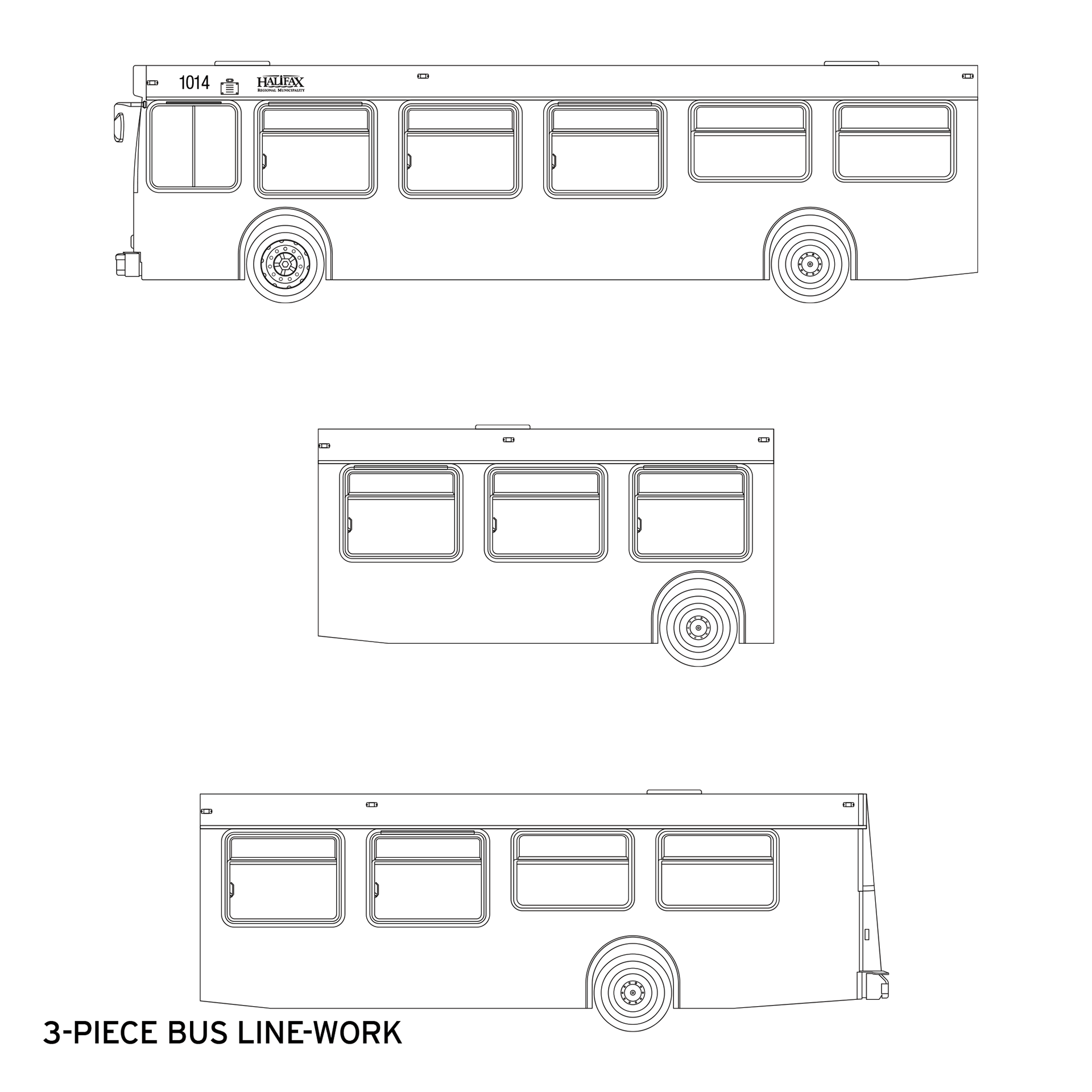
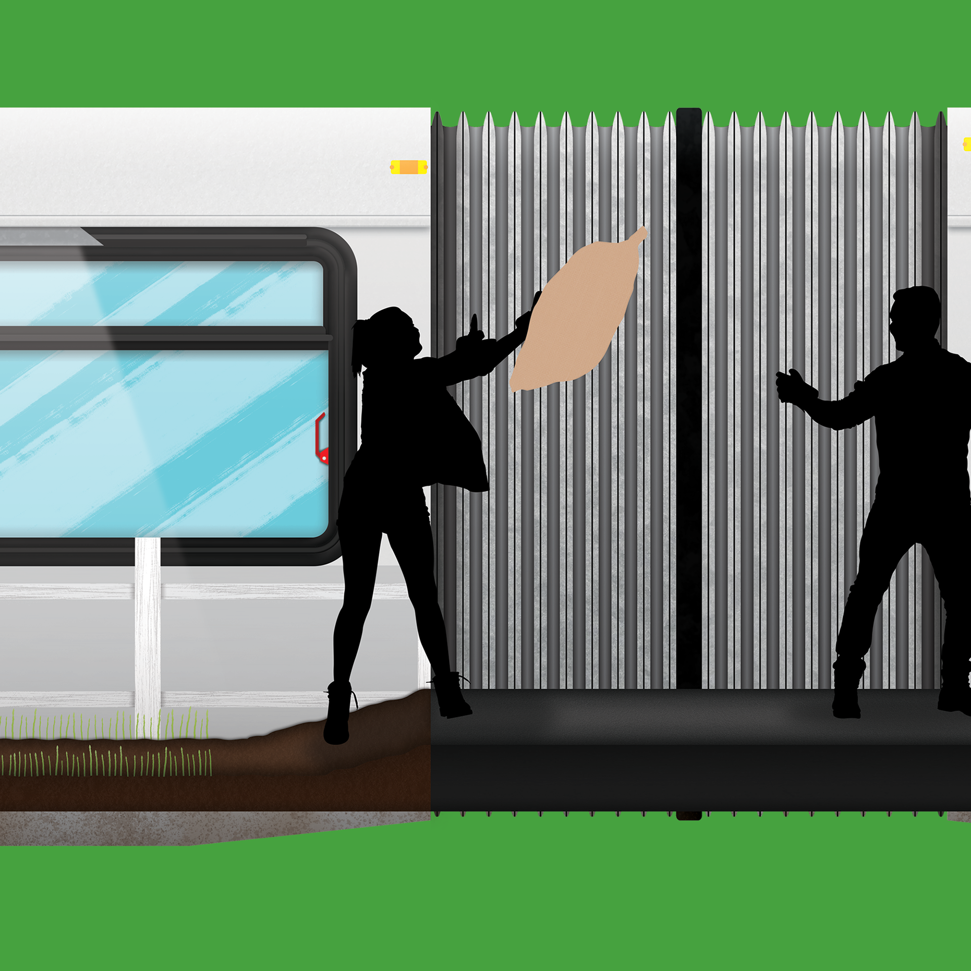
I created linework for the three partitions and the middle articulation pieces (the accordion). As time passed, I realized that I would not have time to complete all three sections for the project deadline. In addition, the middle piece seemed to be a bit excessive, so I removed it; the design was pushing 100 inches.
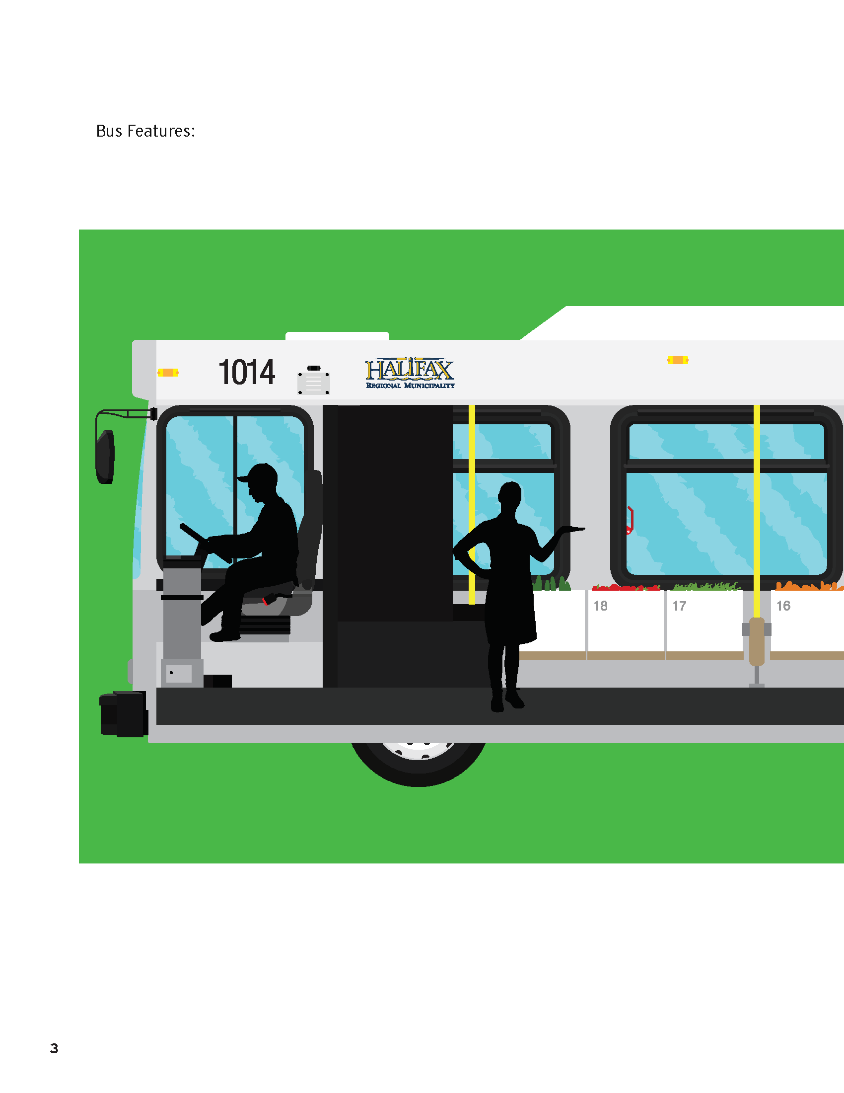
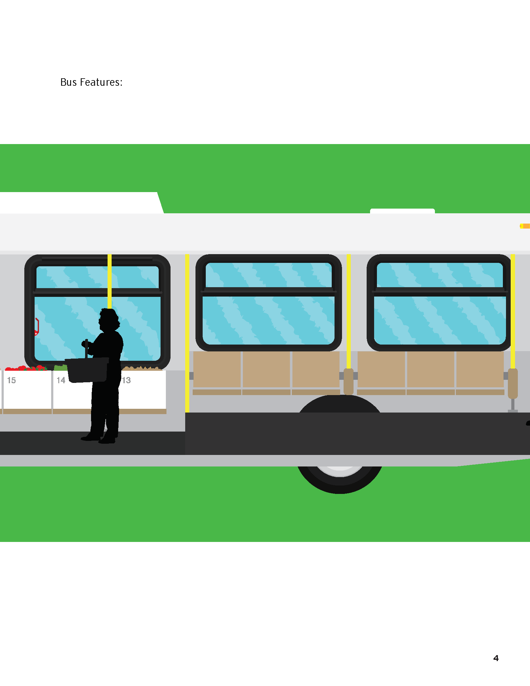
The inserts are anything attached or close to the driver side wall. The passenger side of the bus has been removed (imagine the driver and passenger sides of a traditional car). The passenger side wall is peeled away, then the seats are removed to expose the current view. The only portions of the passenger side that remain, are the roof, front wall and bumper and the rear wall and bumper. This contains the area, leaving only one opening to view the interior of the bus and somewhat containing the forced perspective.
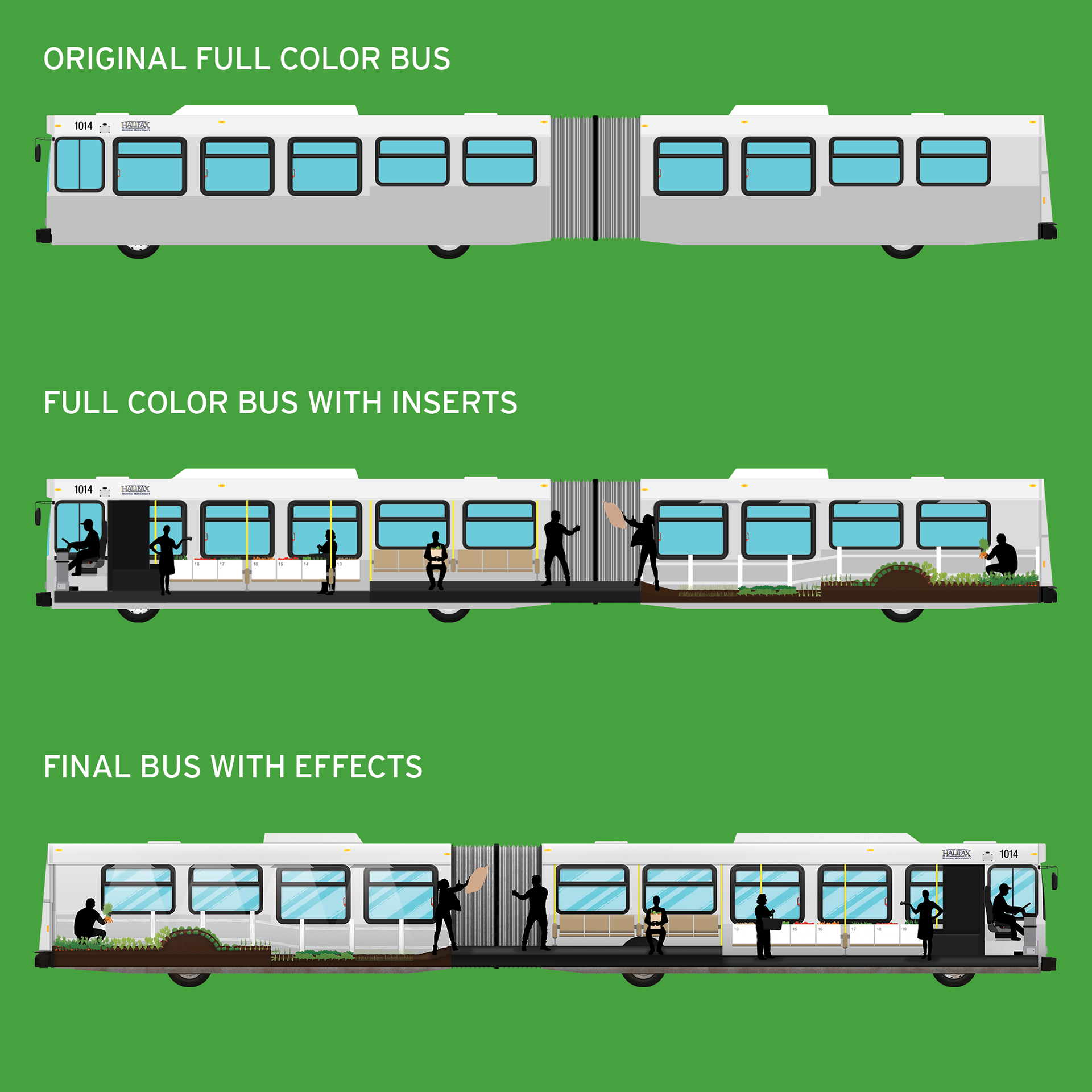
I created the vegetables from reference photos and turned them into brushes that followed my paths, in illustrator. Each one was tweaked and randomized to create a slightly more natural and irregular feel. Once I had solidified my linework, I flipped them all from path to fill and adjusted the colors for each object. The bus I submitted to class had one less person, one less row of vegetables and no fence. I added these to better fill the space.
I stopped before that point for the school-based project, which you can see further down below. Though as mentioned I revisited the project after class. I brought the design into photoshop and began to add shading and highlights to each individual piece. After that I applied textures from creative commons resources online. This combination hopefully adds some extra depth and feel to an otherwise flat image.
Designs For University Course
Below are the final designs I created for my university course. I have included these, so you can truly see the difference between the original vs. the new updated design. I was happy submitting these for my course, regardless of the updated version. I felt that I had dedicated a substantial amount of time to the project and that the result reflected the effort that I had put into it. The time slot was limited as I was also juggling other coursework. I knew that once, the course ended I would have to make changes, but I really had no idea how long those changes would take. I spent a lot of time experimenting and playing around with different effects and layers.
You can also see my editorial design below. This was my first time creating an editorial of this style. I wasn’t fully sure what to create, but I went through numerous concepts and settled on this design. The Editorial is on 8.5 in x 11 in sheets utilizing a 9 x 9 Grid. It was initially supposed to be a two-page spread, but I wanted to find a way to include the bus design. Through talks with @VetaTesting, he suggested that I place the bus along 4-pages that unfold from the main two-page spread. I tried it out and was fairly happy with the result. The text is all for place-holding. I have not remade the editorial layout, though I may decide to remodel it and include the newly updated bus, at some point.


Final Design And Applications
A detailed view of the bus itself, please scroll through the images to see the texture and details.

Here is the final design, a culmination of many hours of work. I decided to place the bus on a road to better ground the design in reality. In addition, I made the tagline easier to read and added extra contact information, along with their logo for the heading.

Thanks For Scrolling, Please
Feel Free To Leave Feedback!
Copyright © 2018 - Bezzina Designs
Project falls under intellectual property law.