Arial Type Specimen & Product Design
Here is the first of two projects, I created for the Fall 2018 Semester at NSCAD University. This project took place throughout the entire semester of my Typography Course, as a part of my first year in the design program; or second year overall. For this project we were asked to develop and create a type specimen for a famous typeface, past or present. We were required to create a poster and calendar that displayed specific typographic attributes of our chosen typeface. The overall type specimen should work as a marketing presentation for those interested in licensing the type family.
I chose one of the most prevalent typefaces of recent history, Arial. For those of you who don’t know, Arial is “one” if not “the” most used font of our present day. I wanted to take this very well-known font and cast it in a different light. Throughout the course of this Behance Project, you will see my beginning to end process for the planning, development and presentation of My Arial Type Specimen.
This is definitely a more lengthy and word-heavy project. Obviously not everyone will have the time to read everything, but this took a lot of time to plan and develop. If you have time, please read through the main brief and concept development steps, as they explain the overall objectives and ideas of the project.
If you like my work, please leave a like, comment and consider following. If you or anyone you know needs designs, feel free to contact me any time at bezzinadesigns.com, I would be happy to help.
About Arial
Arial was initially developed in 1982, by Robin Nicholas & Paula Sanders. It was released for Windows 3.1 in 1992, where it grew in popularity as a primary system font. The font is considered a Neo-Grotesque Sans-Serif. Neo-Grotesque refers to newer sans-serif typeface designs inspired by the first sans-serif designs of the mid-late 19th century and very early 20th century. Arial also has Humanist / calligraphic features and varies greater in line width, compared to traditional Grotesque fonts.
Arial is owned by Monotype Imaging Holdings Inc. They license more than 30 total font styles. This project focuses on the 6 Regular and 6 Italic Weights: Light, Medium, Regular, Bold, Extra-Bold, Black.
Brief & Planning
I knew from the beginning, I wanted to create a physical product that would house/accompany my poster and calendar. To do this I came up with a story to market my promotional product.
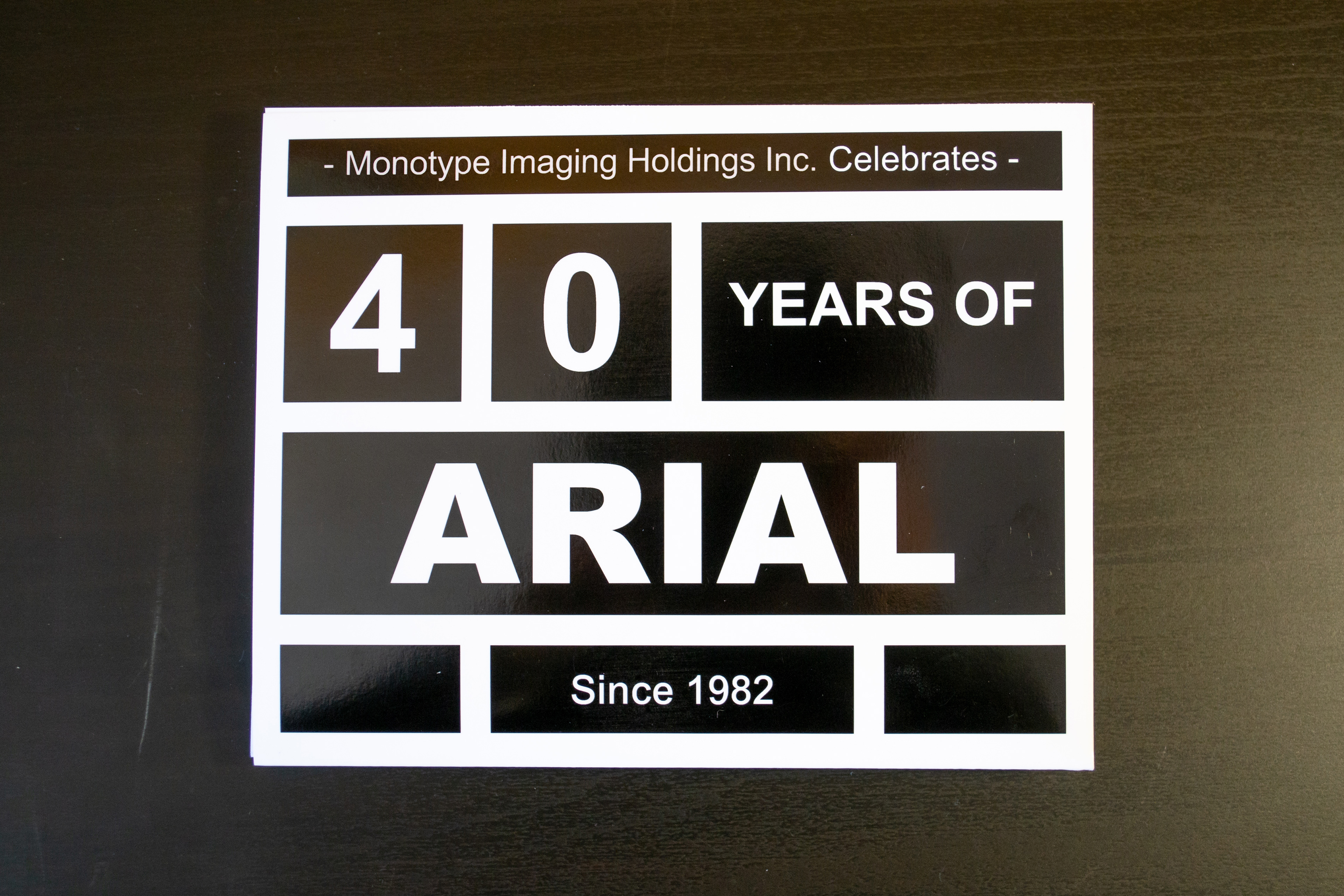
The year 2022 is Monotype Imaging’s 135th Anniversary, as well as Arial’s 40th birthday since initial inception in 1982. For this Anniversary, Monotype Imaging (in this situation) has decided to release promotional items to commemorate their long history of analog and digital typeface development. To celebrate this milestone Monotype Imaging is looking to blur the lines between analog and digital design stylings and printing technology. They want to highlight their most famous cast and digital typographic families in contrasting ways.
In this situation, Arial a modern font, primarily released for digital usage, will be re-imagined as a cast-metal type used for letterpress. The idea is to display this relatively “new” font in an older style, using modern day methods. To reflect upon a new age of printing and typography, while celebrating the past.
Visual Themes & Concept
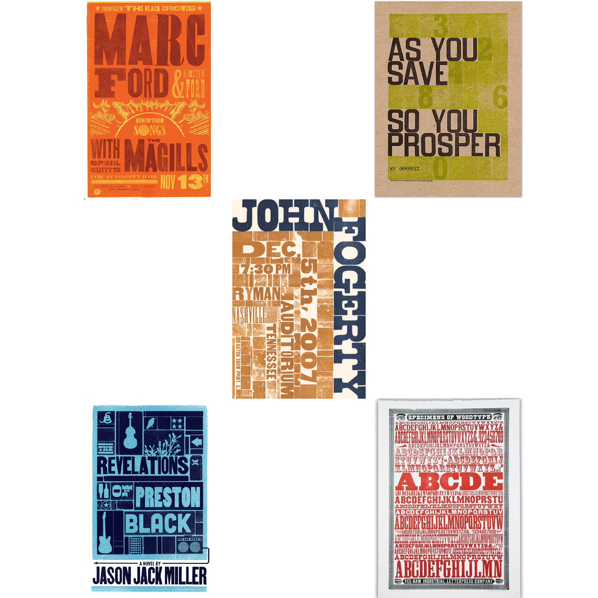
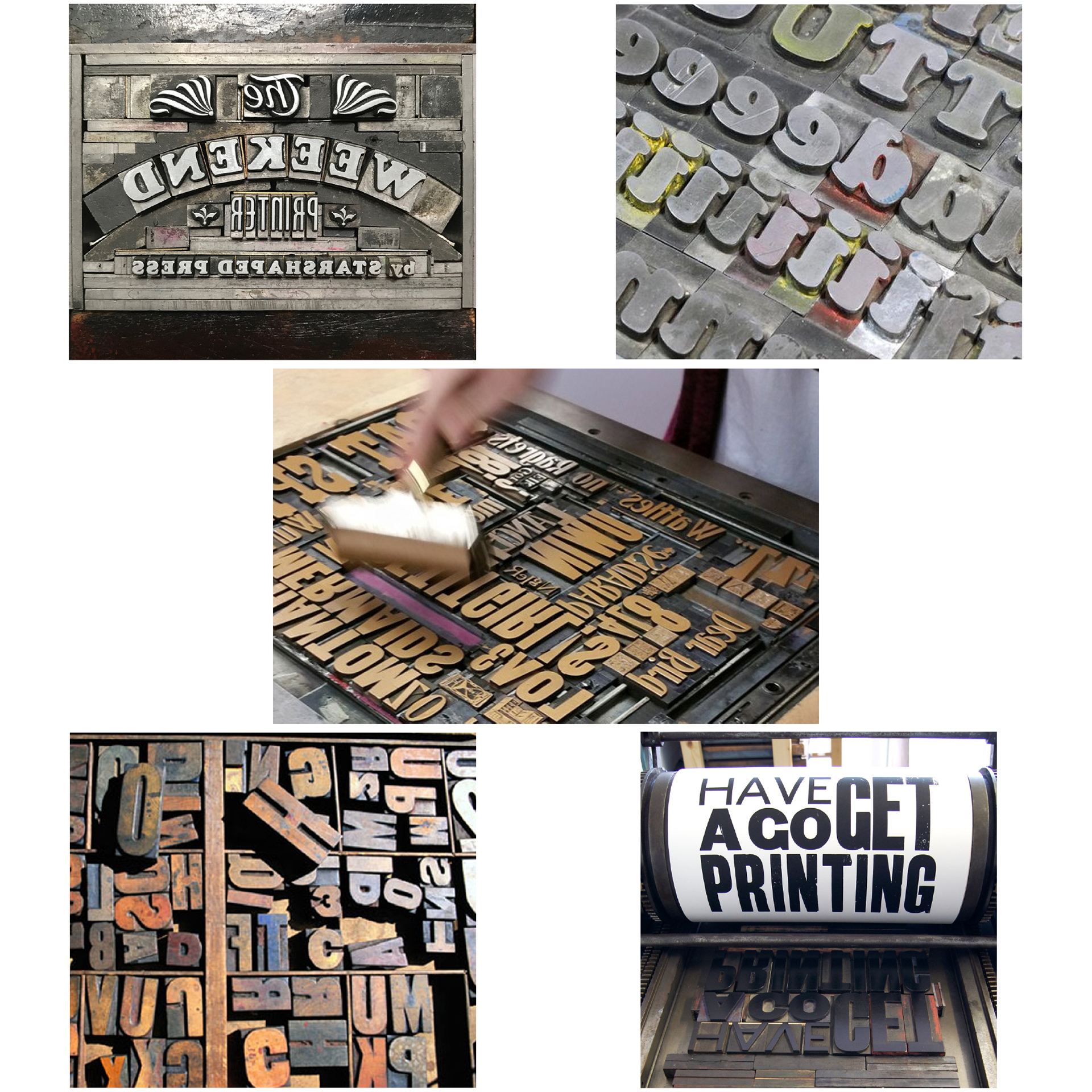
The primary design motif is simple, reminiscent of old letterpress lockups, while also contrasting with more complex secondary digital elements. A physical product was developed inspired by the process of Letterpress printing but was created in a 3D printed medium. A continuous theme is the contrast between new and old, which is also a reference to the modernization and digitization of old typefaces.
The main focuses and imagery are: the letterpress lockup, the contrast between addition and subtraction, blocks, grids, sections, cells, Windows. All the main design elements will remain Black and White allowing the type to stand on its own, to emphasize form and shape; further drive the theme of contrast.
Poster Development
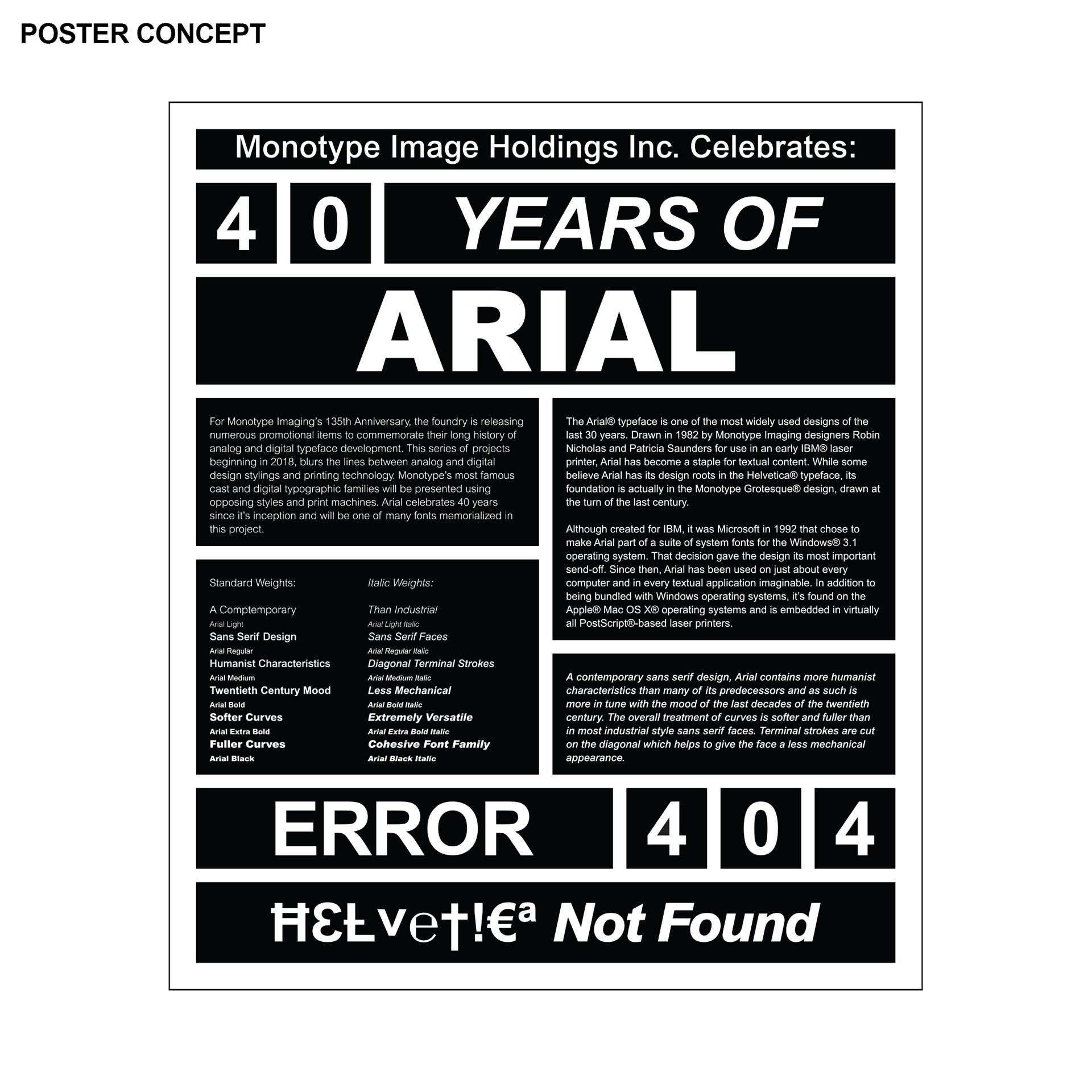
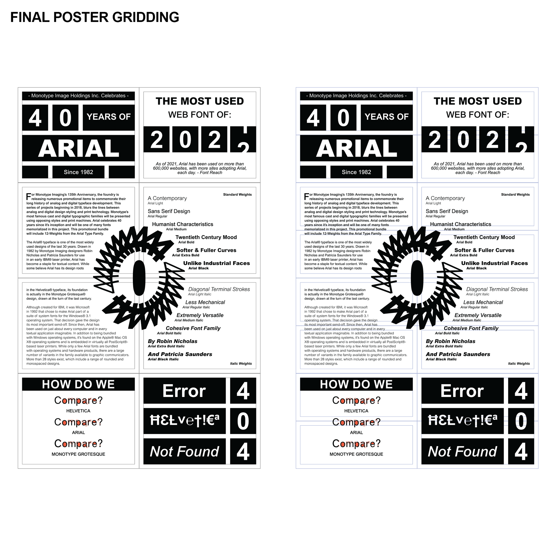
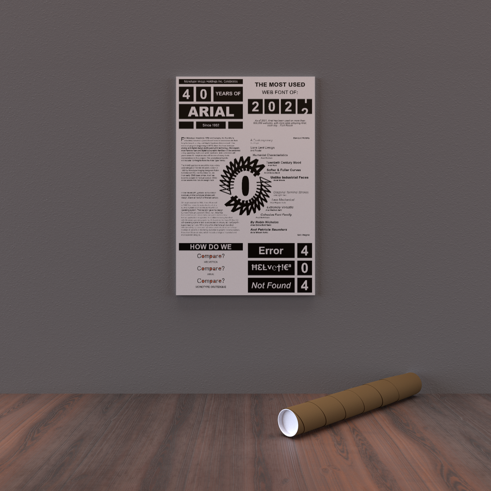
I was greatly inspired by the both new and old letterpress posters. I wanted to combine thick dark blocks with lighter more open sections. My first concept brought together the basic elements, that I wanted to include in the final poster.
I decided that I wanted my final poster to fold down from eight panels to one single panel. I took the concept elements and applied a grid to them. Every panel is its own individual entity, but together, each panel is a single cell or window within a larger lockup. The main individual elements within each cell should be possible to print using historical letterpress technology. Whereas the centerpiece along with smaller details, would be much harder and less seen in letterpress prints. The centerpiece works as an anchor to our current time and represents the 40 Year Landmark.
Final Poster Design
Here is the final poster. I would suggest for this image and all images that have white backgrounds, that you click on the image, so you can see where the design borders off. I wanted proper white space, within the designs, but also around the edges. This makes it easier to print.
In both the poster and the calendar, there are panels that are more black and more white. In the poster these panels line up on diagonals, just like the slit of the main centerpiece. In this case, the upper-left and bottom-right are black heavy and the upper-right and bottom-left are white heavy; while the middle remains open and white.

Here is a digital mockup of the poster along with a printed copy. You may notice that I have a slight typo on the first two images, but this is fixed on the final image, which was an edited print.

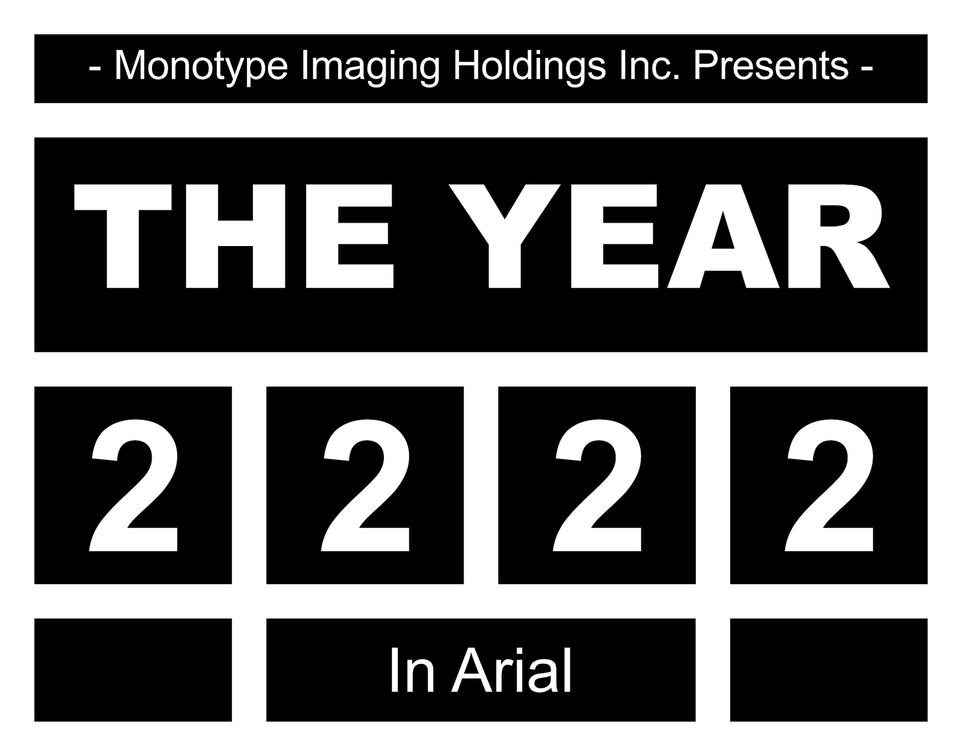
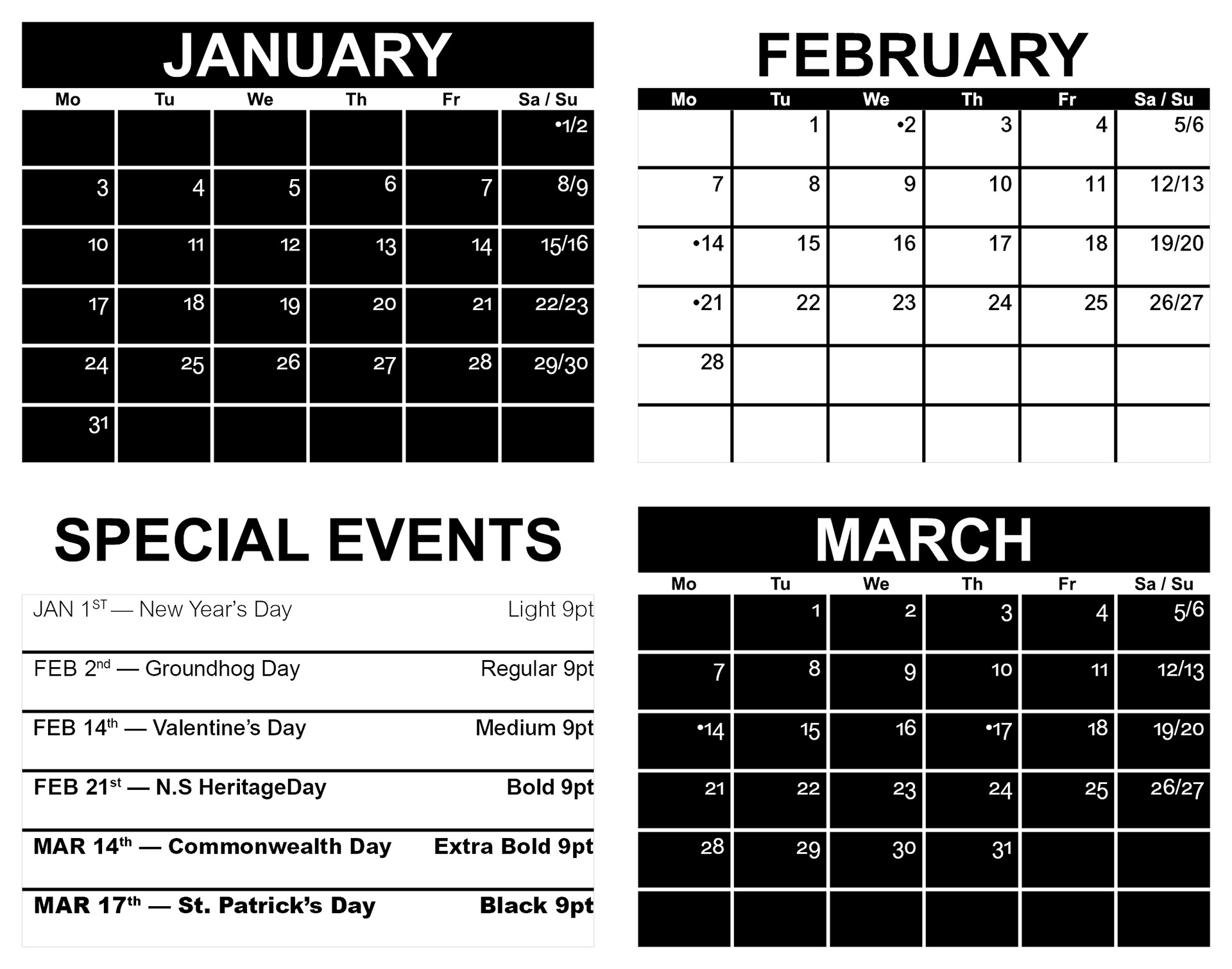
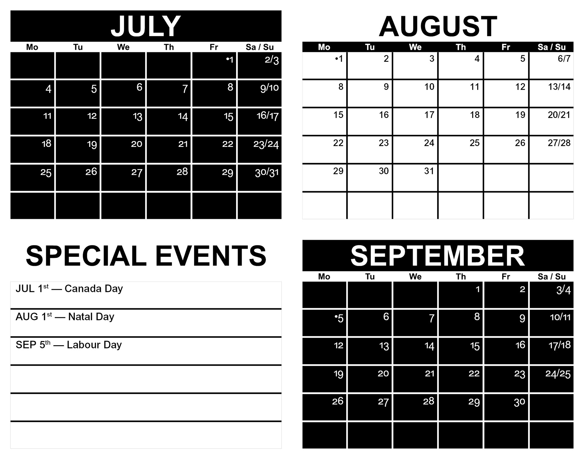
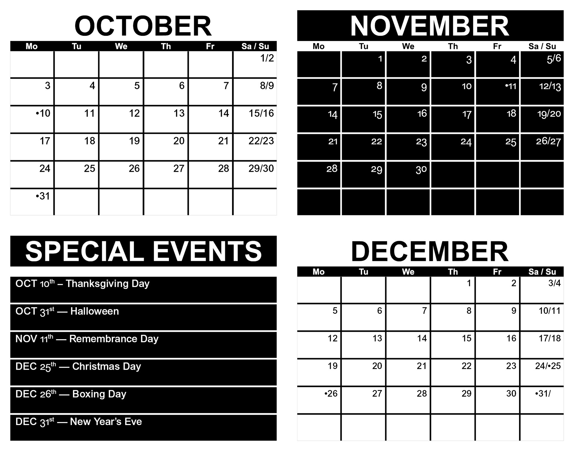
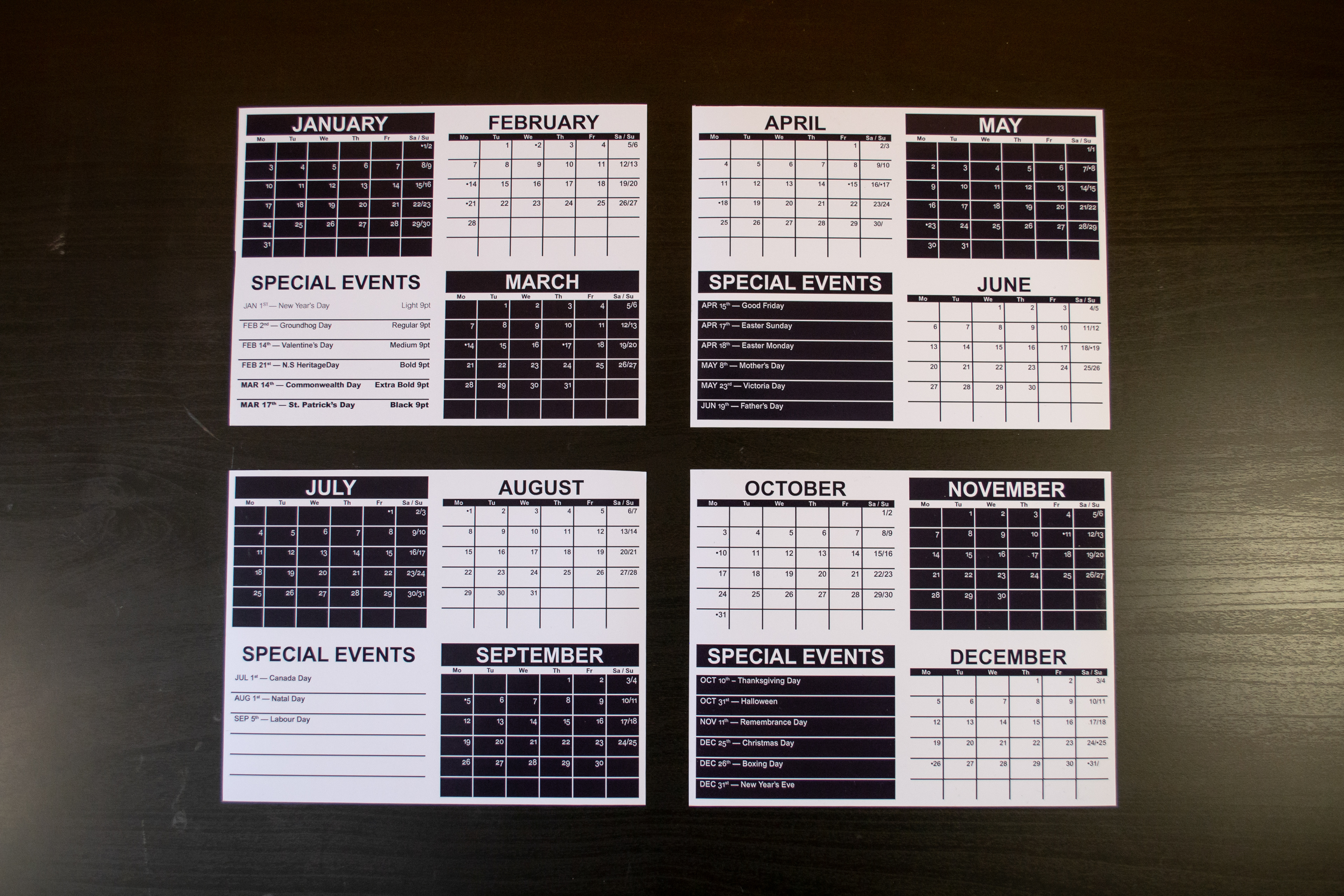
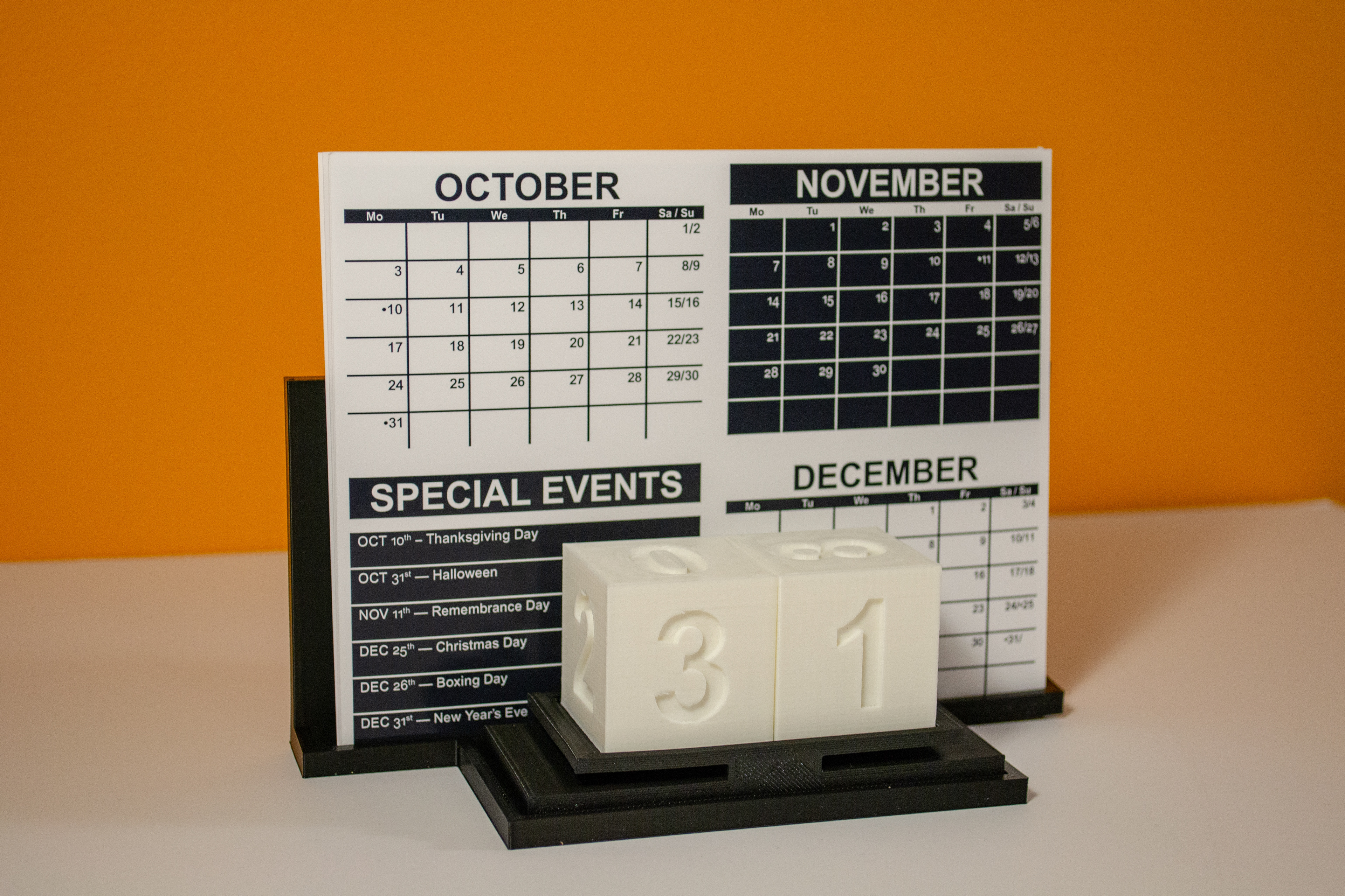
Final Calendar Design
Now we have the calendar design. The main cover page is like the first panel of the poster, though calendar specific information was added.
To briefly address the calendar format: each page has three months per page, black and white themes swap each month, weekends are grouped together, six-day slots or one per type weight, special events feature common holidays (in Nova Scotia). We also have the same grid pattern, seen in the poster, but on a smaller scale.
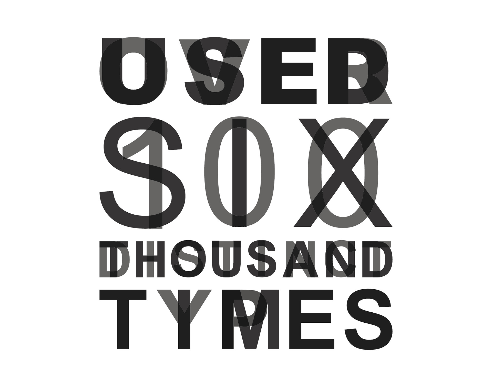
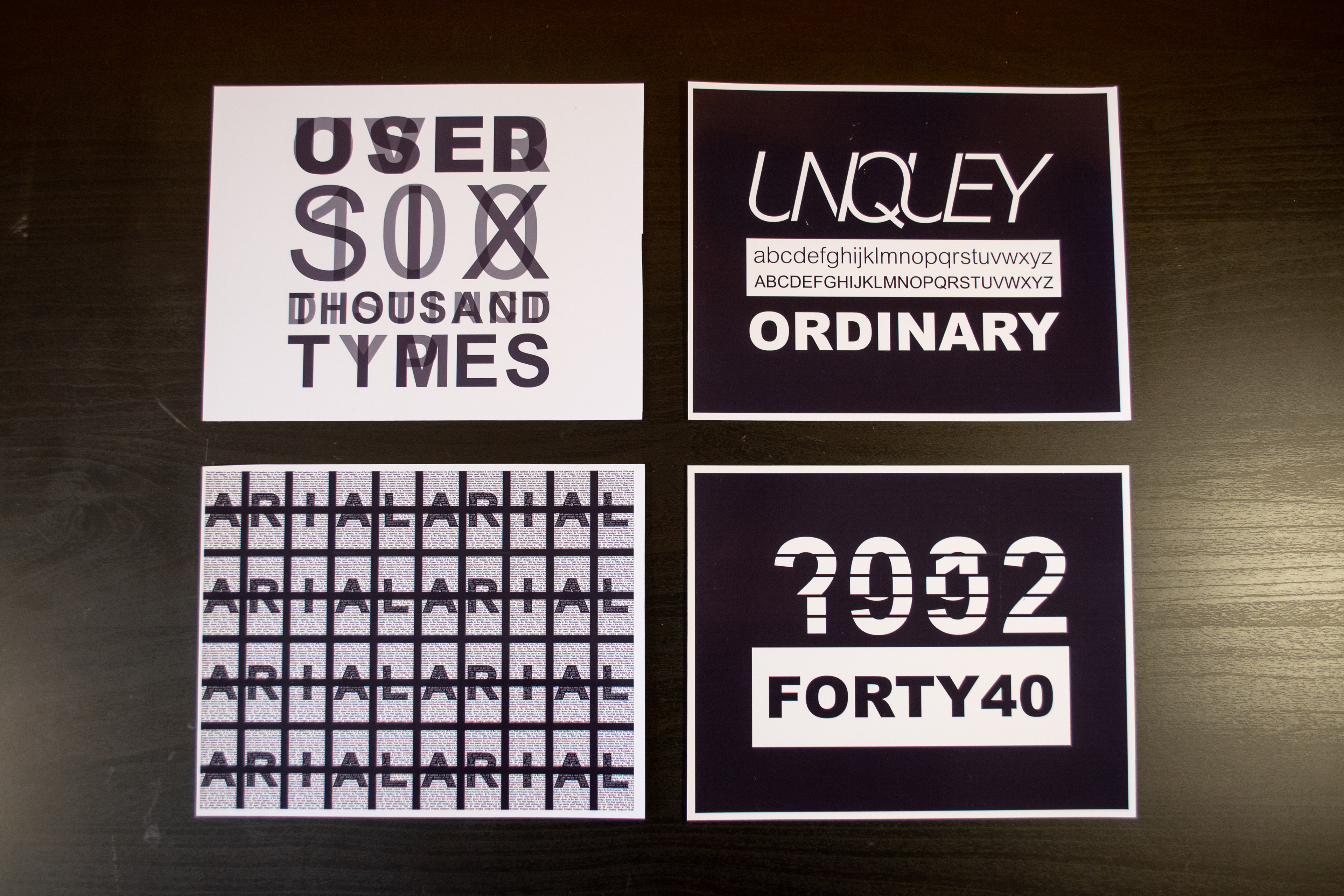
For each calendar page, we were required to display a certain element of the typeface. The first panel was related to type weight. The words were set at different opacity, so the focus could be derived from the darker overlaid regions. The words break down into multiple different messages. For example: “Used Over Six Hundred Thousand Distinct Times” regarding web usage; “Over One-Hundred Distinct Types” referring to variations of Arial and different language type weights; the first message can also be read as “Over Used” referencing those who believe the font is too prevalent.
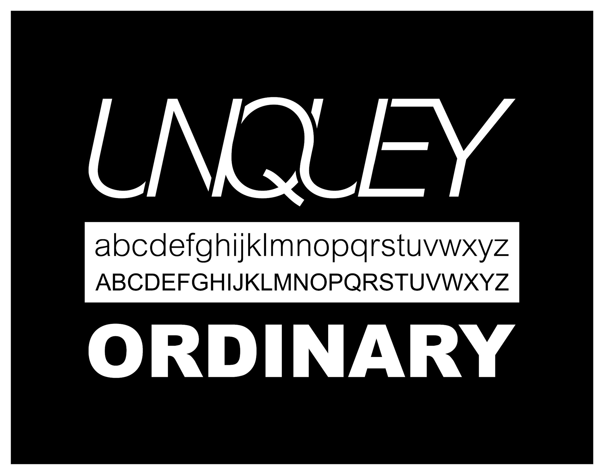
The second page focuses the construction of the typeface. The message reads, Uniquely Ordinary. This was to display that even though Arial has become a “conventional typeface”, it’s construction can be manipulated to create new forms. Below the modified Italic letterforms are standard letterforms for reference.

For the third page we had to make a pattern using the typeface. This design was meant to be more closely influenced by digital designs, as it would not be realistically reproduced using cast-metal or wood type. Though the motif of letterpress is not lost, the grid pattern is similar to the calendar pages, and each block of text is reminiscent of letter-blocks with leading within a letterpress lockup. In addition, these blocks look like windows, a reference to Windows 3.1. Little pixel-like words come together to create a larger type-based image.

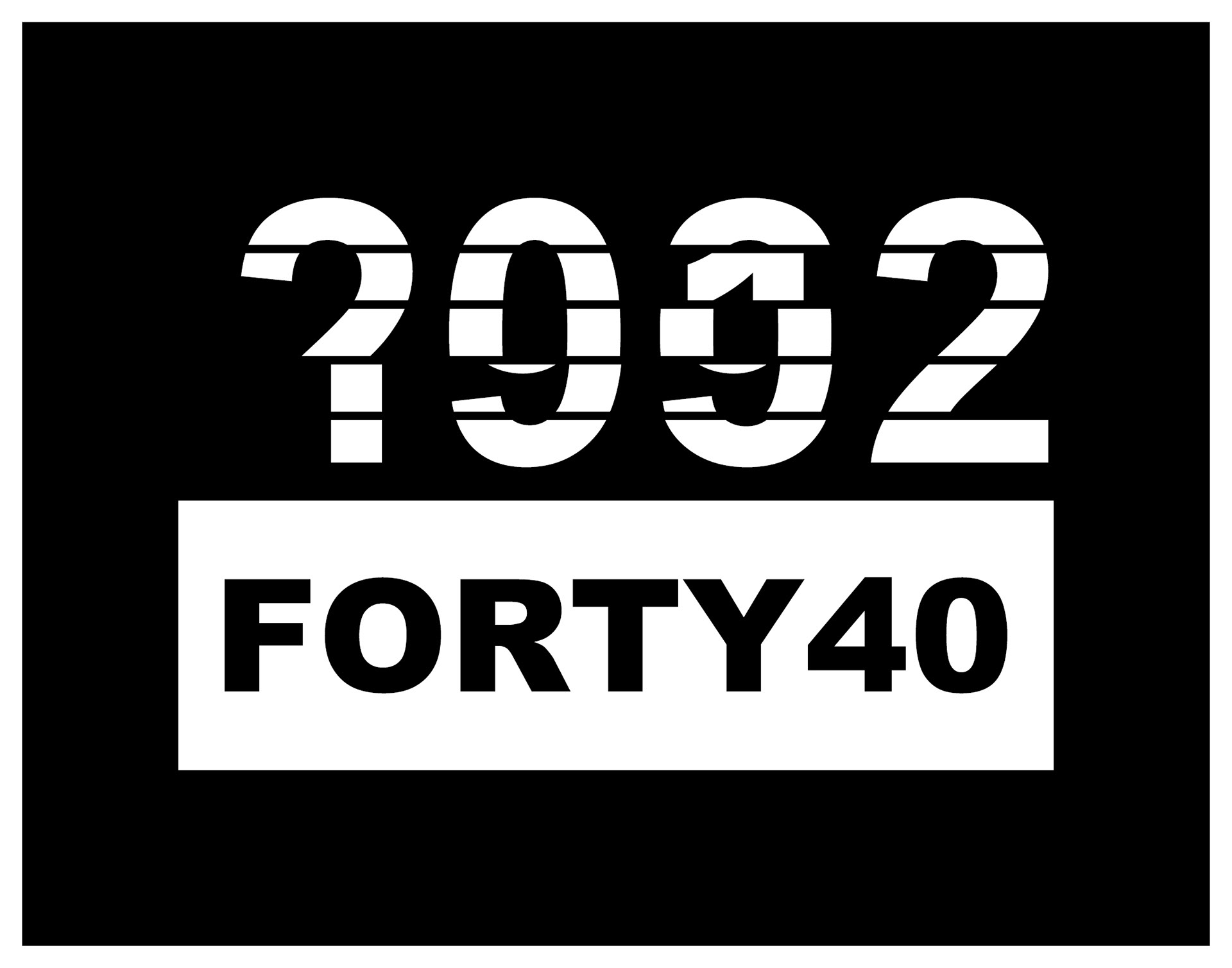
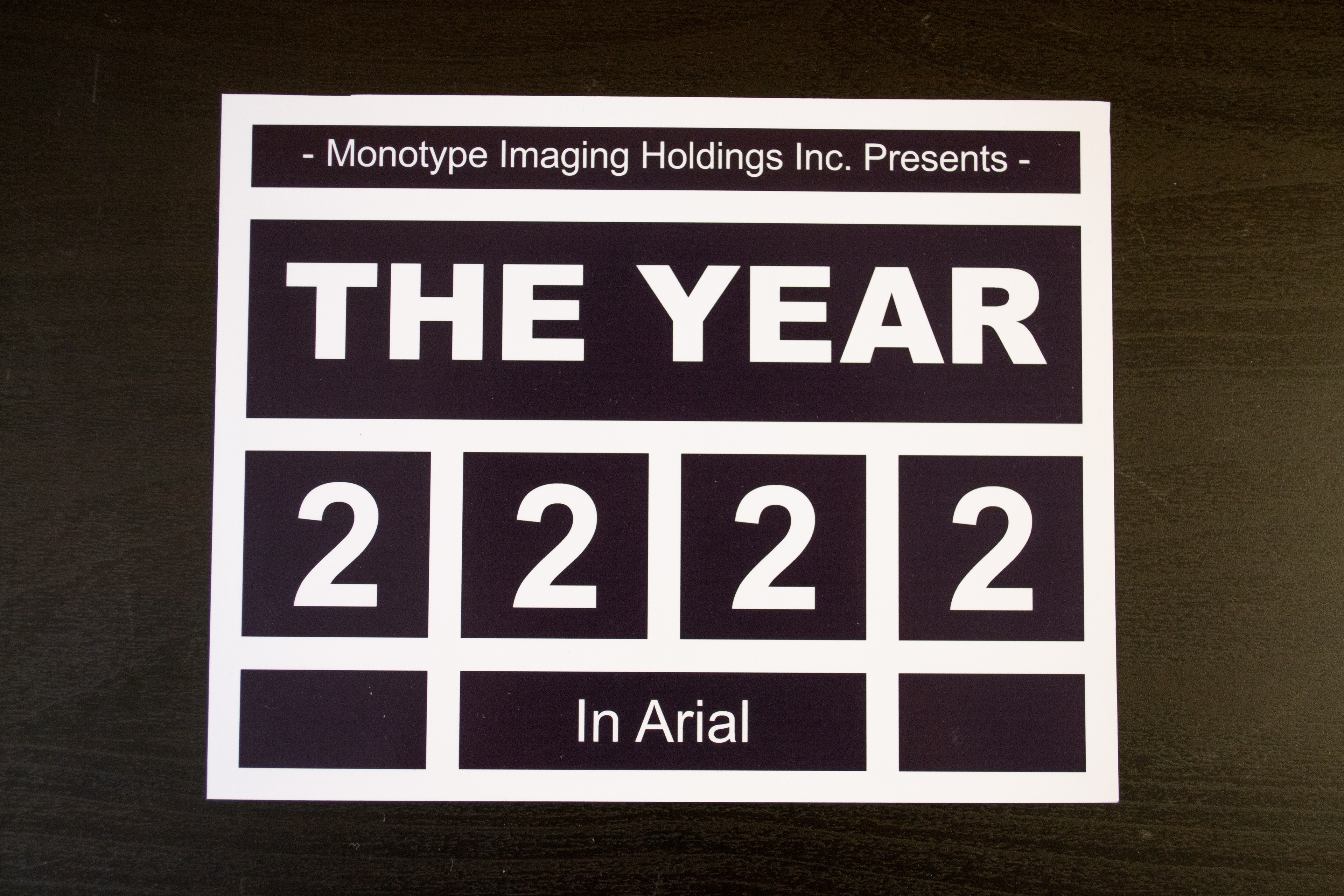
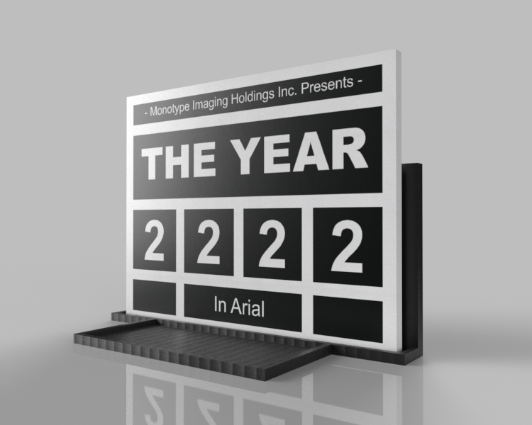
The fourth page focuses numerals within the typeface. This is a more complex abstraction, so carefully read my explanation. The top slice of the main numbers is the year 2022, the bottom is 1982; in-between are the decades 1992, 2002, 2012. The top and bottom decades subtract and separate into one item. The bottom white block and Forty40 functions as the lower portion of a hand-drawn equation; where you would find the line, subtraction symbol and a space for the answer of the equation.
In this situation our equation is 2022-1982; our line between the equation and answer is the white block, the subtraction symbol is the lettering subtracted from the white block and the answer to the equation is our lettering Forty40, for forty years.
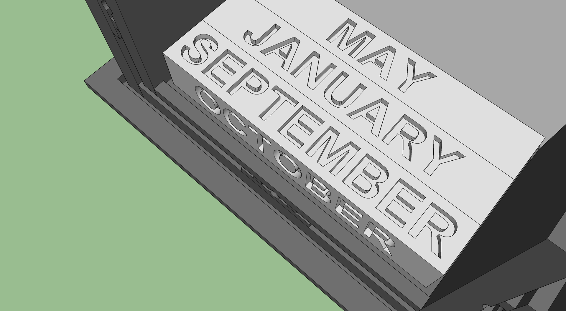
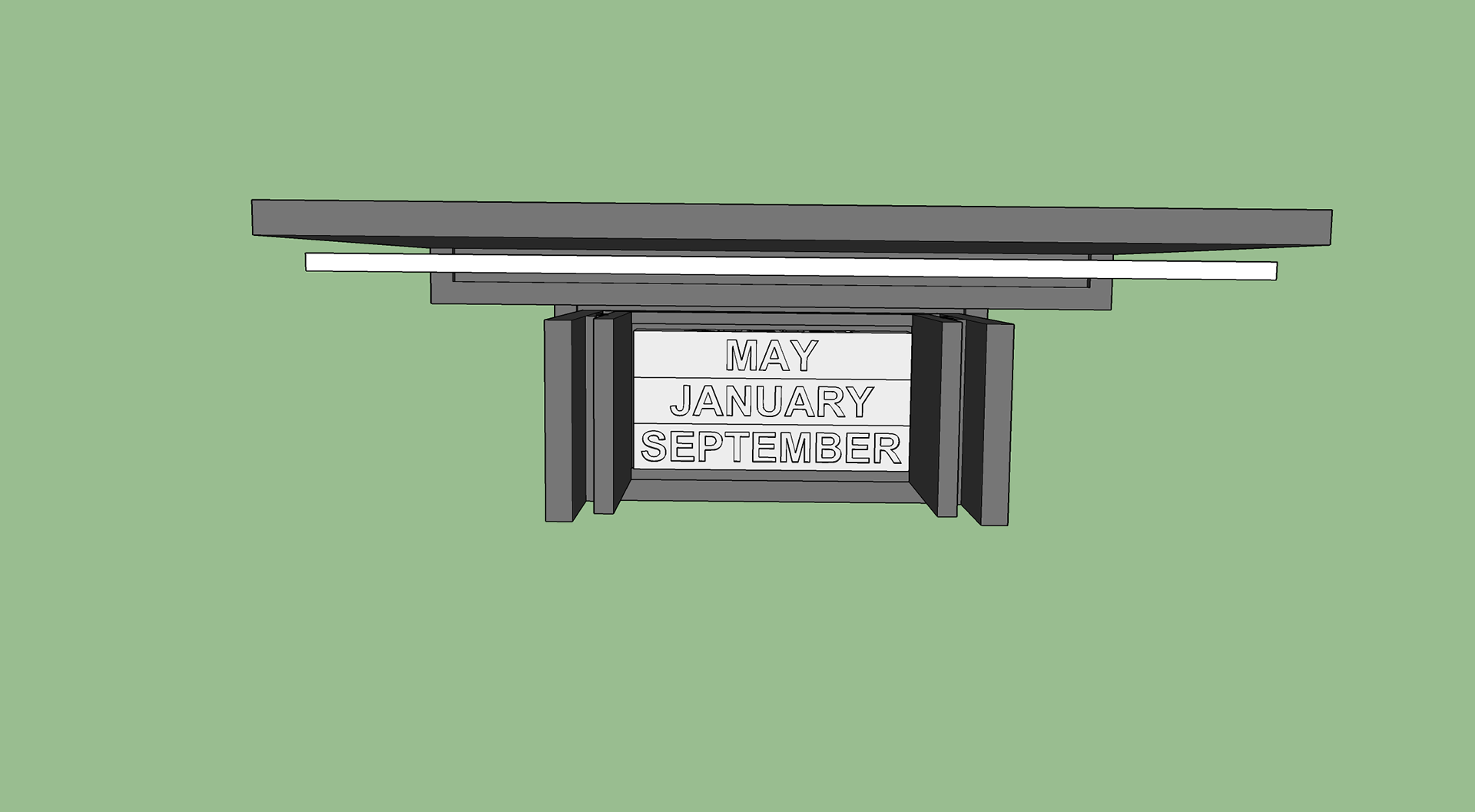
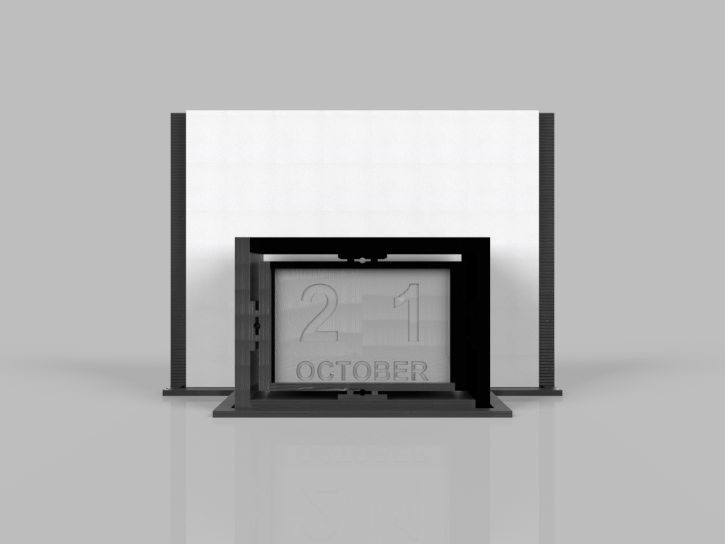
Product Development
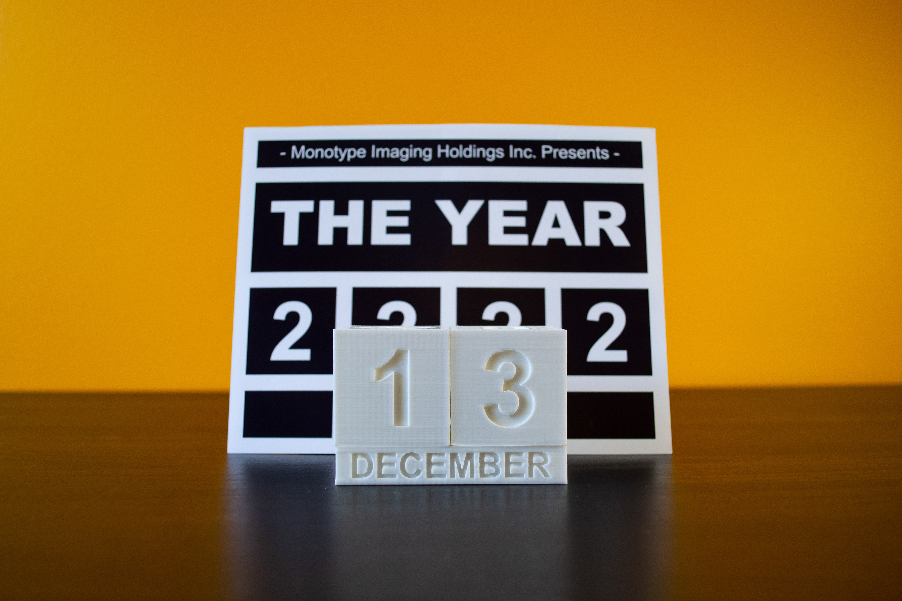
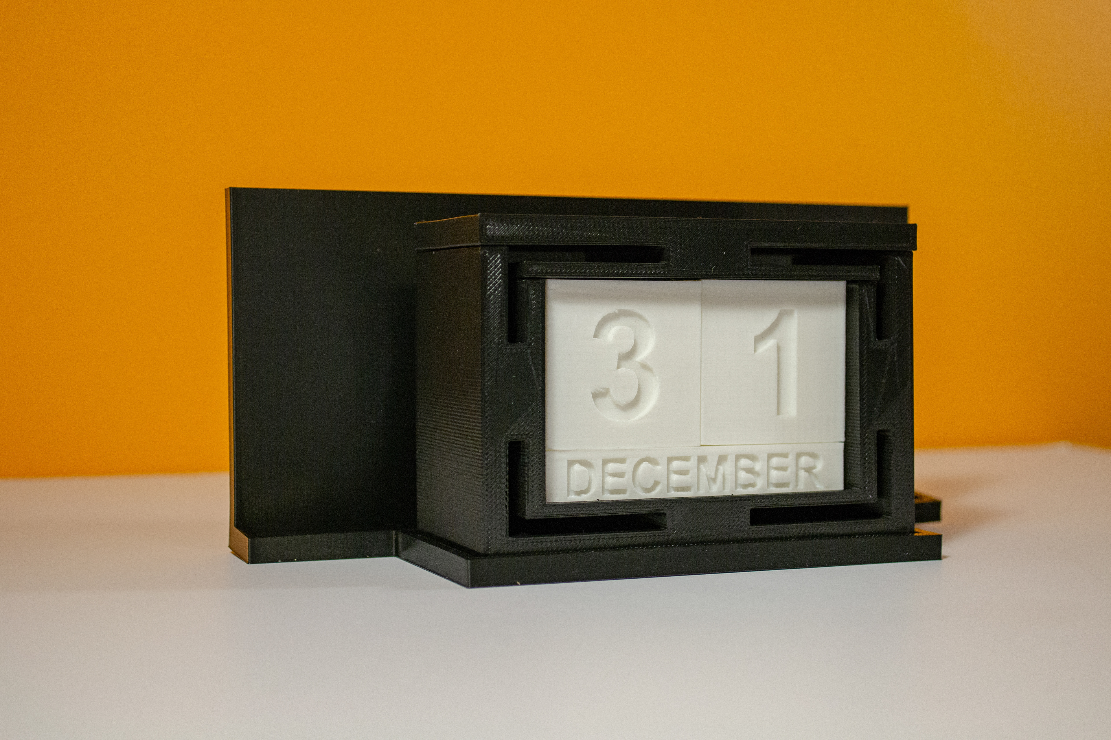
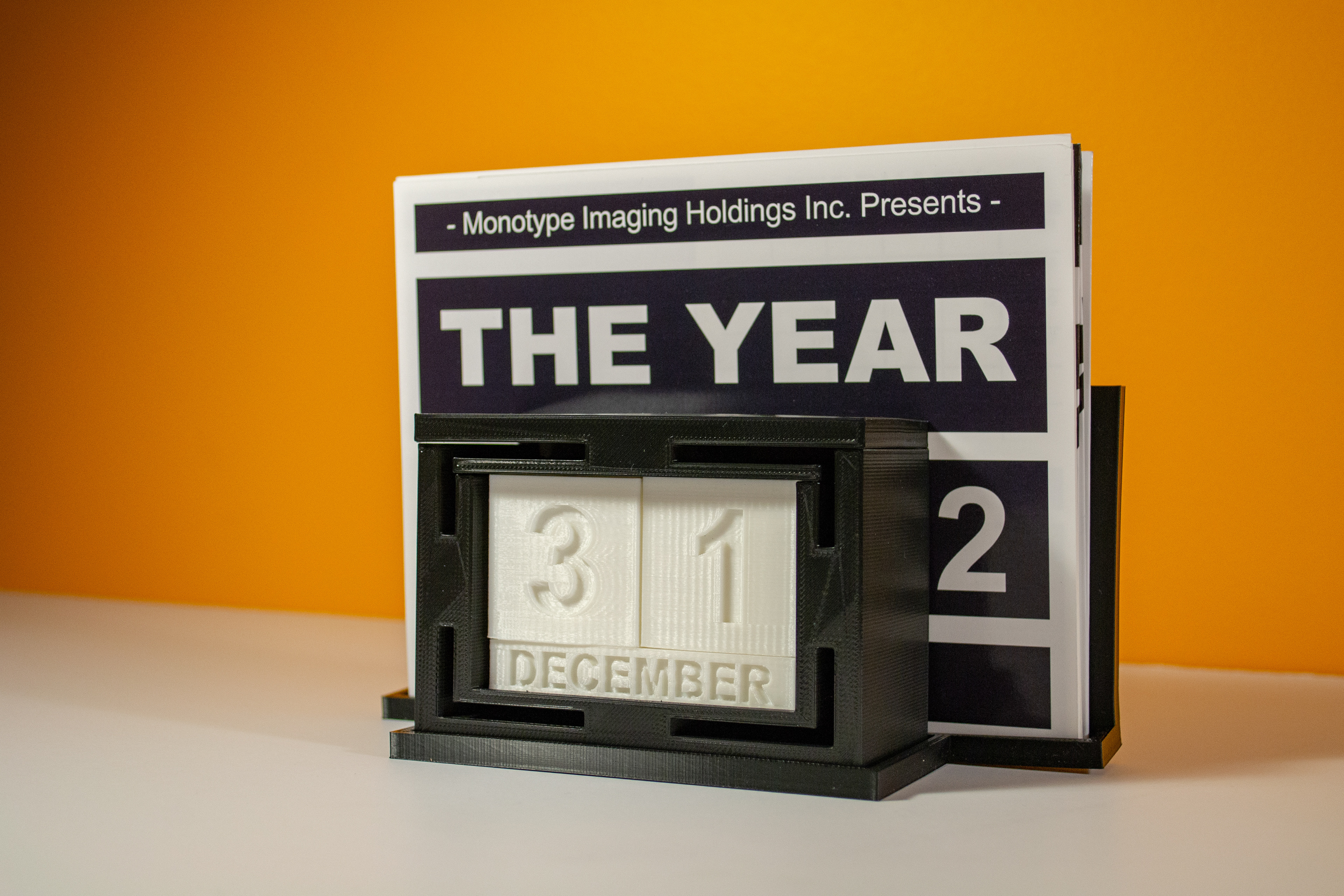
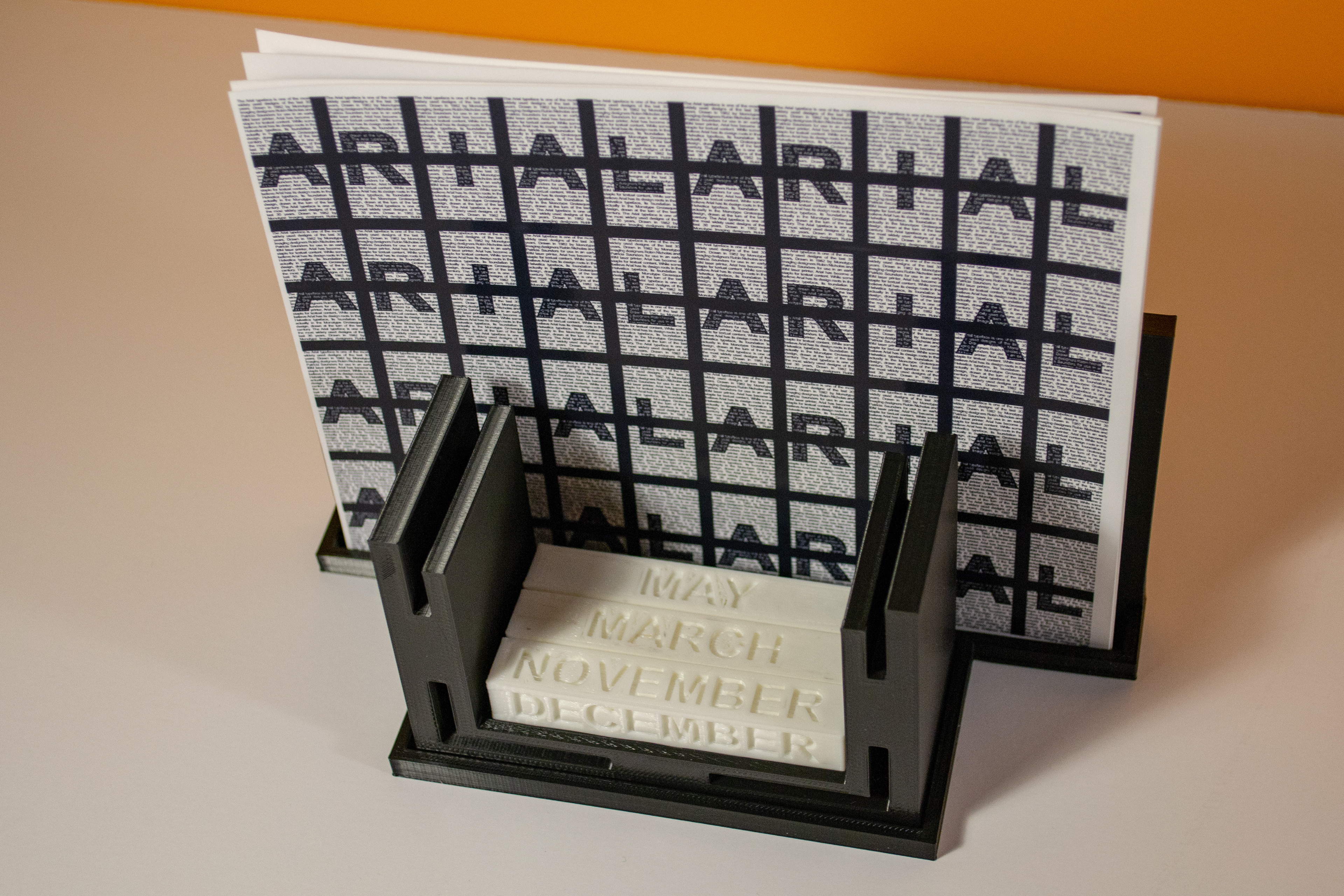
Here now, is the product I to developed to contain all the printed elements of the project. The design is a 3D printed block calendar, with all the days and months of the year; contained within a faux letterpress lockup inspired holder; with a back piece to hold the printed materials, reminiscent of the letterpress machine holding the paper that will be imprinted upon.
Obviously, the letters made in cast-metal within a lockup are reversed and adjusted specifically so their imprint will be legible once the printed but flipping the orientation of the letters would make this product non-functional. So, this product is more-so aesthetically influenced by the letterpress style and cannot be used as functional type blocks for hand-printing.


Final Presentation
Here are the final printed products alongside the 3D printed product. The white number blocks were printed by an online sub-contractor, while the enclosure was printed on my own machine after it arrived from China. My machine is called the Creality Ender-5, I was quite impressed by the print quality overall. The rear holder warped slightly during the print, because of the orientation in which I printed it. I decided not to redo it as to not waste more plastic, I think the overall design is conveyed regardless of a slight warp.

Thanks For Scrolling, Please
Feel Free To Leave Feedback!
Copyright © 2019 - Bezzina Designs
Project falls under intellectual property law.