
Historic Properties "Privateers Wharf" Market Mall
Introductory Brief:
The Historic Properties Market Mall is an indoor-shopping plaza, located within the Historic Properties region, on the Halifax Waterfront. Historic Properties is a provincial heritage site that has stood for nearly 300 years, as one of the first developments downtown.
With the recent influx of new residential, commercial and office growth within the downtown core we see an opportunity to re-position the Market Mall as a year-round resource for those new residents—a neighborhood market area that serves their daily needs.
Our goal is to change the perception of the Historic Properties Market Mall from being a tourist-focused destination to that of a neighborhood resource for the daily needs of the residents in the area. We want the Market Mall to be their first choice shopping area. We want to make our new environment, friendly, welcoming and directly focused on our target market’s comfort.
My Requirements for the project, were to develop two completely different logo development directions with multiple applications for each.
Target Markets:
Our two target markets are based upon the new residents moving into the downtown core.
Our Primary target market (80% of potential residents) are 25 to 35 year-old, child-less professionals — Millennials
Our Secondary market are retirees and empty-nesters. These are typically 60+ years old —Baby Boomers
Pre-existing Identity:

Conceptualization:
Below are some examples of different exploratory sketches, I developed in the early stages of the project. Beside it is a written description that breaks down the final logo designs to come.
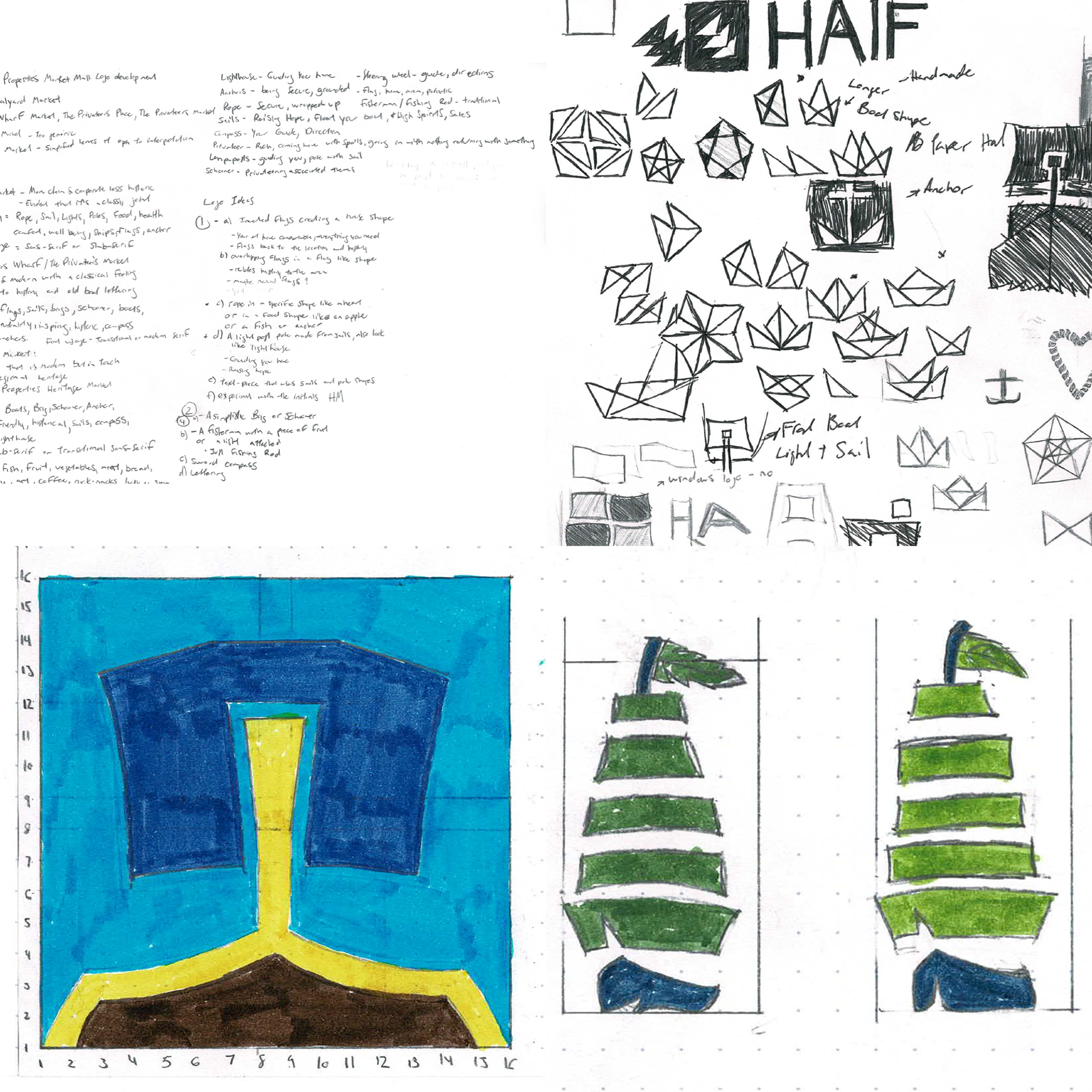

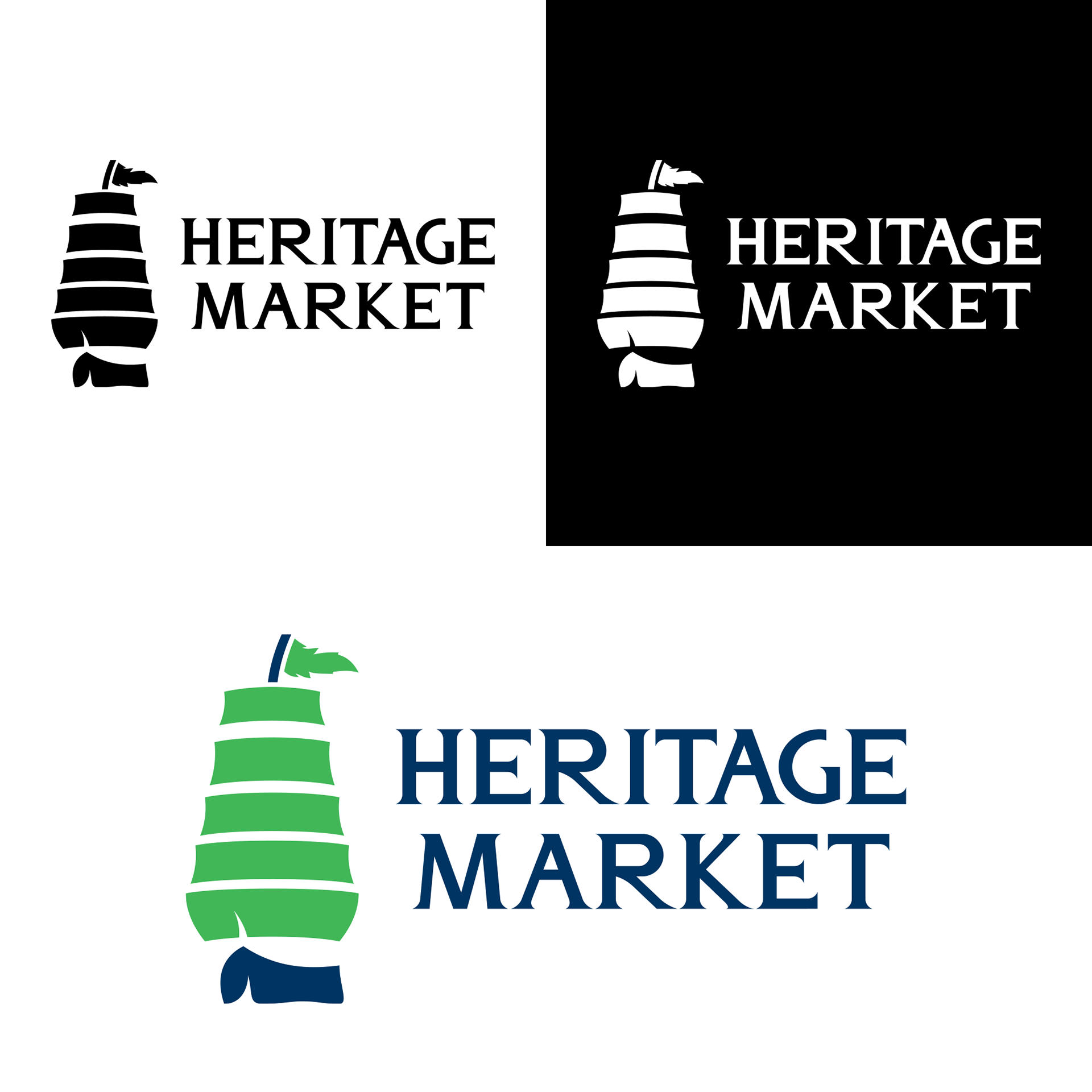
Logo Direction #1
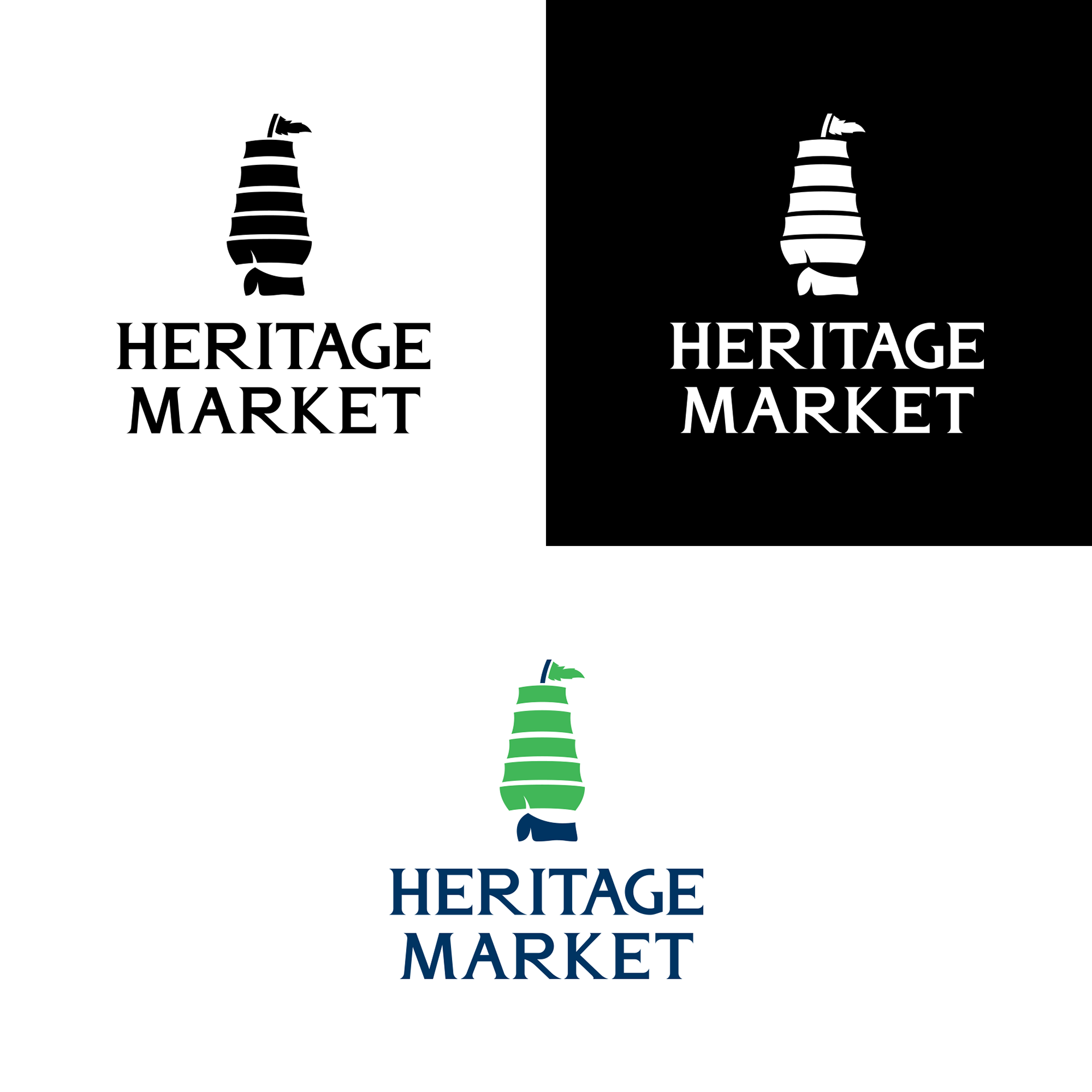
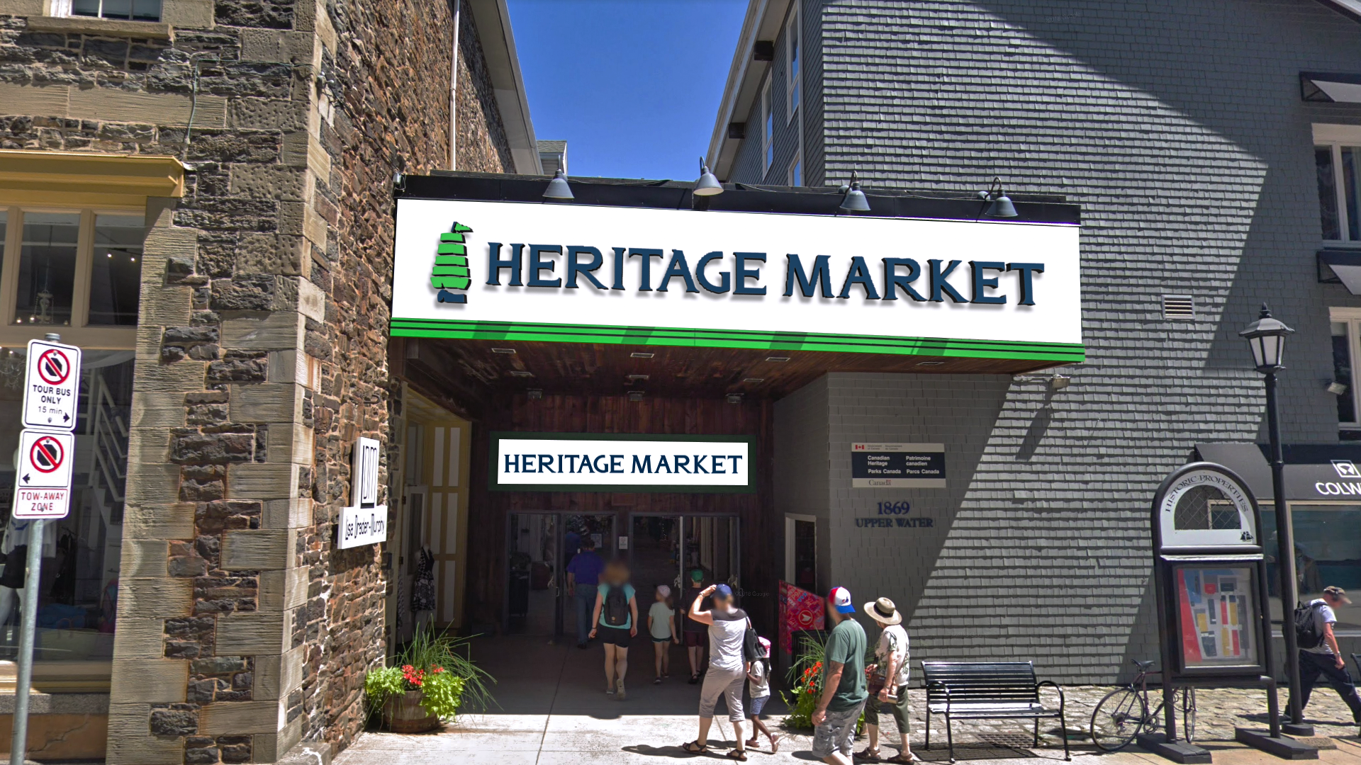
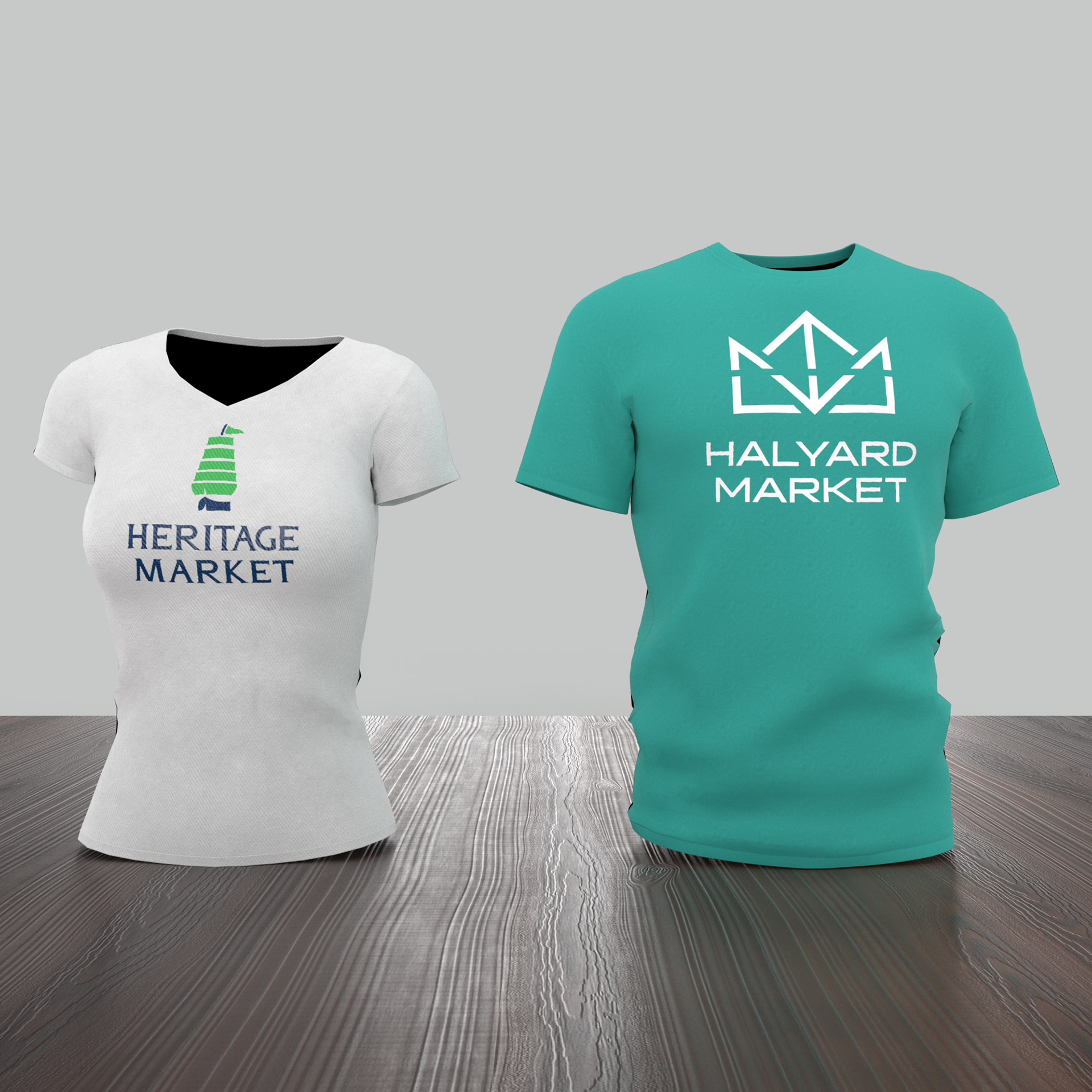
The first logo developed came under the name Heritage Market. I thought this would be a logical simplification of the existing lengthy name that still recognizes the historical significance of the mall.
In addition, The Historic Properties venue has been deemed a provincial heritage site.
While developing the logomark, I also created a short Glyphic Typeface, that I called Heritage Glyphic. I may refine and complete all the characters at some point, as I did not have time to do so during the project.


Design Significance:
The logo design represents a combination between Nova Scotia’s history of Privateering and the healthy local products that can be purchased at the market. The main logomark is a schooner-class ship with large rising sails, that form the shape of a pear.
The schooner ship symbolizes the fast fishing and privateering ships, that sailed the waters of Nova Scotia centuries ago and every year during the tall ship festival. Canada is the number two grower and supplier of pears worldwide. Nova Scotia is a hub for pear growing in the warm summer months.
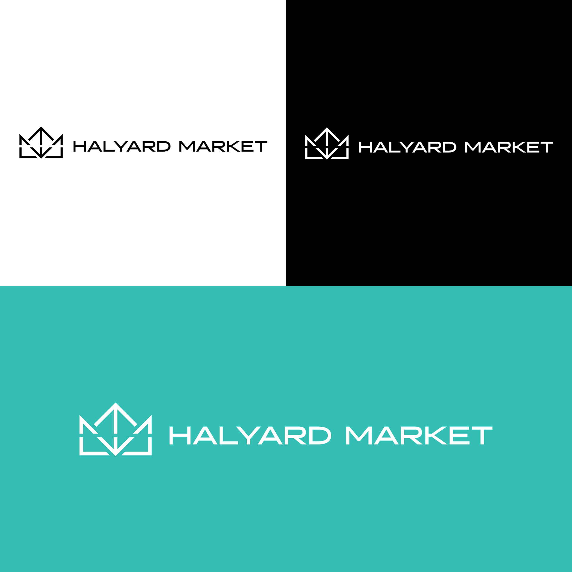
Logo Direction 2:
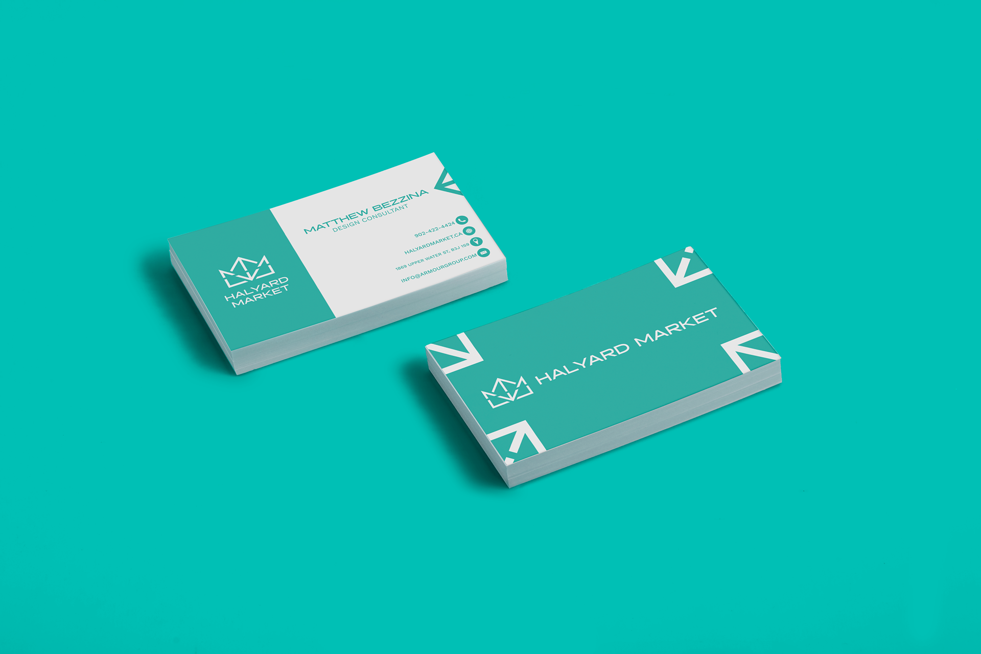
The Halyard Market is a name based upon the rope used to raise sails, on sail boats. The Name Halyard also signifies the location of the Market on the Halifax Shipyard or Hal Yard. The word Halyard means, to haul yards; which in this situation references boats hauling, their bounty back to shore.
The Halyard Market is about community and hopes that a visit to their market will raise their customers “sails” and spirits.

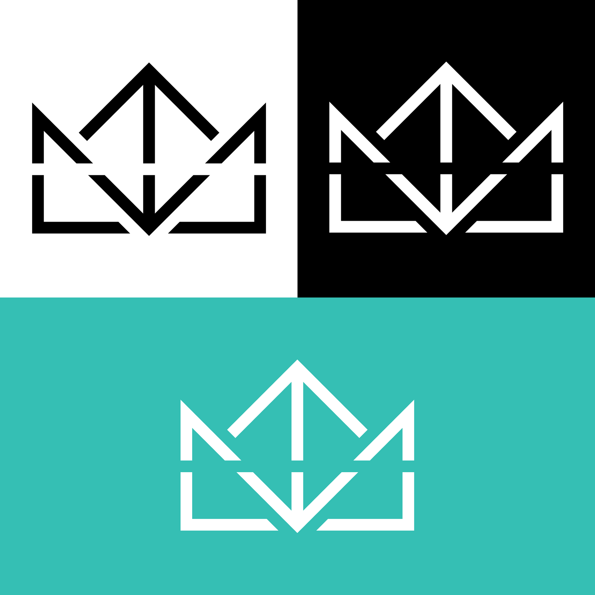
Design Significance:
The logo design is linear and uses simple geometric forms to create a small boat, reminiscent of the paper boats you would make as a child.
The downward pointing diagonals form the letter M for Market, while the horizontal slash creates an H for Halyard. The central rising lines act as Mast to hold the triangular sails up. The central double-sided arrow is an inbuilt directional system that will be used on signage in the building.

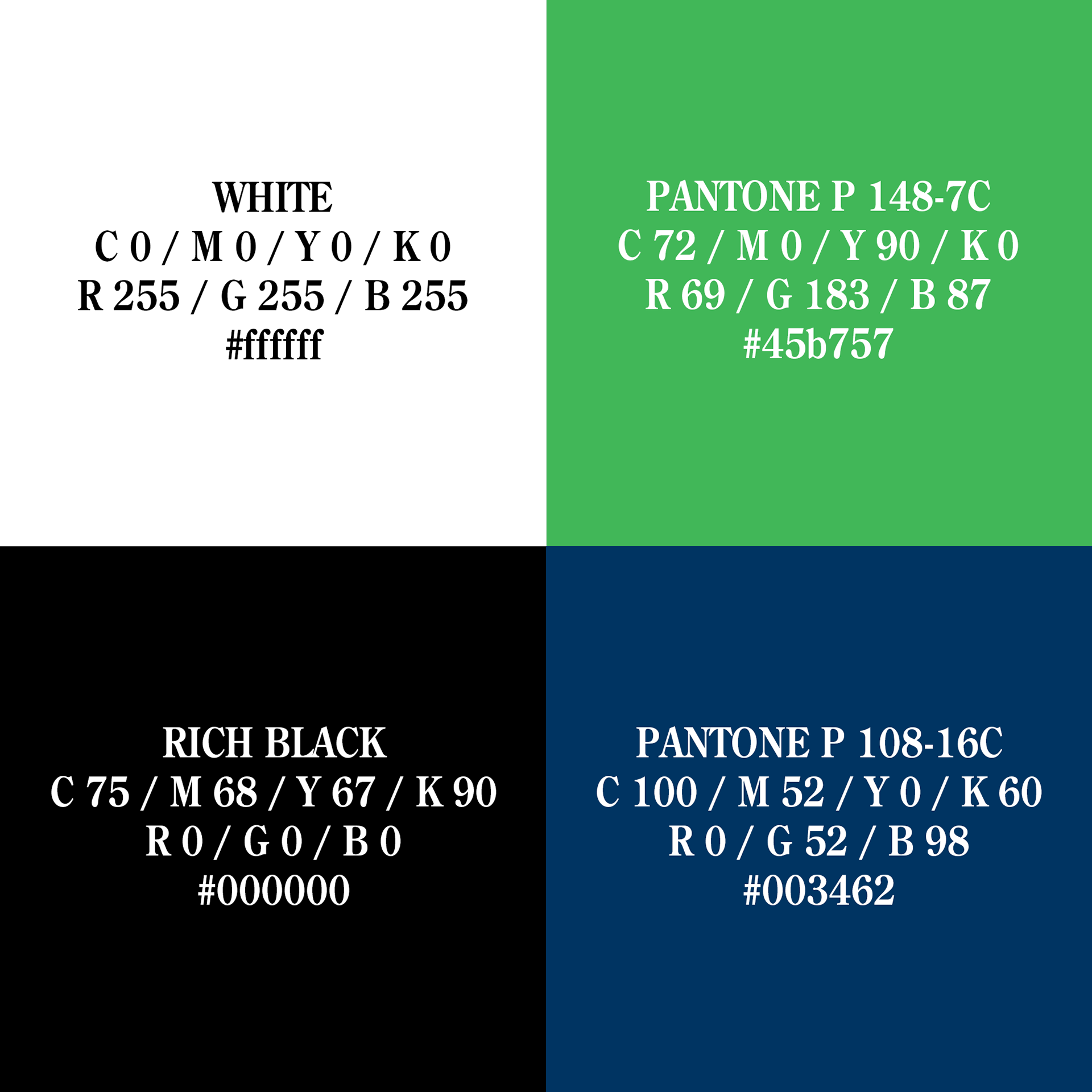
Color & Typography:
Logo 1: The green color symbolizes the natural elements found within the mall, such as food markets. The blue colors focus on the location of mall on the waterfront. The overall tone is meant to appear kind and friendly rather than intimidating.
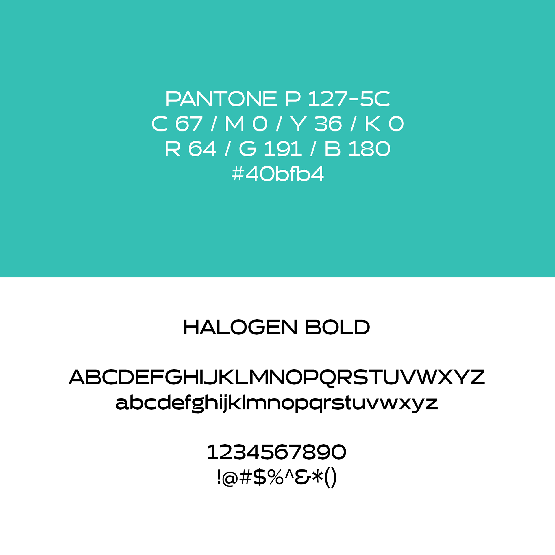
Logo 2: The color used is a light almost sea-foam green. This was chosen as it combines the natural, healthy, friendly centered green, with the more comfortable, ocean feel of blue. The font used within the logo is Halogen, a sans-serif display font that had a nice wide frame, similar to the logo itself.
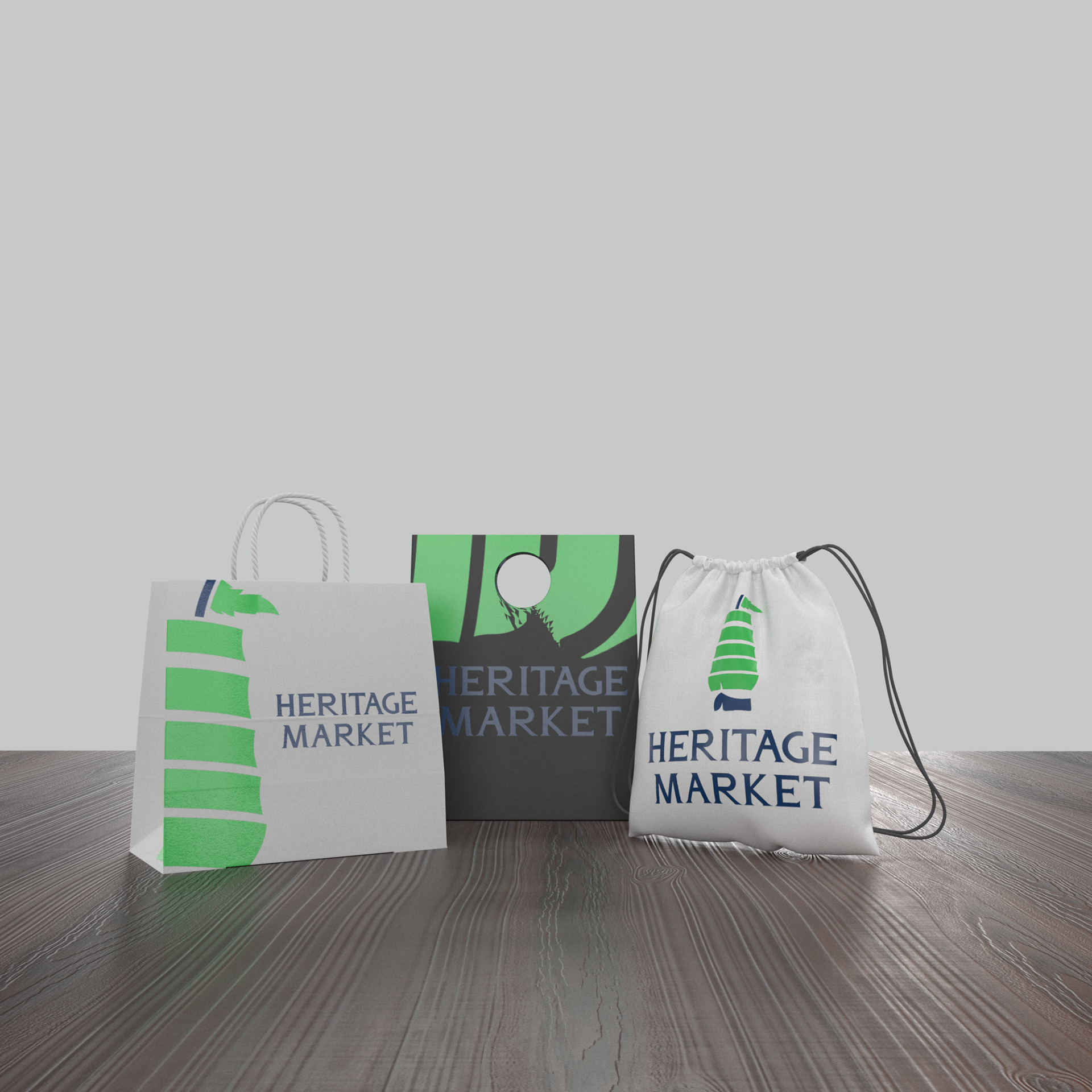
Heritage Market Applications:
Halyard Market Applications:

Apparel Application:
Thanks For Scrolling, Please
Feel Free To Leave Feedback!
Copyright © 2019 - Bezzina Designs
Project falls under intellectual property law.