Brand Identity Product Creation:
This project requires you to display the historical significance of a given typeface through the creation of a three dimensional extruded “product”. This product would be geared towards designers, typographers and creative professionals.
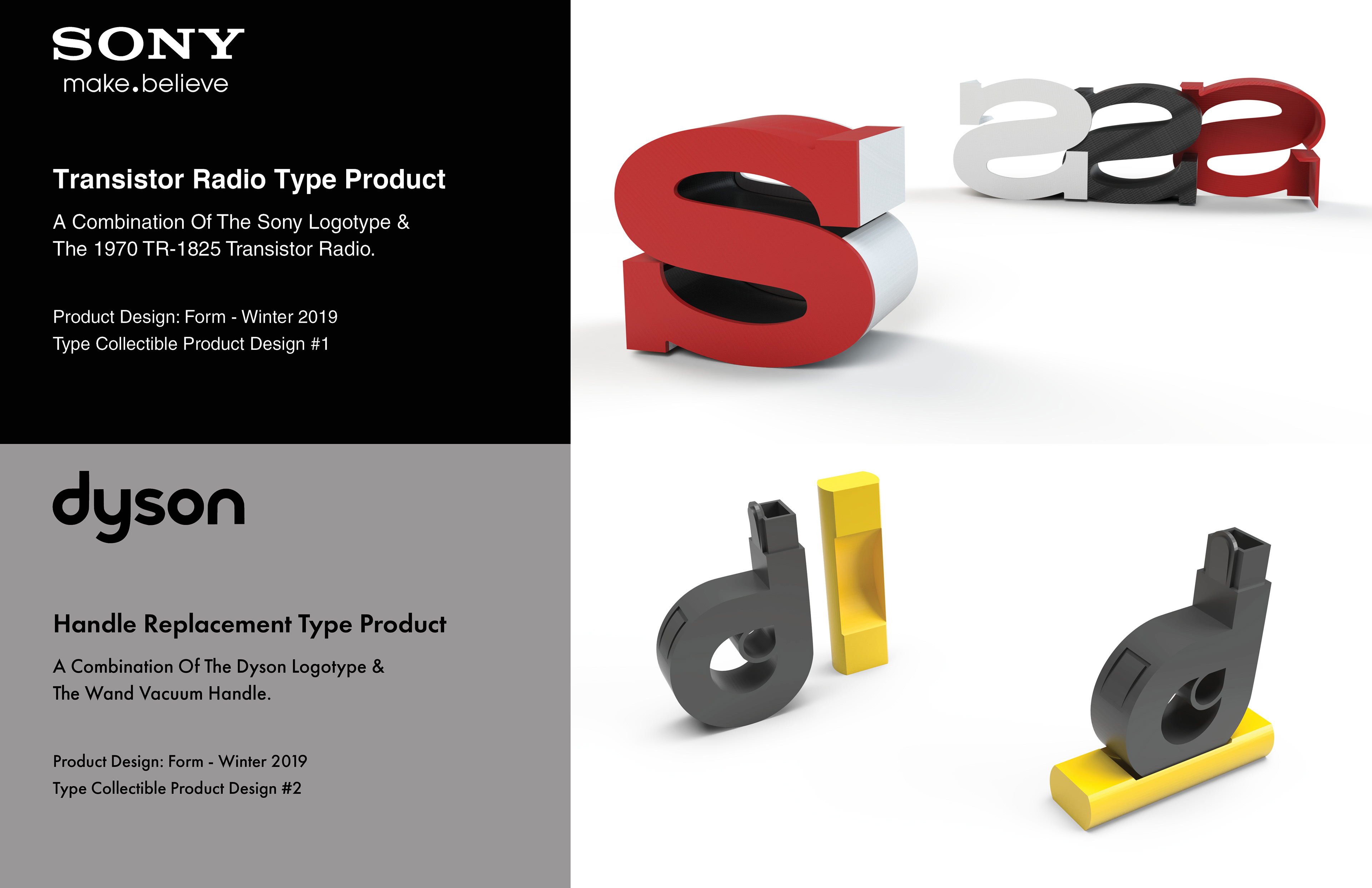
For my project I’ve decided to focus on the typographical designs used in the logotypes of famous brands. In this series of two product designs, I will be taking the first letter in the name of a given brand and extruding its exact form. In addition, it’s form will be influenced by a product the company released around the time the logo was first developed or in use.
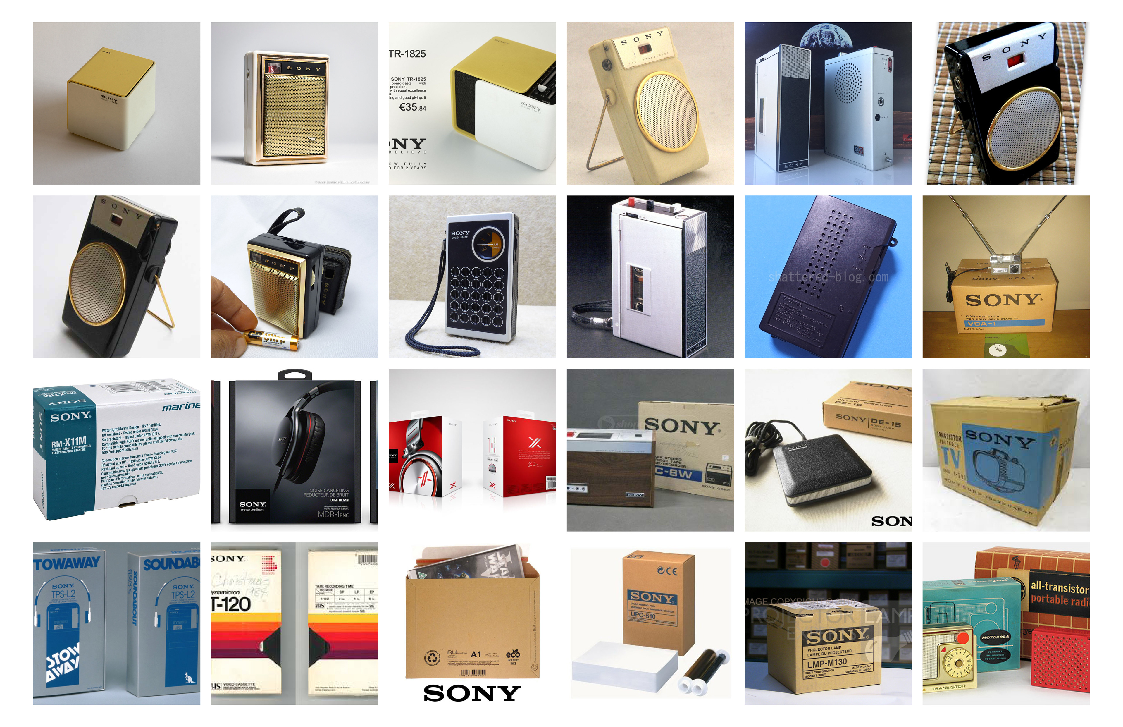
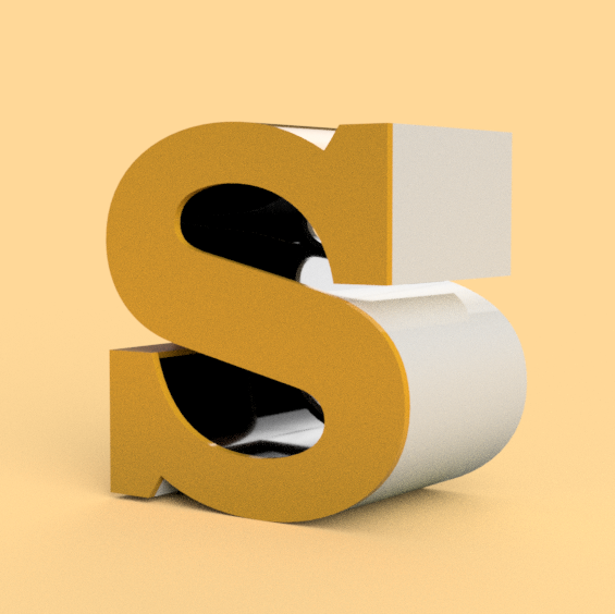
For my first design, I’ve chosen the electronics company, Sony Corporation. Their logotype uses a modified version of an Expanded Clarendon Bold. The modifications are seen specifically in the edges of the slab serifs and in the width of each glyph.
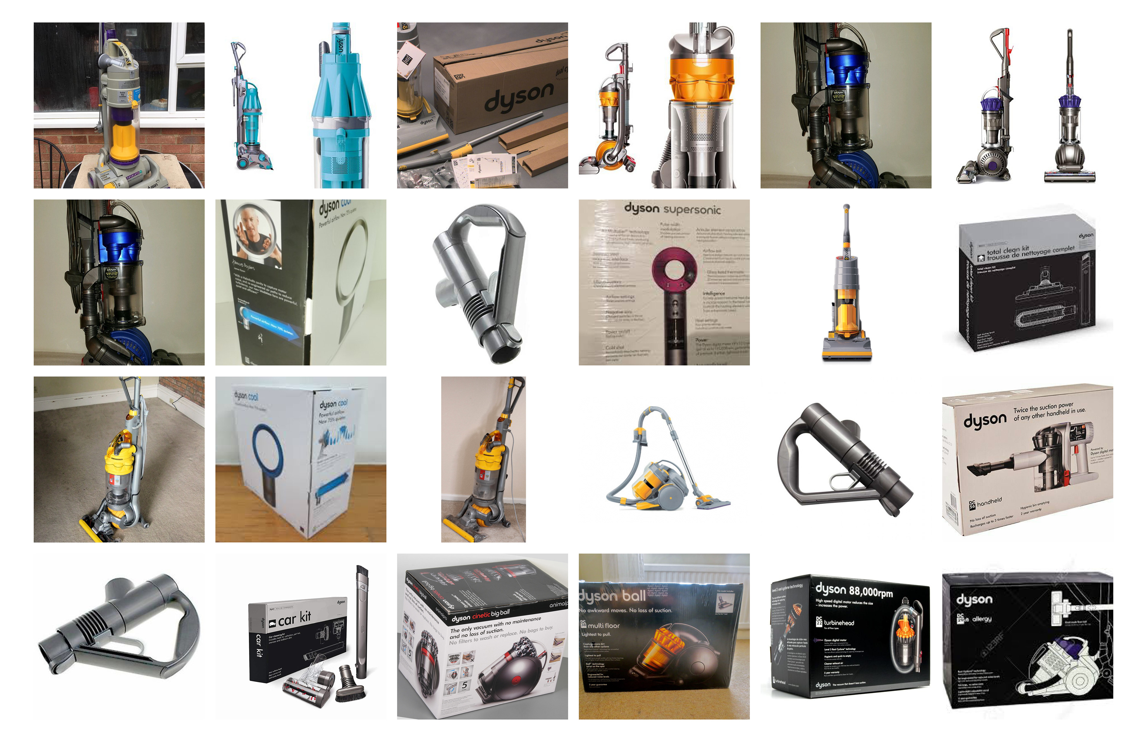
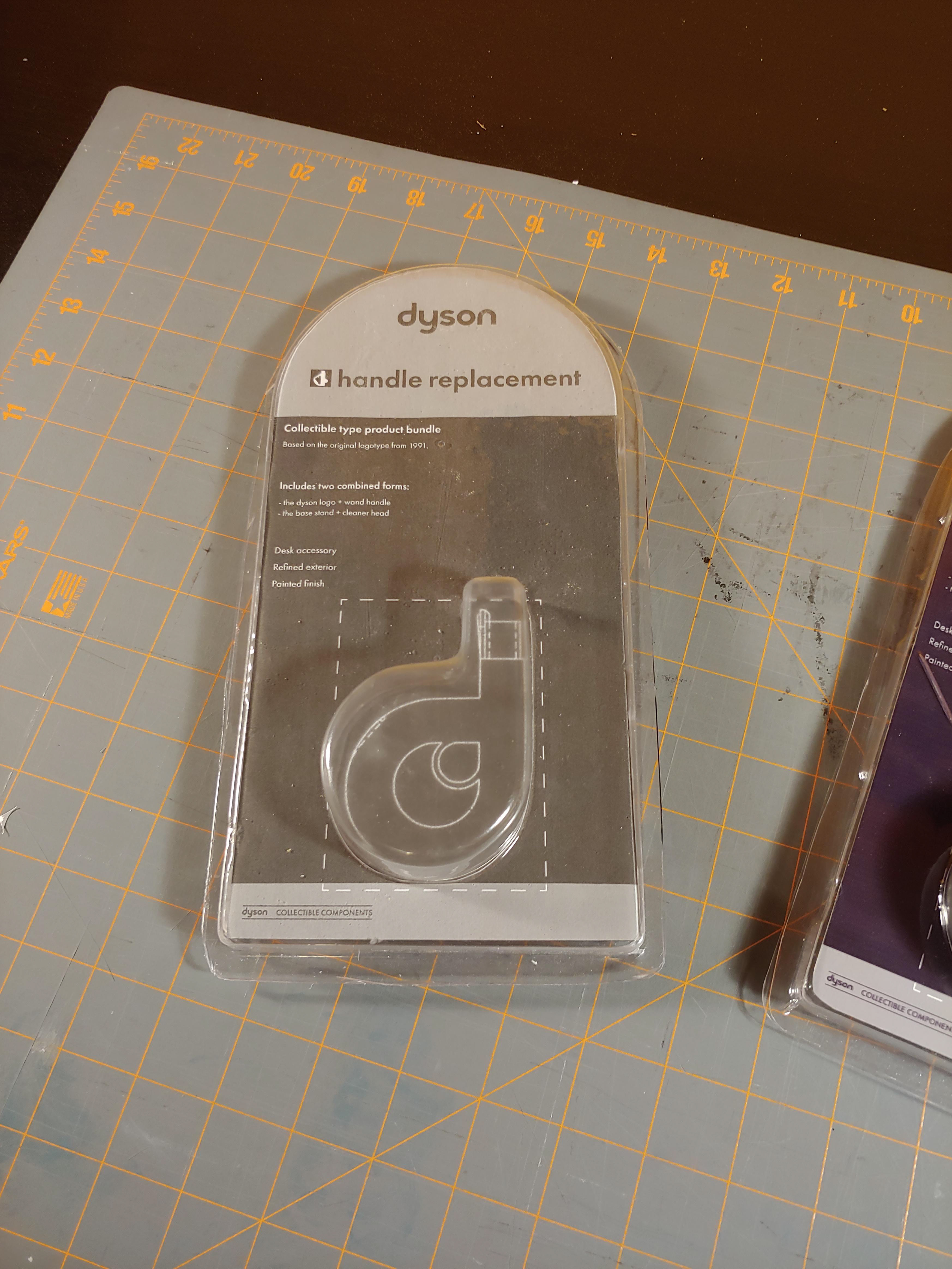
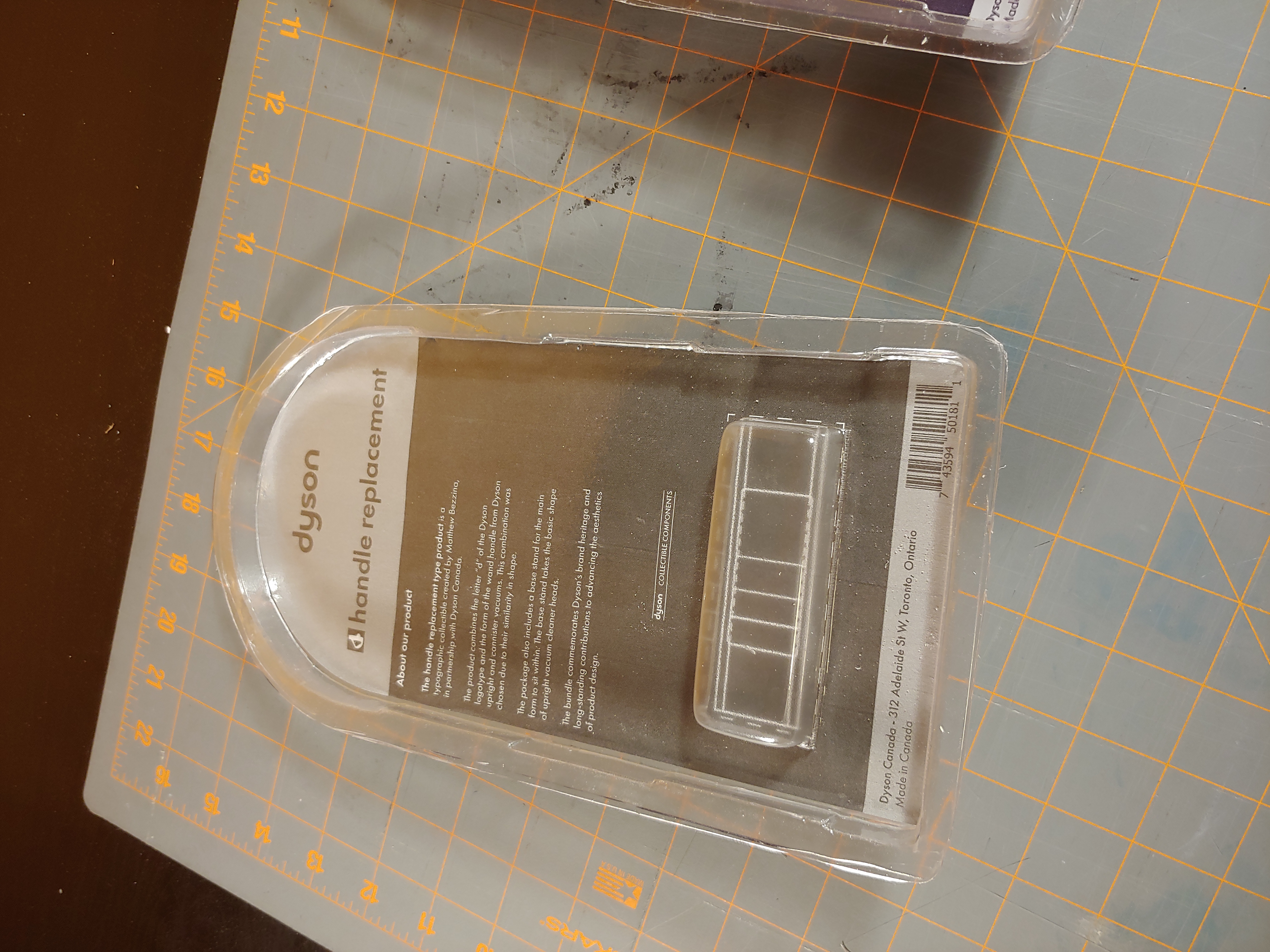
For my second design, I’ve chosen Dyson LTD. The brand uses a custom typeface as their logotype. It is possible to find similar typefaces, but most of them vary greatly from the Dyson typeface.
Physical Models and 3D Printed Drafts:
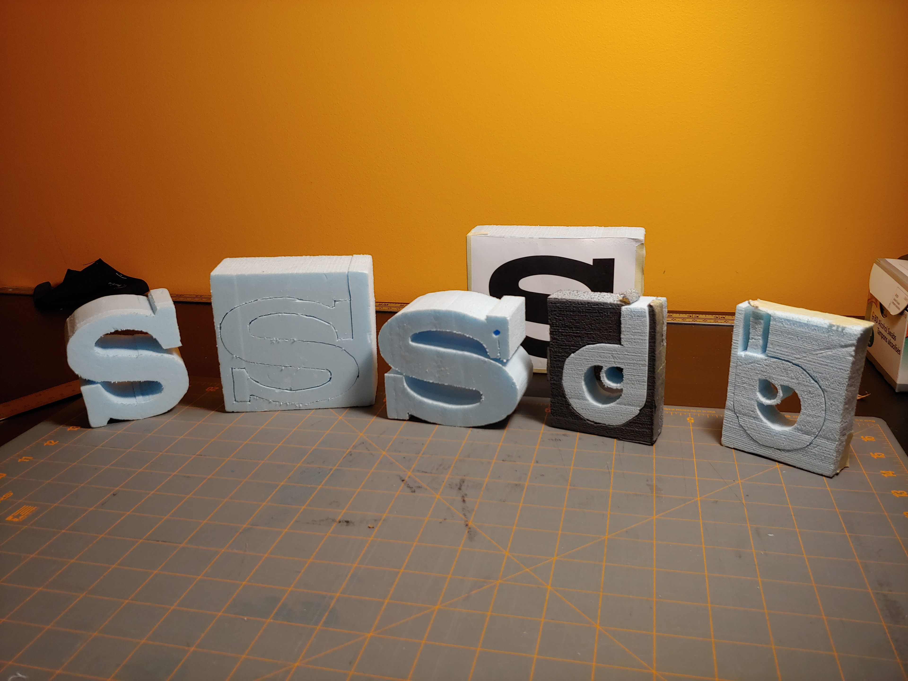
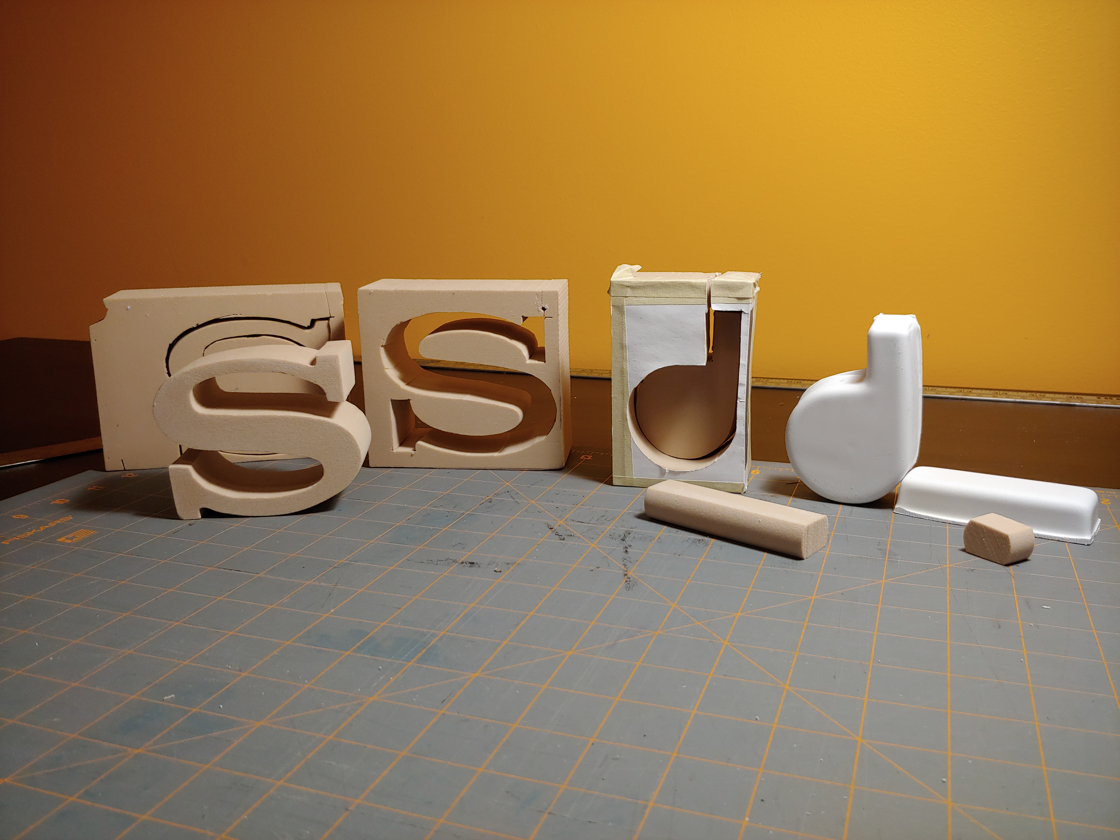
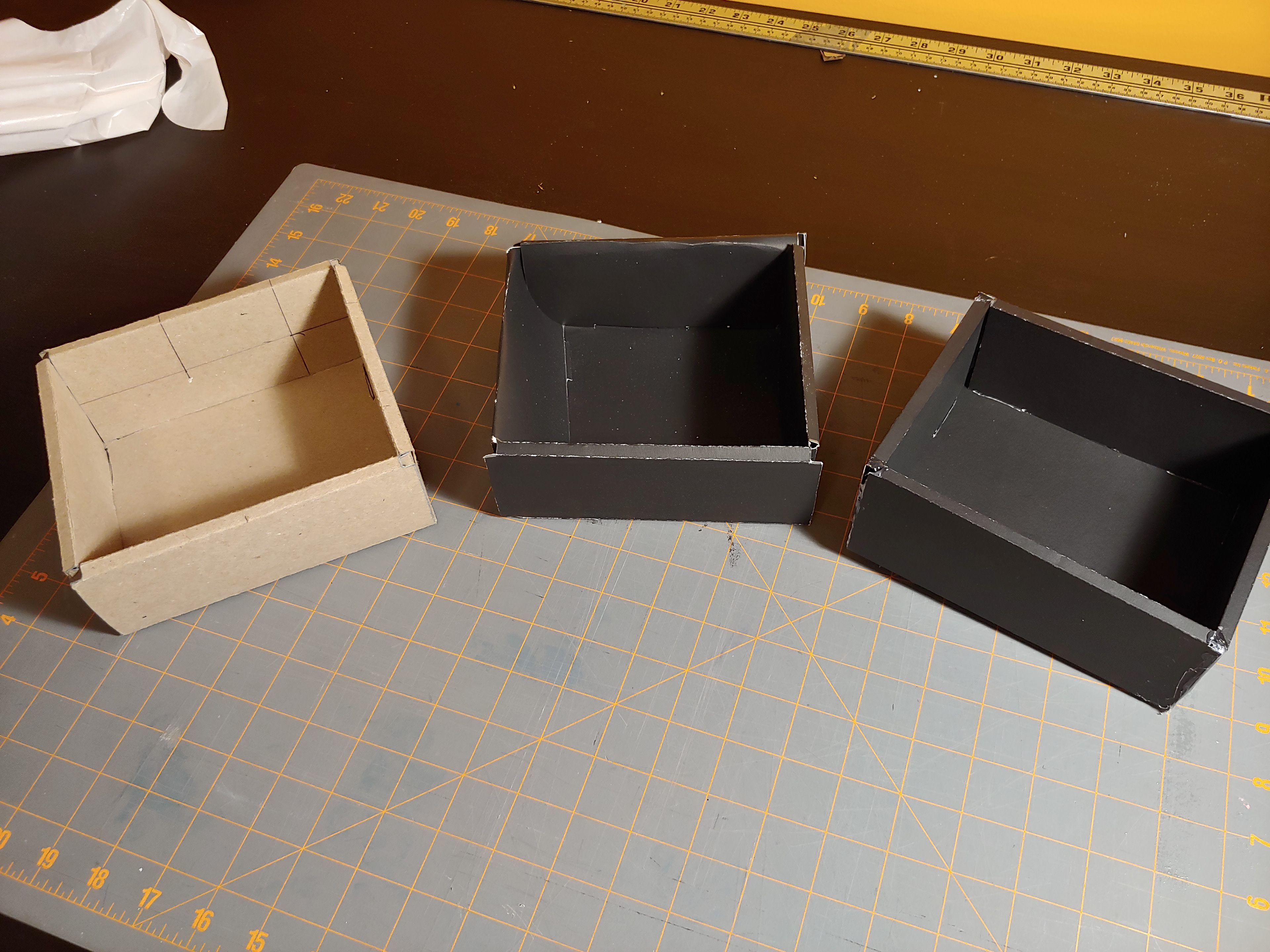
A requirement for this project was to create physical models out of both blue foam and high-density foam; this helps to train hand modelling skills. Blue foam models are basic drafts, that help to lay down the approximate size and form of the product. Once completed, high-density foam models are created.
From this point, if you are happy with your high density model, you can create a mold and cast your high density model or paint and sand the foam itself. We were also provided with the options to use wood, 3D printing or laser cutting to complete our projects.
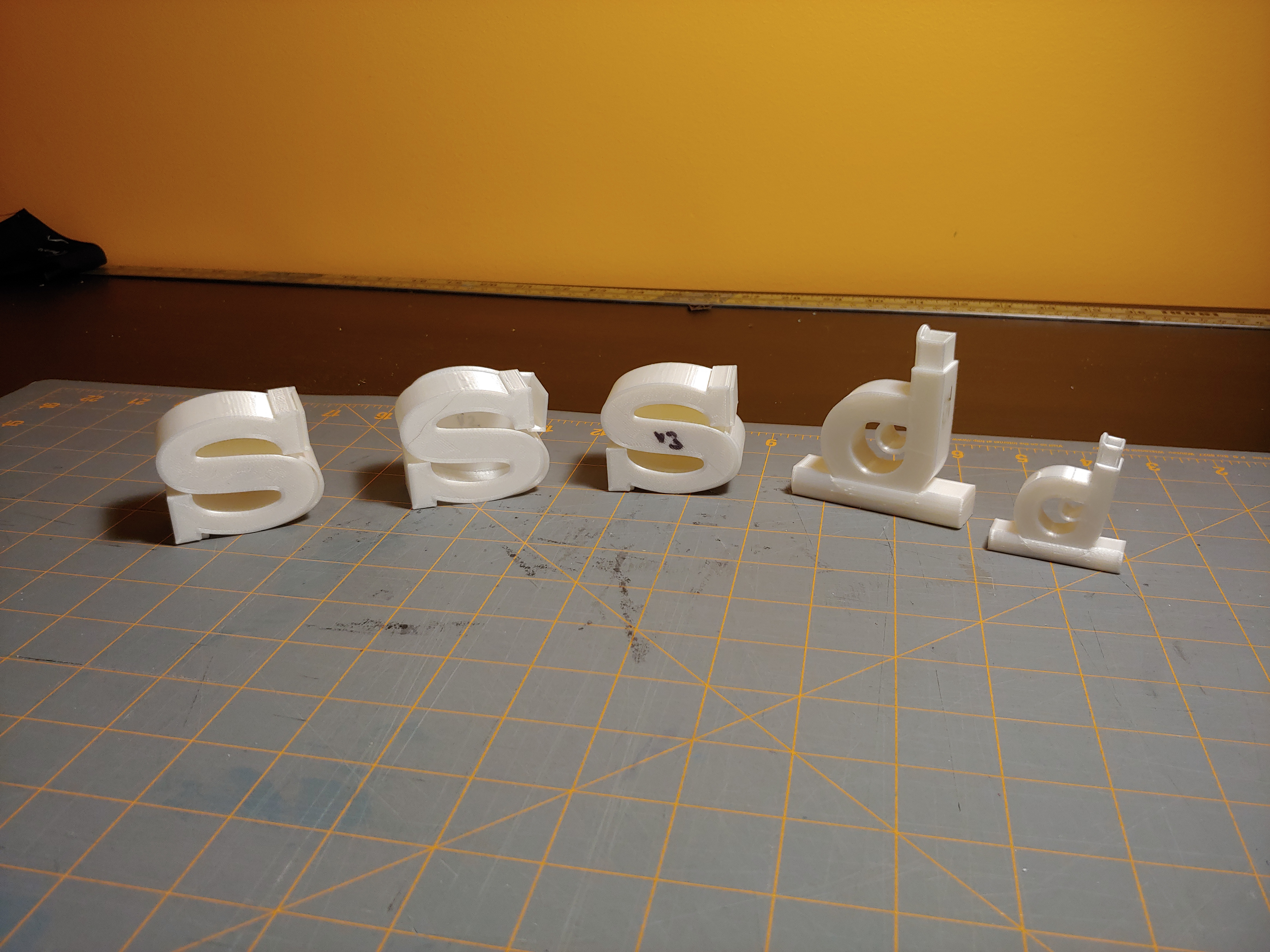
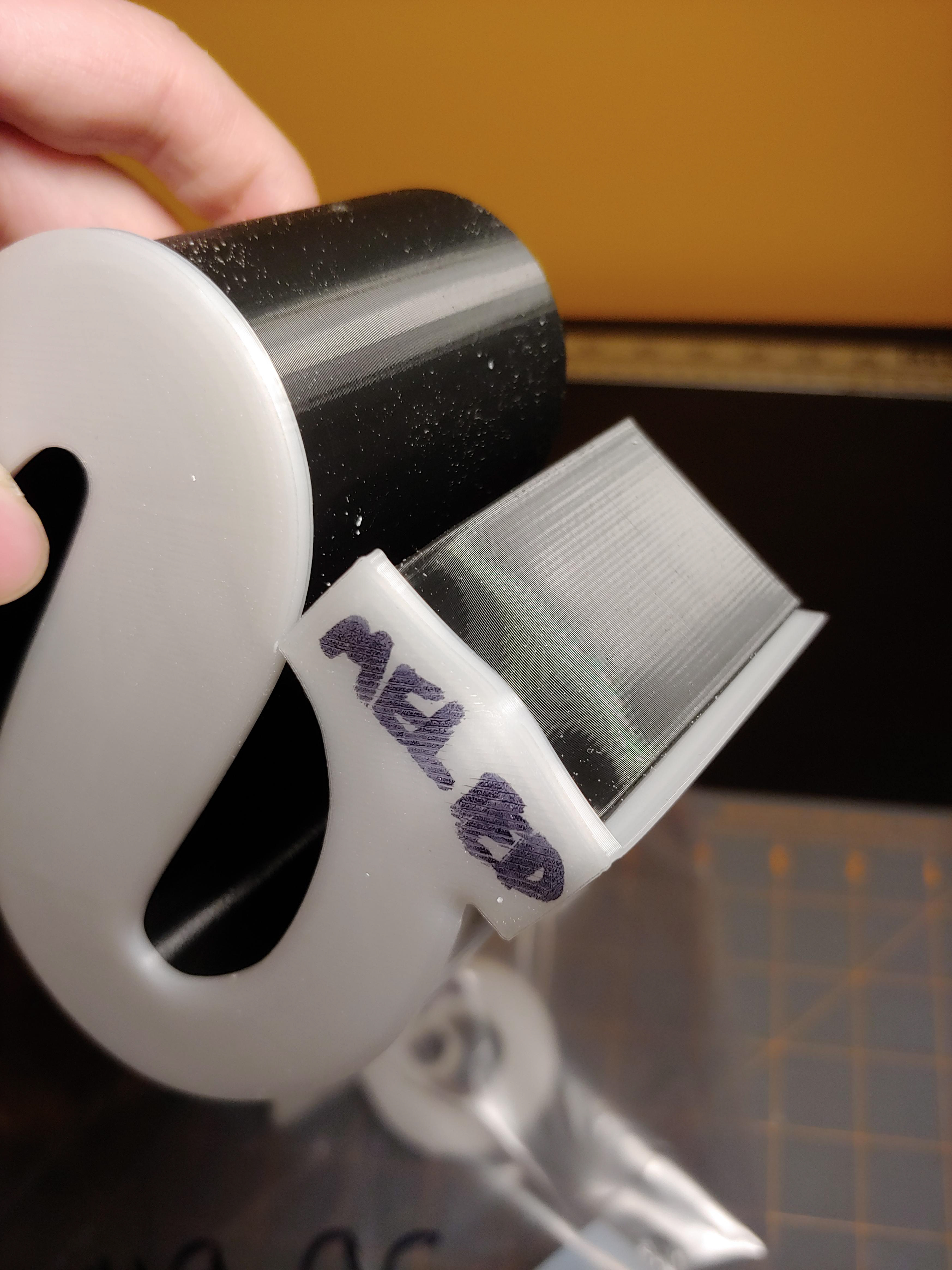
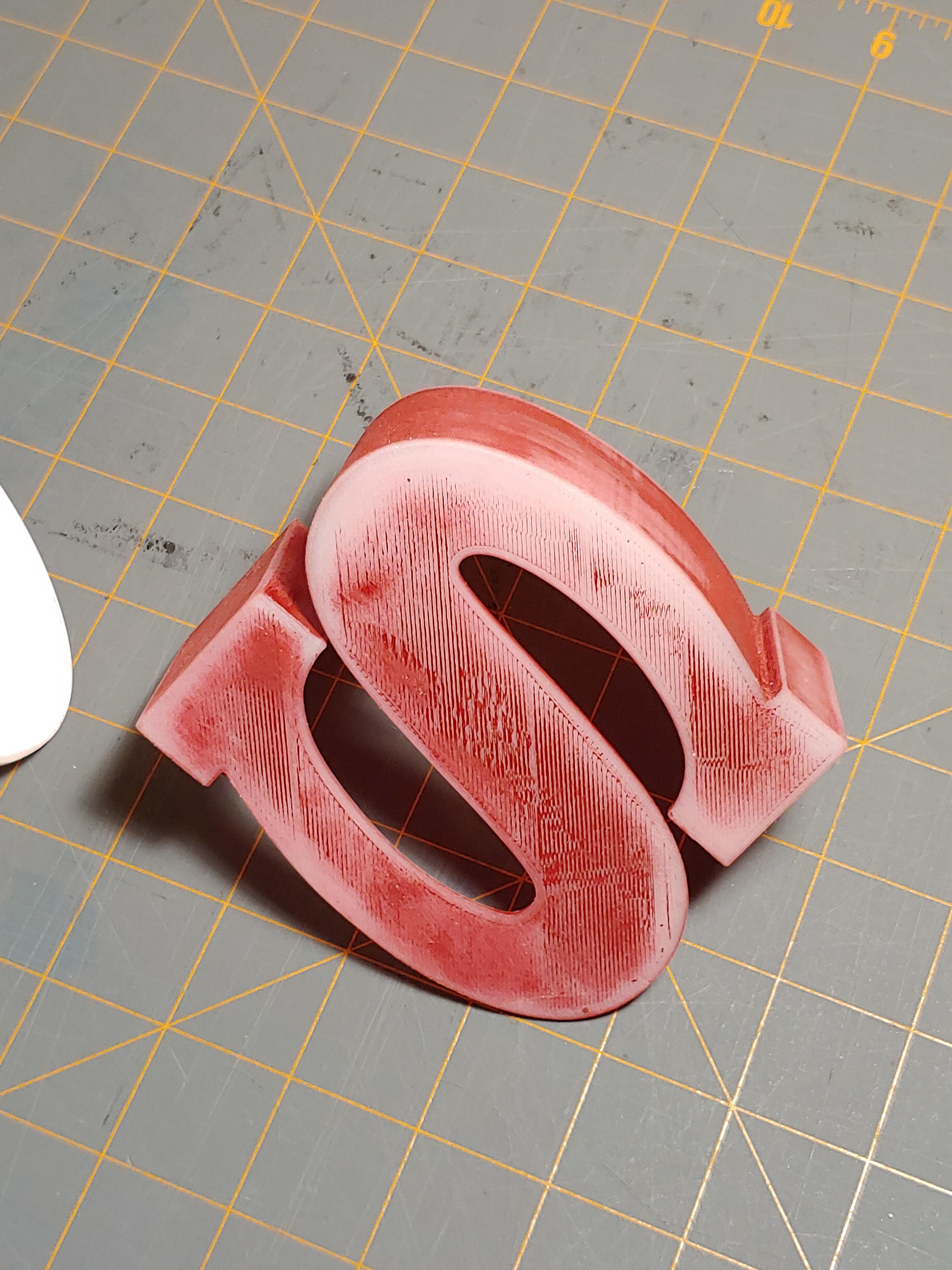
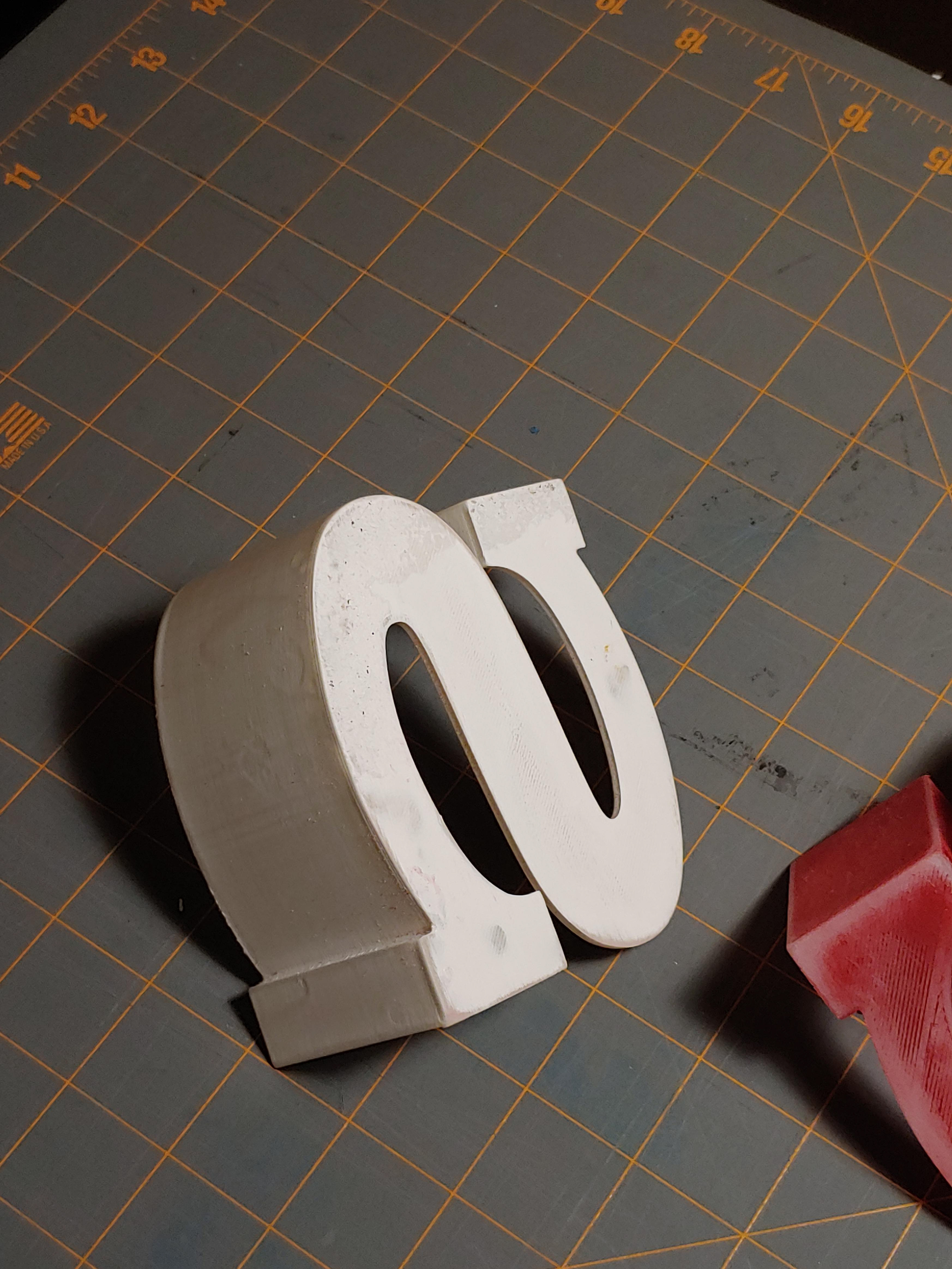
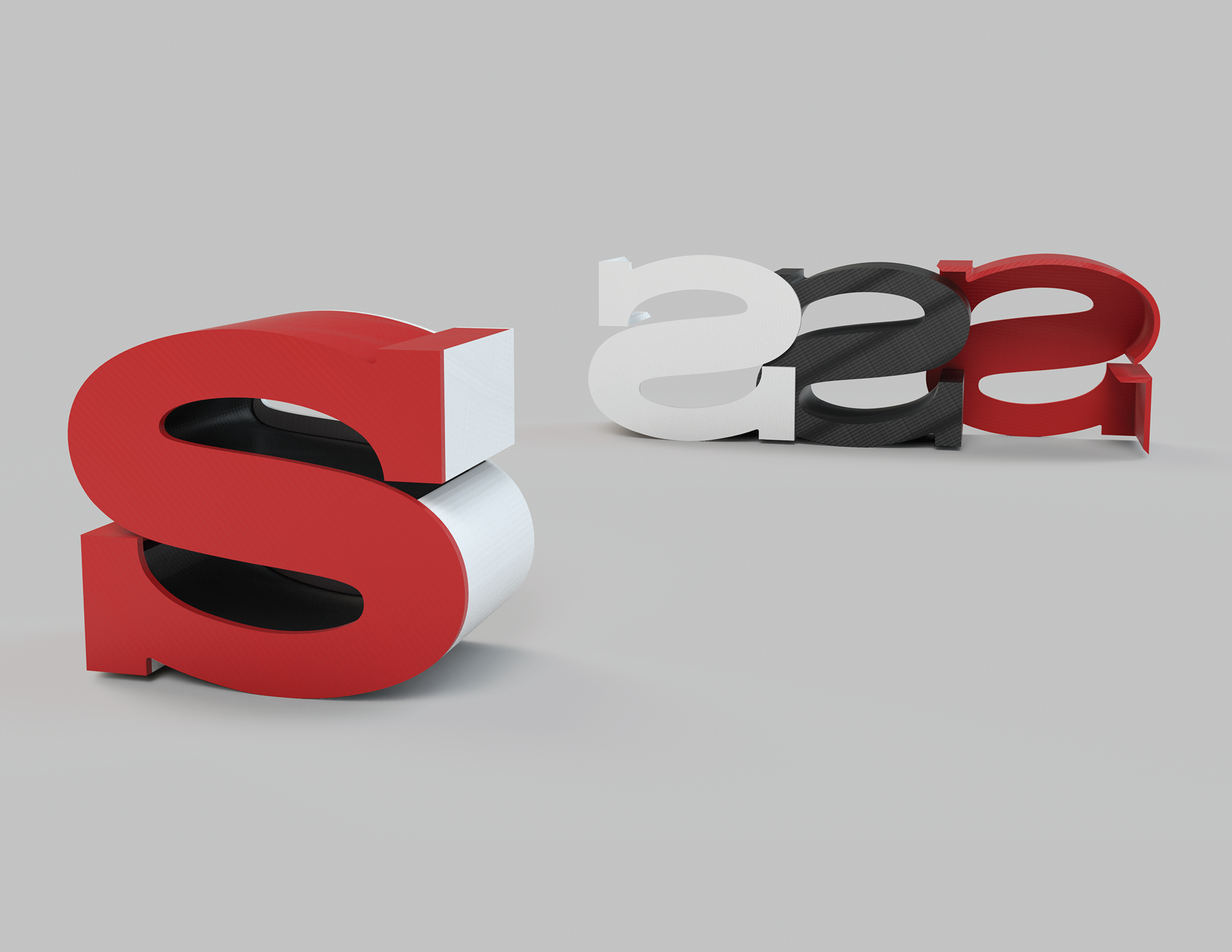
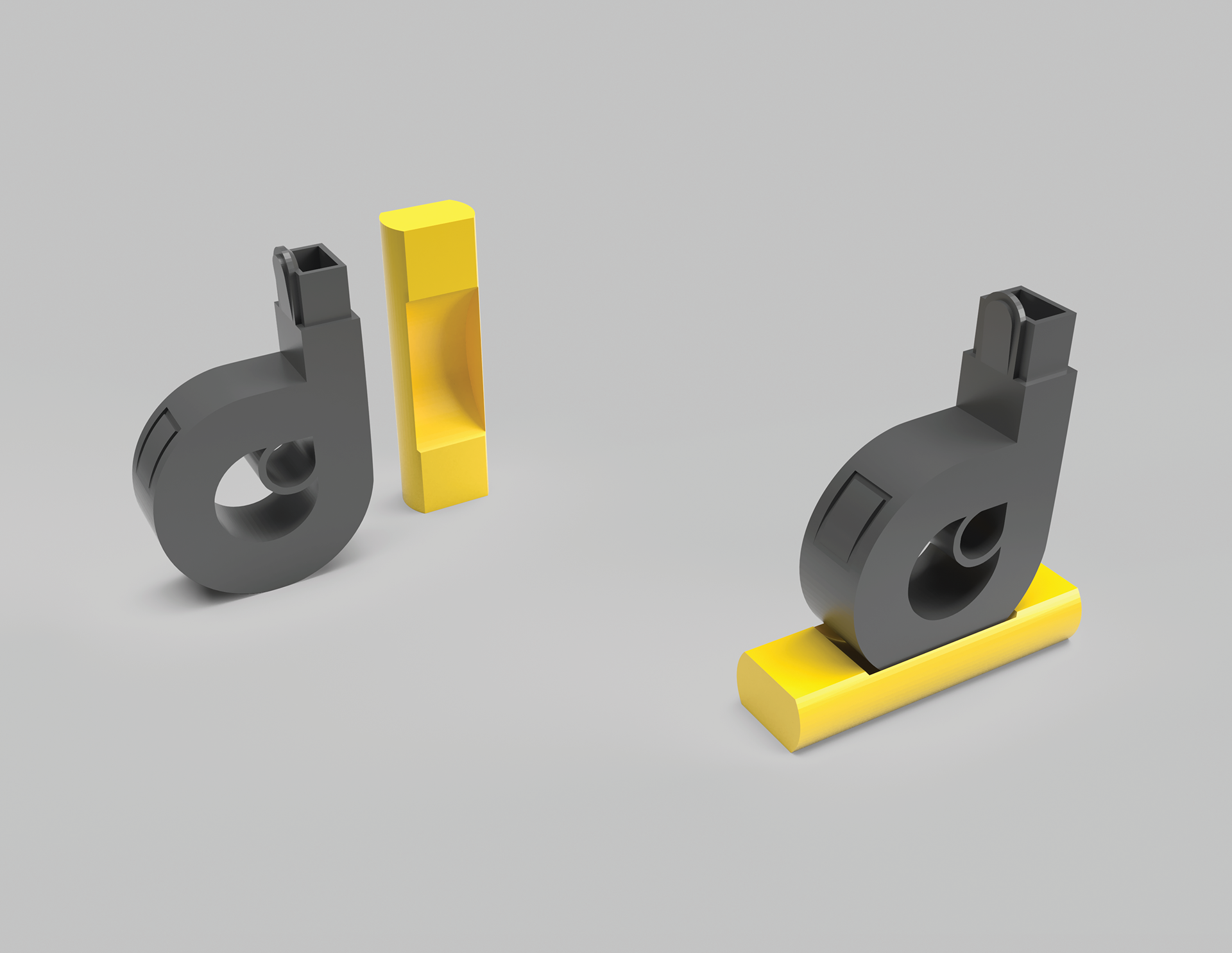
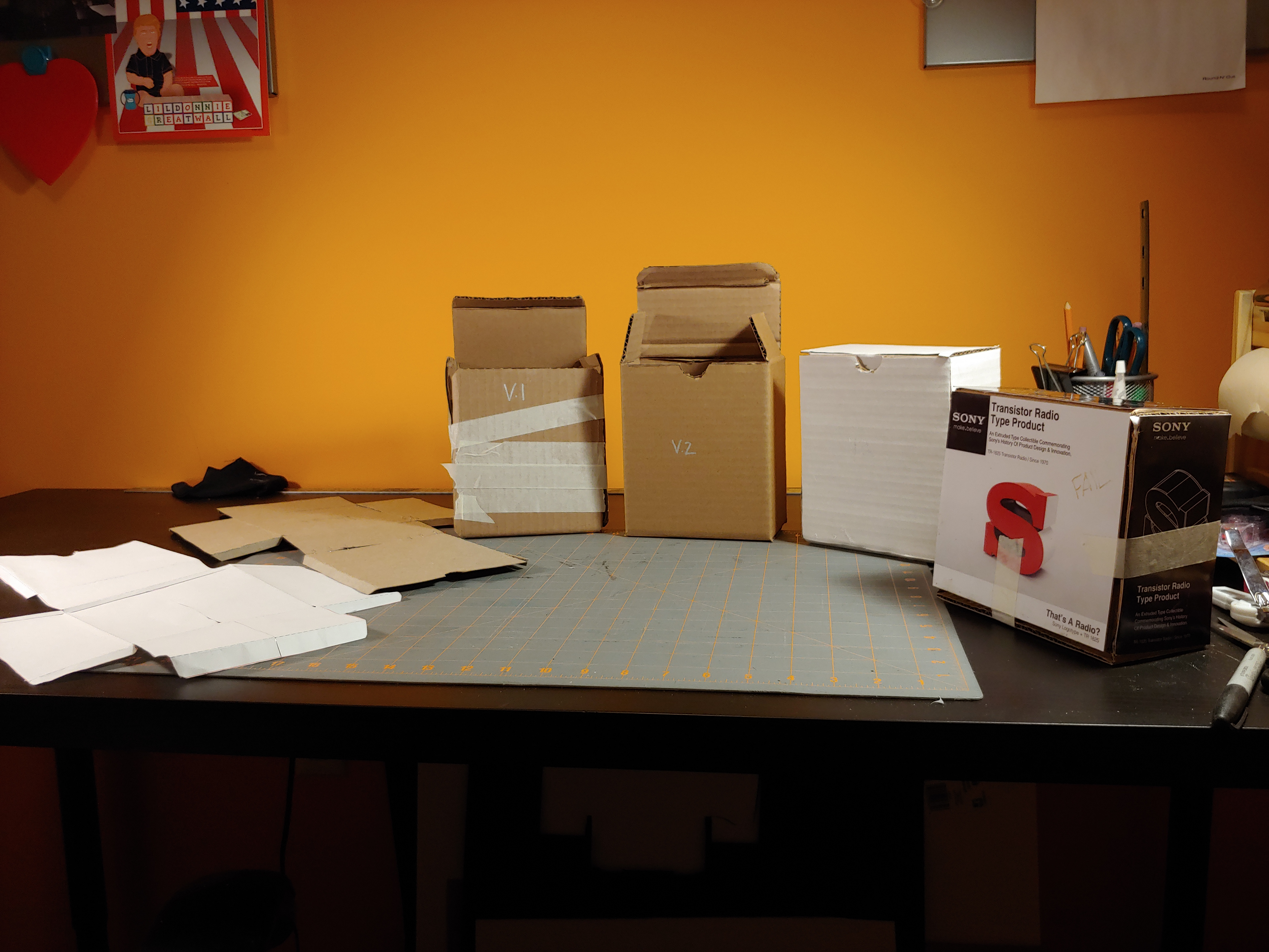
Seeing this as an opportunity to use my 3D Printer, I opted to develop 3D models in Fusion for Printing on my Ender-5 Printer. The last photo below, shows printed draft iterations, in multiple sizes.
Initial Fusion Models:
These are early 3D models that would be modified further to become the above test prints.
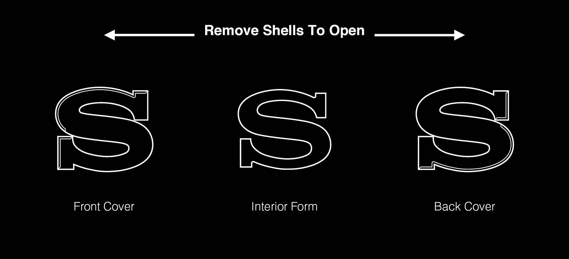
In the case of the Sony Model, I wanted to mimic the TR-1825 Radio without compromising the form of the logo. The radio would turn once opened, so I created shells to mimic the effect of opening the radio.
Contrarily on the Dyson product, I opted to modify the form to mimic the aesthetic and functions of the wand handle that is present on Upright and canister Dyson vacuums.


Printing Failures:
3D printing and finishing is by no means straight-forward. These are some examples of the obstacles that interfered with the final physical designs.
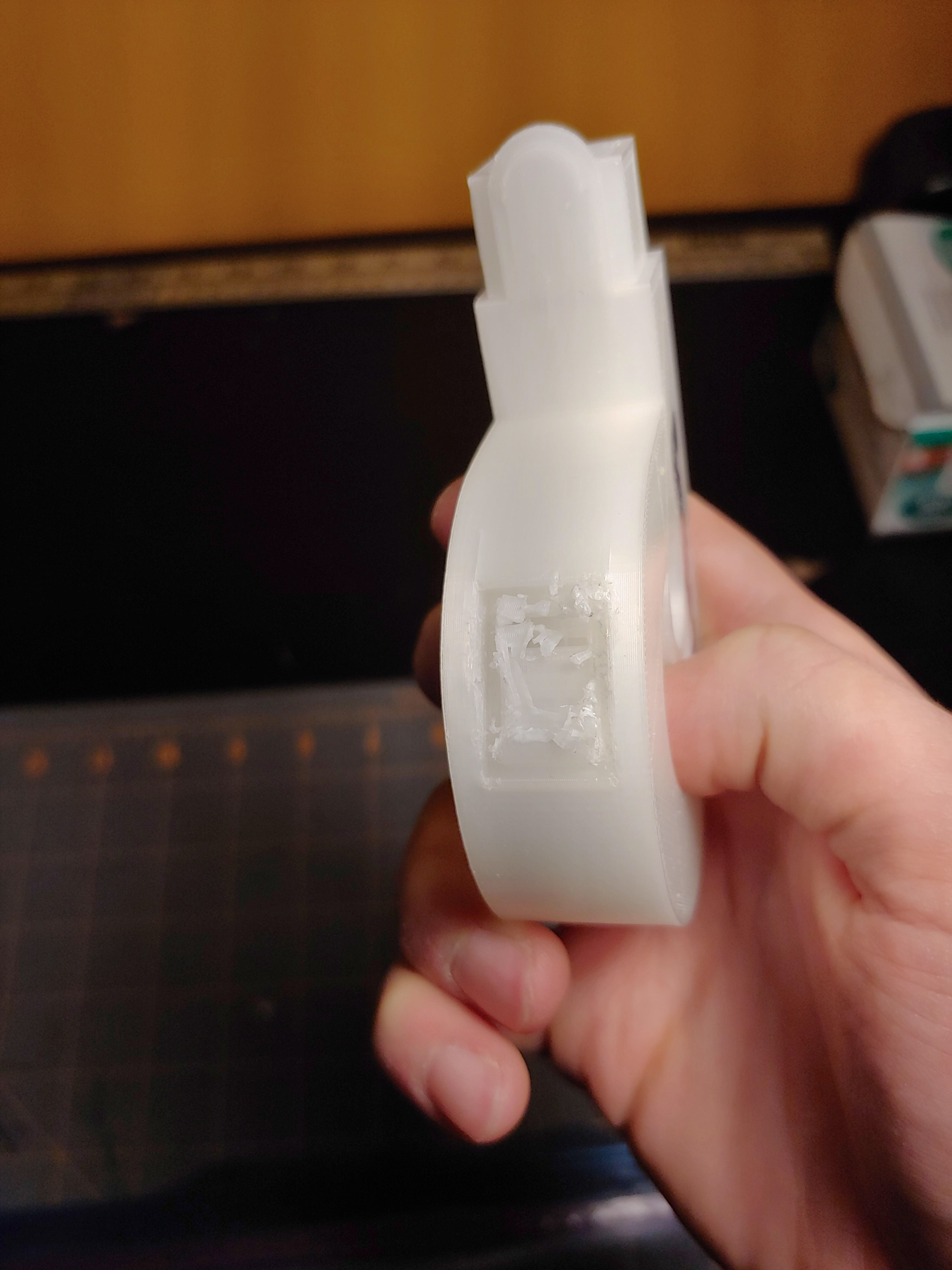
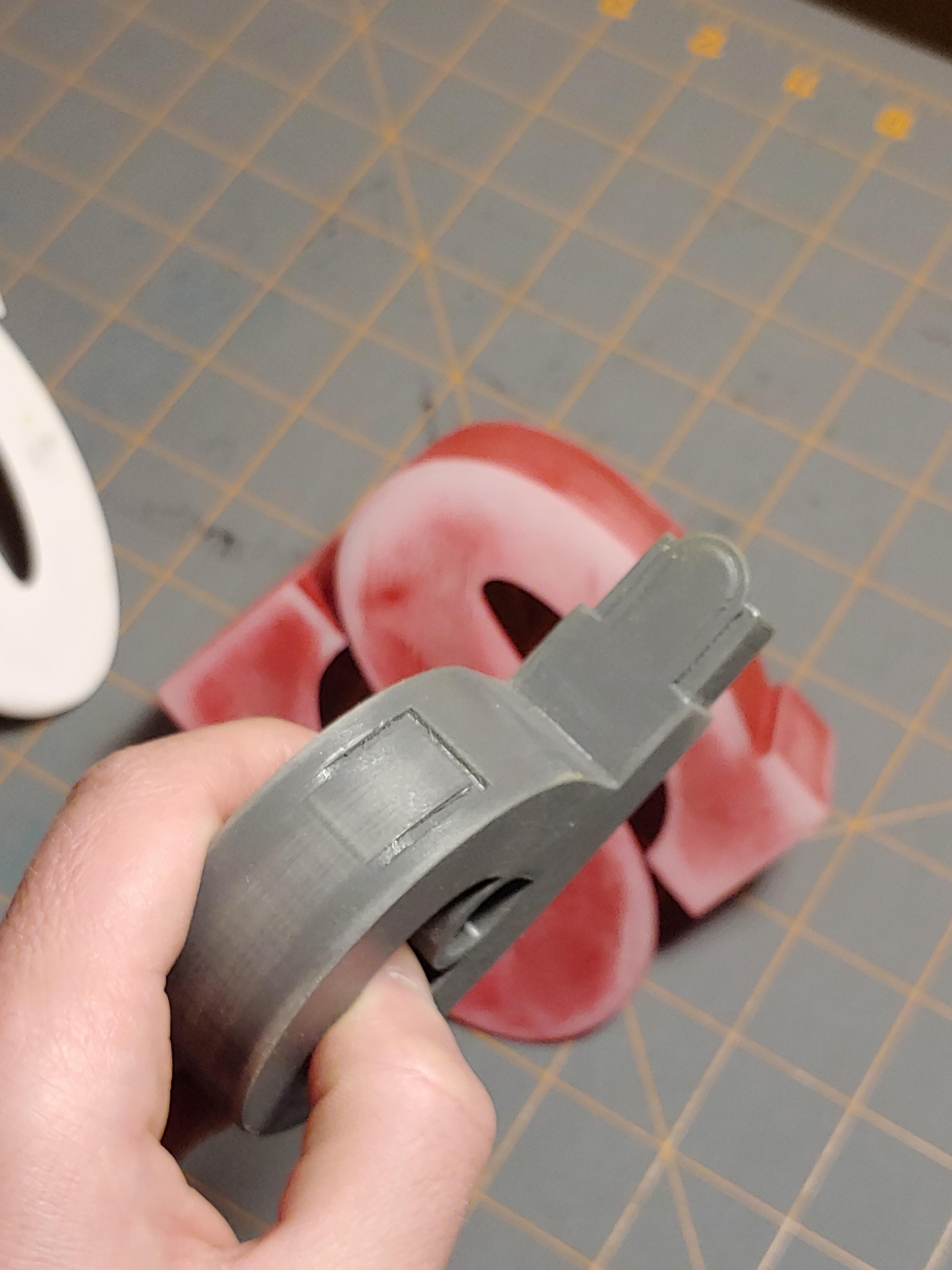
The button on the Dyson product needed support material to print properly, but the channel to remove this excess material was too small and cause the button itself to be destroyed.
The shells on the Sony product didn't fit perfectly due to slight tolerance issues and heat warping. I attempted to heat the shell to fit more flush, but I left it on the heat for too long, causing the plastic to melt and bend undesirably.
After printing both full sized products with the proper modifications, I sanded them down smooth (or as much as I could. I then applied a "heavy" layer of spray paint, thinking that I could also use it for gap filling, and would be able to re-sand the prints to my likely. This was obviously not the right decision and forced me to reprint all my parts.
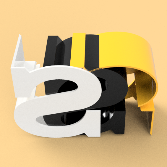
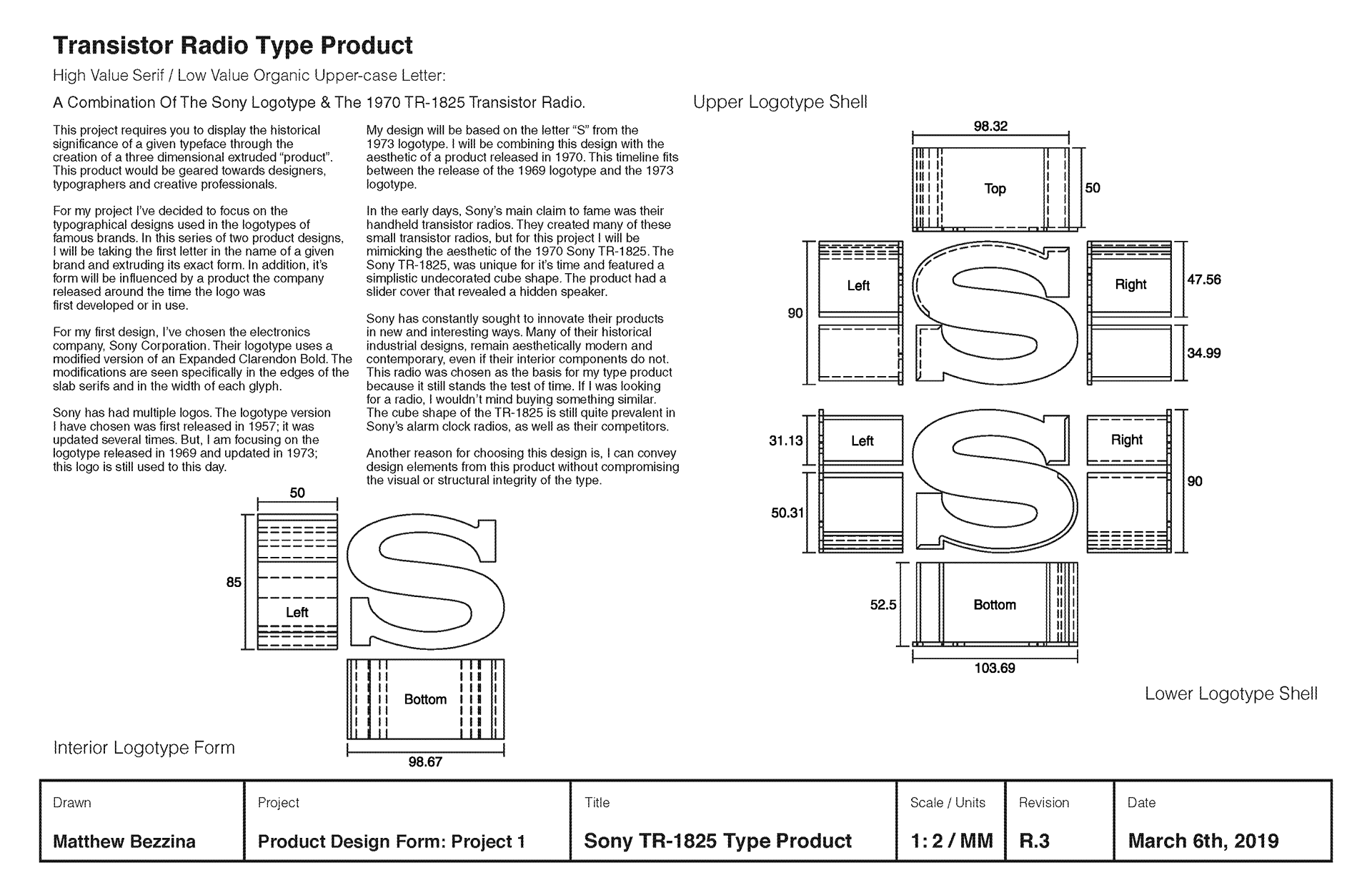
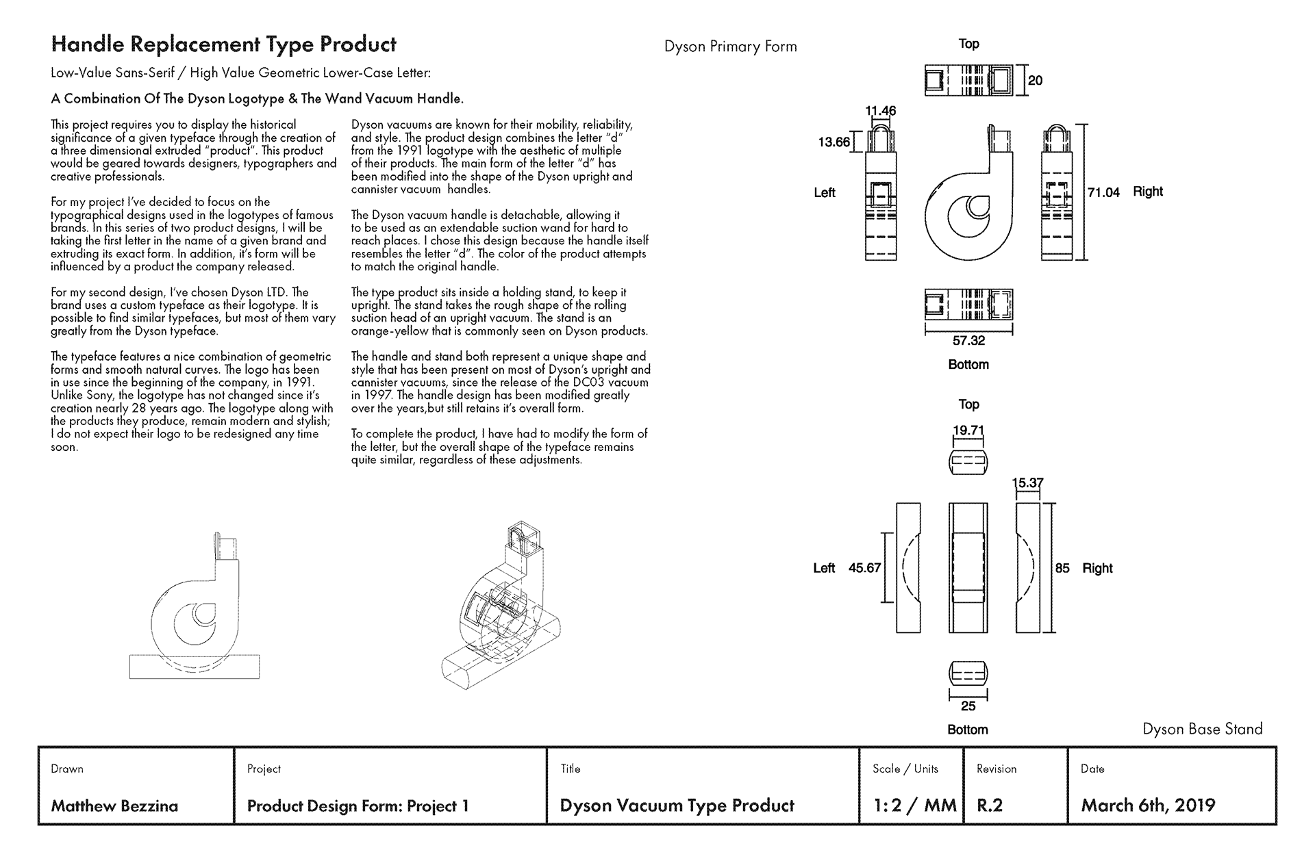
Technical Drawings:
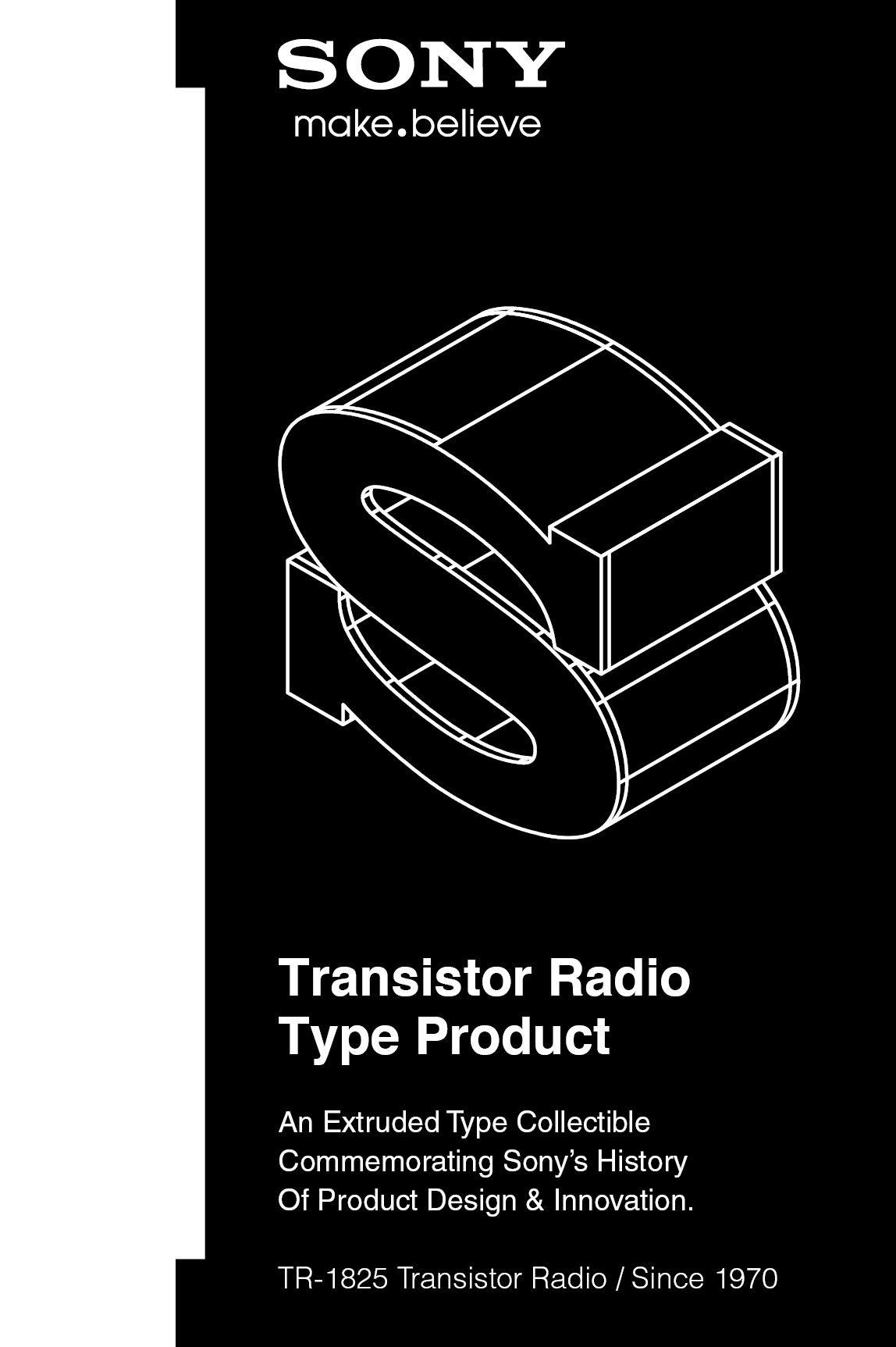
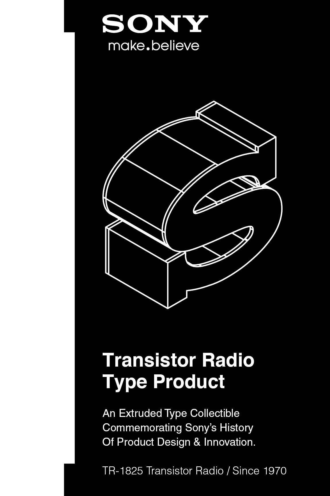
Below are diagrams, that display the construction of both products and some important information, if you have time feel free to read and look at them.
Final 3D Renderings & Significance:
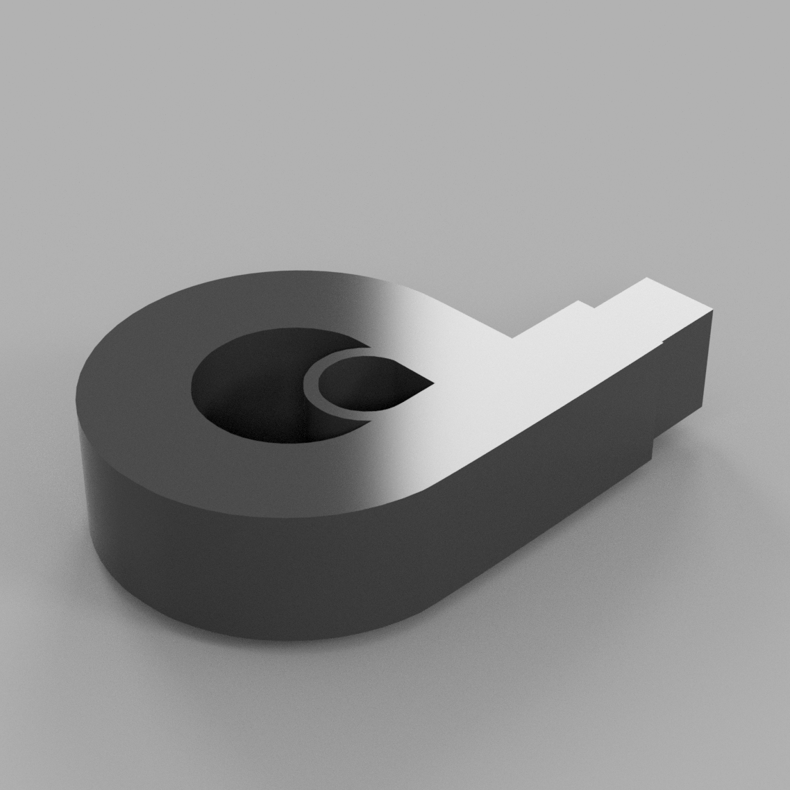
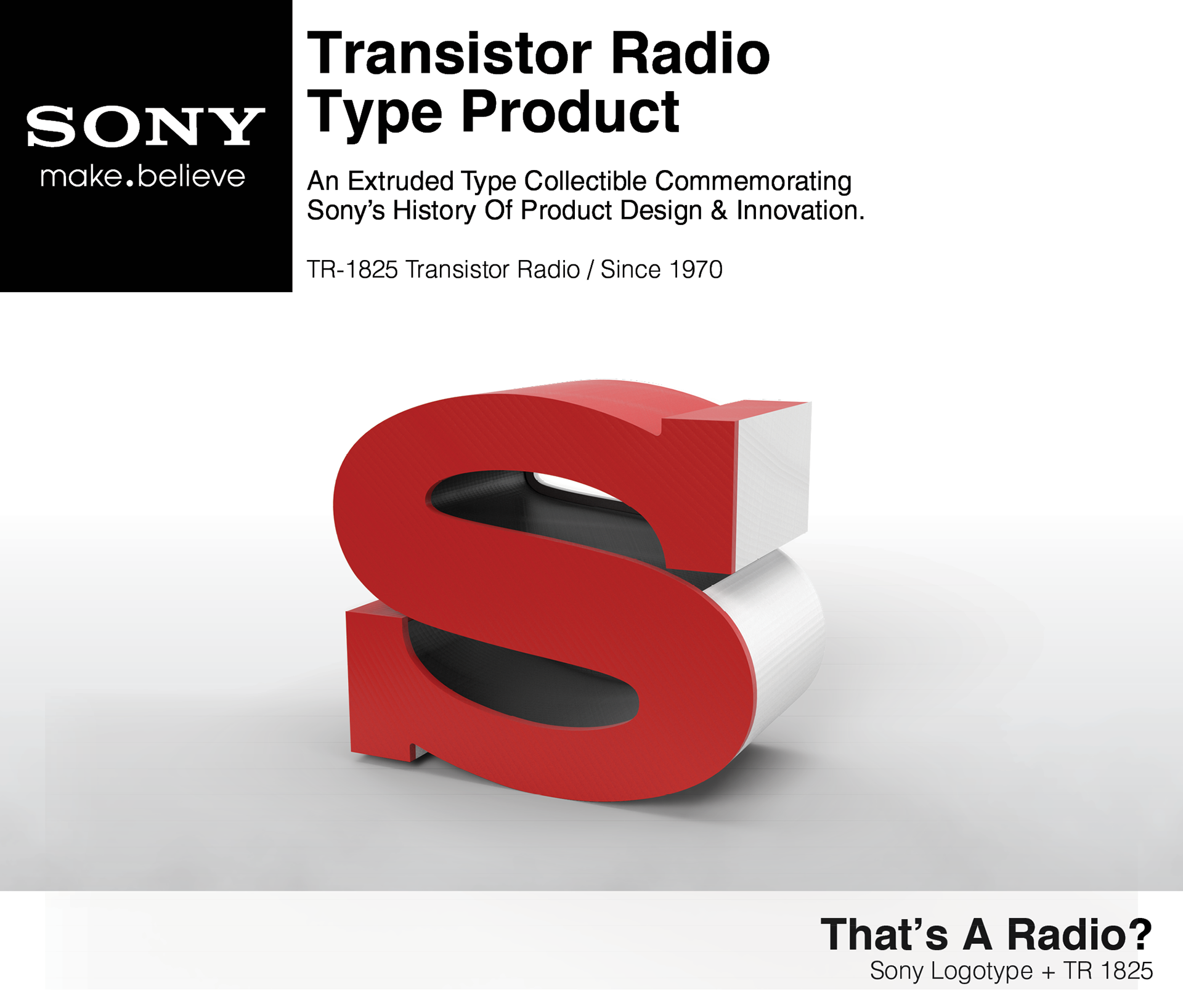
Sony: My design is based on the letter “S” from the 1973 logotype. I will combined this design with the aesthetic of a product released in 1970. This timeline fits between the release of the 1969 logotype and the 1973 logotype.
In the early days, Sony’s main claim to fame was their handheld transistor radios. They created many of these small transistor radios, but for this project I will be mimicking the aesthetic of the 1970 Sony TR-1825. The Sony TR-1825, was unique for it’s time and featured a simplistic undecorated cube shape. The product had a slider cover that revealed a hidden speaker.
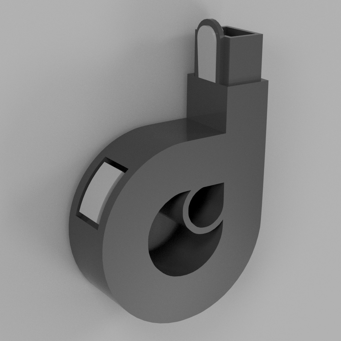
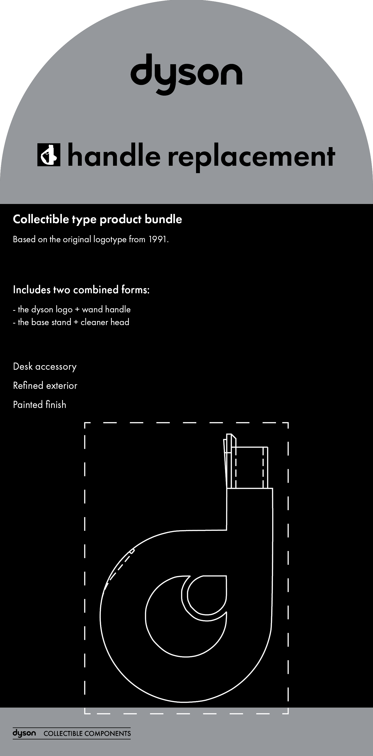
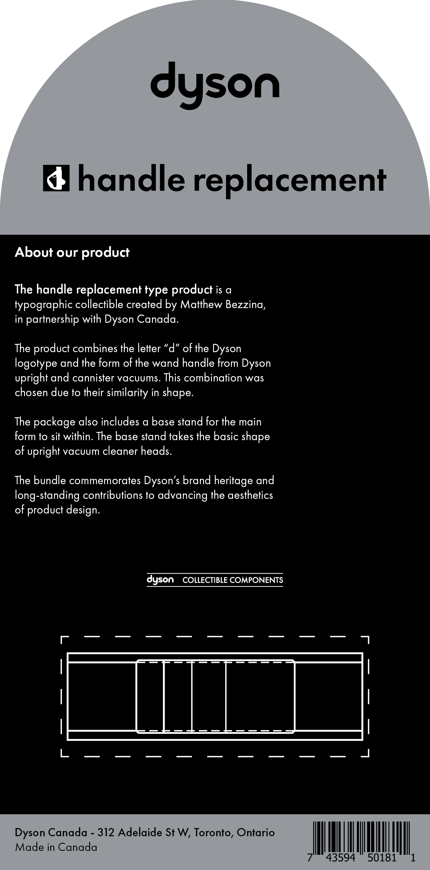
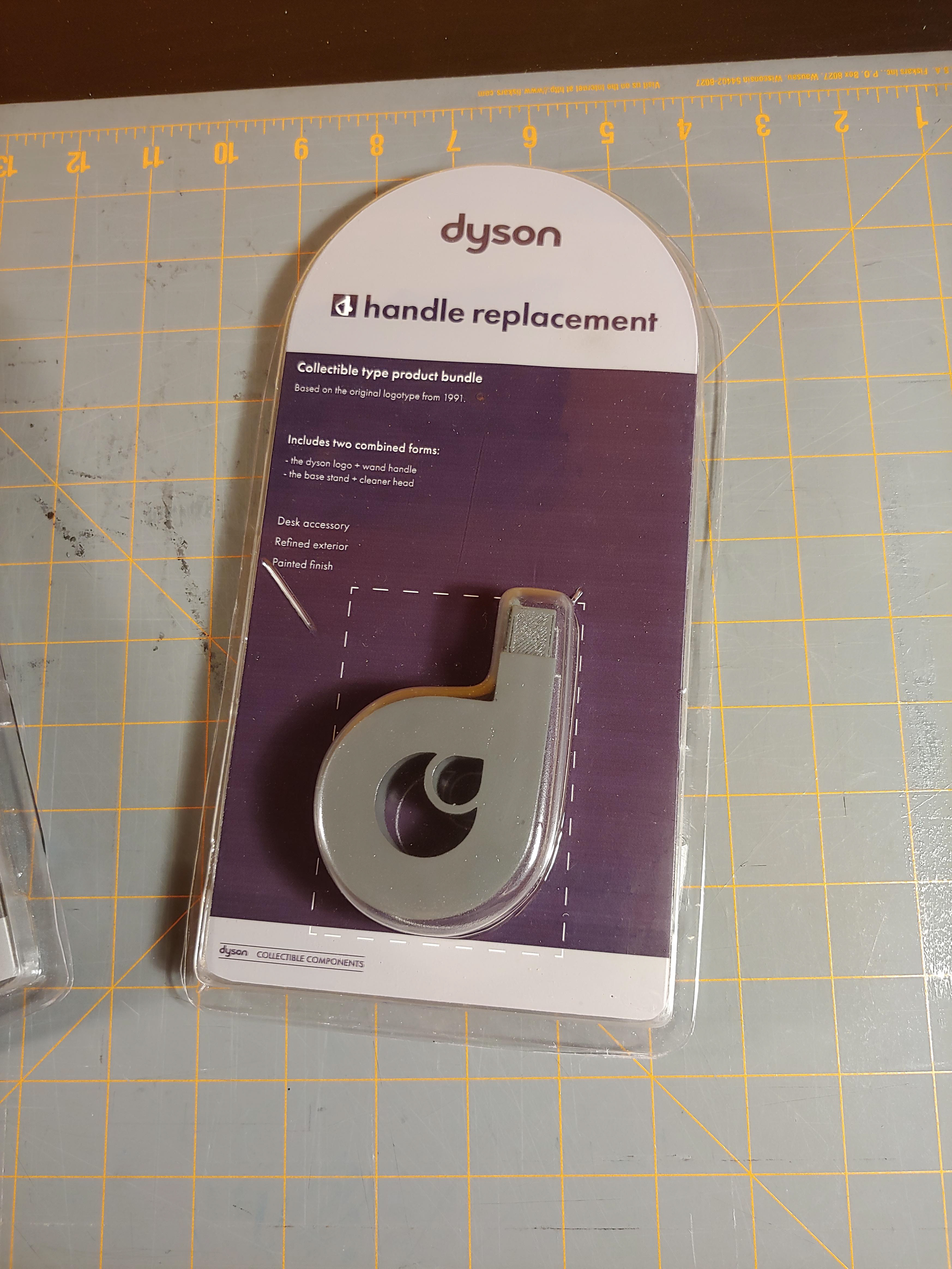
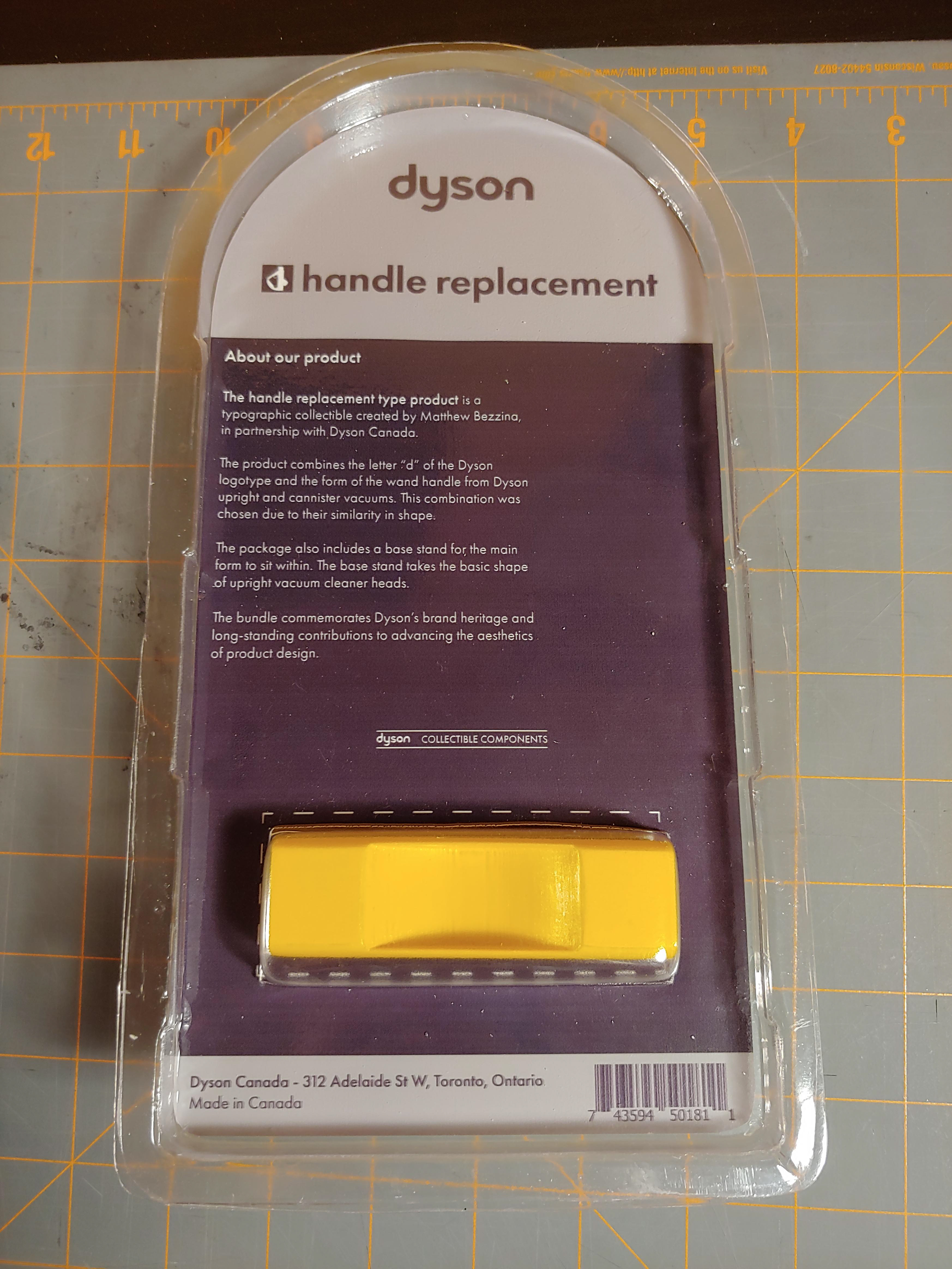
Dyson: Dyson vacuums are known for their mobility, reliability, and style. The product design combines the letter “d” from the 1991 logotype with the aesthetic of multiple of their products. The main form of the letter “d” has been modified into the shape of the Dyson upright and canister vacuum handles.
The Dyson vacuum handle is detachable, allowing it to be used as an extendable suction wand for hard to reach places. I chose this design because the handle itself resembles the letter “d”. The color of the product attempts to match the original handle.
The Dyson vacuum handle is detachable, allowing it to be used as an extendable suction wand for hard to reach places. I chose this design because the handle itself resembles the letter “d”. The color of the product attempts to match the original handle.
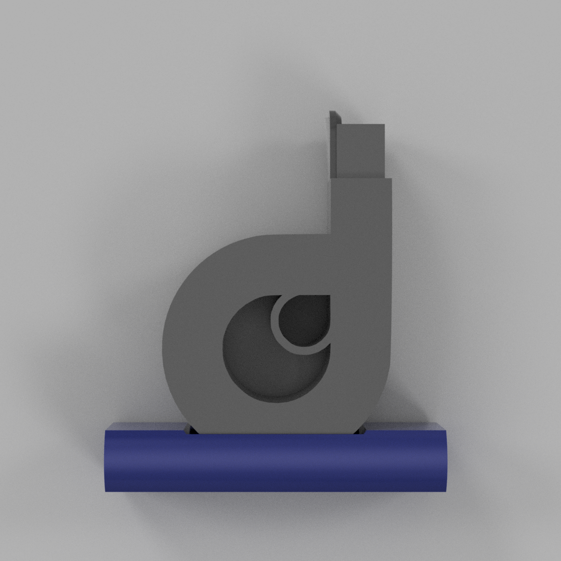
The type product sits inside a holding stand, to keep it upright. The stand takes the rough shape of the rolling suction head of an upright vacuum. The stand is an orange-yellow that is commonly seen on Dyson products.
Packaging Development:
As apart of developing a product, we were required to design and fabricate packaging. With help from the plastic shop director, I made a padded nest for my final Sony product and a vacuum-formed shell, for the Dyson vacuum handle product.
At home, I created a box and developed graphics that fit the brand, the products were developed for.
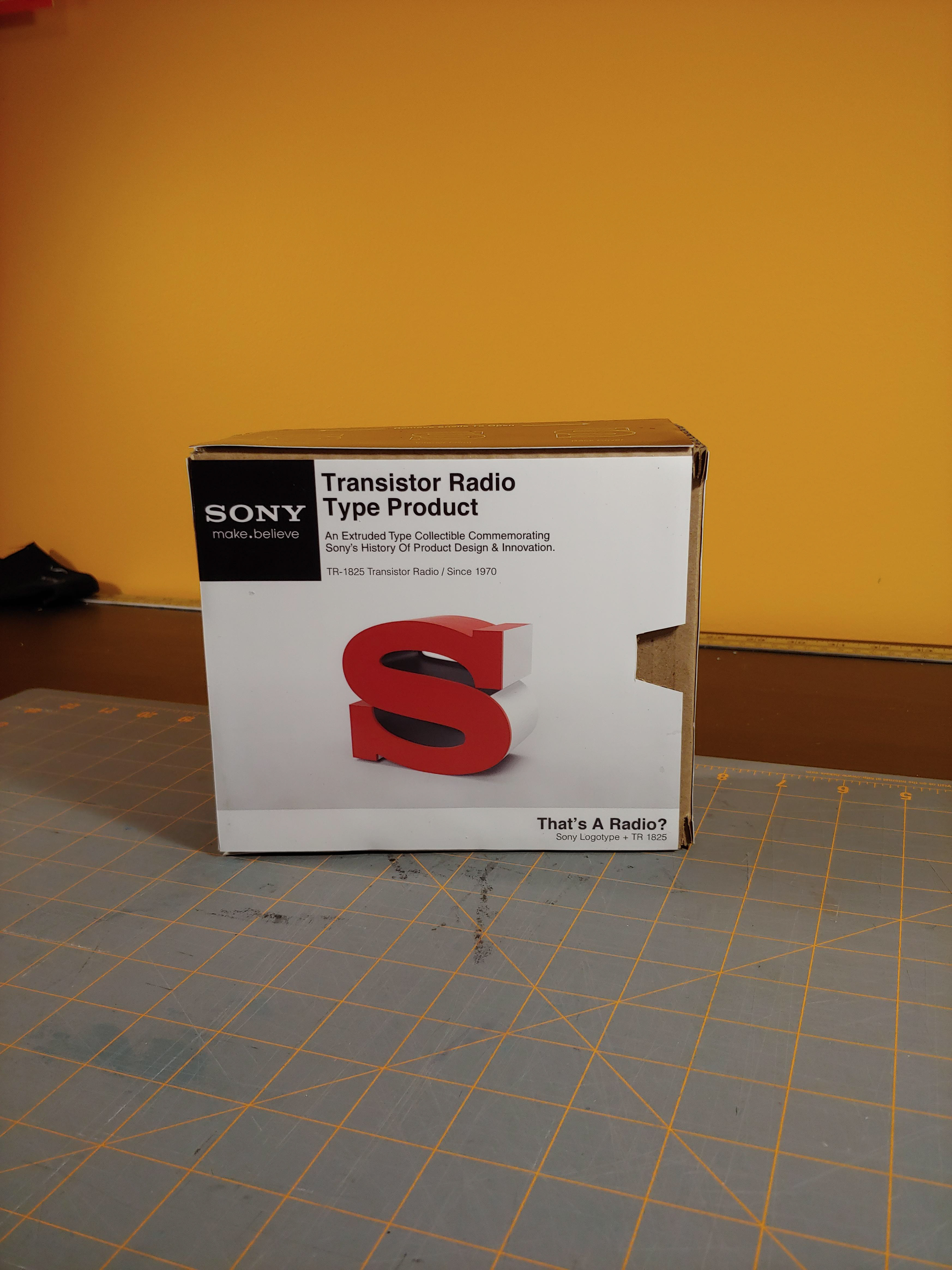
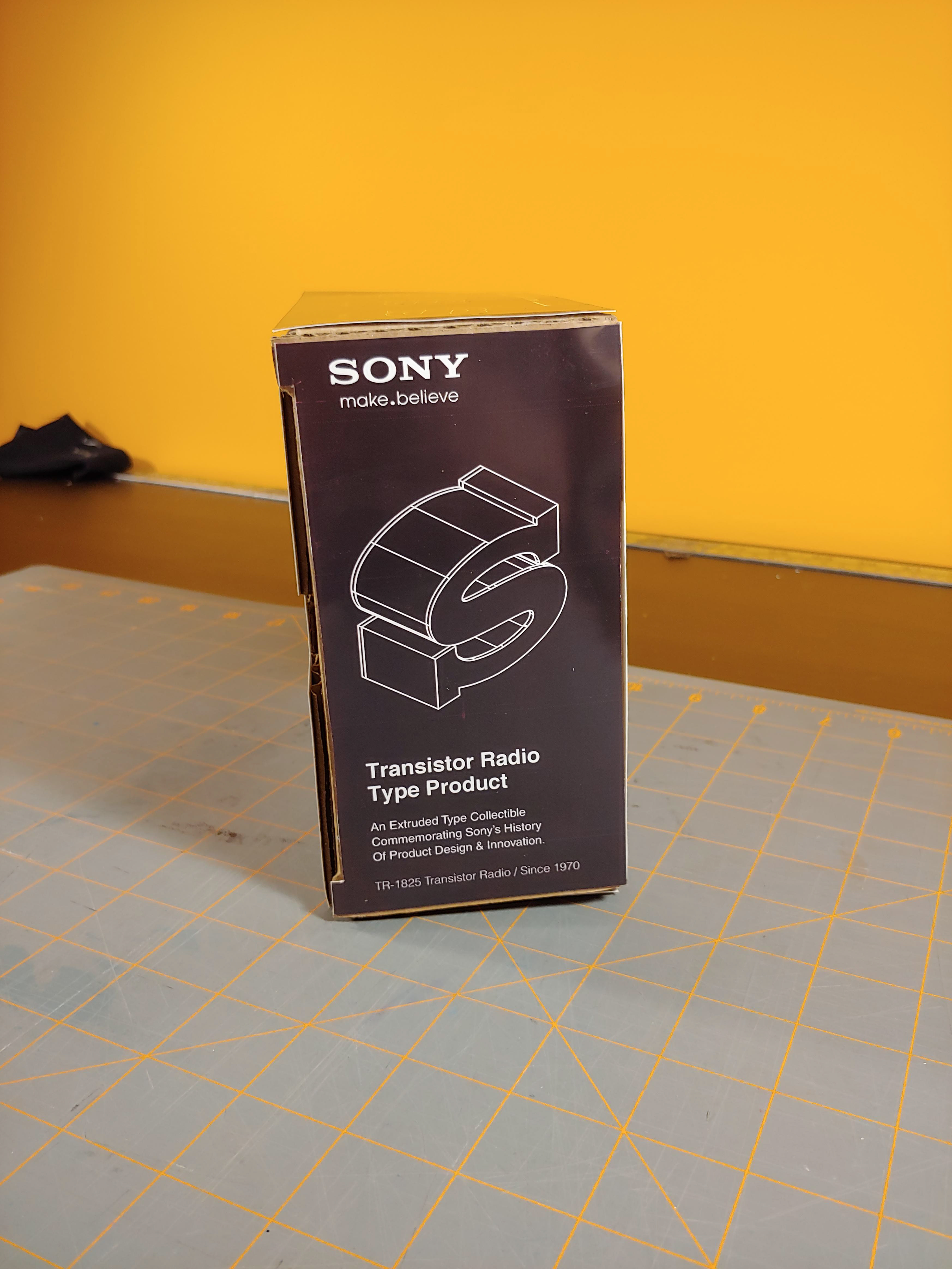
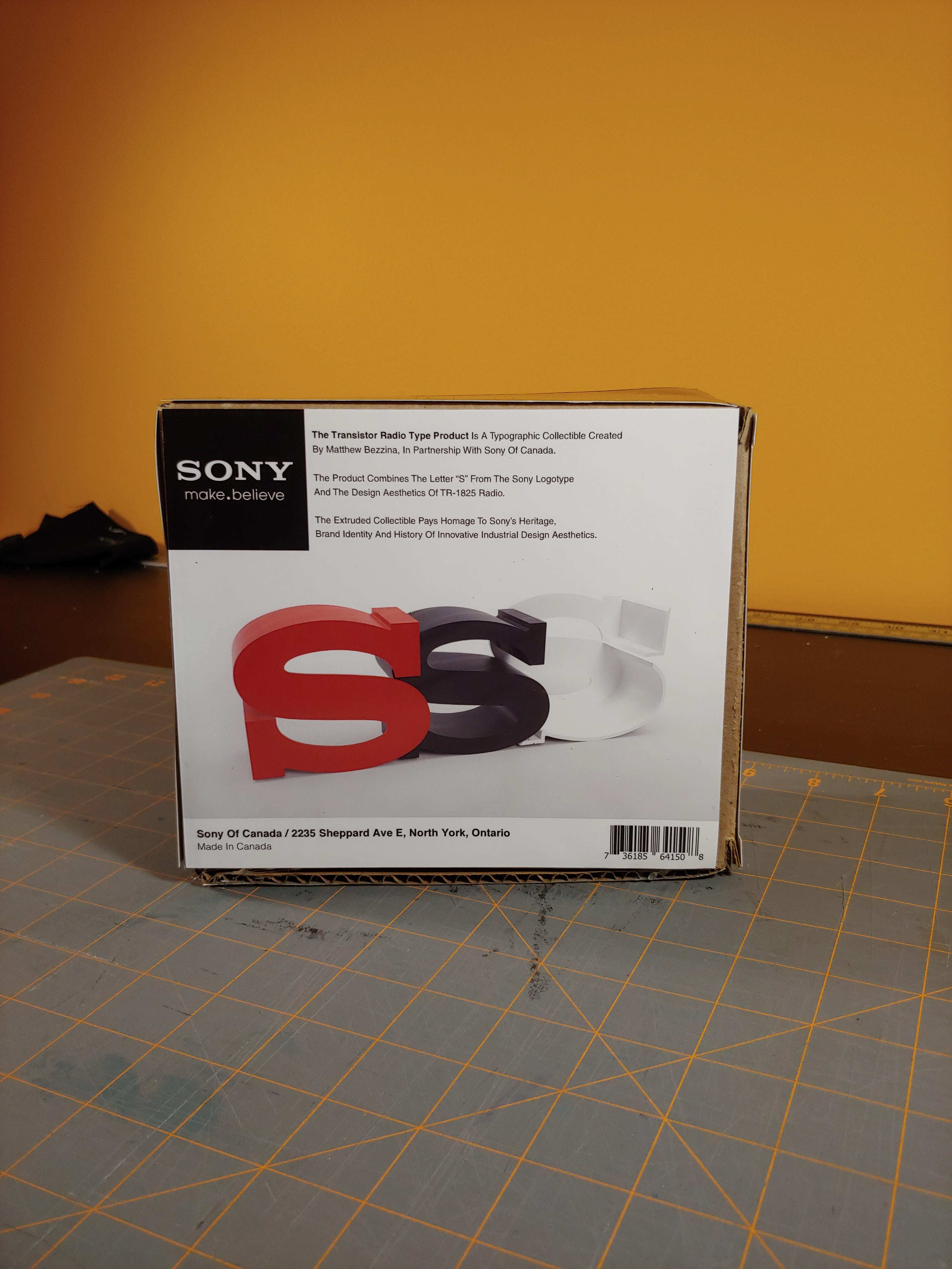
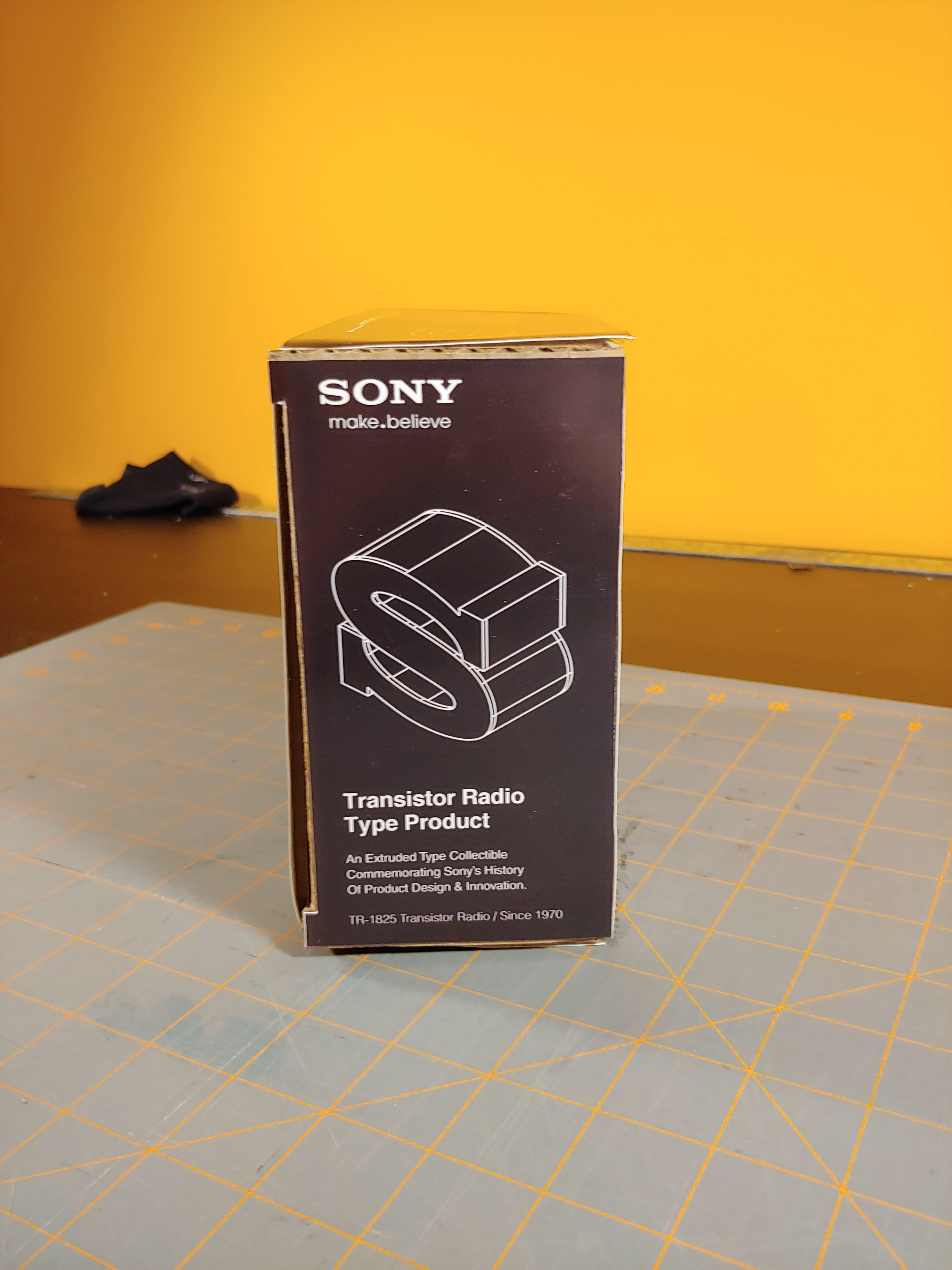
Finished Sony Packaging:
The packaging material was inspired by my reference photos. I noticed that old radio boxes were quite simple, large and made of cardboard. I liked this aesthetic of being overtly simple, but I didn't have the ability to dye the cardboard and thought vinyl wouldn't look nice. So I combined that idea with the newer Sony Packaging used for headphones and audio products.
Applied Graphics:
The difficulty when making the box lied, in both the material and my inability to print all the panels on one sheet of coated paper. Regardless, the effect is there and provides an idea of what this fictional product could look like.
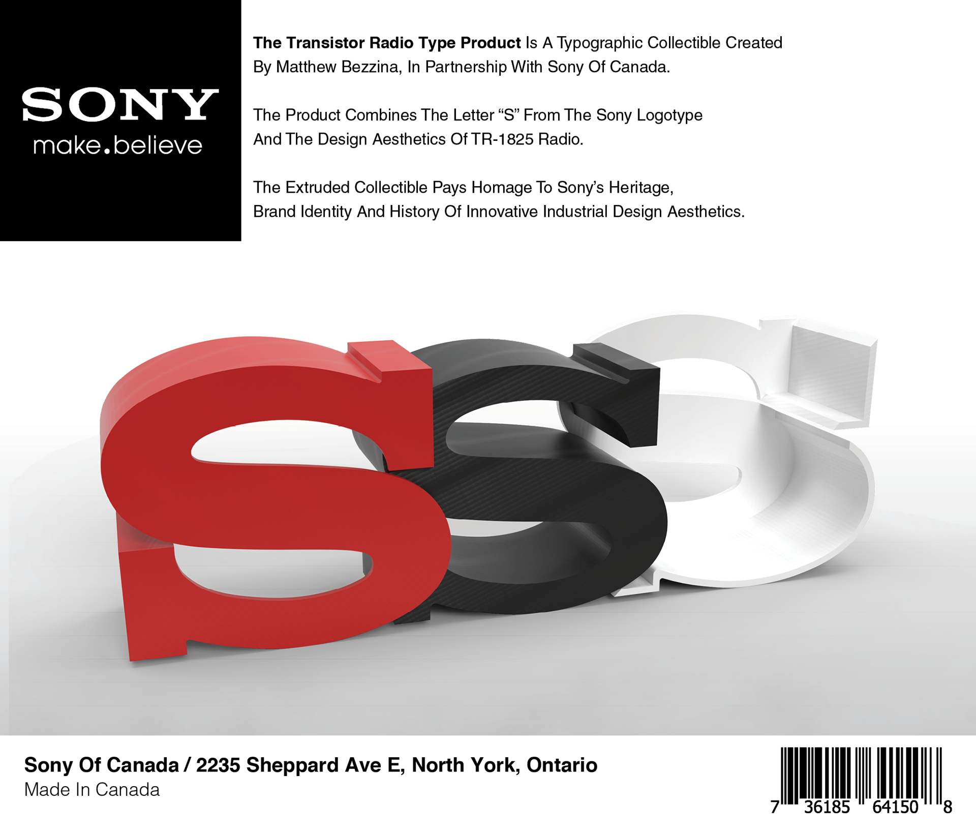
I was in such a rush, to get all of this work completed before the deadline, that I didn't even take a photo of the product out of the box. So you can imagine, one red shell, one white shell and one interior black S like the examples above printed in PLA Plastic.
Finished Dyson Packaging:
This packaging was much simpler and was inspired by the way replacement and auxiliary kits that Dyson sells. If this product was sold by Dyson, as a handle replacement I would expect it to sport similar colors and aesthetics.
Applied Graphics & Final Printed Piece:
Regardless of the printer's difference in color for the product backing, the presentation provides you with an example of how this product could look in reality.
The 3D printed parts were sanded and finished by hand, then received multiple thin coats of spray paint, which resulted in a mostly smooth finish. Trust me they look better in person.
Thanks For Scrolling, Please
Feel Free To Leave Feedback!
Copyright © 2019 - Bezzina Designs
Project falls under intellectual property law.