Bomb Bud Branding Design
(For Sale)
Here is my first personal project that I've made in a while. I tend to create a lot of concepts for my clients and in most cases, only one of these concepts is ever used. This leaves me with numerous concepts that may never be realized. So, I was going through my older sketches, when I remembered this grenade design I originally created for "The Green Aid Gardening Center" https://www.behance.net/gallery/51842677/The-Green-Aid-Gardening-Centre-Brand-Creation
I thought that this grenade symbol definitely had some potential, it really just needed to be tweaked and modified. In this Behance project, you will see my beginning - end process to creating an emblem and wordmark, for a combination logo design. To purchase this logo, please contact me at bezzinadesigns.com or by direct message.
Enjoy!
Concepts
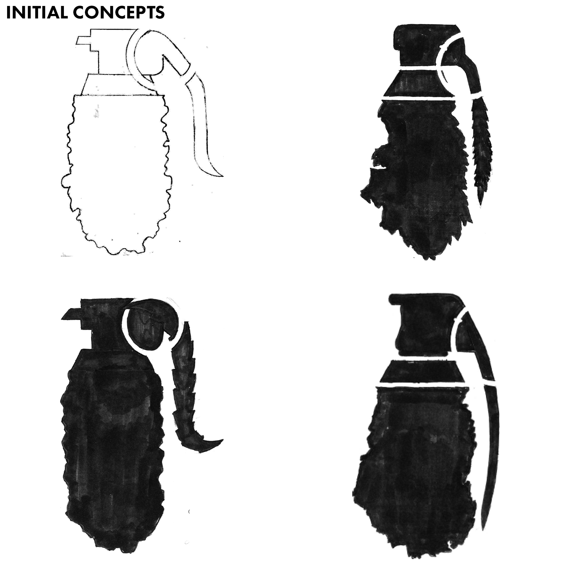
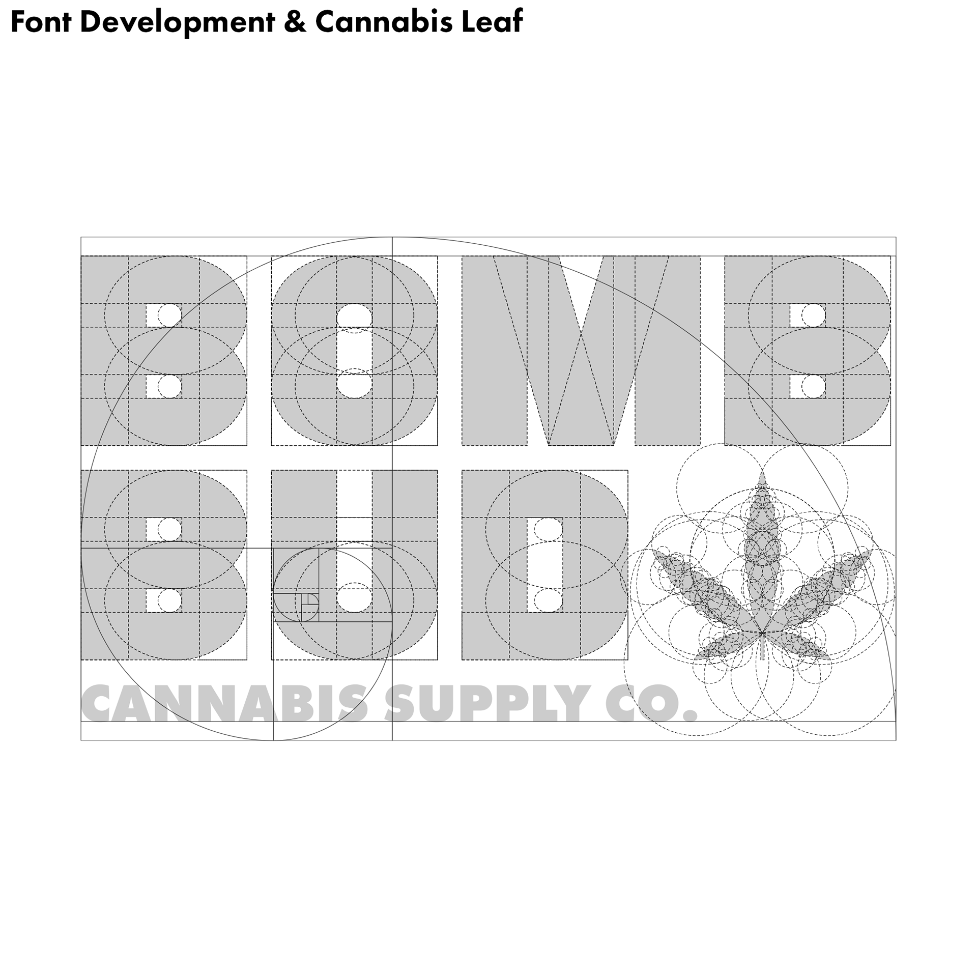
This project started differently from my typical logo design projects, seeing as I already had an idea of where I wanted to start. I took the original logo concept and modified it numerous times, using grid paper to keep my drawings clean.
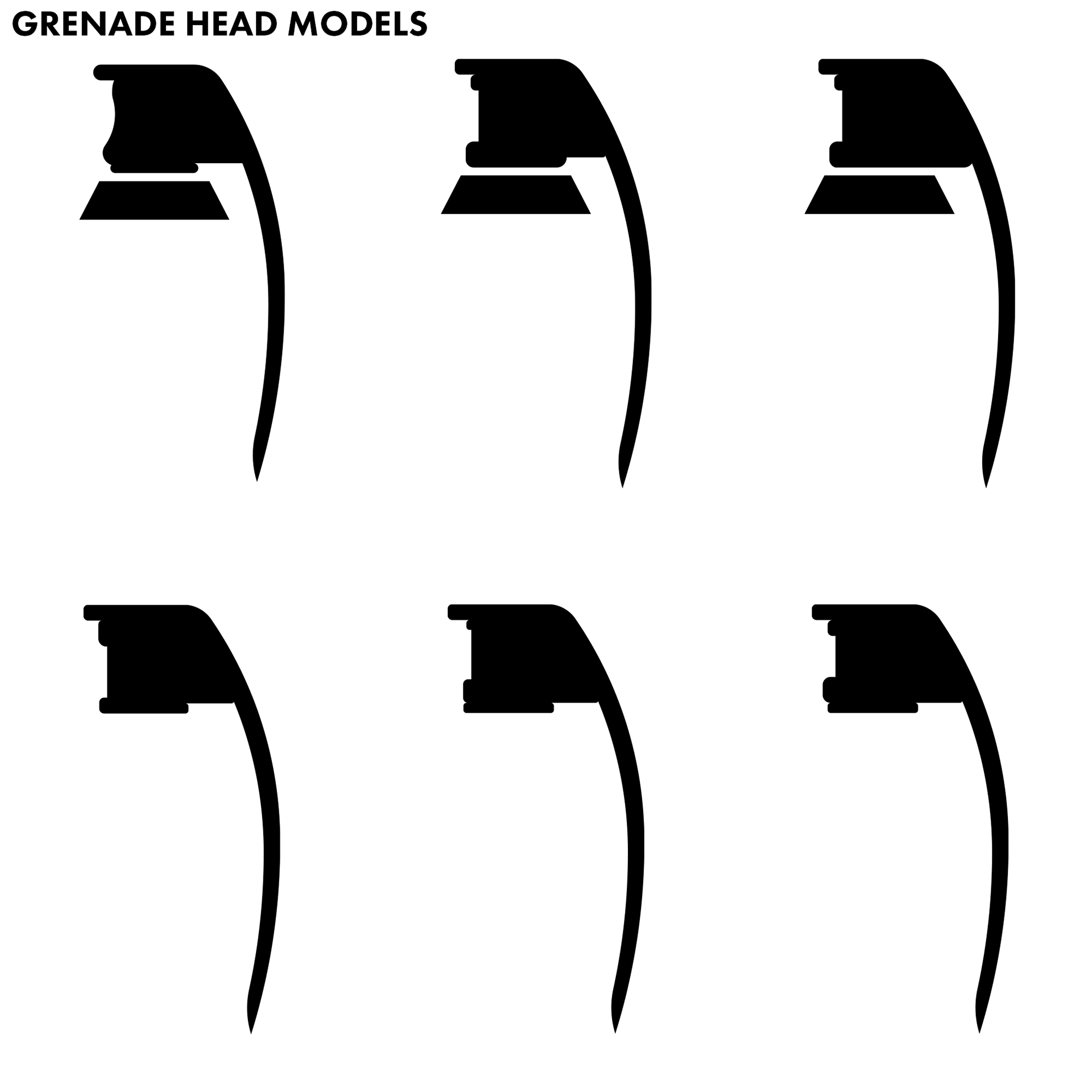
I then brought the designs into Adobe Illustrator. There, I began tweaking the head shape of the grenade, after realizing that my initial head shape was too round.
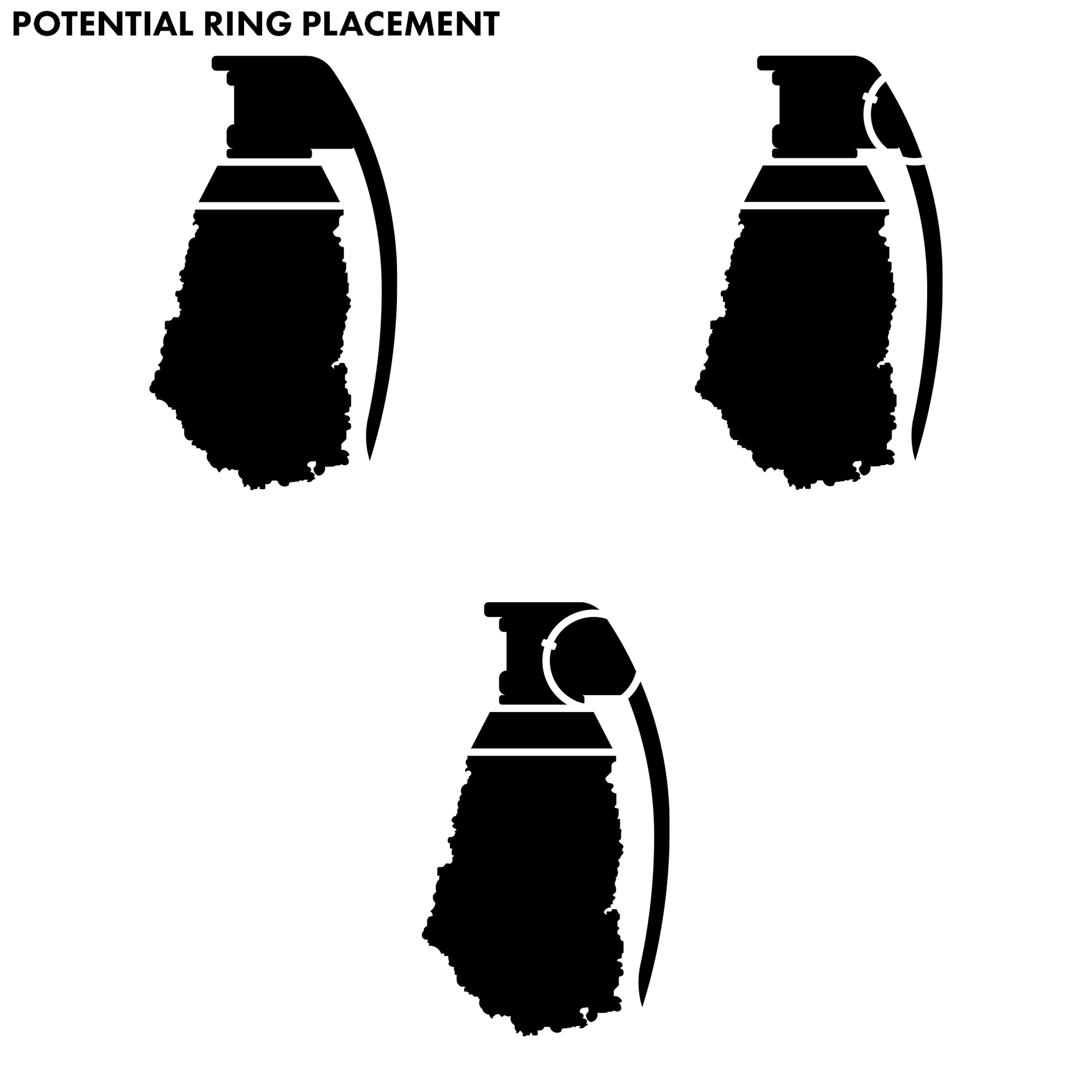
Then I moved onto the placement and size of the grenade pin-ring. I used negative space, to keep the design symmetrical width-wise.
Rationale For Name
The original name for the design concept would have been, The Green Aid. I thought this was a great sort of visual pun, seeing as the logo combines a grenade and a cannabis bud; thus forming a Green Grenade or a Gree-n-aid. Now obviously that project is completed, I had no intention of recycling or reforming their name, so I had to think about something new.
During my product design research for a product I am developing with a friend, I discovered a cannabis peripheral company, with a similar name. I didn't want to use their name, so I decided for the sake of this project, to call it Bomb Bud.
Now in this case, we have the literal reading being, a bomb made from cannabis bud; which matches our imagery. The other meaning of the logo being, a somewhat slang term. When something is "bomb" or "da bomb" it normally implies that the thing in question is good. So Bomb Bud means that the product that this company provides it's clientele is of high quality.
The sub-title is self explanatory, Cannabis Supply Co.
Logo Design
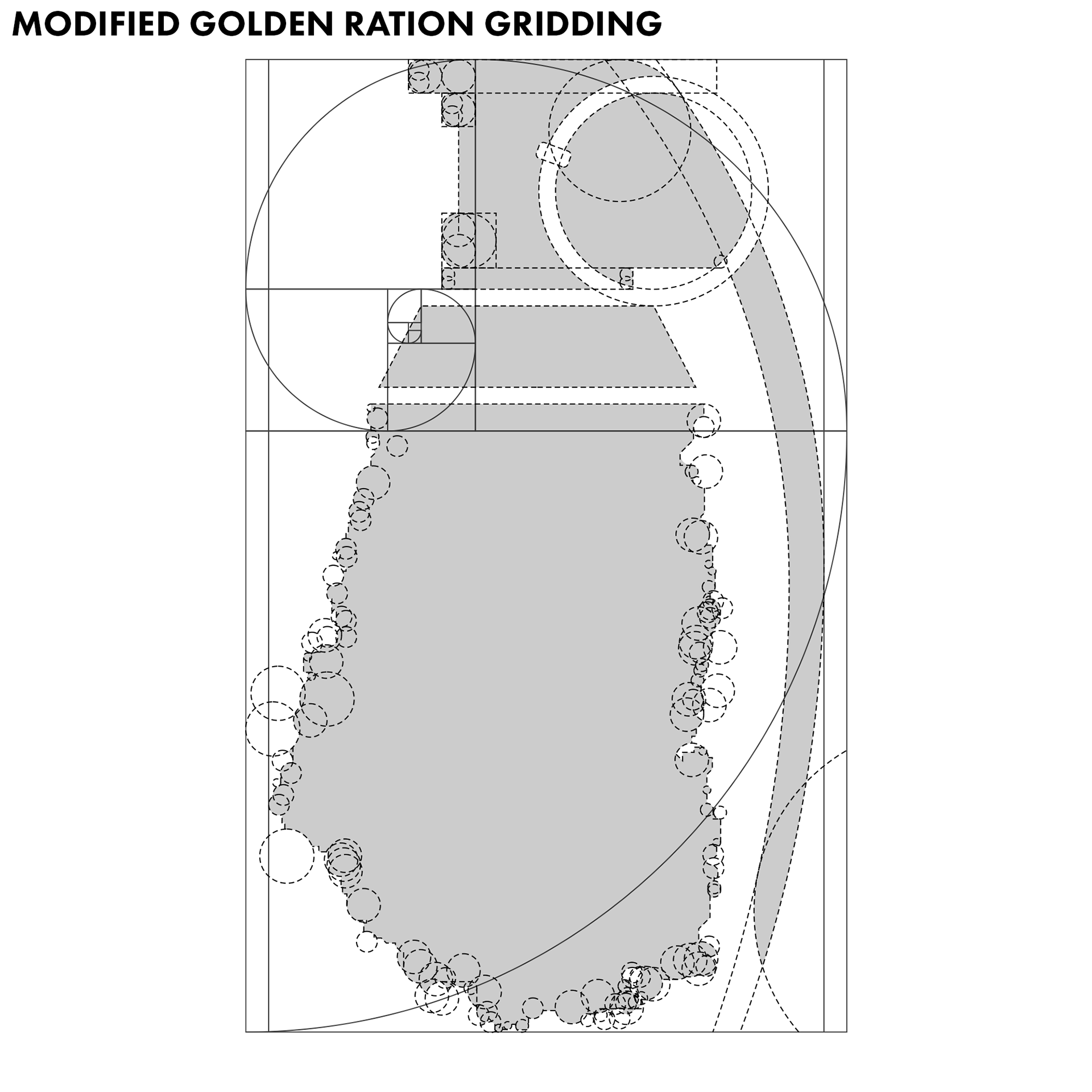
Now for this project, I thought because of the long sweeping hand grip on the grenade, that using a modified golden ratio grid would be beneficial. I combined the grid with the usage of circles sized to match the golden ratio partitions. Now obviously the logo doesn't fit exactly inside the golden ratio grid, but the logo itself was built around the grid rather than matching the grid exactly.
The "Bomb Bud" wordmark on the other-hand, was not explicitly built using the golden ratio. It was heavily inspired by the Quatro UltraBlack Font from Adobe Typekit, in saying that, the type is 100% custom. The cannabis leaf was built off of another concept I had created for The Green Aid's Project. Though this time around, I used the golden ratio circles to refine its shape. The only reason I have both the wordmark and the leaf inside the golden ratio grid, was to match its vertical height to the emblems horizontal width.
The sub-title was created with the Futura PT Heavy font.
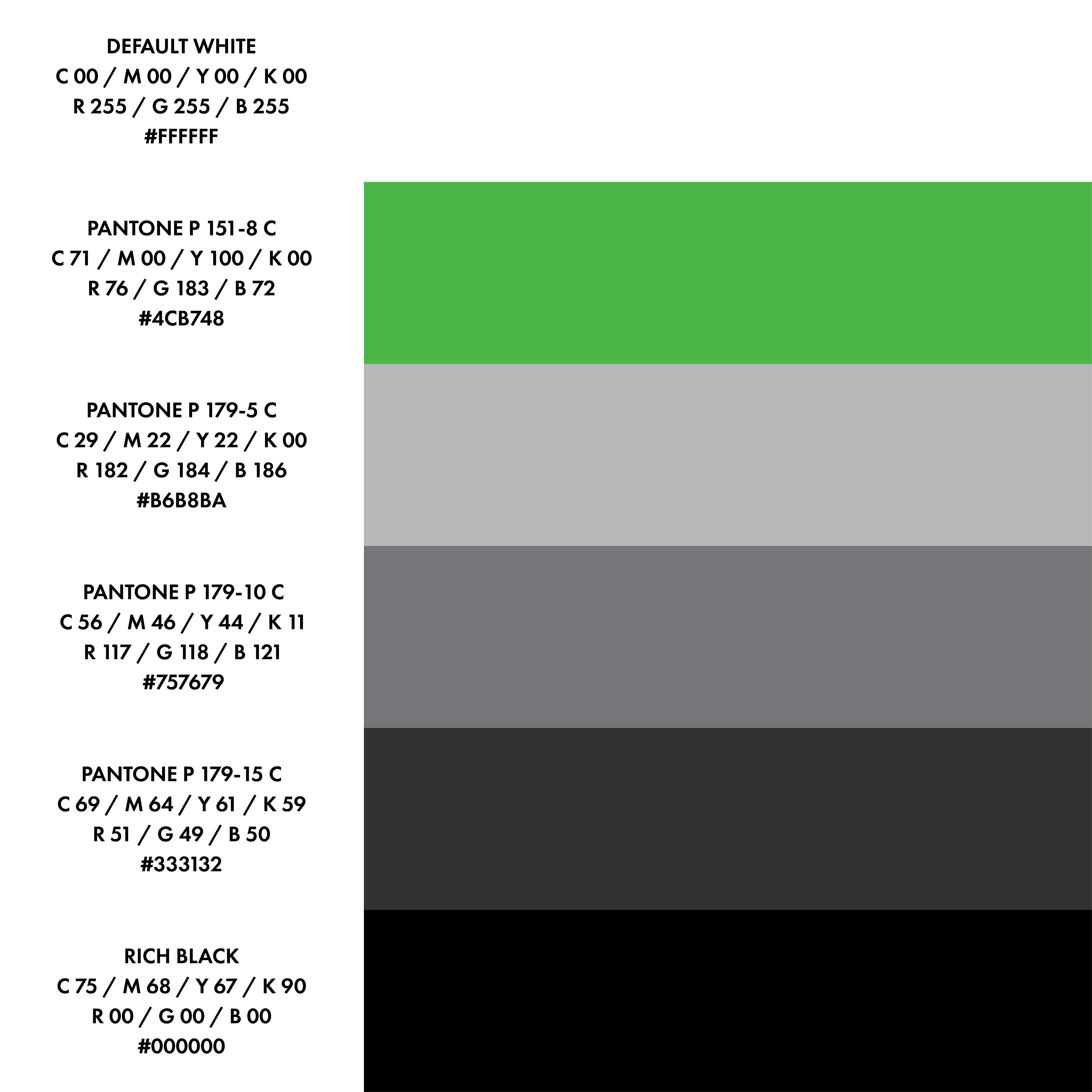
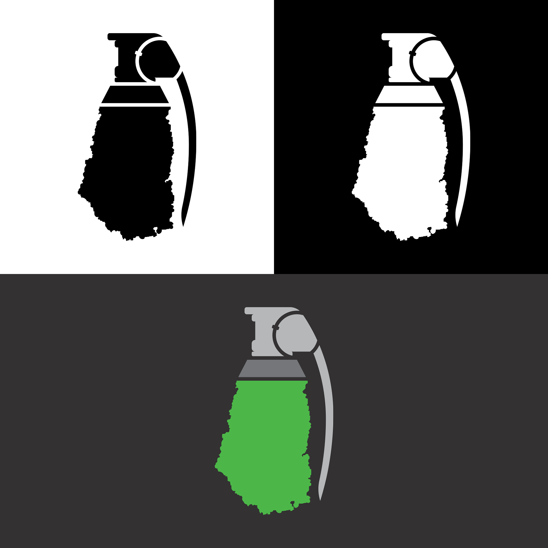
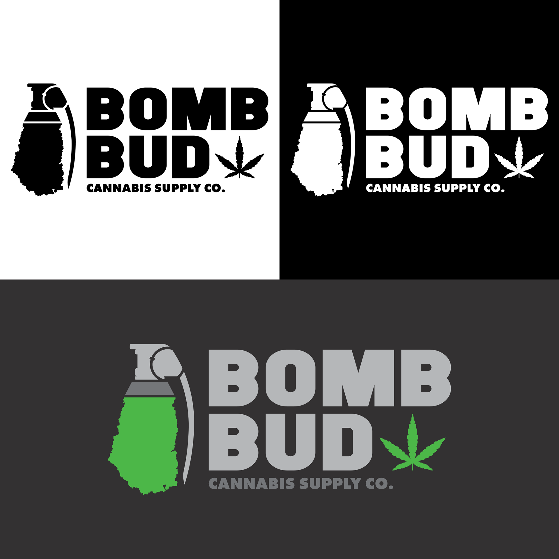
Once I had all the design elements together, my focus shifted towards choosing appropriate colors. For the Bomb Bud or Cannabis Grenade, I chose a three color combination as the emblem is made up of three parts; The head piece, the receiver and the bud. I chose a light grey for the head piece, to approximately match the color of a real grenade. I chose a darker grey for the receiver, to distinguish it from the head piece. Finally, I chose a light and warm green, so that it would stand out and be more eye catching.
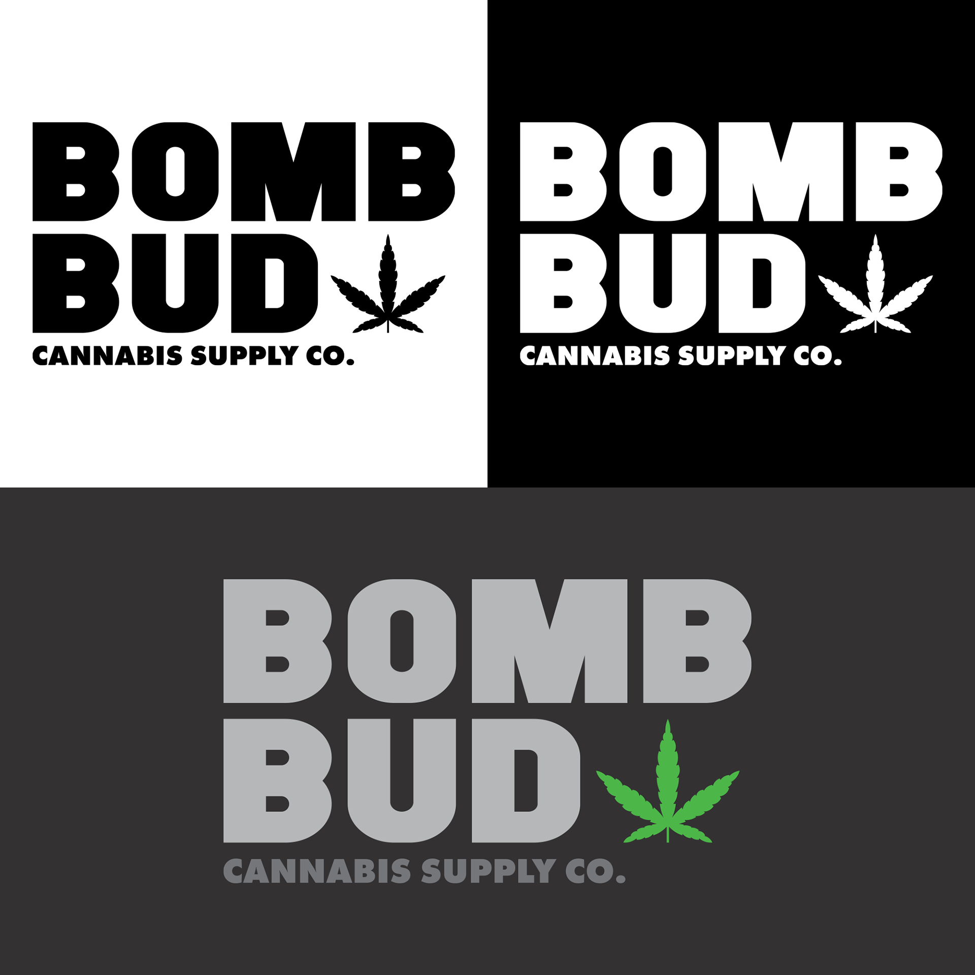
I took a similar approach with the wordmark; keeping the same colors from the main emblem. The addition of the cannabis leaf brought more green to the wordmark and reinforced the cannabis theme.
You can see all of my color choices, directly above.
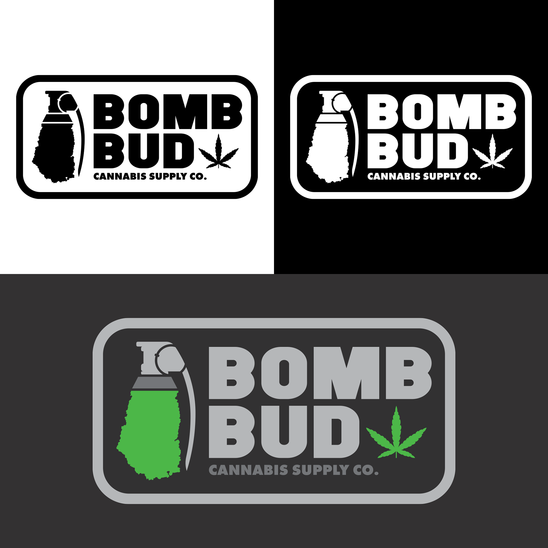
After creating both the emblem and wordmark, I experimented with the idea of adding a frame to the logo. I thought that the logo would make a great patch, so I added a slightly rounded rectangular frame to contain the interior contents.
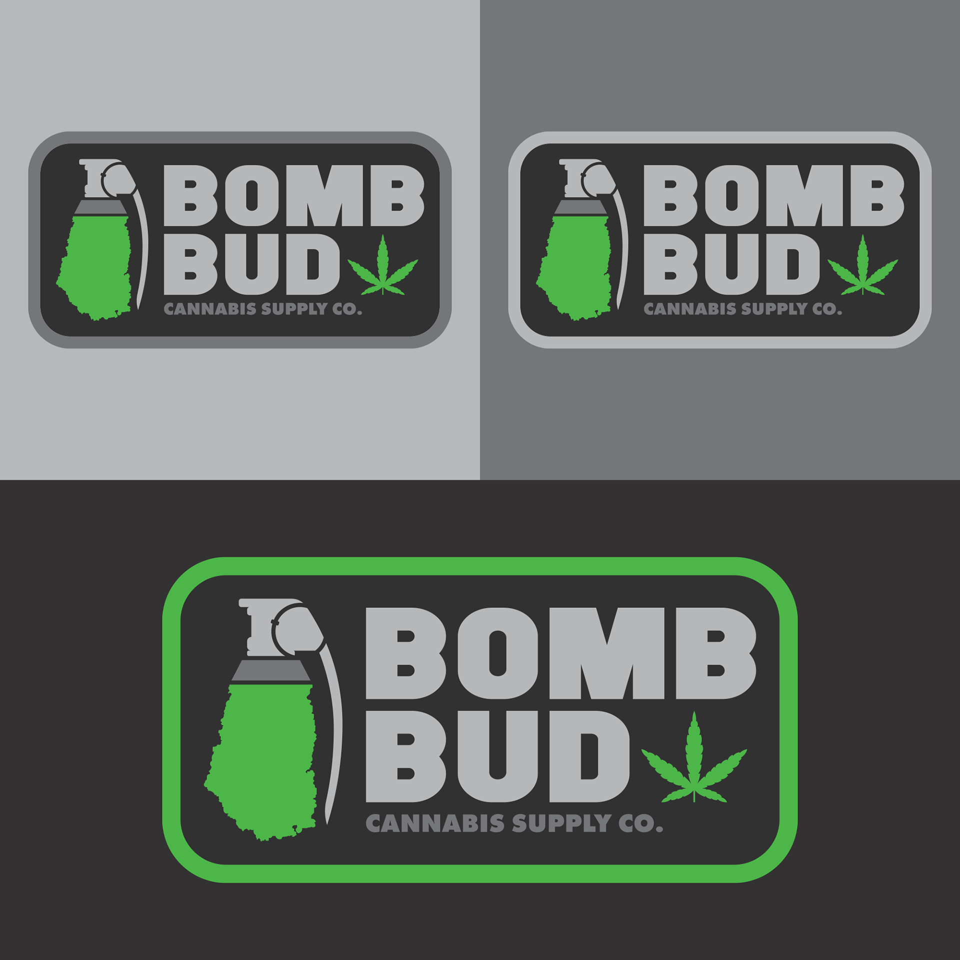
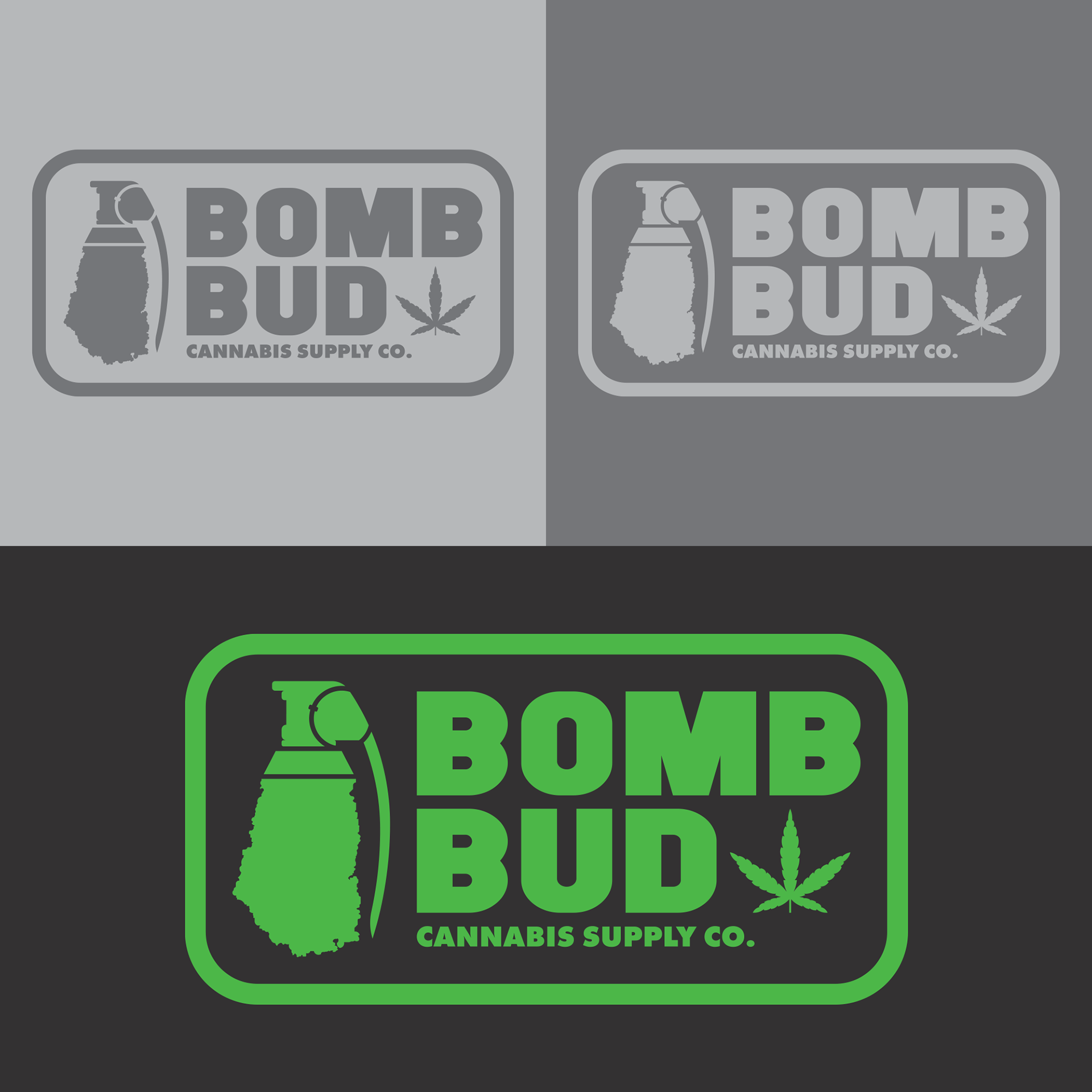
To the left we have the main color combination for the final logo combination, the other two to the right feature alternate color combos for both 4-C and 1-C usages.
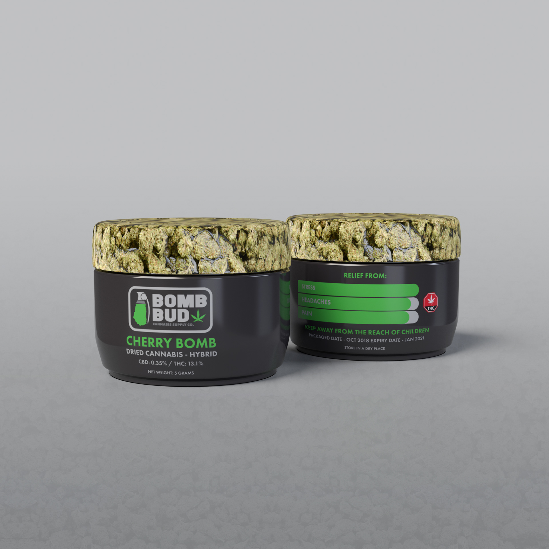
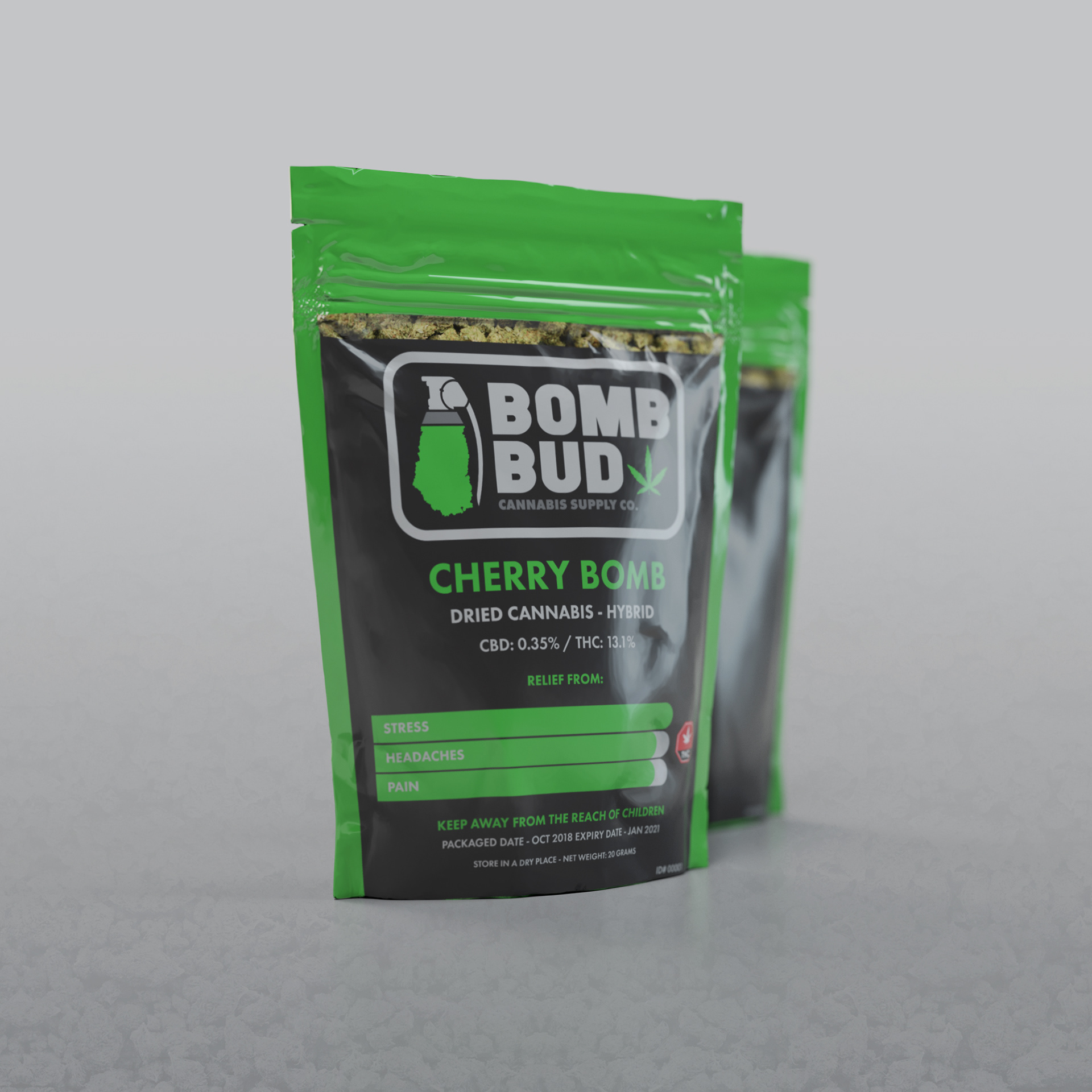
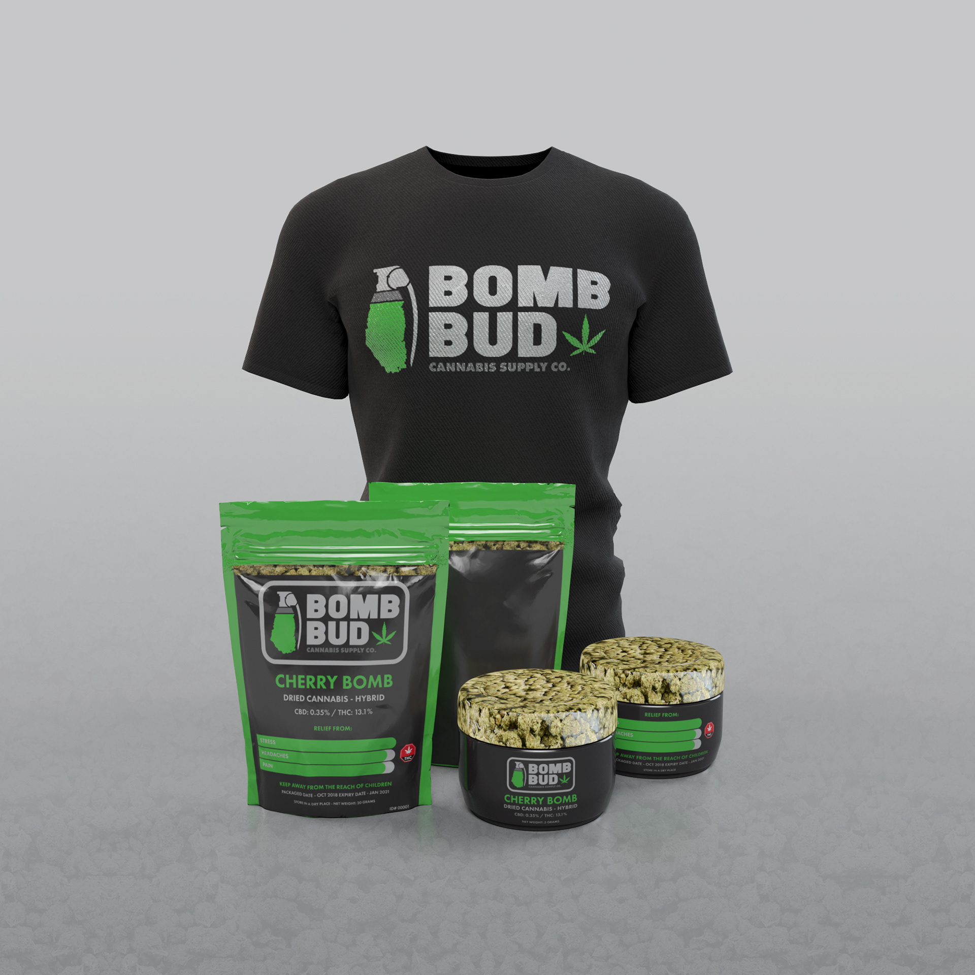
Presentation Applications
All applications were made with the help of Adobe Dimensions, absolutely blown away by this software, a lot of potential.
Thanks For Scrolling,
Please Contact To Purchase!
Copyright © 2018 - Bezzina Designs
Project falls under intellectual property law.