Nuclear Disarmament Branding Design
This is the first in a series of design projects, I have created for my design fundamentals university course. For this project, we were asked to create a logo design and brand manual for a social cause of our choosing. The logo design had to represent or include a sense of environmental inclusion. To promote this inclusion, we were required to utilize the tagline "creating an inclusive environment." In this Behance project, you will see my beginning to end process for logo and brand identity creation. If you are interested in the designs and would like to purchase them, please contact me for more information.
References And Concepts
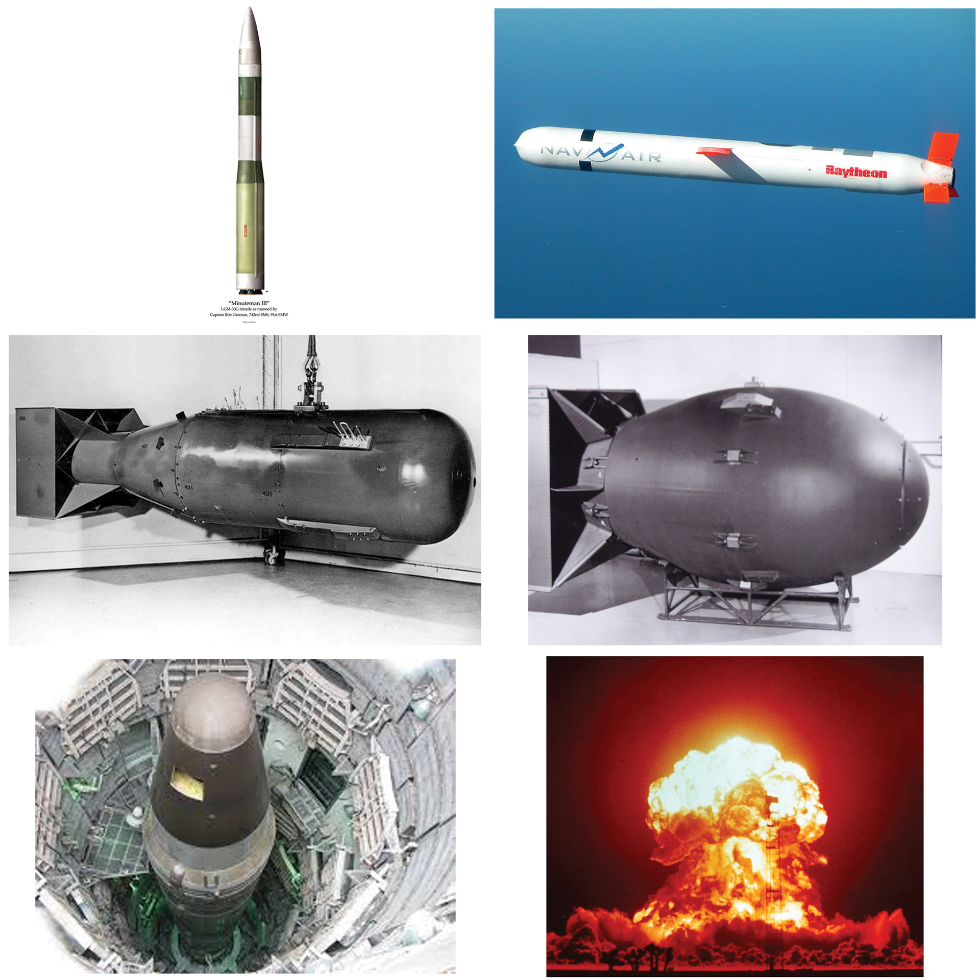
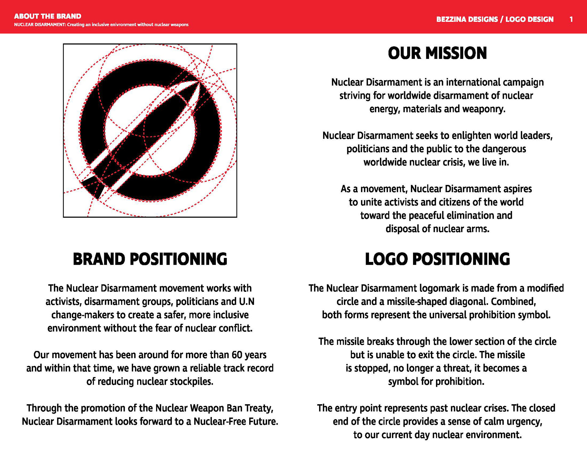
In my planning stages, I decided to pursue a logo design for the Nuclear Disarmament movement. This social movement began in 1954, after the events of the Second World War. The movement has been working to reduce and ultimately remove worldwide nuclear weapon stockpiles, energy, materials and waste. The movement recognizes nuclear weaponry's destructive power and wants to eliminate it, before it eliminates us.
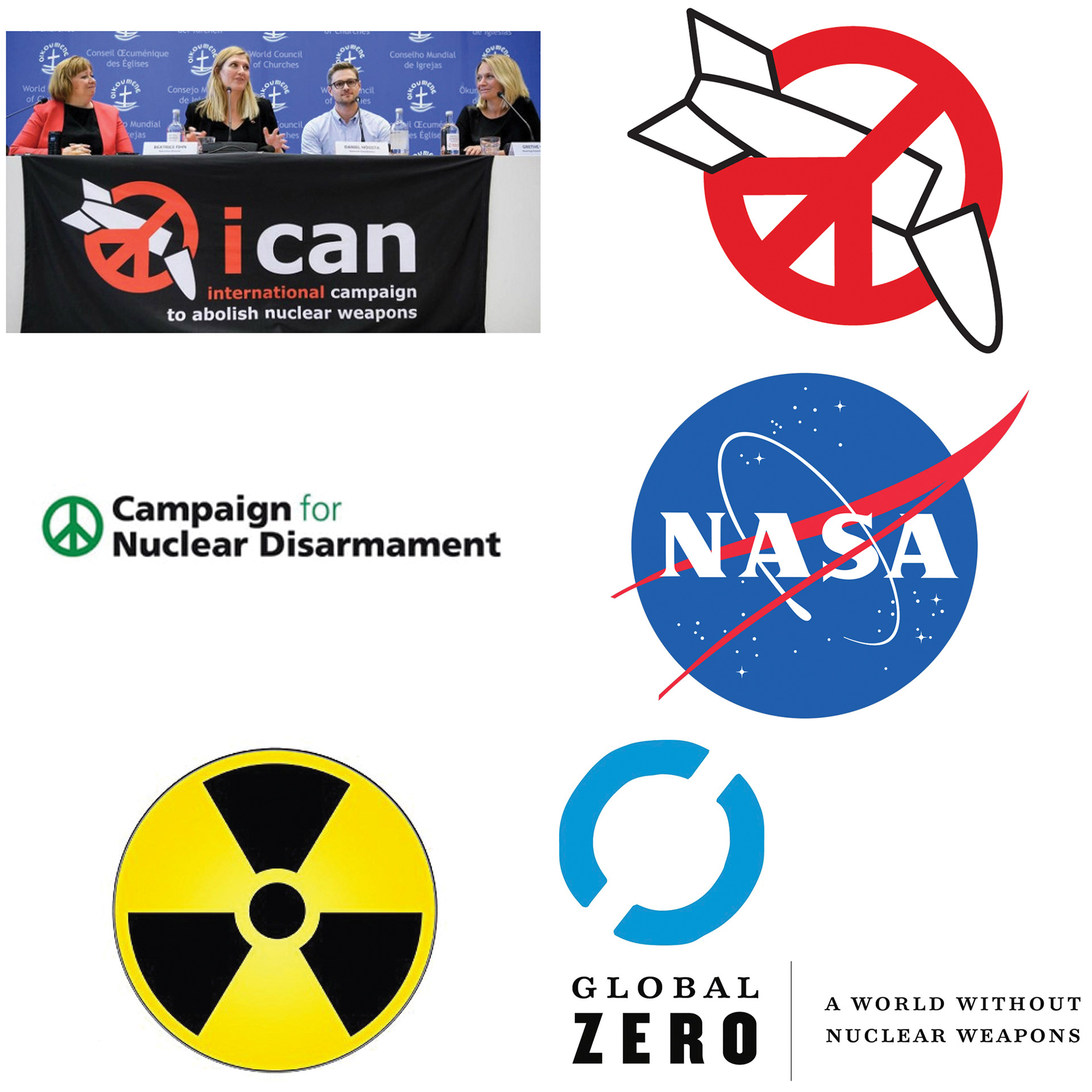
I began researching other organizations and campaigns within the movement, though I settled with the "Nuclear Disarmament" name for my logo. The idea of inclusion may not be evident in my logo design, but my form of inclusion falls from the logo's ability to be universally legible. The environment will only become inclusive when the looming fear of nuclear annihilation is removed from the equation.
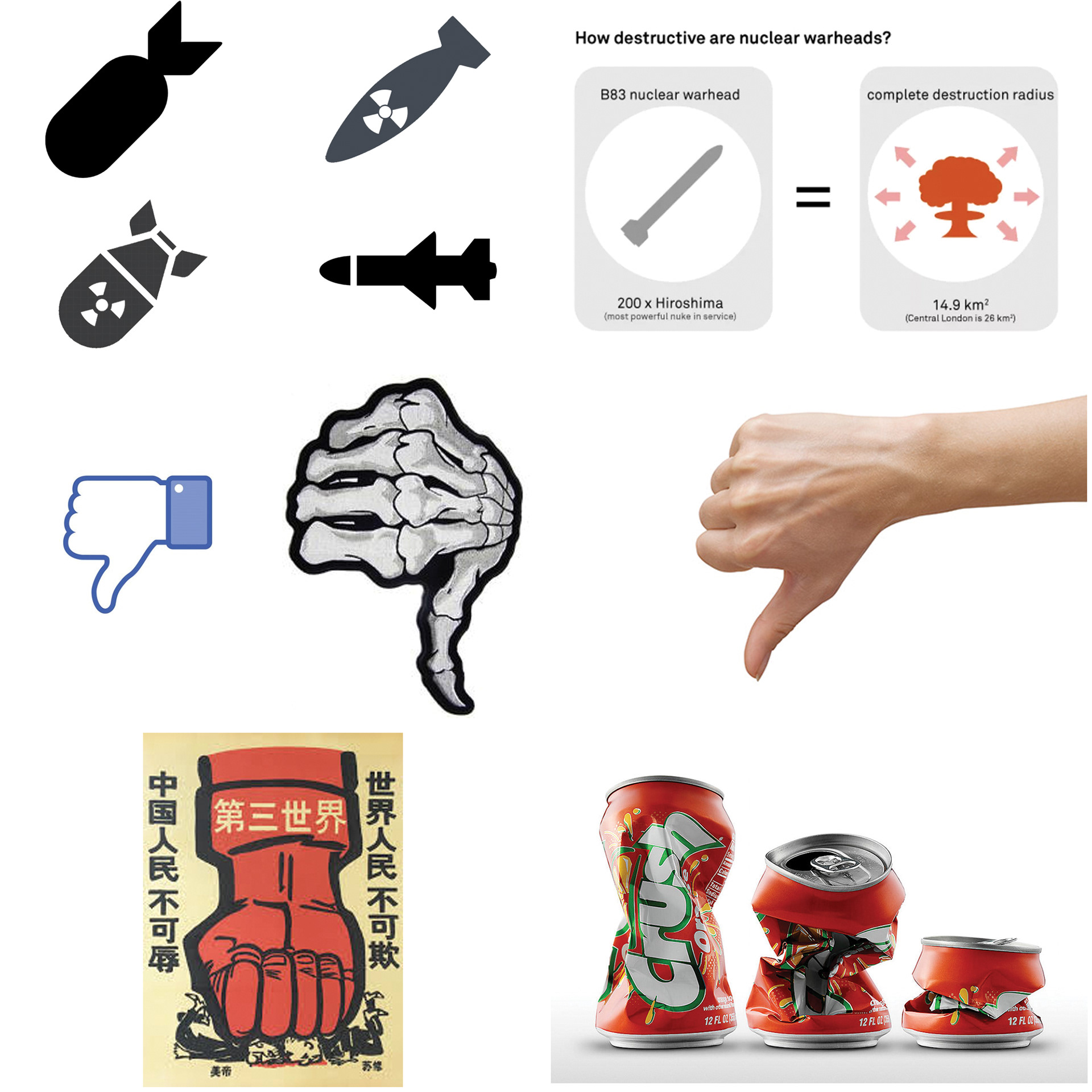
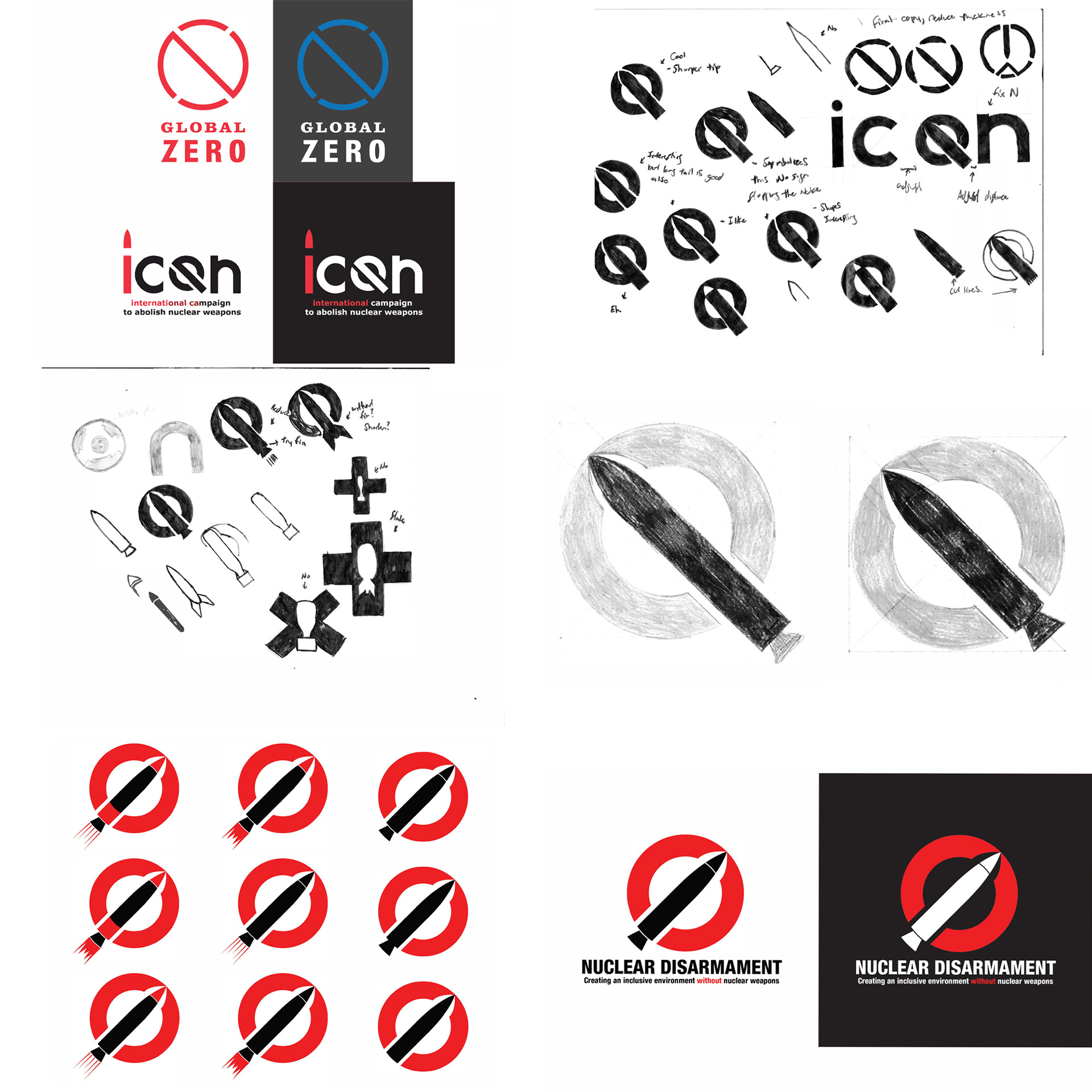
After I finished my research, I assembled a few mood-boards and made numerous concepts. Below you can see some of my later concepts leading up to the final logo design.
Logo Design
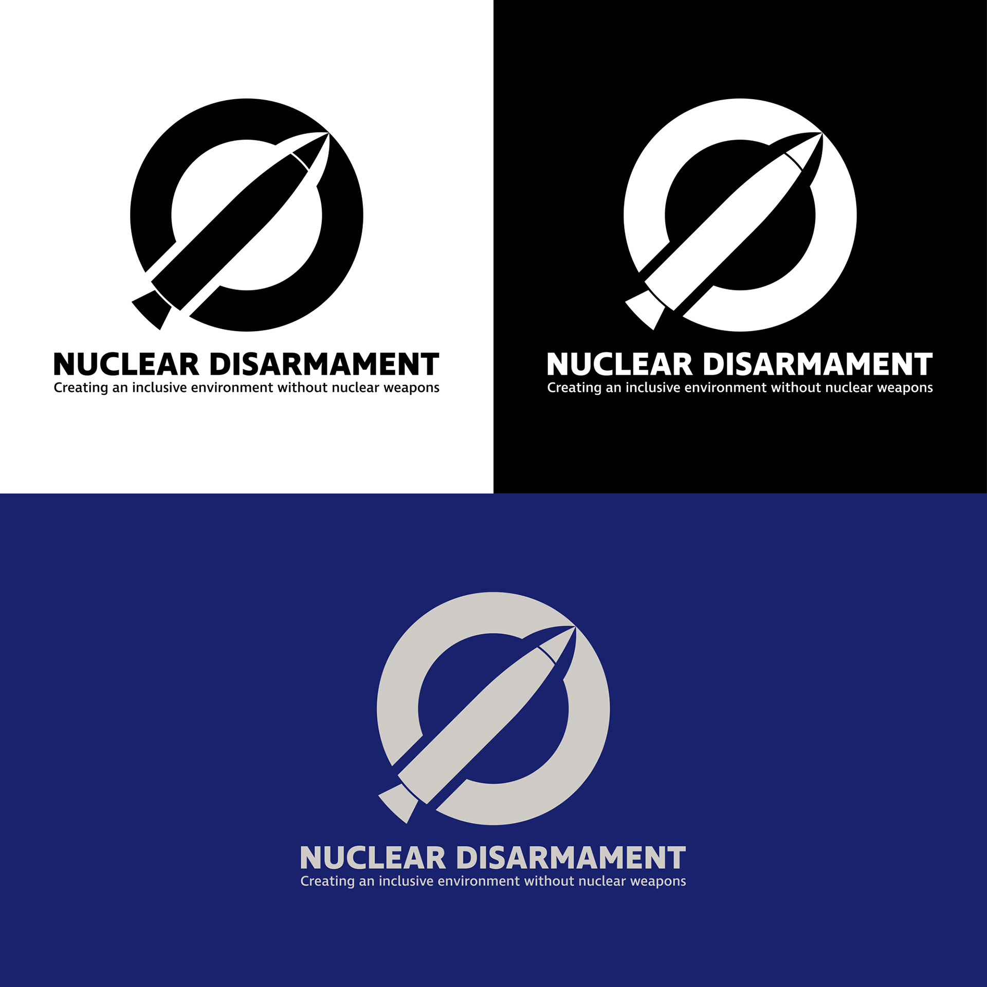
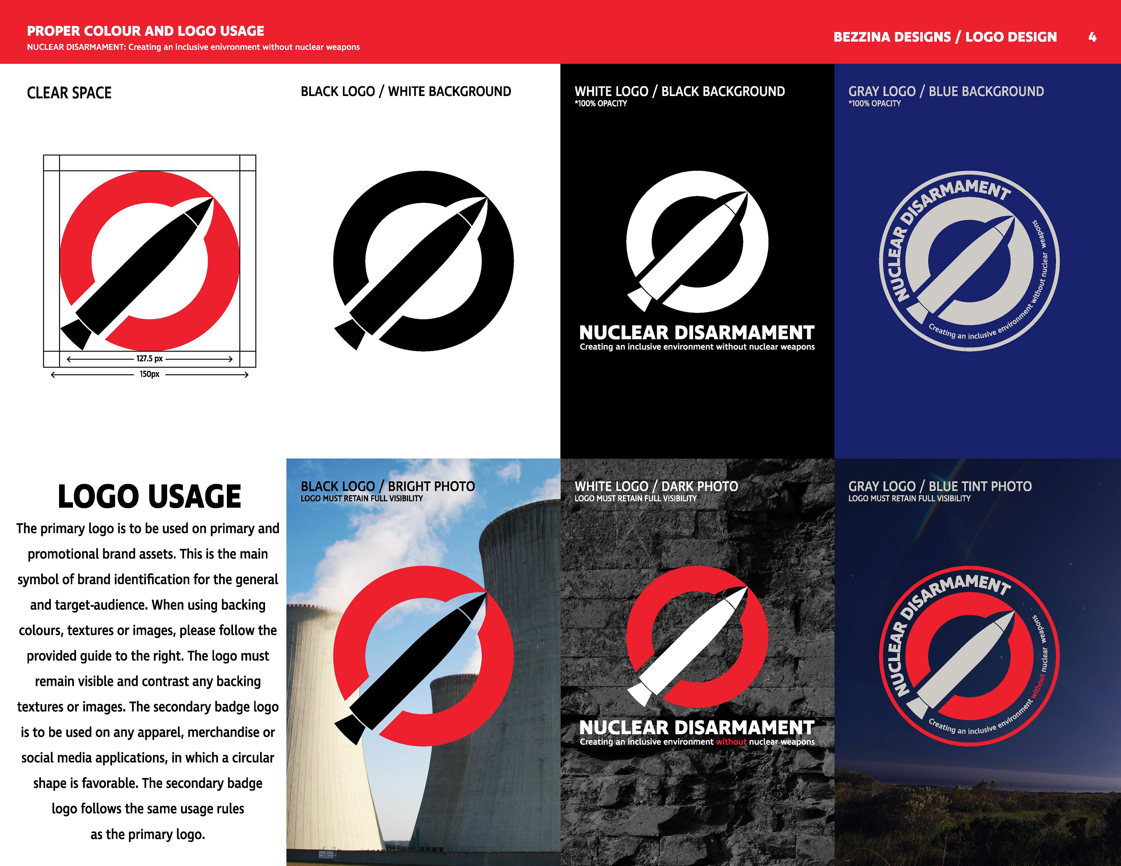
After numerous concepts and adjustments, I found the below logo and wordmark combination. The logo combines the universal prohibition symbol and the shape of modern Nuclear ICBMs. The missile enters from the lower corner but is unable to exit. No longer a threat the missile combines with the circle to create a symbol for prohibition. The entry point represents past nuclear disasters and crises. The closed edge represents our current nuclear environment, together and stable, but on the verge of breaking.
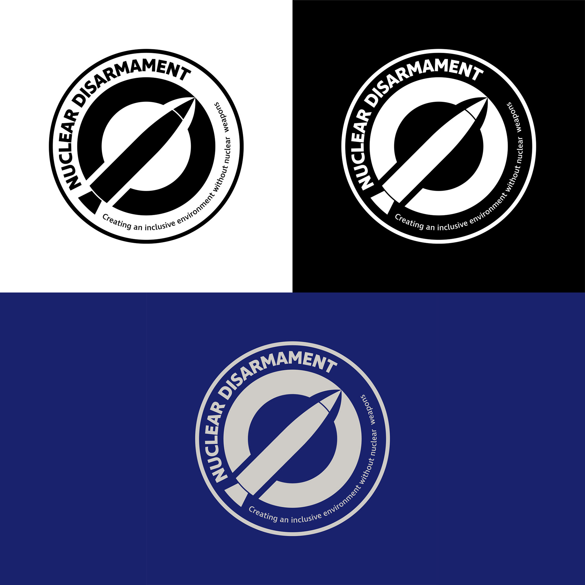
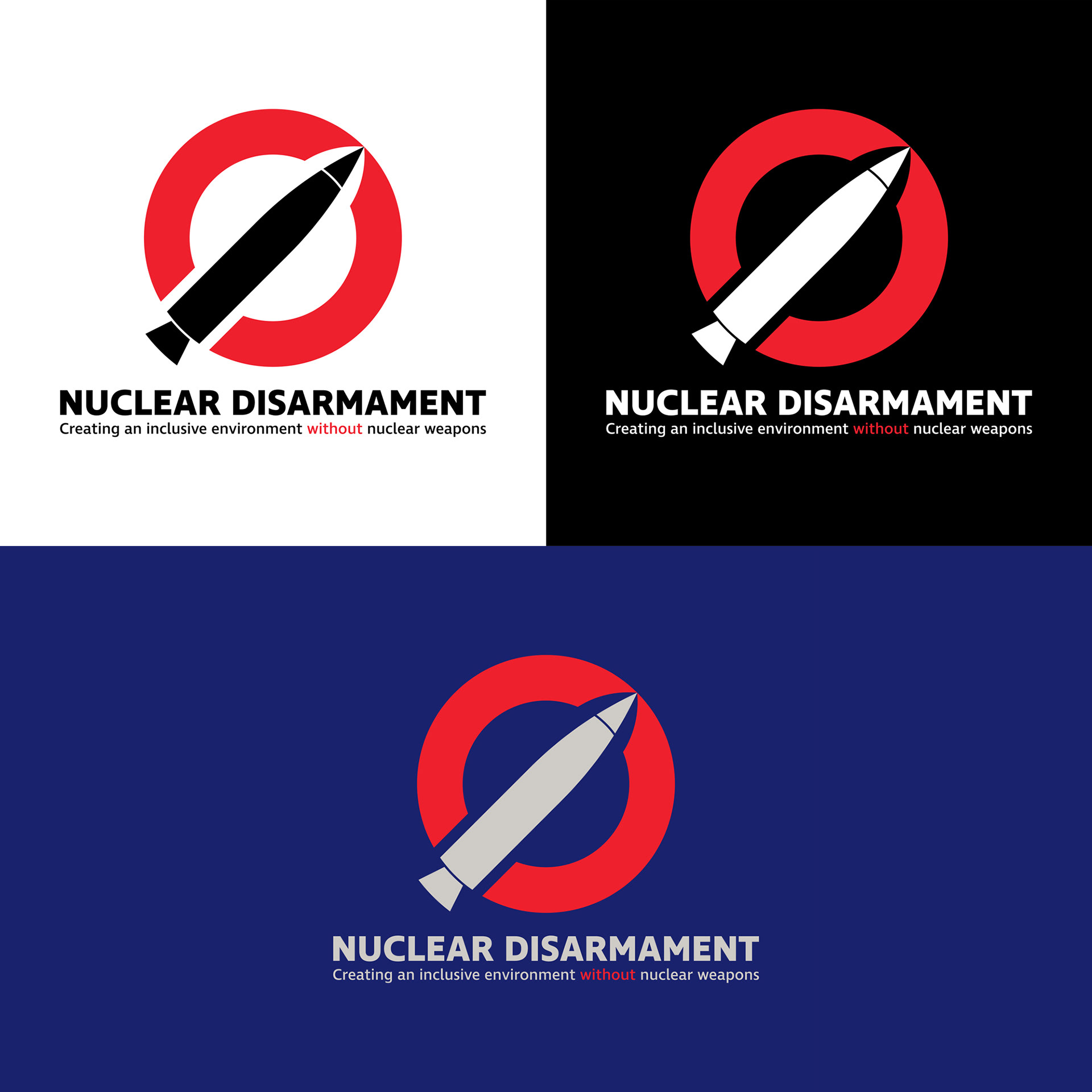
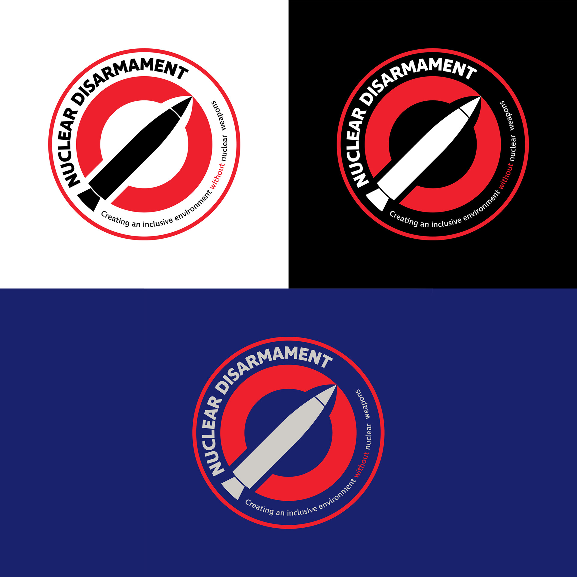
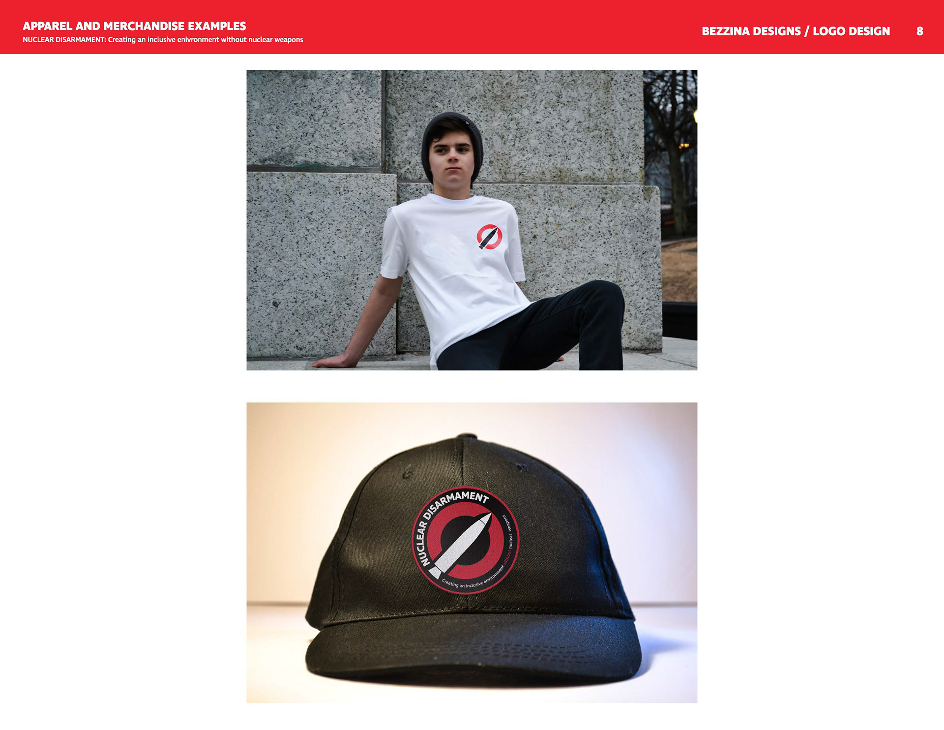
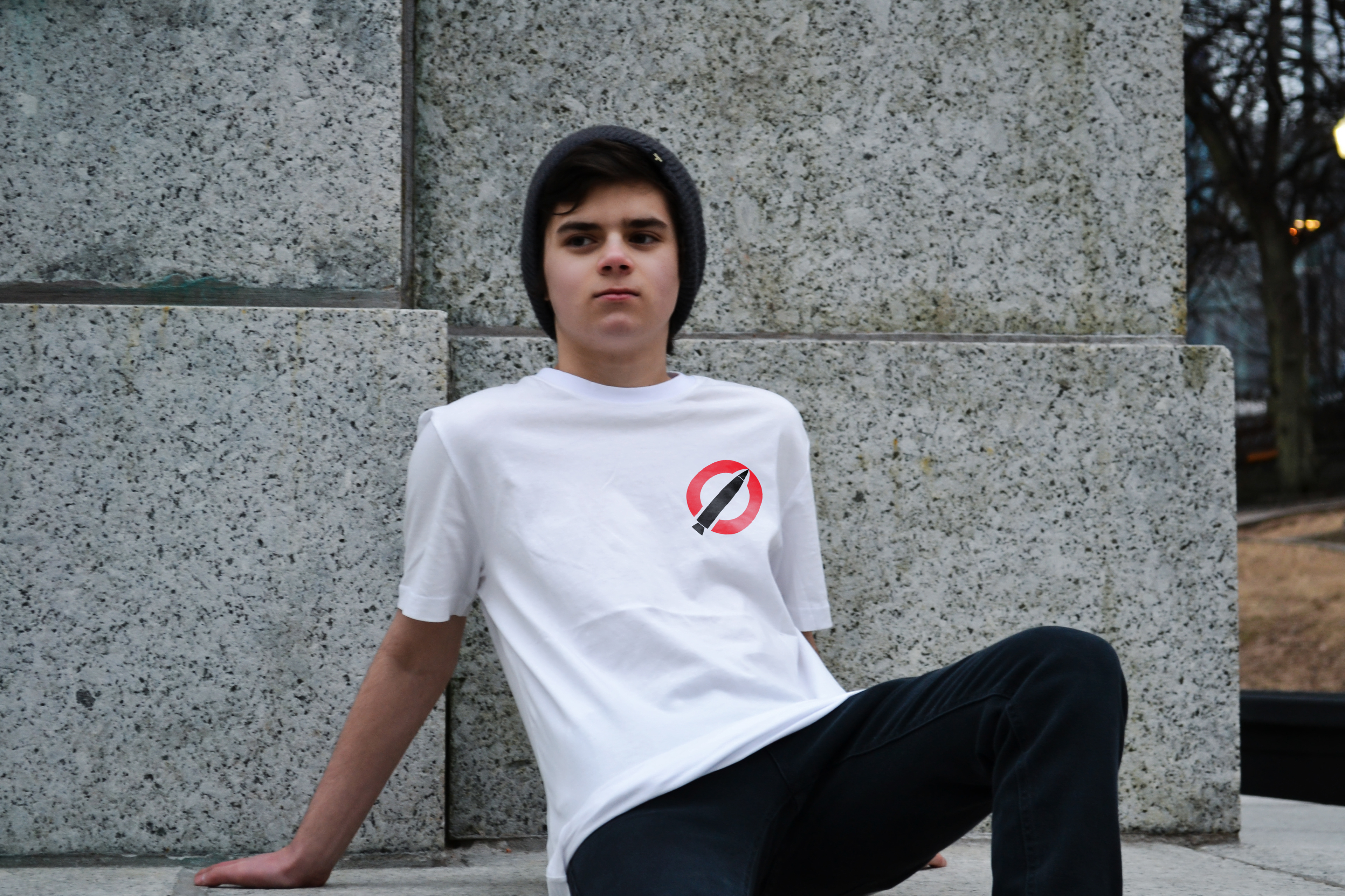
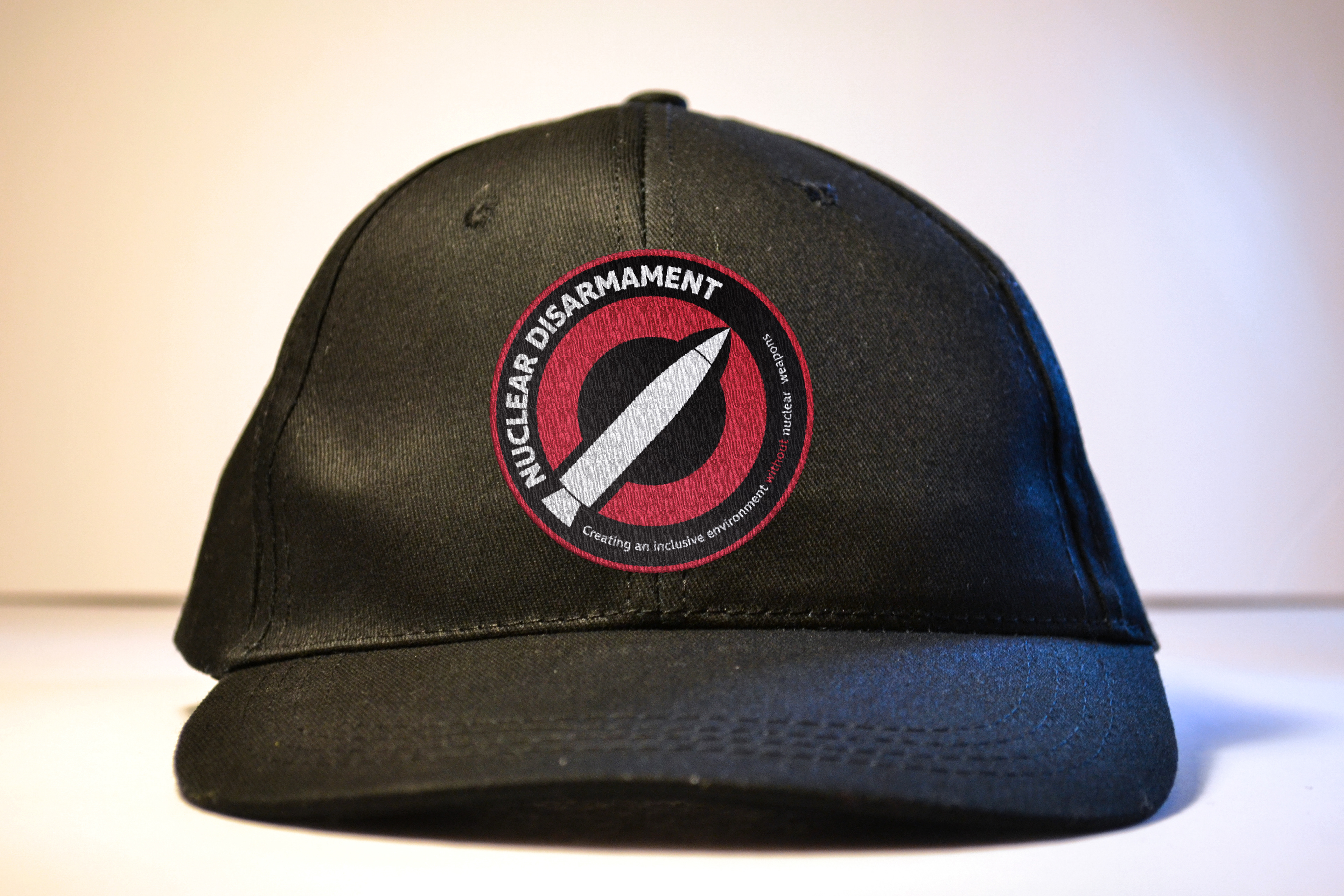
The logo is presented as a logomark, logo and text and a secondary emblem. The secondary emblem was created to compliment the round shape of the mark.
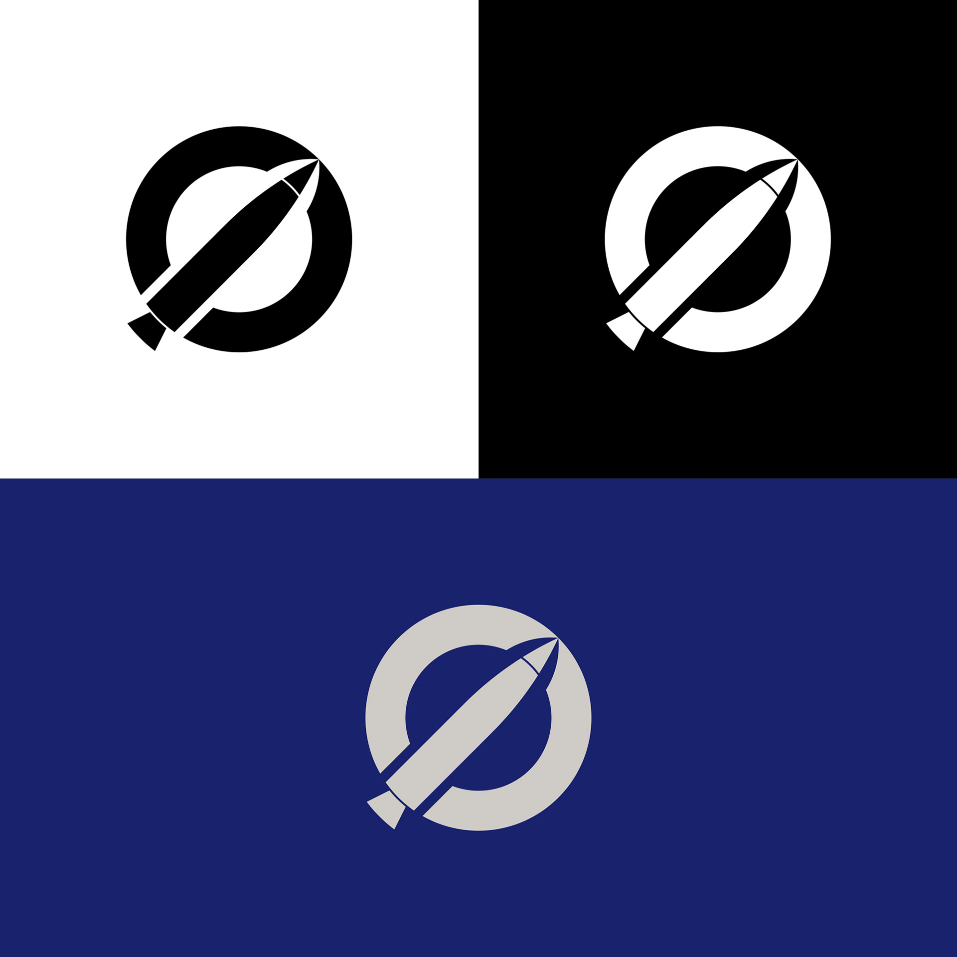
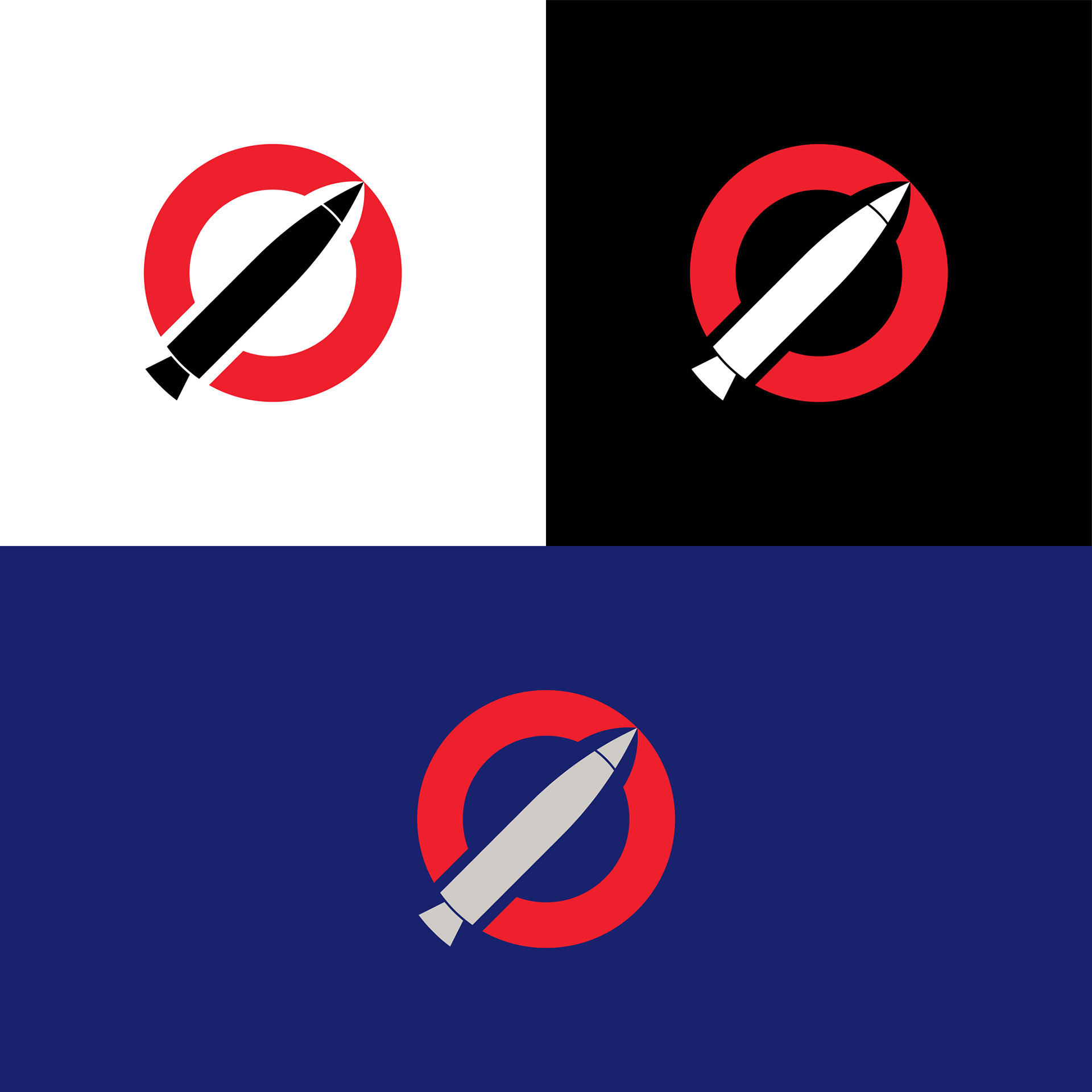
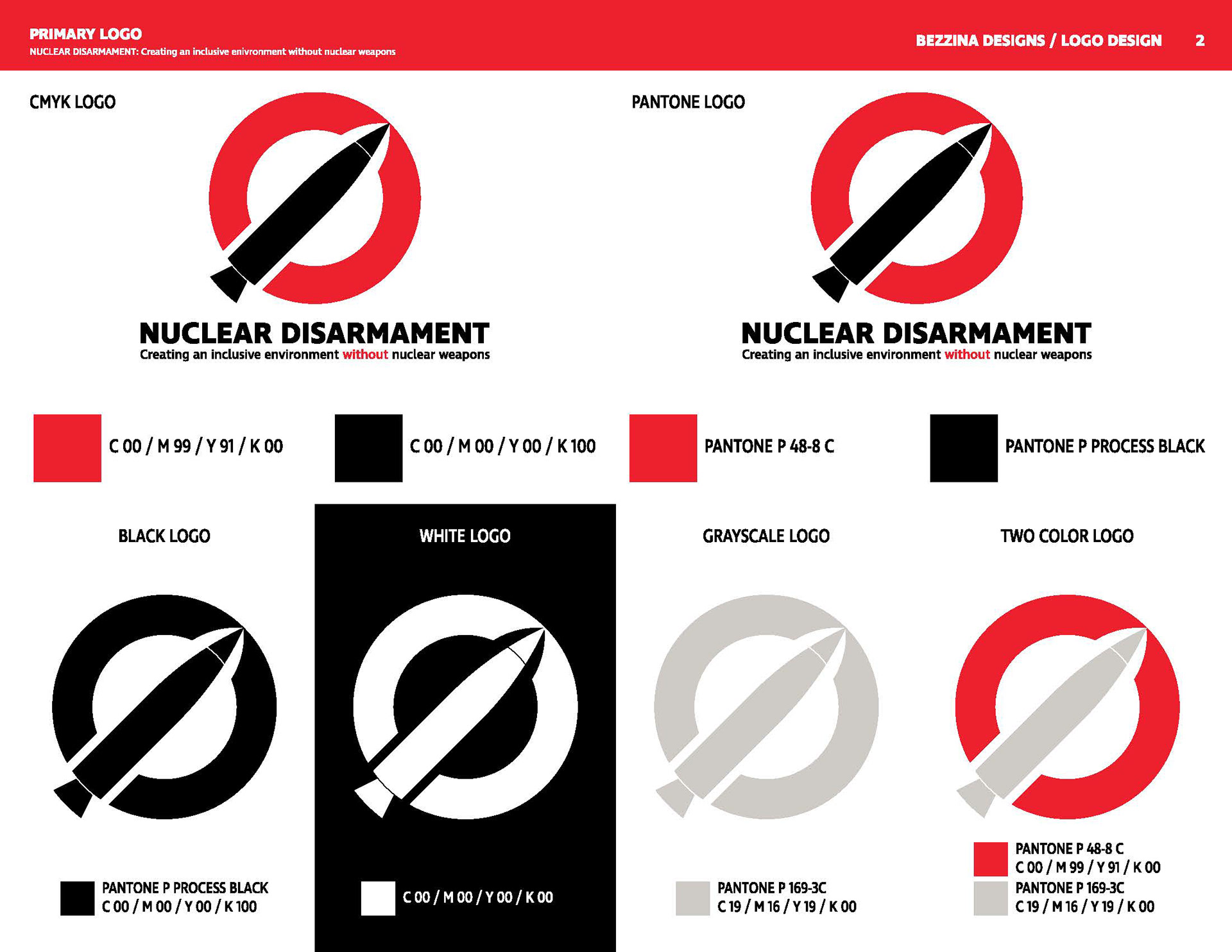
I also created full color copies of the logo. The red circle represents the prohibition symbol. Red is an alert warning color used as a sign for stopping and saying no. In this case, black represents a symbol of death and fear, which is stopped by the red. The white is used to invert the logo colors. In some countries, it can also be seen as a symbol for death. The gray is reminiscent of the finish color applied to some missiles. The dark blue is a serious color used to ground the grey.
Brand Manual
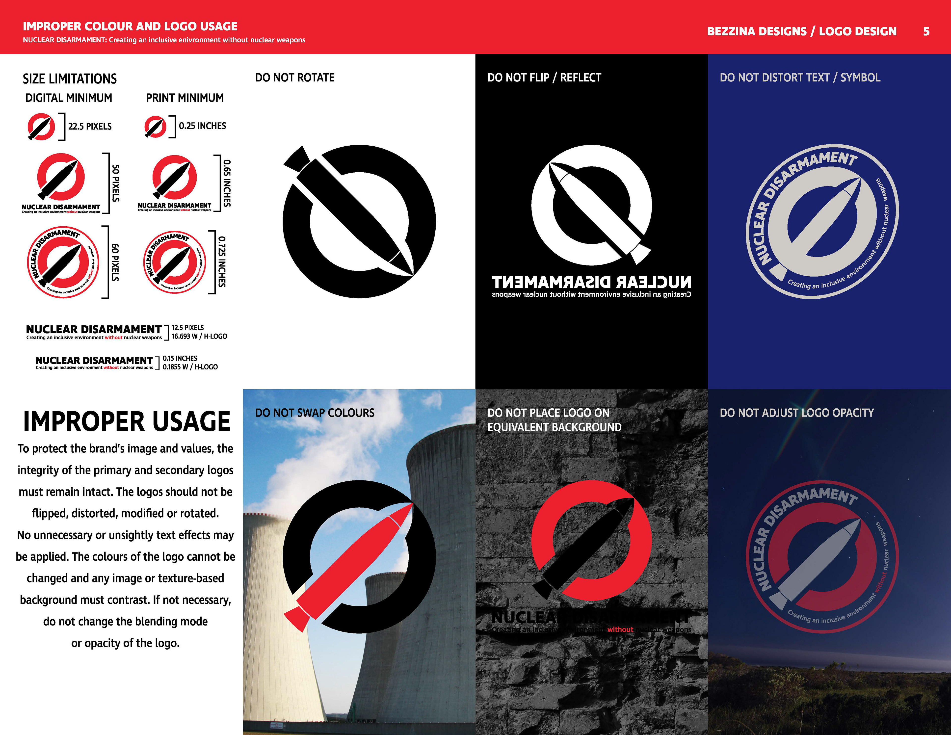
For this project, we were required to create a four-page brand manual. Knowing that I would use this project as a portfolio piece, I decided to create an 11-page manual. Nine of those eleven pages are present. The pages include logo gridding, brand information, the logos, logo treatment, color and text usage, applications and file usage. If you have time, I suggest that you click and look at the individual pages.

Logo Applications
Thanks For Scrolling,
Please Contact To Purchase!
Copyright © 2018 - Bezzina Designs
Project falls under intellectual property law.